About
Randy Krum
President of InfoNewt.
Data Visualization and Infographic Design

Infographic Design

Infographics Design | Presentations
Consulting | Data Visualizations

DFW DataViz Meetup

Join the DFW Data Visualization and Infographics Meetup Group if you're in the Dallas/Fort Worth area!

Search the Cool Infographics site

Custom Search

Subscriptions:


Feedburner

The Cool Infographics® Gallery:

How to add the
Cool Infographics button to your:

Cool Infographics iOS icon

- iPhone
- iPad
- iPod Touch


Read on Flipboard for iPad and iPhone

Featured in the Tech & Science category

Flipboard icon

Twitter Feed
From the Bookstore

Caffeine Poster

The Caffeine Poster infographic

Entries in social media (74)

Monday
Jul112011

Client Infographic: Facebook, Privacy and Health

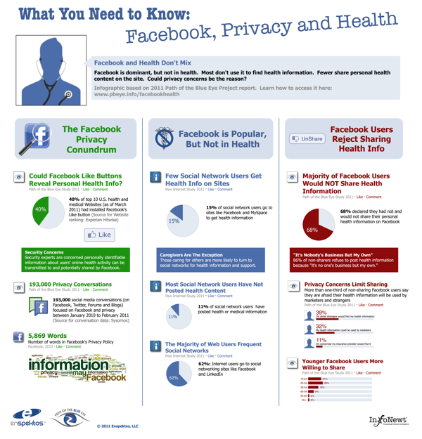
For the Path of the Blue Eye Project, InfoNewt (my company) recently designed the infographic: What You Need To Know: Facebook, Privacy and Health.  The group at the Path of the Blue Eye Project has done some fantastic, primary research about online users’ willingness and attitudes about sharing health information online, and specifically Facebook.

The answer is overwhelmingly “NO”.

If Facebook is so popular (Pew reports that 62% of Web users frequent sites like Facebook and MySpace), why are people shying away from sharing health content with others on the site?  To answer this question, the Path of the Blue Eye Project commissioned a national survey designed to tease out some of the reasons why Americans are reluctant to exchange health information on Facebook.  We found:

  • 68% of Facebook users have not and would not share their personal health information on the site. The most commonly cited reason for refusing to share: “it’s no one’s business but my own (86%).”
  • Privacy concerns may be one reason many refuse to share.  39% of non-sharers were afraid strangers would find their health information and 32% worried marketers might use it to sell products and services.

Online users do a lot of searching for health information, but very few are willing to share any of their own information on social sites like Facebook.

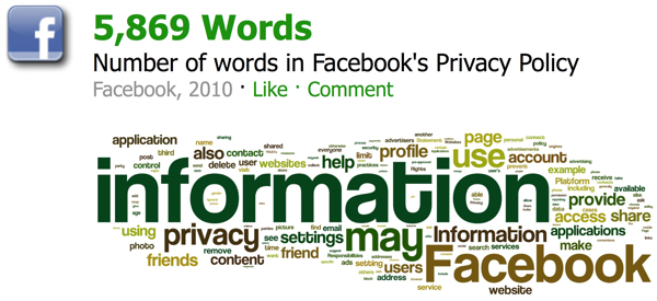
The Facebook Privacy Policy is huge, and most of the concerns why oline users are unwilling to share online information have to do with unintended people finding their information.  Insurance companies, marketers and strangers top the list of concerns.

Thanks again to Fard and the team at Enspektos.com.  There’s much more information available at the Path of the Blue Eye Project.

Tuesday
Jun212011

Foursquare Reaches 10 Million Users


Foursquare yesterday announced that they have reached 10 Million members, and released this infographic for the occasion.

And, to commemorate this pretty crazy occasion, we put together a little infographic. Be sure to click through to see it bigger; if you’re anything like us, watching the full-size animated map puts butterflies in your tummy. Thank you so much for supporting us!

I love the animated portion right in the middle!

Personally, I have mostly given up on Foursquare check-ins without the points or mayorships earning anything for me.  I wonder how many of those 10 Miliion joined, but don’t use Foursquare anymore?

Thursday
May052011

The Reality Behind Social Location Apps #infographic

Digital services company Beyond compiled the results of their research into location-based apps, and designed this infographic summarizing the results; Check-In Data: The Reality Behind the Hype.  Released in conjuction with the Social-Loco conference in San Francisco, CA on May 5th.

As part of our involvement in the Social-Loco conference we have done some research to try to understand the difference between what people are saying online compared to the actions of early adopters and the views of the rest of the US population when it comes to their mobile check-in habits.

The results give us a clear understanding of who the winners and losers are likely to be, as well as the types of things that will motivate the mass consumer to adopt location-based apps. They also highlight some of the real challenges there are to consumers embracing this technology.

The data is very interesting.  Personally, I continue to use Foursquare, but find myself checking in less and less because I don’t get any direct benefits out of it.

From a design standpoint, I like the circle clusters, but I don’t like data separate in a legend on the side.  I appreciate that the color-coding remains the same, so Twitter is the same color in each visualization.  I would have included the logo images for the social location-based apps, and connected the data directly to the circles.  Data legends like this make your readers work harder to understand the information.

I also think that the most interesting learning from the study is the comparison between how people interact with national brands and small, local businesses.  However, this is the last visualization at the bottom, and gets lost.

Found on Mashable!

Wednesday
May042011

Real Estate: Social Media Killed the Blog Star


Another good infographic from Fixr.com about the how the real estate industry is changing.  Social Medai Killed the Blog Star: Real Estate looks at how buyers are finding their information online and who are the most influential blogs and real estate people on Twitter.

I like the use of company logos and Twitter profile images.  I also like that all of the data is built-in to the pie charts and bar charts to make it easier for the readers to comprehend.

The side-by-side Top 10 lists are interesting, but because they’re based on different measurements (followers vs. Alexa page rank), the graphic should give the reader some context of how to compare the different values.  Why do these lists support the overall message that social media is more important than blogging?

Some major technical errors as well.  Pie chart percentages should ALWAYS add up to 100%.  The pie charts here add up to 71%, 99%, 91% and 100%, which means that the visual of the slice sizes doesn’t match the data.  You never want your data visualizations to tell a story that isn’t supported by the data.

Thanks to Raul for sending in the link!

Tuesday
Apr262011

Real Estate Professionals & Social Media Infographic


From Mashable and Postling, the Real Estate Industry + Social Media Use infographic looks at how social media is reshaping how realestate agents communicate with potential buyers.

The real estate industry has seen a number of social media innovations over the past few years. Real estate pros are using social media to provide online property tours, schedule showings and showcase local expertise.

Alexis Lamster, VP of customers at Postling and creator of the infographic below, told us that the company analyzed more than 500 Postling accounts specific to real estate and more than 7,000 small business accounts to extract information on how the real estate industry is using social media.

Although the infographic is made up of mostly pie charts and bar charts, it clearly communicates the information in a clean, easy-to-read format.

Wednesday
Apr202011

Social Media and College Admissions


Are colleges using social media as part of the student admissions process?  Schools.com explored this topic with the Reading Students like an Open Facebook infographic.  It’s hard enough to get teenagers to understand that online photos and status updates will be a permanent record of their behavior for the rest of their life, but even more immediately it could impact their entrance into college!

As Facebook has become more and more popular—if it were a country, it would be the third largest in the world—its use in the field of education has expanded, too. In fact, more than 80% of college admissions officers report using Facebook as part of their recruiting process. 

Are admissions officers really looking at the Facebook profiles of prospective students? And if so, are they making admissions decisions based on these profiles? Below is an infographic that highlights the answers to these questions and more—which might surprise you.

Thanks to Kristen for sending in the link!

Tuesday
Apr122011

The Current State of Social Networks #infographic

From ignite, a social media agency, comes The Current State of Social Networks.

It goes without saying that Facebook is the network du jour, but even though the reigning champion’s user stats keep soaring, social networking as a whole might be leveling off. Nevertheless, there are still scores of other highly competitive social sites that are waxing and waning; and different networks and apps are more popular in specific geographic areas, with certain genders or age groups, and even among various social classes.

For example, Plaxo is the network with the most users over the age of 65. Facebook is more popular with women, but Digg and Reddit tend to be more popular with men. LinkedIn is the “richest” social network, but Plurk outranks it when it comes to well-educated users who have graduate degrees.

They have a ton of traffic data to work with, and this infographic does a good job of summarizing some of the key findings at the top level. 

Found on Mashable and Social Media Graphics

Thursday
Mar312011

Do You Need a Social Media Detox? [infographic]

From Column Five Media, Do You Need a Social Media Detox? is a lighthearted infographic look at what can happen when you get sucked into the social media hype.  Light on data, it’s a fun, infographic poke at those of us that believe being a Foursquare Mayor of the local grocery store actually means something.

If you find yourself tweeting from the shower and updating Facebook while doing 85 on the freeway, we created this graphic to save your life. Click below or go here to view the full-size version.

Thanks Jarred for sending in the link!

Monday
Oct182010

The Conversation Prism 3.0 for 2010

Brian Solis and JESS3 have released v3.0 of The Conversation Prism for 2010.  The Conversation Prism is a great infographic showing the major players in each of 28 different online conversation categories.  The original 1.0 version from August 2008 (image available on Flickr) only had 22 categories, and some of those only had one player.

You can buy the poster (I’ve got v2.0 hanging in my office) for $20, or there are also some great multi-pack deals for 3 posters for $40 or 4 posters for $50.

One of the best projects I’ve worked on is to use this idea to help companies map out their own corporate online strategy.  Which if these categories and tools are you trying to use to drive your business?  My advice, don’t try them all, be targeted about which ones are best to reach your target customers.  Use this as a guide, but make your own company-specific conversation prism.

Found on FastCoDesign by Cliff Kuang

Thursday
Oct142010

Map of Online Communities 2


This is one of my favorites.  xkcd has updated their Map of Online Communities for 2010!  This is an update from the original 2007 Map of Online Communities, and has changed quite a bit.

Communities rise and fall, and total membership numbers are no longer a good measure of a community’s current size and health.  This updated map uses sizes to represent total social activity in a community - that is, how much talking, playing, sharing or other socializing happens there.  This meant some comparing of apples and oranges, but I did my best and tried to be consistent.

You can also view the LARGE version, or pre-order the poster.