About
Randy Krum
President of InfoNewt.
Data Visualization and Infographic Design

Infographic Design

Infographics Design | Presentations
Consulting | Data Visualizations

DFW DataViz Meetup

Join the DFW Data Visualization and Infographics Meetup Group if you're in the Dallas/Fort Worth area!

Search the Cool Infographics site

Custom Search

Subscriptions:


Feedburner

The Cool Infographics® Gallery:

How to add the
Cool Infographics button to your:

Cool Infographics iOS icon

- iPhone
- iPad
- iPod Touch


Read on Flipboard for iPad and iPhone

Featured in the Tech & Science category

Flipboard icon

Twitter Feed
From the Bookstore

Caffeine Poster

The Caffeine Poster infographic

Entries in social media (74)

Friday
Mar092012

Rock of Ages: The Evolution of SxSW

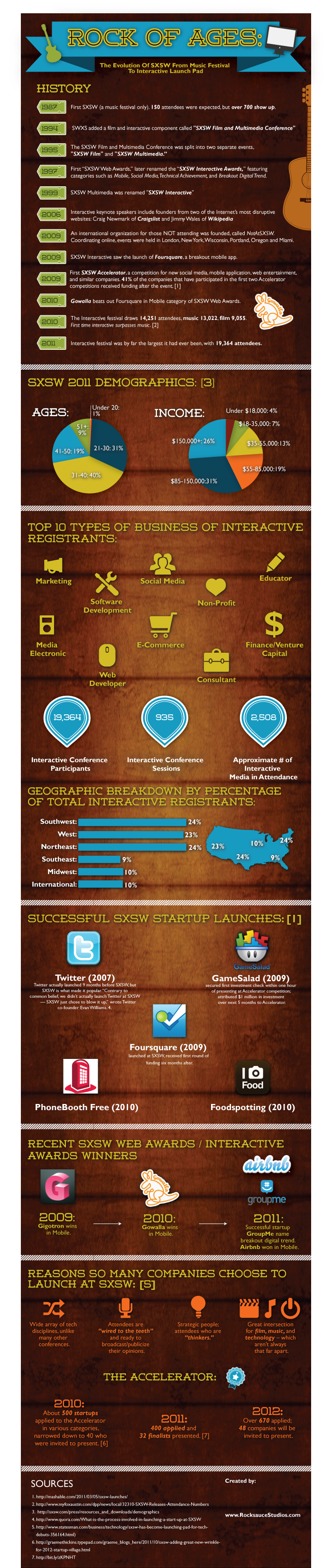
Rock of Ages: The Evolution of SxSW from Music Festival to Interactive Launch Pad is a new infographic from Rocksauce Studios just in time for SxSW 2012 this weekend.

Since 1987, SXSW has morphed into an interactive, film and music conference and festival that brought together 19,364 attendees in 2011.

Austin-based app development firm, Rocksauce Studios, has created an infographic that dissects the interactive portion of SXSW, and proves why this conference is the new popular techie playground.  

The topics and cited statistics covered in “The Evolution of SXSW from Music Festival to Interactive Launch Pad” include:

- History of SXSW
- 2011 Attendance Demographics
- Top 10 Types of Business of Interactive Registrants  
- Geographic Breakdown of Total Interactive Registrants
- Successful SXSW Startup Launches
- Recent SXSW Web Awards  / Interactive Awards Winners
- Reasons So Many Companies Chose to Launch at SXSW
- The Accelerator

You can read more about the development of the infographic on Silicon Angle

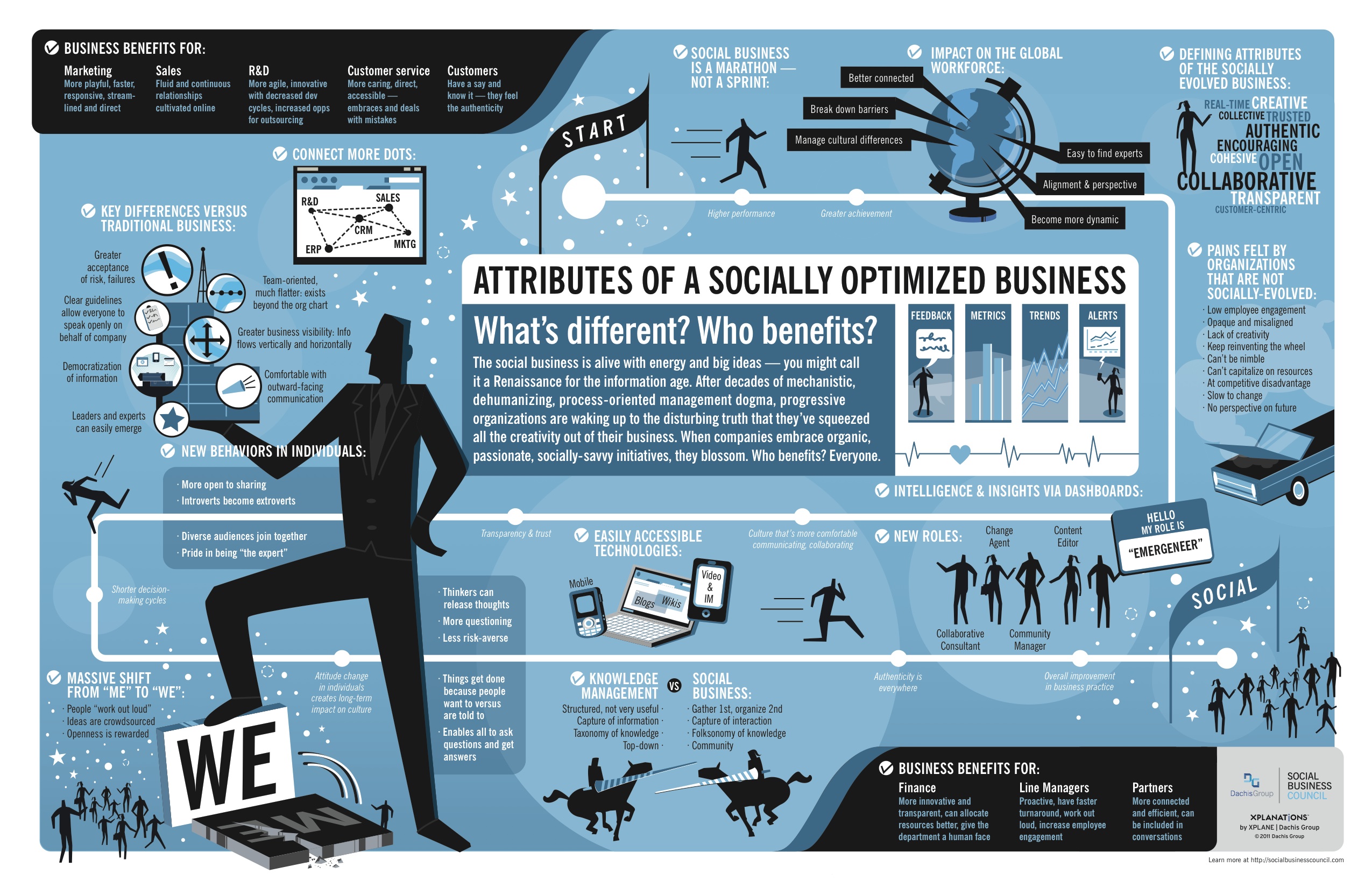
This design does a really good job with the visual basics.  Showing the icons/logos of the startup companies, illustrating the business types, mapping the conference registrants. The overall design tells a good story top-to-bottom to the readers, and it’s easy to follow the flow of information.

Three things stood out to me that could be improved:

  • There are a lot of data values in the text of the timeline that should have been visualized.
  • The three shapes showing the amount of Interactive Conference Participants, Conference Sessions and Interactive Media in Attendance all of different values, but the shapes are not sized to match those values.
  • The last section “The Accelerator” seems to fall apart as all text, even though there are some good data values there that should have been visualized.

Thanks to Kelly for sending in the link!

Tuesday
Feb212012

The United States of Craigslist

Welcome to The United States of Craiglist! This infographic map, found on the IDV User Experience blog, shows approximately how craigslist divides its geographic zones across the U.S.! Very important for a website who bases its usefulness on location!

WHY?  Locality is inherent to the value of craigslist; I go to craigslist.org but I get kicked over to the local instance of craigslist (my IP address sources me to somewhere in the illustrious Lansing, MI).  But how does craigslist know where to send me?   Some mysterious system of assigning a geocoded IP address to just the right site must be in place…I wonder what that map looks like.


When Ian Clemens proposed the idea, I looked around to find an existing map of craigslist sites-to-areas -maybe even find the lookup that they themselves use. I couldn’t find anything like it.
Whether it matches their system well or not, here is a map that approximates geographic coverage to individual sites using a Voronoi process as a base (more info on process below).  It is at least a start at visualizing the geographic coverage and distribution of the community-driven instances of craigslist.  Shapes like this might provide some useful context for other data, demographic or market information, for instance.  Also, when pulled into VFX, it can serve as an input to some spatial querying on those other metrics.

It’s worth noting that this is not from Craigslist at all, but an outside analysis of the cities from the craigslist site and approximates the geographic areas covered by each.  A complete post about how this map was generated is available here, and they have even made all of the data files available in a number of different formats.  Bonus!

Craigslist doesn’t care about state lines, counties, time zones or voting districts.  They care about defining an area that covers certain population levels that effectively use their service.

Thanks to Jim for sending in the link!

Monday
Feb132012

The Social Brand Value of the World's Leading Brands

The Social Brand Value of the World’s Leading Brands infographic from Sociagility.

In November 2011, we looked at the social brand value of 50 of the world’s leading brands, creating a revised top 50 ranking according to their social media performance, as measured by our PRINT Index™ KPI.

The PRINT system compares brands on five key dimensions or ‘attributes’ of social media performance – popularity, receptiveness, interaction, network reach and trust – across multiple platforms. The Sociagility Top 50 report analyses the social brand value of the world’s leading brands and the competitive influences that determine their social media performance. Here’s a visual representation of just some of the report highlights.

I really like both the topic, and the design of this infographic.  The colors are bright, and appealing.  In the Top 20 Brand Leaders, I suggest that using the actual brand logos would have made the bar chart easier to understand.  It’s interesting that beyond the first section, the actual values aren’t shown along with the visualizations. I really like the circles comparison of the three attributes of each brand.

Also, “Legends are Evil”.  The color coding by market is at least a secondary level of data, but the legend still makes the reader work harder by looking back-and-forth to understand the meaning behind the colors.  It’s even harder as you move down the infographic, because the color coding continues, but the legend is way up near the top.  You could put icons or the text into the color bars themselves, and the reader would figure out the color coding scheme. 

At the bottom, a copyright and the URL of the original infographic would make it easier for readers to find the original posting.  Some credit to the designer would be nice as well.

Found on DR4WARD.

Tuesday
Dec132011

Social Media Stats of the Day


This is a LONG one, but a good one based on statistics recently published in AdAge.  Social Media Stats of the Day from Dream Systems Media visualizes some fo the recent stats about Favebook Twitter and general Social Media usage.

Saw an article on Social Media stats the other day on AdAge by Sarah Evans (awesome list of stats she compiled) and of course, me being who I am, I wanted to visualize the data. So enjoy! I used several of these statistics in my recent SMX Social Media Scottsdale presentation on SoLoMo – Checking into the real world.

- Mat Siltala

I really like the coloring in this design that visually ties the data to the Facebook and Twitter brands instantly for the readers.  Although, big fonts don’t make a data visualization, and a number of percentages included could easily have been visualized as simple pie charts or stacked bar charts.  I do think there is too much text in the design, but I can appreciate how specific you have to be when describing the research data and where it came from.

Nice job Mat!

Tuesday
Nov012011

The Life Cycle of a Web Page on StumbleUpon


StumbleUpon.com has shared a number of the differetn stats behind it’s social sharing service in the infographic The Life Cycle of a Web Page on StumbleUpon.  Designed by Column Five Media, the infographic focuses on the half-life of a link and the length of time users view pages and interact with StumbleUpon.  This information shows that the half-life of a StumbleUpon link is much longer than other social media sites that were shared by bit.ly in September.

You may have heard the stat that StumbleUpon drives more traffic referrals than any other social media site. We wanted to shed some light on this by describing the lifecycle of a web page in StumbleUpon, especially how long you could expect the average web page to keep getting visitors.

StumbleUpon doesn’t get as many mentions in the media as Facebook and Twitter, but the data indicates that they have more referrals than those two combined.  I see that here on the Cool Infographics blog occassionally.  When one of my posts is picked up in StumbleUpon is usually gets thousands of stumbles.

Found on Visual News and Fast Company Design.

Thursday
Oct202011

The Socially Optimized Business


Attributes of a Socially Optimized Business is a new, visual XPLANATION from the Dachis Group after acquiring the XPLANE company.  You can view it in SlideShare (they should have put it into Prezi), or download the high-resolution PDF.

What’s a Social Business? It’s a business alive with energy and big ideas. It’s collaborative, authentic, customer-centric, trusted, open and real-time.

And it’s about time. After decades of mechanistic, process-oriented management dogma, progressive organizations are waking up to the disturbing truth that they’ve squeezed all the creativity out of their business. But when companies embrace organic, passionate, socially-savvy initiatives, they blossom. That’s Social Business.

This would make a great poster!

Wednesday
Oct052011

Social Media Brandsphere

The Social Media Brandsphere is a new collaboration between Brian Solis and JESS3.  The Brandsphere explores how brand storytelling can cross different communication mediums. 

Over on the JESS3 blog, they’ve posted 10 of the different early versions and concepts of the Brandsphere so you can see some of the behind-the-scenes design process at work. 

Social networks and channels present brands with a broad array of media opportunities to engage customers and those who influence them. Each channel offers a unique formula for engagement where brands become stories and people become storytellers. Using a transmedia approach, the brand story can connect with customers differently across each medium, creating a deeper, more enriching experience. Transmedia storytelling doesn’t follow the traditional rules of publishing; it caters to customers where they connect and folds them into the narrative. In any given network, brands can invest in digital assets that span five media landscapes:

1. Paid: Digital advertising, banners, adwords, overlays

2. Owned: Created assets, custom content

3. Earned: Brand-related conversations and user-generated content

4: Promoted: in-stream or social paid promotions vehicles (e.g. Twitter’s Promoted products and Facebook’s Sponsored Stories)

5. Shared: Open platforms or communities where customers co-create and collaborate with brands. (e.g. Dell’s IdeaStorm and Starbuck’s MyStarbucksIdea.)

Any combination of the five media strategies defines a new Brandsphere where or

ganizations can capture attention, steer online experiences, spark conversations and word of mouth can help customers address challenges or create new opportunities. Each media channel connects differently with people and thus requires a dedicated approach integrating tangible and intangible value. Doing so ensures a critical path for social media content: relevance, reach and resonance.


Available as a poster on the Conversation Prism site

Tuesday
Oct042011

Social Media Usage in the UK

Social Media Usage in the UK is a new infographic from Umpf.co.uk

We then analysed the results to bring what we believe is the most up-to-date snapshot of social media usage in the UK.  If you like statistics, you can view them all here.

Our infographic, created by Vapour, helps visualise statistics; it outlines the gender and age differences in social media usage.

It needs a title.

I love that they included a link to the data file in GoogleDocs in the original posting.

I like the idea of the Man/Woman stacked percentages.  Although, I’m guessing they didn’t calculate the icon shape areas to get the section sizes right, which makes the visualization false.  They probably just calculated the height of each section, which visually misinterprets the data.  YouTube is shown to be much bigger than it really is because the shape is widest there.

They don’t need the Key/Legend at the bottom (“Legends are Evil”).  The social media icons were clearly used in the first bar chart, and could have been included in them all for clarity.  Build the data right into the charts, and you don’t need a legend.

At the bottom should be a copyright (or creative commons license), the URL to the original infographic, the Umpf company logo,  the sources listed and the designer credit.  Once this infographic is posted elsewhere on the Internet (like here on the Cool Infographics blog) all of the information that was included in the original posting is lost.  (unless a good blog author, like me, includes the links)

Thanks to Jon for sending in the link!

Thursday
Sep292011

Airlines: The Future of Loyalty is Social


SimpliFlying has done some great research on how frequent travelers use social media.  The Future of Loyalty is Social infographic summarizes some of the key findings from the research.

To dig deeper, we partnered with Cranfield University in the UK to conduct a study on how frequent travelers (who travel at least five times a year) use social media. And here are some highlights of what we found:

  1. There are more airlines on Twitter than there are airlines with frequent flyer programs (191 vs 179)
  2. Almost 90% of frequent flyers use Facebook regularly, and over 65% “Like” at least one airline on Facebook
  3. To frequent fliers cheapest fare is the least significant loyalty factor among customer service, earning loyalty points and onboard experience
  4. 72% of frequent fliers would join a social loyalty program
  5. Over 65% of frequent fliers would like to earn social loyalty points via check-ins or by contributing ideas to an airline’s Facebook page.
  6. Over 80% of frequent fliers would like to earn social loyalty points by recommending the airline to a friend or providing positive feedback.

In the infographic below, we have summarized the findings of the study, and will soon release a detailed presentation of these findings too. Special thanks to Gavin Tan and Prof. Keith Mason from Cranfield University for their tremendous help with this study.


The simple, isotype-style illustrations are immediately recognizable since they are so similar to the figures used in airports and airline signage.  I think the Frequent Flier Participation Ladder is some fantastic data, and should have been more prominent in the design.

A handful of things I would have changed about the design:

  • The initial visualization of social sites should have been in descending order.  It’s almost there except for Twitter listed first.
  • The Twitter factoid ‘Frequent fliers “following” their favorite airlines on Twitter are steadily increasing’ is not supported by the visual showing how many airlines are followed by frequent fliers.  The statement claims a change over time.
  • The benefit percentages are shown on an odd shape of 10 squares.  Is that supposed to be an airline seat?  Hard for the reader to visually grasp the percentage since it isn’t a simple square shape.  A grid of 100 squares would have worked better.
  • The doughnut percentages are sorted in descending order, so the colors are in a different order in each doughnut.  Very hard to interpret.  The orders should have stayed consistent from Very Strong to Not at all in each doughnut.  Doughnuts are also hard to compare with each other visually.

Some great research data, and an infographic was a great way to publicize it.  They were very thankful to the professors at Cranfield University for their help with the research, but I wish they had credited a designer.  Was this done by someone inside SimpliFlying?

Found on MediaBistro

Wednesday
Jul272011

The VIZoSPHERE - Visualizing DataViz People on Twitter

From Moritz Stefaner on Visualizing.org, comes the VIZoSPHERE project (Click the image to see the high-resolution image viewer).  Using GePhi, Moritz started with 18 seed accounts on Twitter, and then mapped 1,645 of the connected, networked accounts that relate to data visualization.  Bubble size in this visualization shows how many followers each account has from within this DataViz pool of users.

This map shows 1645 twitter accounts related to the topic of information visualization. The accounts were determined as follows: For a subjective selection of “seed accounts”[1], the twitter API was queried for followers and friends. In order to be included into the map, a user account needed to have at least 5 links (i.e. follow or being followed) to one of these accounts. The size of the network nodes indicates the number of followers within this network.


[1] The seed accounts were; @moritz_stefaner, @datavis, @infosthetics, @wiederkehr, @FILWD, @janwillemtulp, @visualisingdata, @jcukier, @mccandelish, @flowingdata, @mslima, @blprnt, @pitchinteractiv, @bestiario140, @eagereyes, @feltron, @stamen, @thewhyaxis

The zooming interface is crucial to view such a highly-detailed visualization and be able to read any of the nodes.  I was about to find my own Twitter account (@rtkrum), but it would be nice if Moritz would also provide a listing of the Twitter accounts or some way to search the map.

Great job Moritz!

Found on FlowingData and Robin Richards (@ripetungi) on Twitter.