About
Randy Krum
President of InfoNewt.
Data Visualization and Infographic Design

Infographic Design

Infographics Design | Presentations
Consulting | Data Visualizations

DFW DataViz Meetup

Join the DFW Data Visualization and Infographics Meetup Group if you're in the Dallas/Fort Worth area!

Search the Cool Infographics site

Custom Search

Subscriptions:


Feedburner

The Cool Infographics® Gallery:

How to add the
Cool Infographics button to your:

Cool Infographics iOS icon

- iPhone
- iPad
- iPod Touch


Read on Flipboard for iPad and iPhone

Featured in the Tech & Science category

Flipboard icon

Twitter Feed
From the Bookstore

Caffeine Poster

The Caffeine Poster infographic

Entries in social (50)

Friday
Jan282011

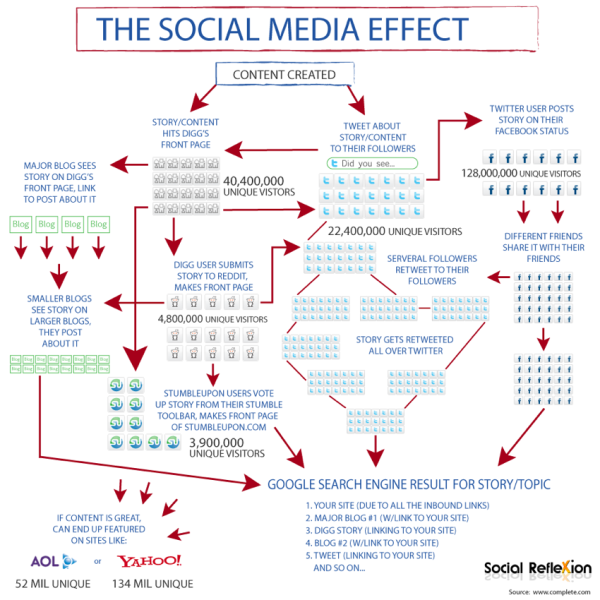
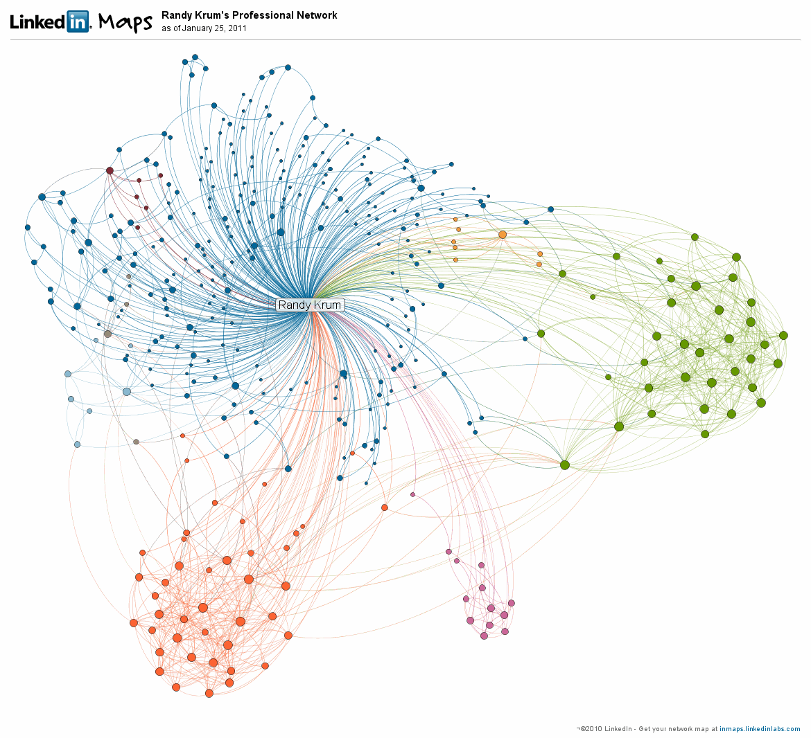
InMaps: Viewing Your Business Network

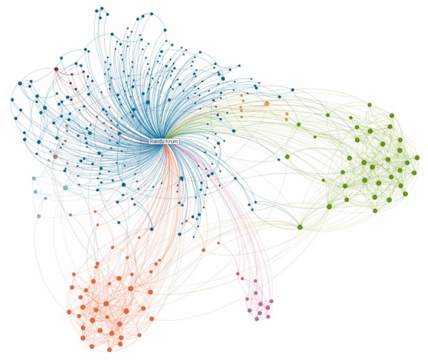
The new LinkedIN Maps is a very cool interactive infographic that visualizes your own LinkedIN network.  The InMaps pull data from your own LinkedIN profile when you allow access, so you can only see your own network.  

The connections are grouped into clusters based on shared connections and companies.  You can see above that my network has a few clearly defined clusters, but then a large blue area that has no clear cluster information.  You can also learn about you network with some of the visual data built into the map.  People with bigger dots and their names in larger fonts have more connections.

It’s interactive, so you can zoom in to see the individual names, and if you click on a connection, it highlights all of their connections as well.

Check out the quick, descriptive video from LinkedIn’s chief scientist DJ Patil:


For some reason, it doesn’t show every connection between people.  There are a few people in my network that I know are also connected to each other; however, the map didn’t show any connection between them.  Not sure what’s going behind the scenes.

You can publicly share your map on Twitter, Facebook and of course LinkedIN when you click the share buttons.  Here’s mine.  This creates a static image with a legend if you have named your color-coded clusters.  Clicking on the map takes readers to the front page to create their own, but clicking on your name takes them to your LinkedIN profile page.

You can also see some other anonymous maps on the front page by clicking on the “Next Map” button which will change to the background map image.

This one has been popular.  Found on FlowingDataVizWorld, Infosthetics and Mashable.

Monday
Oct182010

The Conversation Prism 3.0 for 2010

Brian Solis and JESS3 have released v3.0 of The Conversation Prism for 2010.  The Conversation Prism is a great infographic showing the major players in each of 28 different online conversation categories.  The original 1.0 version from August 2008 (image available on Flickr) only had 22 categories, and some of those only had one player.

You can buy the poster (I’ve got v2.0 hanging in my office) for $20, or there are also some great multi-pack deals for 3 posters for $40 or 4 posters for $50.

One of the best projects I’ve worked on is to use this idea to help companies map out their own corporate online strategy.  Which if these categories and tools are you trying to use to drive your business?  My advice, don’t try them all, be targeted about which ones are best to reach your target customers.  Use this as a guide, but make your own company-specific conversation prism.

Found on FastCoDesign by Cliff Kuang

Thursday
Oct142010

Map of Online Communities 2


This is one of my favorites.  xkcd has updated their Map of Online Communities for 2010!  This is an update from the original 2007 Map of Online Communities, and has changed quite a bit.

Communities rise and fall, and total membership numbers are no longer a good measure of a community’s current size and health.  This updated map uses sizes to represent total social activity in a community - that is, how much talking, playing, sharing or other socializing happens there.  This meant some comparing of apples and oranges, but I did my best and tried to be consistent.

You can also view the LARGE version, or pre-order the poster.

Thursday
Sep092010

The Web 2.0 Points of Control Map


The Web 2.0 Summit Points of Control Map is a very cool, interactive map.  As part of the marketing for the upcoming Web 2.0 Summit (November 15-17 in San Francisco) they have released this interactive map that takes the metaphor of web companies/brands as countries on a map (from xkcd.com and flowtown.com) to a new level.

Pan and Zoom to explore the map, and click the icons to get some insight about each player and their position.

Then, turn on the comments view to discuss the map with others and add your own ideas!


By clicking on any of the company icons at the top, arrows are shown to indicate the business areas (continents) that the companies are trying to expand into (colonize).  You can turn them on one at a time, or turn many of them on at the same time.

Additionally, you can select any individual icon to get more details:

John Battelle has an in-depth post on the Web 2.0 Summit blog, Points of Control: The Map, about the creation of the map, and his hope that others will add to it in the future.

We’ve put the entire map under a Creative Commons Attribution-NonCommercial-ShareAlike 3.0 Unported License, which means we want you to take this idea and add to it, making it better. Once our amazing development partners at Blend Interactive catch their breath, we also plan to release the code and documentation, so you can create your own maps as well.

Our thanks to the team at Blend who worked with me to bring this vision to reality, and to Janetti Chon, my producer, who kept it on track, and the entire team at Web 2.0 for bearing with us as we brought this first iteration to fruition.

Found on VizWorld.com and VizThink.com 

Friday
Sep032010

The 2010 Social Networking Map


The team at Flowtown.com designed the 2010 Social Networking Map as an update to the Map of Online Communities by xkcd.com in early 2007.  Social networking has certainly advanced in the last three years (even in the last three days!), so the update shows a lot of changes in geography.

It does seem a little premature to claim this is the map of social media for 2010 with five months left to go.  A lot can happen in five months (like the Apple PING service announced this week).

Tuesday
Jul132010

Google's Social Media Timeline

From Mashable.com, Google’s Long History of Forays’s into Social Media is a timeline of acquisitions, deals and updates showing Google’s attempts to get involved in Social Media.

Google hasn’t had the best track record when it comes to social media attempts. Rather than a boring old list of past efforts, we decided to put together a graphical timeline with text by our very own Stephanie Marcus and graphics by Shane Snow.

Friday
Jul022010

5 Ways to Cultivate an Active Social Network infographic


5 Ways to Cultivate an Active Social Network is a nice infographic by Mark Smiciklas at Intersection Consulting.  Although not conveying a lot of data, this does a nice job of visualizing the five different activities that Chris Brogan advocates to build and maintain your social network.

This marketing visual was inspired by Chris Brogan. Check out his original post: Cultivate an Active Network.

Thanks to @MarshaCollier on Twitter for tweeting the link.

Tuesday
May042010

A HubSpotter's Guide to the (Social Media) Galaxy

I love this humorous Star Trek parody take on how to man your Marketing crew to be prepared to explore the (social media) galaxy!  From HubSpot.com, A HubSpotter’s Guide to the Galaxy is an infographic designed by our friend Mike Wirth.

Sometimes marketing seems like a cosmic adventure through social media, the blogosphere and other new, unknown regions of the internet!  Here’s how HubSpot imagines businesses traversing through the galaxy to meet new beings, engage with them and exchange new ideas!

Mike, where’s the holodeck so we can interact with infographics???


Wednesday
Apr212010

The Social Media Effect

This was the original infographic, The Social Media Effect, from InfographicWorld that inspired part of yesterday’s post, The Visual FAQ of SEO.  This infographic maps out the process of what happens when social media gets excited about your posted content.

A great example of why I started the Cool Infographics blog in the first place.  Create a great place to find inspiration to create your own infographics.

Tuesday
Apr202010

The Visual FAQ of SEO infographic

A Visual FAQ to SEO is a great infographic from Matt at Datadial.net covering many of the different aspects of Search Engine Optimization for your web pages.

Images are a fantastic way to present data and abstract concepts, they’re a much clearer way of getting information across and more people take the time to digest it. I thought it would be a good idea to try to present solutions and explanations to the more common SEO questions that we hear from our clients.

The image covers everything from basic keyword research concepts, through site architecture, page optimisation, link building, SEO tactics, social media, and some basic SEO and PPC clickthrough stats and explantions.

Portions appear to be inspired by The Social Media Effect from Infographic World.  (Look for tomorrow’s post)

Found on Social Media Graphics