About
Randy Krum
President of InfoNewt.
Data Visualization and Infographic Design

Infographic Design

Infographics Design | Presentations
Consulting | Data Visualizations

DFW DataViz Meetup

Join the DFW Data Visualization and Infographics Meetup Group if you're in the Dallas/Fort Worth area!

Search the Cool Infographics site

Custom Search

Subscriptions:


Feedburner

The Cool Infographics® Gallery:

How to add the
Cool Infographics button to your:

Cool Infographics iOS icon

- iPhone
- iPad
- iPod Touch


Read on Flipboard for iPad and iPhone

Featured in the Tech & Science category

Flipboard icon

Twitter Feed
From the Bookstore

Caffeine Poster

The Caffeine Poster infographic

Entries in software (55)

Friday
Oct232009

Collaborative, Online Mind Map about Mind Mapping Software


I know, that's a mouthful of a title.  MindMeister is an online, collaborative mind mapping tool that lets multiple users edit a common mind map.  Essentially, its a visual wiki, that allows anyone to makes changes to the data, but you need to be logged in so that it can track who makes the changes.

Andrew Wilcox has created a public mind map with the catchy title "The Strengths and Weaknesses of Mind Mapping Software Applications".  You can see all of the different mind mapping software packages, the pros and cons of each one, and add your own comments.


Your voice can still be heard, a few of the software applications don't have any comments at all yet.  They need people to help add information to the map.

Found on the Mind Mapping Software Blog, by Chuck Frey

Also, MindMeister has an iPhone app that allows you to view and edit online mind maps from your iphone.  It's $6.99US in the iTunes App Store.  MindMeister (mind mapping)

Friday
Sep042009

New Hans Rosling video, using GapMinder (Must see!)

New TED Talk video of Hans Rosling talking to the U.S. State Department, "Let my dataset change your mindset".  Using the GapMinder software that was purchased by Google, Hans shows the third world isn't as far behind the U.S. as most people believe.

Wednesday
Aug122009

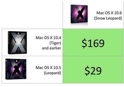
Mac OS X Snow Leopard Upgrade Chart


In contrast here's my version of the Mac OS X Snow Leopard upgrade chart.  The comparison to the Mac was inevitable, and I couldn't find that anyone else had created this chart yet.

The $169 price for users that don't have Leopard also include iLife and iWork.

Wednesday
Aug122009

Improved Microsoft Windows 7 Upgrade Chart

The chart above is NOT from Microsoft.  Ed Bott, over at ZDNet, was able to quickly redesign the Windows 7 Upgrade Chart from Microsoft in about an hour.  And Ed's a journalist.

The original chart (below) is unnecessarily complicated and hard to comprehend.  I generally don't post about bad infographics, but in this case Ed was able to re-do Microsoft's chart into the improved, simpler version you see above. 

Honestly, the upgrade process is still too complicated and Microsoft should be ashamed of themselves.  This deserves a new Mac vs. PC ad just by itself.

Found on Engadget and All Things D.

Here's the official "horrendous" (I don't get to use that word often) chart from Microsoft.

Tuesday
Jun162009

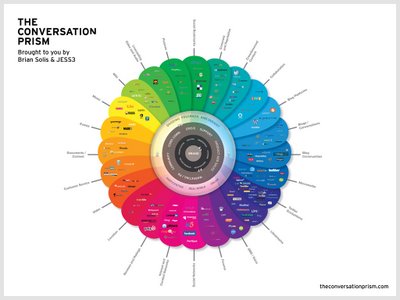
The Conversation Prism 2.0 has been released!


Check out the new version of The Conversation Prism 2.0 by JESS3 and Brian Solis and theconversationprism.com.  Available as a poster for $20 US on thier website, and they also have some high-resolution versions available.

I love the design of this one.  It's seems to be essentially a mind map, but much easier to read and understand.

This is an update to the original Conversation Prism that you can see here on Flickr.

Thanks Dana!  I found the link to the 1.0 version on ON:Digital+Marketing

Monday
Jun012009

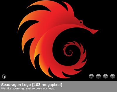
You Need to Get Seadragon!


If you haven't checked it out yet, you need to take a look at Seadragon.  I know its from Microsoft, but I like it anyway!  Seadragon is a software project to allow users to browse and zoom into high-resolution images.  I'm especially attached to the iPhone version of Seadragon Mobile (link opens iTunes) available for free from iTunes!

One of the best things about the iPhone version is that it includes some example images, and includes some of the work from Chris Jordan.  Longtime readers of the blog know I really like Chris Jordan's series "Running the Numbers" which uses high-resolution images to visually show the viewer statistical information about how we live.

Thursday
May212009

What is Wolfram|Alpha?

I'm not sure I understand what Wolfram|Alpha is yet, but so far it's pretty impressive.  Developed by Stephen Wolfram and his team, it claims to be a "computational knowledge engine".  The input box looks like a search engine, but it is definitely NOT a search engine.


When you type in a question, it attempts to show you all of the relevant data it can find.  It is actually calculating and charting this information real-time in order to present it to you.  Because its built on top of the Mathematica Engine, it can also handle math problems.


I think this will be an important tool for many designers of infographics, because you can get some of your raw data directly from Wolfram|Alpha.  As they add more data into the system over time, this will become one of your best resources for information.  They have a pretty extensive page of examples by category that is a great place to start.  Also watch the short video by Stephen Wolfram showing what the system can do.

Wednesday
Feb182009

Mapped Up - Visual News ScreenSaver


From lifehacker.com, MappedUp is a visual RSS Reader/ScreenSaver that displays the location of news stories on a pixel map of the world.  MappedUp is a free download for Windows and Mac OS X.

Sunday
Feb152009

The Browser Wars Infographic


Great timeline infographic depicting the rise and fall of different browsers portrayed as knights marching across a field.  The data set used is available here.

It took me a while to find any information about the author, but I found this description on the Wired.com blog.

Here's a creative look at the history of the browser wars from 2002 through mid-2008. The infographic was submitted to Reddit by a user named BovingdonBug. He says he created it as part of an application for a graphic design job on a newspaper.
 Thanks Alwyn for the link!

Thursday
Dec112008

The AI Landscape


From the Association of the Advancement of Artificial Intelligence (AAAI), a cool poster image designed by Giacomo Marchesi that lays out the different areas of AI development.

Thanks Zach!  Also can be found on digg.com