About
Randy Krum
President of InfoNewt.
Data Visualization and Infographic Design

Infographic Design

Infographics Design | Presentations
Consulting | Data Visualizations

DFW DataViz Meetup

Join the DFW Data Visualization and Infographics Meetup Group if you're in the Dallas/Fort Worth area!

Search the Cool Infographics site

Custom Search

Subscriptions:


Feedburner

The Cool Infographics® Gallery:

How to add the
Cool Infographics button to your:

Cool Infographics iOS icon

- iPhone
- iPad
- iPod Touch


Read on Flipboard for iPad and iPhone

Featured in the Tech & Science category

Flipboard icon

Twitter Feed
From the Bookstore

Caffeine Poster

The Caffeine Poster infographic

Entries in software (55)

Wednesday
Nov262008

Welcome to the world baby...Processing


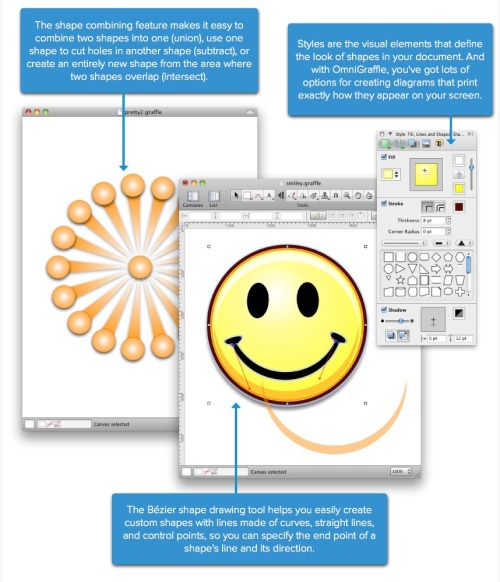
In my email yesterday I received a note announcing the release of Processing 1.0.  It's very exciting to see this project release to the world.  There have been many beta versions leading up to this release (162 versions in fact), but for those interested in creating your own infographics this is big news.  What is Processing, you ask?
Processing is an open source programming language and environment for people who want to program images, animation, and interactions. It is used by students, artists, designers, researchers, and hobbyists for learning, prototyping, and production. It is created to teach fundamentals of computer programming within a visual context and to serve as a software sketchbook and professional production tool. Processing is an alternative to proprietary software tools in the same domain.
Processing is free to download and available for GNU/Linux, Mac OS X, and Windows.
Some of the infographics I have highlighted here on Cool Infographics have been created with the earlier versions of Processing, and I'm hoping for more to come.

Wednesday
Aug202008

Olympics Schedule Tracker


The Olympics Tracker is an interactive schedule of the events.  It now only shows which events are scheduled each day and hour, but you can drag them to rearrange your favorites to the top.  Clicking on past events shows the results, and clicking on future events shows the upcoming event details.  Medal awarding events marked with a small medal icon.  You can even download a desktop version for Mac or Windows.

Tuesday
Jul292008

Radiohead: House of Cards visualization video

Really cool use of visualization tools to create this music video for Radiohead's "House of Cards".

Check out this link to a different version on Google that lets you move the video image around while its playing. and the "making of" video that shows the laser scanners they used.

Radiohead just released a new video for its song "House of Cards" from the album "In Rainbows".

No cameras or lights were used. Instead two technologies were used to capture 3D images: Geometric Informatics and Velodyne LIDAR. Geometric Informatics scanning systems produce structured light to capture 3D images at close proximity, while a Velodyne Lidar system that uses multiple lasers is used to capture large environments such as landscapes. In this video, 64 lasers rotating and shooting in a 360 degree radius 900 times per minute produced all the exterior scenes.

Watch the making-of video to learn about how the video was made and the various technologies that were used to capture and render 3D data

Thursday
Jul242008

What Software do you use for Infographics?


A few readers have written emails to me asking about what software to use to create infographics.  My needs are pretty simple for my day job, so I only have a handful of tools that I use loaded onto my MacBook.  But the graphics I create are fairly simple, and don’t use massive amounts of data.

Yes, I included MS Office in the list because there are some really cool things you can do with Excel and PowerPoint.  I’ll post some examples in the future.


What software do you use?

Post about your favorite software in the comments and share your “must have” software with everyone here.

Monday
Jul212008

When are you at risk online?

From the Mozilla website, and obviously a part of their sales pitch.  I picked up that the calendar arrangement of the squares is in fact correct for 2006.  Its getting the small things right that help make good infographics.

An independent study shows that, in 2006, IE users were vulnerable to online threats 78% of the time. Firefox users? Only 2%.

“At risk” defined as publicly available exploits with no patch. Source: “Internet Explorer users Unsafe for 284 Days in 2006” Brian Krebs, Washington Post, 1/4/2007

Tuesday
Jun172008

Code Swarm: Eclipse


code_swarm - Eclipse (short ver.) from Michael Ogawa on Vimeo.

Created by Michael Ogawa. Check out the website describing the project here.

This visualization, called code_swarm, shows the history of commits in a software project. A commit happens when a developer makes changes to the code or documents and transfers them into the central project repository. Both developers and files are represented as moving elements. When a developer commits a file, it lights up and flies towards that developer. Files are colored according to their purpose, such as whether they are source code or a document. If files or developers have not been active for a while, they will fade away. A histogram at the bottom keeps a reminder of what has come before.
Thanks Alwyn for sending in the link!

Thursday
Jun122008

WarCraft III DotA Poster


Created by Alwyn B., this hierarchical tree shows the complex Hero Item recipes for the WarCraft III MOD "Defense of the Ancients". As a fan and a player of the game, Alwyn painstakingly created his own infographic and then posted in on the Internet to share with other players. This makes a fantastic poster!

More than just the item combinations, the poster shows:

  • Shows the basic items and how to combine them to form better items.
  • Shows where to buy them, and for how much.
  • Mini Map that shows shop locations
  • Shop Item Layouts
When I looked today, this chart had been viewed over 100,000 times. Great job Alwyn, and thanks for sharing.

Tuesday
May202008

TweetWheel


I just found TweetWheel, and its really cool. Made by Augusto Becciu.

Enter a Twitter ID (I used my ID: rtkrum), and in real time it will generate a connection wheel built from 100 people that person is following. Hover the mouse over any of the names, and it will show the connections that that person is also following on Twitter.

It takes a few minutes to load the user data.

Wednesday
Apr162008

Quake Family Tree

From Wikipedia, the Quake Family Tree shows the history of the Quake computer game engine and all of the other games that were built from each version using a mind map.

Found on digg.com

Monday
Apr142008

Treemaps for drive space

I don't think I've posted much about specific software programs, but there are a number of infographic programs that anyone can use. These two are programs that analyze what's on your hard drive, and show it you in a treemap display.

The one above is Disk Inventory X for the Mac (which I use), and the one below is WinDirStat for Windows. Both are free, and are real-life examples of how you can use infographics in your life. So take a minute, and clean off some of that old junk taking up space on your hard drive.