17 Ways to Visualize Twitter


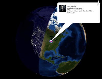
Also from FlowingData.com, this post about the many ways to visualize the Twitter universe is really cool. Twitter has really been gaining some momentum lately, but I keep looking for better ways to follow the posts.
Join the DFW Data Visualization and Infographics Meetup Group if you're in the Dallas/Fort Worth area!

The Cool Infographics® Gallery:
How to add the
Cool Infographics button to your:
- iPhone
- iPad
- iPod Touch
Read on Flipboard for iPad and iPhone
Featured in the Tech & Science category


Also from FlowingData.com, this post about the many ways to visualize the Twitter universe is really cool. Twitter has really been gaining some momentum lately, but I keep looking for better ways to follow the posts.
 Another infographic advertisement from Elliance.com to share around your office. How do the different Web2.0 services available today address the different needs within a company? An ideal graphic to share with the people in your organization that don't really understand how they can use these new web services.
Elliance is posting a weekly series of infographics on their site to help explain their services.

Wired magazine has this infographic flow chart of what happens after someone posts on their blog. From aggregators to text scrapers, your posts live a life of their own on the Internet.
You click Publish and lean back to admire your work. Imperceptibly and all but instantaneously, your post slips into a vast and recursive network of software agents, where it is crawled, indexed, mined, scraped, republished, and propagated throughout the Web.It's on their multimedia section of the website, but the only multimedia aspect it has is zoom, which is a little disappointing.
Thanks Oliver for sending me the link!
Found originally on Digg Images, this one is hosted on Steven Hilton's website (the author).
I guess you could call this a Mind Map style, but it's more like a Battlefield style infographic. I really like how it shows the products that multiple competitors are challenging Microsoft with and the associated product on the Microsoft side that is being challenged.

NodeTrix was a study of social networks by Nathalie Henry, Jean-Daniel Fekete, and Michael J. McGuffin from France and Canada. Natalie presented their results at the InfoVis conference in Sacramento, CA in November.

From Paul Nixon on nixlog.com. In 2005, Apple finally released products from both the Mac line and the iPod line that reached the masses. This created the Tipping Point Effect that has rocketed Apple products and stock in the last two years. Rock on!
The Sweet Spot. Until January 2005, Apple had no iPod or PC products that served the mass market. With the launch of iPod Shuffle and Mac mini they have finally converged two product paths with the mass market in mind. This will not only drive more iPod sales (via the Shuffle), but also fulfill the promised "halo" effect of the iPod products as PC users jump to the Mac mini.Thanks to Karen for the submission
 Found on Information Aesthetics, this is a map of all 4,294,967,296 IP addresses in the world. Blocks of addresses are shown grouped together in squares based on the owner (ISP, corporation, goverment, university, etc.), and individual addresses are shown as grey dots. The IP addresses that are listed on the Spamhaus XBL blacklist are shown as red dots, representing suspect addresses.

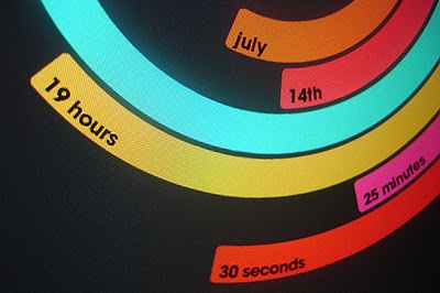
The Polar Clock, from Pixel Breaker, version 3 is now out as a screen saver for Mac and Windows. It's also available as a Mac OS X Widget.
I don't know why, but I love this clock. I'm mesmerized watching the seconds going around. With a little practice, you can visualize the time. I won't say this is the best way to visualize the time, but it's definitely fascinating.

O'Reilly has created a poster showing the 50-year history of computer languages from 1954 to 2004, available as a PDF. They have also been giving away copies of the posters at O'Reilly conferences. I love the links shown where older languages split or combined to create the newer languages over time.
I look back around 1990 when I was programming in college and see Fortran V, C++ and the birth of Visual Basic. I remember having to convince my engineering professors to let me program assignments in C++ instead of Fortran.
The original diagram was created by Éric Lévénez. Although O'Reilly is not updating the poster, Eric is keeping his original diagram up to date on levenez.com.

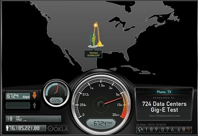
Speedtest.net does a great job showing you the data while testing your own internet connection speed. From locating a test server on the map, to animating the speedometer as the test runs. Without much text at all explaining what's going on, you understand the test, and the results.
Then you get the code to embed your results (see below) into a blog post, email or website. How fast is your connection?