About
Randy Krum
President of InfoNewt.
Data Visualization and Infographic Design

Infographic Design

Infographics Design | Presentations
Consulting | Data Visualizations

DFW DataViz Meetup

Join the DFW Data Visualization and Infographics Meetup Group if you're in the Dallas/Fort Worth area!

Search the Cool Infographics site

Custom Search

Subscriptions:


Feedburner

The Cool Infographics® Gallery:

How to add the
Cool Infographics button to your:

Cool Infographics iOS icon

- iPhone
- iPad
- iPod Touch


Read on Flipboard for iPad and iPhone

Featured in the Tech & Science category

Flipboard icon

Twitter Feed
From the Bookstore

Caffeine Poster

The Caffeine Poster infographic

Entries in sports (38)

Tuesday
Oct112011

Backyard Sports Court Dimensions

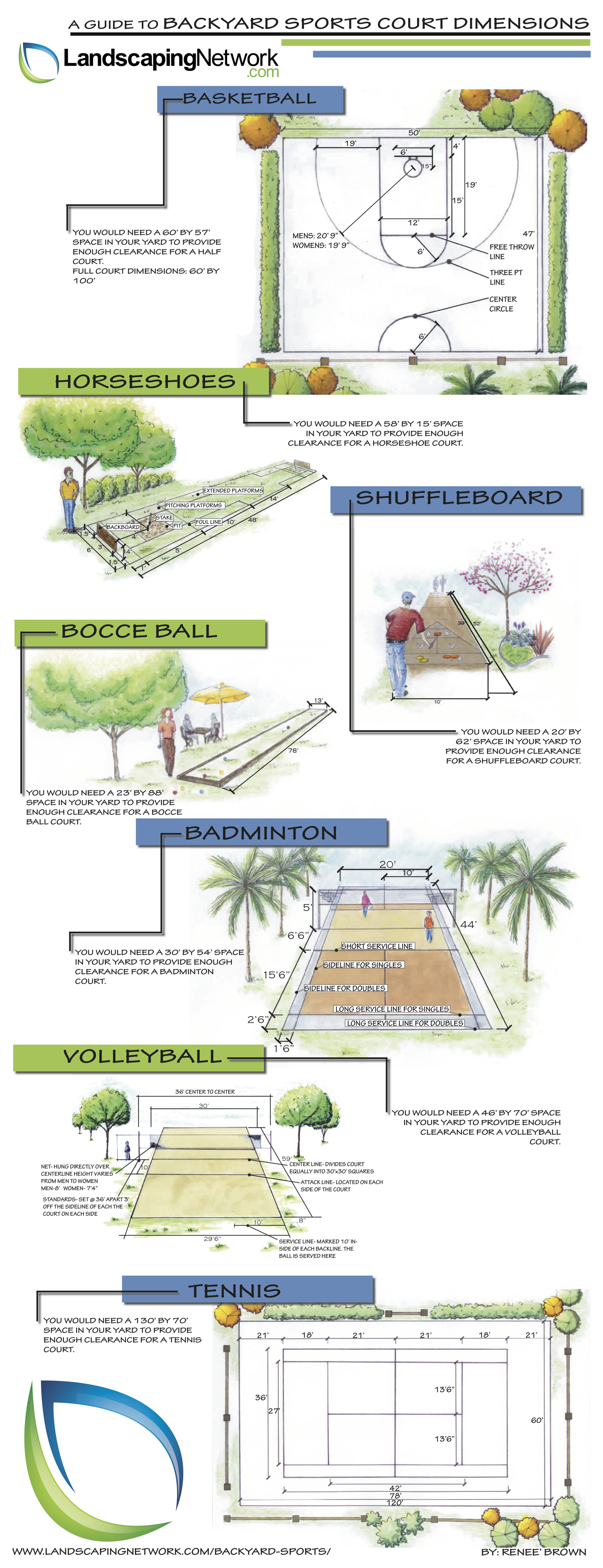
What a great use of an infographic!  From LandscapingNetwork.com comes The Guide to Backyard Sports Court Dimensions.

Get common court dimensions for basketball, horseshoes, shuffleboard, bocce ball, badminton, volleyball and tennis.

The topic is perfect to drive links and traffic to a landscaping site.  People are always looking up these dimensions, and by covering all seven of these in one infographic, this will attract views for years to come.  I was looking up the basketball free throw line dimension just last week!

Monday
Nov012010

World Series Infographic Comparison


What makes an infographic, an infographic?  

It’s commonly understood that infographics visualize data.  But the question is: at what point data becomes information is where the grey area begins. The following two submissions from CoolInfographics.com readers allow a clearer comparison between interesting presentation of information vs. infographic.  As a Dallas-area resident, I couldn’t be happier to present two visualizations about the World Series between the Texas Rangers and the San Francisco Giants.  Go Rangers!


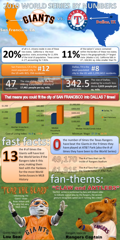
Lillian Smith of VerticalBrands.com created the first in our series: 2010 World Series By Numbers (above).  A look at the home cities of the two teams dueling it out in the 2010 World Series, the San Francisco Giants and the Texas Rangers from Dallas.

In the spirit of the World Series, MyCheapApartments.com has decided to take a closer look at the two bustling metropolises that this year’s championship contenders call home.

Posted on mycheapapartments.com, this one does a better job of visualizing data.  The cities are located on visuals of the states, some housing statistics are in bar charts and even the mascot visuals add to the comparison.  There are certainly other statistics included that could also have been visualized, but are only included as text (Show me the map of San Francisco inside the map of Dallas for size comparison).  I do like that most of the comparisons are side-by-side for the cities, so the reader can understand the comparisons quickly.


On the other hand is a blog post from the folks at Sterling Satellite: 14 Things You Didn’t Know about the World Series.


My opinion is that this one doesn’t actually qualify as an infographic, because there isn’t any data being visualized.  It’s a list of interesting facts presented in a graphic format, but many of the statistics included would have been better understand if they had been visualized (i.e. graph the comparison of advertisement costs).

The World Series is one of the premier events in all of sports, and it is steeped in fascinating facts and figures that will amaze anyone.  Here are the 14 things you didn’t know about the World Series (as if you need anything to make you more excited):


What do you think?


Thanks for submitting these.  And… Go Rangers!

Wednesday
Jun302010

Interactive 2010 FIFA World Cup Game Tracker


There are many World Cup infographics this year but I thought this 2010 World Cup Game Tracker from Positive Studio was really done, so I decided to share.

As football fever sets in we decided to make a very handy World Cup game tracker. There’s no need to ask your pals ‘who’s playing who’ anymore because this automatically updates daily with all of the fixtures & match results.

An interactive infographic that let’s you see the past results and the future scheduled games on a circular timeline.  The center arc shows you how much of the schedule has passed up to the current date, and there are clickable arcs for Group Matches, Last 16, Quarter finals, Semi Finals and the Final match.

Thanks to Mike Jenkins from Positive for sending in the link!

Monday
May242010

Ecological Footprint from Digital Eskimo

In their interactive 2009 Ecological Footprint infographic report, Digital Eskimo has used the analogy of the football field (soccer field in America) to visualize their impact because global hectares (the standard units of ecofootprint measurement) aren’t easy to conceptualize.

I love that the team at Digital Eskimo is not only using this infographic to share results and information within the company, but also sharing it publicly to demonstrate their commitment to working on projects that inspire positive social, organisational and environmental change.  Infographics are a VERY powerful tool for communicating clear messages within your company, even if you never share it with the outside world.

Digital Eskimo has always worked very hard to minimise our impact on the environment. In order to help us better understand these impacts, and develop more effective strategies to address them, we calculated our ecological footprint for the 2009 financial year.

Ecological footprinting is one way of measuring whether the way in which we operate is sustainable in a global context. We chose this method because it is widely used, it provides results in an understandable format while clearly showing relative impacts of different elements of our operations.

Thanks to Sally for the link and a description of how Digital Eskimo is walking the talk.

Friday
Feb262010

The History of Olympic Pictograms [video]


NYTimes.com posted this video by designer Steven Heller called “Olympic Pictograms Through the Ages”.  You may not agree with Steven’s opinions on which icons were better than others, but it is fascinating that every city for every olympics has tried to redesign the icons to add their own visual personality (with the exception of Montreal in 1976 that reused the icons from 1972).

Designer Steven Heller traces the evolution of the tiny symbols for each Olympic sport since their appearance in 1936.


Found on FlowingData and VizWorld

Wednesday
Feb032010

Periodic Table of Professional Cycling


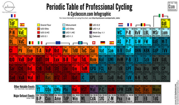
Cosmo Catalano has created the Periodic Table of Professional Cycling for his cycling website, Cyclocosm.com.

The data lends itself surprisingly well to the periodic table format. Horizontal periods correspond closely to the prestige of each event, while vertical series indicate geographic location. Multi-day races are on the left hand side of the chart, one-day events on the right.

Thank Cosmo, via http://cyclocosm.com/periodic_table/

Friday
Dec042009

Enter the "Visualize The BCS" Infographic Contest! #BCSvisual


Think you can design an infographic?  Well now's your chance to prove it!

Announcing the "Visualize the BCS" contest from InfoJocks.com!  The Bowl Championship Series causes a ton of debate between sports fans over the holidays.  We want you to design an infographic about the BCS.  What to visualize is completely up to you, but must meet two criteria: 1) relate to the BCS and 2) use statistics.  Should be easy, right?

Prizes:  Three winners. Best Entry gets two posters of their choice and a $50.00 gift certificate to ESPN’s online store. And to keep it interesting, Most Artistic Entry and Most Analytical Entry both receive posters as well. All entrants with legitimate entries will receive a free set of our Taxonomy of Team Names gift cards.

Of course, I will post the winners here on Cool Infographics and maybe more of the entries as well.

Deadline:  All entries are due January 1, 2010. The winner will be selected before the National Championship is played. Send your entry in PNG, JPEG, or PDF format to contest@infojocks.com, along with your mailing address.

Visit the InfoJocks.com blog for complete details and some ideas.  Jeremy will be posting some links to possible resources and datasets next week.

Spread the Word!  Also, from Cool Infographics you can win a free poster by helping us spread the word.  Tweet about the contest on Twitter with a link back to this post and include the hashtag #BCSvisual.  On December 21st, I'll use a random number generator to pick a random qualifying Tweet and send you a free poster from Infojocks.  (only one Tweet per person will qualify)  An example Tweet would look like this:

Enter the "Visualize The BCS" infographic contest by Infojocks and Cool Infographics!  #BCSvisual http://bit.ly/8Fo4Ii


Remember, everyone who enters will receive a FREE set of Taxonomy of Team Names gift cards.

Thursday
Dec032009

Sports Infographic Poster Deal from Infojocks!


Jeremy over at Infojocks is offering a special discount deal for the holidays: Buy one poster, and get the second poster for half price!  (offer good through Friday, Dec 11th).  That's any two posters from his store for $30!  Choose from "Cities of Champions", "Taxonomy of Team Names" or "Road to the Stanley Cups".

For readers of Cool Infographics to take advantage of the deal, go to the Infojocks store.  No promotion code necessary, the discount will be automatic when you add two posters to your shopping cart.

Infojocks.com is a great site by our friend Jeremy Yingling who designs and produces infographic posters covering sports related topics.  Great gifts for the sports fan on your Christmas list!

Page 1 ... 1 2 3 4