About
Randy Krum
President of InfoNewt.
Data Visualization and Infographic Design

Infographic Design

Infographics Design | Presentations
Consulting | Data Visualizations

DFW DataViz Meetup

Join the DFW Data Visualization and Infographics Meetup Group if you're in the Dallas/Fort Worth area!

Search the Cool Infographics site

Custom Search

Subscriptions:


Feedburner

The Cool Infographics® Gallery:

How to add the
Cool Infographics button to your:

Cool Infographics iOS icon

- iPhone
- iPad
- iPod Touch


Read on Flipboard for iPad and iPhone

Featured in the Tech & Science category

Flipboard icon

Twitter Feed
From the Bookstore

Caffeine Poster

The Caffeine Poster infographic

Entries in sports (38)

Wednesday
Aug152012

Which Countries were Successful at the Olympics?

Which Countries were Successful at the Olympics? infographic

A personal infographic design project by Paulo Estriga, Which Countries were really the Most Successful in London 2012? compares the Top 10 medal winning countries with a normalized set of data showing the number of medals per one million people in the population of each country.

The official standings are reached by counting the number of gold medals obtained by each country, using silver and gold [bronze? - Randy] medals to break ties.  By this method, the USA was the most successful country, followed by China in second and Great Britain in third.

However, most of these countries have many millions of people to pick from, which naturally generates a large number of quality athletes making it to the Olympics.  What happens when we take population numbers into account?  Which are really the most successful countries in getting the most gold medals out of the fewest people?

This design is clear, easy-to-read, and does a great job of showing how normalizing the data with population gives you a very different result.  He clearly cited his sources, included a copyright statement and the URL to his site.  I would have preferred the URL to be directly to the infographic.

Paulo’s structure of the overall infographic is a great example of the 3-part story format!  The introduction visualizes the traditional way of measuring countries based on their gold medal counts, by showing medal icons.  The Main Event is the visualization of the new, normalized for population chart that shows something new and unexpected to the reader.  Finally, a conclusion wraps up the design describing where the traditional Top 10 countries fall in the new ranking.

Outstanding job Paulo!

Wednesday
Aug012012

VISA London Economic Outlook

VISA London Economic Outlook infographic

VISA was smart and jumped on the London band wagon.  Designed by Bright Blue Day, the VISA London Economic Outlook infographic from Visa Europe shows a summary of the Olympics impact report.

The London 2012 Olympic and Paralympic Games will deliver an £804m consumer spending injection for the UK this summer and an economic legacy worth £5.33bn by 2015, according to Visa’s report, “Realising a Golden Opportunity: Visa Europe’s London 2012 Olympic and Paralympic Games Expenditure and Economic Impact Report”.

The report looks at the consumer expenditure and economic output related to the Games and its distribution across the country. It is based on Visa’s unique insight into consumer spending in the UK and spending data from previous Games and major sporting events.

We have also produced a unique infographic providing an easily-digested visual summary of the report’s findings.

This is a great use of an infographic as an executive summary of a much larger report.  This builds awareness, interest and traffic to a report that VISA Europe obviously spent a lot of money to sponsor.

A few thoughts about the infographic design:

  • The call-out circles surrounding the map of the UK should be sized to match their values.
  • The doughnut charts don’t work for the Distribution of Economic Activity.  The percentages are too close together, so all of the doughnuts look almost the same.  I think a pair of bars for each location, but keeping the scale consistent across all locations would have worked much better.
  • I love the icons for the business sectors
  • The color scheme is fantastic!  Simple, directly tied to VISA and makes the overall design bold without being gaudy.
  • The monument silhouettes from London are easily recognizable, and work nicely in the background without drawing too much attention.
  • The bottom should have a clear copyright, and the direct URL link to the original infographic landing page.

They also created a short infographic video based on the static infographic:


The infographic is available as a high-resolution JPG image file or a high-resolution PDF.

The designer at Bright Blue Day was Ollie Flippence.  Great job Ollie!  Thanks for sending in the link!

Thursday
Jul262012

2012 London Olympic Venues

2012 London Olympic Venues infographic

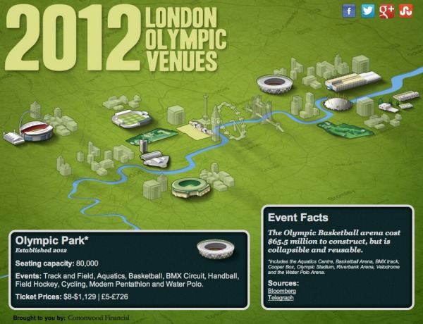
The 2012 London Olympic Venues from Cottonwood Financial’s CashStore.com site is an interactive infographic design showing facts and information about each of the main event locations in London.

The 2012 London Olympics are rapidly approaching, and they’re set to become the most expensive games yet with a budget of $14.5 billion. So what can Olympic attendees expect this year? Impressive landmarks, state of the art facilities, millions of sports fans and of course the best athletes in the world competing for the title of Olympic Champion.

Click the venues for more information on the events and ticket prices (figures in U.S. dollars and British pounds) for each one.

I really like the interactivity, but I think they used way too much text.  All of the statistics (like seating capacity and ticket prices) should have been visualized to make it easy for the reader to see.  Event icons and the Olympics are always tied together, so lining up this year’s icon designs instead of the text event names would have been more visually appealing as well.

The reader clicks on each of the venues to bring up different information, but the building illustration is the only indicator showing which venue the information is referring .  A connecting line or a highlight color to indicate which building is currently being displayed would have helped out tremendously.

It’s all designed in HTML5 too, so all of the interactivity works on mobile devices (like the iPad) as well!  Very cool!

I’m very jealous if you’re going to any of these events, but this guide could give you some idea of what to expect when you get there.

Thanks to Joe for sending in the link!

Thursday
Jun212012

Kelly Slater: Greatest Athlete of All Time?

Quiksilver - Kelly Slater Infographic

Kelly Slater: Greatest Athlete of All Time? is a design collaboration between InfoNewt (my company) and the design team at Quiksilver.

It is common knowledge among our tribe that June 20th is recognized as International Surfing Day so who better to celebrate then Kelly Slater, 11X ASP World Champion. In the spirit of ISD, we’ve created an Infographic comparing Slater to athletes from traditional sports who have made history and measured their achievements to our Champ’s. Have a look and decide for yourself if Slater truly is “The Greatest Athlete of All Time”.

Do you think Kelly Slater is “The Greatest Athlete of All Time”? If yes, share this with your friends and get ready for summer with a pair of Kelly’s Cypher Nomad Boardshorts.

Of course it’s difficult to compare athletes from different sports, but Kelly Slater’s surfing achievements are truly impressive.  Despite being both the youngest and the oldest to win the ASP World Champion title, holding three Guinness World Records, winning 11 Would Tour Championships and winning events in 11 different countries, Kelly Slater has never been on the cover of Sports Illustrated.  :(

Here are some of the design aspects that this infographic gets right:

  • The key message is communicated within the first couple of seconds.  Even if a reader doesn’t read the whole infographic, they will leave understanding the key message.
  • Visually appealling with vivid, colorful images, but still easy to read top-to-bottom.
  • Intergrated the visual brand style of Quiksilver using photos, with the data visualizations about his career.
  • Good mix of different data visualization styles that are unique to the data they communicate
  • The key parts at the bottom are all there.  Data sources, brand logo, copyright statement and the URL to the original, full-size infographic.

The data for this design was the key challenge, and finding similar titles or awards in the other sports inspires discussion and debate among readers of the infographic.  Whether it’s on Facebook, Twitter or blog comments, this design draws in readers and invites everyone to share their own opinion.

Check out the full-size infographic HERE, and you can voice your own opinion about Kelly Slater in the comments below.

Thanks to the team at Quiksilver for being fantastic to work with!

Friday
May252012

NASCAR 101: The Beginner’s Guide to NASCAR

NASCAR 101 The Beginner’s Guide to NASCAR infographic

Have you ever watched NASCAR? Apparently, its the 2nd most popular professional spectator sport in the U.S.! However, if you haven’t, the NASCAR 101: The Beginner’s Guide to NASCAR infographic from Quicken Loans Racing gives an illustrated breakdown of the 2012 Sprint Cup Series.

By now you’ve heard that Quicken Loans is dipping our toes in the whole NASCAR sponsorship world. We’re new to the whole thing, so we decided to put our creative heads together and make a super cool, fun-for-your-eyeballs NASCAR 101 infographic to explain the basics of NASCAR!

Maybe you’re new to racing and could use an introduction?  

Maybe you’re a superfan and you want to help your uninformed friends/family members/random people on the street realize the awesomeness of stock car racing?  

Maybe you like beautifully-designed artwork that is not only pleasing to the eyes but chock full of neat info?


Check it out.

This is a cool infographic design that does a fantastic job of communicating the basics.  Bold color scheme that uses the black background and textures to embody racing.  Simple, clear visualizations that are easy for the reader to understand.  Not too many stats or information crowded into the design to keep the overall design clean.

At the bottom, there should be a copyright statement and the URL to final the original landing page.  I linked back to the original landing page here, but not everyone will.

Found on TopSpeed.com


Friday
Apr062012

Augusta National Golf Club - Then and Now

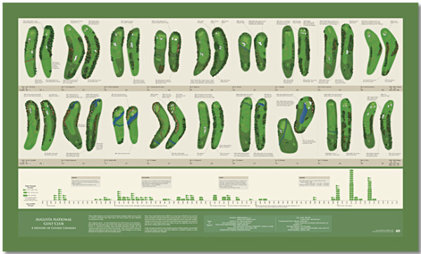
Bill Younker from Historyshots.com has designed a new infographic poster!  Augusta National Golf Club- Then and Now, shows how the famous golf course has changed since its first Masters Tournament 79 years ago!

Augusta National Golf Club has undergone continuous modification since hosting its first Masters Tournament in 1934. This graphic depicts the more than 100 major changes made to the course over the past 79 years. At the top is a visual side-by-side comparison of each hole for 1934 and 2012. Below the hole comparisons is a timeline that maps tee, fairway and green area changes year-by-year. The combination of visual comparison and detailed timeline provides a sweeping overview of all the major changes made since 1934.

This is a great design that demonstrates how simple visuals can be used to show the viewer differences between the hole designs.  By showing a terrain map of each hole then and now, side-by-side, the poster is easy for viewers to compare the changes and enjoy.

You can buy the 40” x 24” inch poster for $34.95 and definitely check out the zooming viewer to see the poster up close at Historyshots.com.

Great job Bill!

Friday
Mar302012

Guide to the Final Four Ticket Pricing

Timely for the Final Four on Saturday, the SeatGeek to the Final Four infographic takes a fun look at the expenses related to anyone headed to New Orleans to watch the Final Four games in person.

The infographic stands on its own nicely without any description, and I really like the design.  Of course they used a basketball court wood flooring as the background, and carefully didn’t use any official Final Four logos from the NCAA.  Even the jerseys are helpful illustrations and avoid using any official school logos. 

I like most of the data visualizations.  The line charts are simple, and the map is easy to read with clear driving paths.  The Flying vs. Driving comparisons are also very easy to understand, but should have been visualized.

The design makes one big mistake!  Only a couple data sources are mentioned at all (Kayak.com and Hipmunk.com), so we are left to wonder if the rest of the data is accurate. Did the rest of the data come from the SeatGeek servers?  Where did the historical ticket prices come from?

The ticket price chart title indicates that they only charted the actual face value of the tickets, but they probably should have been adjusted for inflation.  The doughnut charts for ticket sales by state and by city are hard for the viewer to compare, and I think it was a poor choice of visualization method.  Aren’t these supposed to add up to 100%? 

The visuals are very heavily weighted at the top of the design layout, and it’s disappointing that the information becomes mostly text at the bottom.  My guess is that the designer was running out of time.  The Total Spent values and the spending comparisons also should have been visualized.  As an infographic designer, you should never make fake visualizations either (like showing 40 Hurricanes from Pat O’Brien’s next to the actual value of 125).

It’s interesting that they didn’t include the URL to the find the original infographic at the bottom, it’s really an ad URL to their Final Four page of ticket sales.  I would have recommended including both URLs.  There’s nothing wrong with the link to the sales page, but you should also include the infographic URL.  There should also be a copyright statement at the bottom as well.

Thanks to Ryan for sending in the link!

Tuesday
Mar202012

Brand Madness! Social Media Bracketology

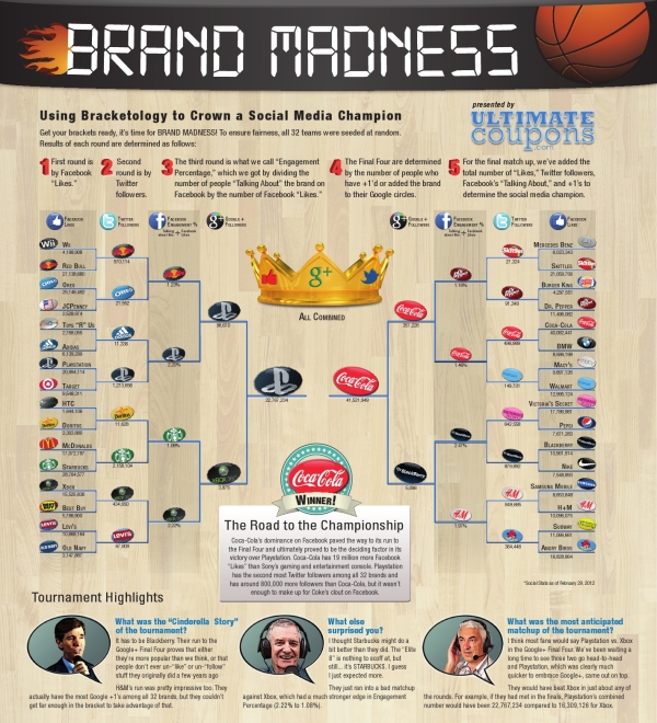
Brand Madness! Using Bracketology to Crown a Social Media Champion is a fun infographic design during the NCAA basketball tournament that uses social media scores to determine winning match-ups.  From UltimateCoupons.com, this design is a great example of taking boring data (Facebook likes and Twitter followers are available to anyone) and using infographic design to make it fun and engaging to the readers.

March Madness has officially arrived, but the UltimateCoupons.com team has Brand Madness! While everyone else’s mind is on basketball, we decided to fill out a bracket pitting 32 of the world’s most popular brand names against each other with the winners and losers being decided by social media popularity.

This is a great use of the visual company logos and the bracket structure to show the readers all of the match-ups, and you can look closer to see the actual numbers if you want to.  Only a year or two ago, this type of blog post would have been all text and a table of numbers, but this is a simple and very effective use of design to grab the readers’ attention.

Thanks to Scarlett for sending in the link!

Friday
Jan202012

A Visual Guide to Marathon Running

Taking it to the Streets: a Guide to Marathon Running is a cool infographic from CheapSally.com.

As you may already be aware, the number one resolution I made for myself for 2012 was to try my hand at running a half marathon! After some research, I decided to partake in the L.A. Marathon in March, and I have been doing quite a bit to prepare. First and foremost, I put together a handy little marathon training schedule that will help me prepare for the run of my lifetime, I also did tons of research regarding super foods that help sustain energy, and lastly I created this infographic so that all of you can learn a little bit more about what it takes to run a half or full marathon!

A great tactic for the Marketing, the information infographic is being used to draw attention to all of the coupons available on the site related to Dick’s Sporting Goods.

The design starts off slow, with a lot of text that could have been visualized, but gets much better halfway down.  I really like the sequence of information that starts with some general information, moves to fears that keeps people from taking up running, then gets into an actual training schedule and finishes with a list of marathons across the country. 

The Common Running Injuries section is well done with percentages shown in doughnuts connected to color-coded positions on the runners body.  For the non-statistical information, the illustrations are simple and easy to understand.

I love the visual Half-Marathon Training Calendar!  Even though these are just stacked bars, the reader can quickly understand a lot about the increasing training regiment required.

I though it finished weak.  The banners listing marathons throughout the year should have some visual element to it like silhouettes from the locations, or a map showing them color coded by month.  At the bottom, there should be a URL to find the original infographic, a copyright statement to be clear about allowed uses and I always prefer to see the designer listed.

Thanks to Cameron for sending in the link, and I also found it on Infographic Journal.

Monday
Jan162012

Learning to Love Tennis

Learning to Love Tennis is a cool infographic describing the major changes within the USTA’s rules for kids playing tennis.  Designed by Digital Surgeons, the infographic visualizes some the biggest changes like court sizes, raquet sizes and net height.  Also, including things like comparing the calorie burn of different sports help show the reader why tennis is such a great sport for kids.

The game of tennis has been scaled for youth play.  To date, tennis has been the only major sport without equipment and field of play dimensions specific to children.  By introducing smaller and lighter racquets, balls with different compression ratios, lower nets and scaled court sizes, kids can begin playing and competing earlier.  Earlier participation and play increases engagement and reduces frustration associated with using adult-sized racquets that kids find clunky and heavy, or court sizes that are simply too large for children to effectively navigate.  Far too many of our country’s youth are huddled around the TV or tethered to a video game controller.  These new rules provide the means to get kids off the couch and engage in an activity that they can continue for life.

Overall, I really like this design.  The style is eye-ctaching and information is laid out in an easy-to-read manner.  I like most of the visuals, and there are only a couple things I would change:

  • The grid of 30 kid icons showing 70% of Kids Quit Sports isn’t accurate.  The visual is 22/30 kids , which is 73.3%  This type of visual always works better as a grid of 100.  Don’t make your readers count icons to figure out what you’re showing them.  Rows of 6 are just odd, and tought to understand.
  • One of the biggest differences is the new balls used by different ages.  It would have been nice to visualize the difference in bounce for each ball to help the reader understand.
  • The Average Height, Stride Comparison and Average Weight is lost in the design, because it’s all text.  In an infographic that makes it less important and the reader just skips over that section.
  • At the bottom should be the URL to the official landing page so readers can find the original infographic.

This is a really huge initialative for the USTA, and the new rules are complicated to understand for parents.  An infographic is a fantastic way to simplify their message, and I think this will help them out a lot.

Thanks to Pete for sending in the link!