About
Randy Krum
President of InfoNewt.
Data Visualization and Infographic Design

Infographic Design

Infographics Design | Presentations
Consulting | Data Visualizations

DFW DataViz Meetup

Join the DFW Data Visualization and Infographics Meetup Group if you're in the Dallas/Fort Worth area!

Search the Cool Infographics site

Custom Search

Subscriptions:


Feedburner

The Cool Infographics® Gallery:

How to add the
Cool Infographics button to your:

Cool Infographics iOS icon

- iPhone
- iPad
- iPod Touch


Read on Flipboard for iPad and iPhone

Featured in the Tech & Science category

Flipboard icon

Twitter Feed
From the Bookstore

Caffeine Poster

The Caffeine Poster infographic

Entries in travel (66)

Friday
Feb212014

Which Disney Park is the Happiest?

Which Disney Park is the Happiest? infographic

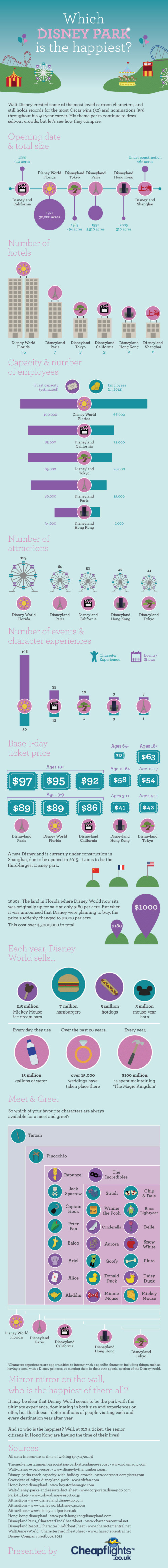
There is definitely some competition between the various Disney parks, and the Which Disney Park is the Happiest? infographic design from Cheap Flights tackles this competition head-on!

There are a handful of things that this design does right:

  • The design is about Disney, but isn’t endorsed or from Disney so they correctly avoided using any official logos that might cause a trademark infringement.
  • Most of the data is visualized, and not just shown in text!  There are a few stats near the end that are just shown as text with an icon, and readers will consider these as secondary, less-important statistics.
  • The consistent icons for the different parks, helps the readers compare between the separate data visualizations
  • Proportionally sized circles are shown a few times, correctly sized by area.
  • Data sources and the publishing company are clearly shown in the footer.
  • The infographic clearly walks the reader through the relevant information, and makes a case for a specific, controversial conclusion, which invites comments and engagement from the readers.

There are a couple things I would suggest as improvements:

  • The double bar used for WDW Florida in the Number of Hotels bar chart mis-represents the data.  I’m sure they did it to keep the overall length of the design shorter, but to give the audience an accurate understanding of how many more hotels there are in Florida, this should be shown as a single bar at the full, correct height.
  • The footer should include the URL to the original infographic on the Cheap Flights site.  It’s actually hard to find the original because there are no links to the infographic anywhere else on the site.

Personally, I favor the Florida parks, and can’t wait to get back there soon!

Found on the Huffington Post

Tuesday
Jan282014

2013 Airline Scorecard Best to Worst

2013 Airline Scorecard; Ranking of Major Carriers in Key Operational Areas, Best to Worst infographic

Traveling by airplane can be a stressful situation. Choosing the correct airline can make all the difference. Check out how your favorite airline scores on the 2013 Airline Scorecard; Ranking of Major Carriers in Key Operational Areas, Best to Worst infographic and article from The Wall Street Journal

In the Middle Seat’s annual scorecard of airline service, tracking seven different key measures of airline performance, Alaska Airlines performed best in 2013 among major carriers. At the top with Alaska was Delta, which for the past two years has posted far better operational results than big competitors. Worst among big airlines? United Airlines and American Airlines, again. 

By assigning each airline a specific color, it allows the viewer to clearly distinguish each airline throughout the scorecard. The lines connecting the columns also gives the whole graphic a sense of connectivity and flow, causing the eye to follow each airline.

Even though this visualization is part of a larger article, they did a good job of including the relevant information in the image file itself.  This is a big help when the scorecard image gets shared online.  It has a clear title, data sources and credit to the WSJ.  The URL back to the article would be very helpful, but they didn’t include that in the image.

Found on http://ilovecharts.tumblr.com


Wednesday
Oct092013

An Infographic Profile of the Modern Travel Blogger

An Infographic Profile of the Modern Travel Blogger

An Infographic Profile of the Modern Travel Blogger from the Sandymount Hotel in Dublin, Ireland, takes a closer look at answering the question “Who are these travel bloggers?”

As today marks the start of the TBEX European Conference – the world’s largest gathering of travel bloggers, writers and new media content creators – we thought we would celebrate their choice of Dublin as this years’ venue with an infographic profile of the modern travel blogger.

Today and tomorrow, Dublin will play host to scores of travel bloggers and writers, but what makes a contemporary travel blogger? It’s an interesting and pertinent question – it’s a demanding occupation (albeit a fun one!) and one that requires a huge amount of hard work, dedication and the potential of not making a huge amount of money, at least in the formative years.

So what’s the average profile of the modern travel blogger? How old are they? What countries do they visit? How do they monetise their writing and what contemporary technology do they utilise to facilitate their writing? To answer these questions and numerous others, we completed an in-depth survey of travel bloggers, giving us some revealing and unique insights into what makes up a travel blogger.

Rather than present all our finding in a page of text, we thought we’d turn them into a far more eye-catching format, so here’s our infographic profile of the modern travel blogger:

The design is clean with a great color palette.  It’s easy for readers to look through the information quickly.

A few of the statistics are shown in text only, while others are visualized.  The stats in text only will be perceived as less important by readers, and I don’t think that was the intent of the designers.  If the data is important enough to include in the infographic, they should also be visualized.

Thanks to David for sending in the link!

Tuesday
Sep102013

Our World Ski Calendar – Seasonal Ski Resorts around the World 

Our World Ski Calendar – Seasonal Ski Resorts around the World infographic

Avid Skier? Want to know where to go at anytime during the year? Our World Ski Calendar – Seasonal Ski Resorts around the World infographic from Monarch has all the financial and event information that you need to know to plan a ski trip during any month out of the year!

To celebrate our new ski flights we produced a world ski calendar so you can ski all year round across the world. For each destination we have provided some interesting stats plus individual piste information. Let us know your favourite ski destination by commenting below!

Thanks to Sam for sending in the link!

Thursday
Jun202013

The Cost of a Road Trip to the Top 10 U.S. Vacation Cities

The Cost of a Road Trip to the Top 10 U.S. Vacation Cities infographic

I Drive Safely and Gas Buddy partner up to create the Cost of a Road Trip to the Top 10 U.S. Vacation Cities infographic. The infographic calculates the total cost of food, lodgings, and gas and then gives some money saving tips. This infographic can be found on idrivesafely.com.

Did you know that a road trip to the top 10 US vacation cities is more than 7,600 miles (12,231km) of driving? That’s the same distance as a flight from Alaska to Australia! Wondering if you could afford to pack up and leave on this awesome road trip? We partnered with our friends at GasBuddy.com to bring you the infographic below which breaks down the cost of a 25-day road trip including the cost of gas, food and lodging. We’ve also included some tips for saving money on your trip.

The top 10 U.S. vacation cities are based on a 2012 poll from U.S. News Travel and excludes cities not in the continental United States. Fun fact: 3 of the top 10 US vacations spots are in California: San Diego, Yosemite and San Francisco!

Fun topic idea, and certainly relevant to both Gas Buddy and I Drive Safely.  Relevance is super-important as the search engines would like to down-grade the value of links to irrelevant content.

I would have liked to see more of the actual data visualized in the design.  Why does the calendar icon have 8 days shown when the data is 5.2 days?  Because it’s just an icon, not a data visualization, and can be confusing to readers.  The costs would have been very easy to visualize as stacked bars to make them easier to understand.

Thanks to John for sending in the link!

Tuesday
Jun112013

The Allergic Traveler's Companion Guide

The Allergic Traveler's Companion Guide infographic

Having allergies can really put a damper on a vacation. To help cut down on the inconvenience, The Allegic Traveler’s Companion Guide infographic from sylvane.com has compiled information on the top places to visit, to stay, and to avoid.

Vacationers and business travelers alike are seeking the same thing in a hotel room: a comfortable place to rest and recharge. But if you have allergies or asthma, the challenge of finding such a hotel is nothing to sneeze at. 

We wanted to find out which major cities and hotels provide the most allergy-friendly accommodations, so we partnered with AllerPassMD, an independent consumer rating organization, on a research project to do just that. Read on to find out all about allergy-free travel, and you can visit AllerPassMD.com to find hypoallergenic hotel ratings for specific cities. 


Before you plan your next trip - be it for business, pleasure, or a little bit of both - prime yourself with The Allergic Traveler’s Companion Guide. 

Thanks to Brian for sending in the link!

Friday
May032013

Subways of North America

Subways of North America infographic

Now this is truly meta.  A subway map visualization of all the Subways of North America from Randall Monroe of xkcd.com.

For the pedantic rail enthusiasts, the definition of a subway used here is, with some caveats, “a network containing high capacity grade-separated passenger rail transit lines which run frequently, serve an urban core, and are underground or elevated for at least part of their downtown route.” For the rest of you, the definition is “an underground train in a city.”

About one in three subways stops in North America are in NYC

Another great design from Randall!

Monday
Apr292013

What Guests Want...at Hotels

What Guests Want at Hotels infographic

Hotels.com has released the 2013 version of their Global Hotel Amenities Survey, summarized in the infographic What Guests Want.  Part of an ongoing series from Hotels.com on their press site, the infographic takes a fun look at what hotel-stayers value most.  Apparently everyone wants free WiFi!

You just checked into your favorite hotel and are ready to enjoy all it has to offer. What kind of amenities inspire you? We surveyed travelers from all over the world to see what perks they valued most when spending a night away from home. 

The infographic is an additional content piece to the release of the complete survey, Global Travelers Want To Stay Connected And Comfy.  The Hotels.com press site is primarily targeted at an audience of hotel industry executives and the news media, and they maintain a dedicated infographics page.  The addition of the infographic to the press release helps to make the often dry survey data more engaging, and additional press releases were also published to highlight some of the hidden gems in the data: Danish Hotel Guests Most Honest; Americans Come In 23rd Place

Designed by Jeremy Yingling with InfoNewt, the infographic is essentially an executive summary of the much larger survey report that Hotels.com publishes each year.

I’ve posted a short, behind-the-scenes Q&A with Hotels.com about their experiences using infographics on the InfoNewt blog.

Monday
Nov262012

What Makes a Travel Writer?

What Makes a Travel Writer? infographic

For those who would love to travel and write, the What Makes a Travel Writer? infographic from hotelclub.com is the infographic for you. This infographic covers the ages and careers of these writers, and also what technology they use.

If you’ve ever wanted to become a travel writer, you’ve probably wondered about the tools and resources the pros use to make their jobs possible. The trade secrets of those who successfully turn international adventures into paychecks are an enticing mystery. Does the key lie in social networking? Is it finding the right technology that makes all the difference? Or have these professionals stumbled onto some obscure websites that the rest of us are ignorant about?

Unfortunately, there isn’t one explicit answer that will transform you into a travel writer overnight. It is a combination of all of these things that enable the professionals to do their jobs well enough to afford a warm meal and their next plane ticket.

So to gain some insight into the tricks of the trade, and hopefully get you one step closer to your dream job, we surveyed some of the best travel writers on the web about their working habits. We got the scoop on Twitter from three of the most ‘Followed’ travel tweeters in the business (@Paul_Steele@TravelEditor, and @DaveDTC); found out that Paris and NYC are two of the best places in the world to find (marketable) inspiration; and were warned against going any where near Birmingham or Malaga.

Find out what else we learned in our detailed infographic.

I really like this design.  I like that the infographic keeps the same, simple color scheme throughout to match the colors in the header. However, it lacks a border or a background color to help frame the infographic on a webpage with a white background.  The white background creates uncertainty of where it actually ends.

Most of the information is in percentages; however, it is all conveyed in different visual formats.  The stacked bars, pie charts and doughnut graphs correctly show them in comparison to the complete 100%.  The partially shaded shaped of film canisters, people icons and the world map aren’t quite correct.  The readers see the area colored of an object, and because of the odd shapes the designer had to guess the correct shading by just changing the height.  It’s close, but not actually correct.

A few other suggestions I would make:

  • The two age groups compared with the man & woman icons aren’t related to each other, so the comparison isn’t helpful information.
  • For the Male-Female comparison comparison in Travel Career, the icons need to be the same width for them the be accurate.  Visually it looks like 75% is at least double 53%, which obviously isn’t true.
  • The Tablet Brands statistics of “100% of male travelers use Amazon Kindle” isn’t support by the data to the left, and is a highly unbelievable stat.  
  • When lining up rows of icons, like in Blogging Platforms, the design should always use rows of 10 icons.
  • I’m sure the last circle in the Twitter Usage section was supposed to be <100 Twitter followers instead of >100.
  • There should be a URL at the end of the infographic linking to the original full-size version.

Thanks to Ally for sending in the link!

Friday
Nov022012

How to Travel Like a President

How to Travel like a President infographic

It is almost election time! Hard to imagine how the presidential candidates were able to accomplish visiting so many cities in the amount of time they did! Flipkey crunched some numbers and put together their How to Travel Like a President infographic. They show the candidate’s mode of travel, what they ate and where they stayed. If you want to see the country, I’d recommend traveling with the president! Just make sure they are the ones to flip the bill. 

With less than a month to go before America heads to the polls, we keep thinking about the candidates hitting the road. After all, for those of us here at FlipKey, visiting over 25 towns across the country in a month sounds like a dream job – but who can afford it? Over the past four months, President Obama’s campaign travel expenses have totaled a cool $3 million, which may have factored into his decision to skip this year’s summer vacation. Meanwhile, challenger Mitt Romney has shown that the first step to becoming president is traveling like one: the former governor has poured close to $10 million into travel for himself and his staff. Looking at these price tags, we decided to go to work and find out exactly what it takes to travel like a president…

I like the different approach to data surrounding the election campaigns.  The data is a little bit skewed because of the date range represented.  The numbers for Obama only show 2 days on the road, so hotel and food costs are very small.

Good list of sources, but missing a copyright and a URL link back to the infographic landing page on the FlipKey site.

Thanks to Claire for sending in the link!