About
Randy Krum
President of InfoNewt.
Data Visualization and Infographic Design

Infographic Design

Infographics Design | Presentations
Consulting | Data Visualizations

DFW DataViz Meetup

Join the DFW Data Visualization and Infographics Meetup Group if you're in the Dallas/Fort Worth area!

Search the Cool Infographics site

Custom Search

Subscriptions:


Feedburner

The Cool Infographics® Gallery:

How to add the
Cool Infographics button to your:

Cool Infographics iOS icon

- iPhone
- iPad
- iPod Touch


Read on Flipboard for iPad and iPhone

Featured in the Tech & Science category

Flipboard icon

Twitter Feed
From the Bookstore

Caffeine Poster

The Caffeine Poster infographic

Entries in visual (320)

Friday
Jul032009

Graphical History of the American Flag


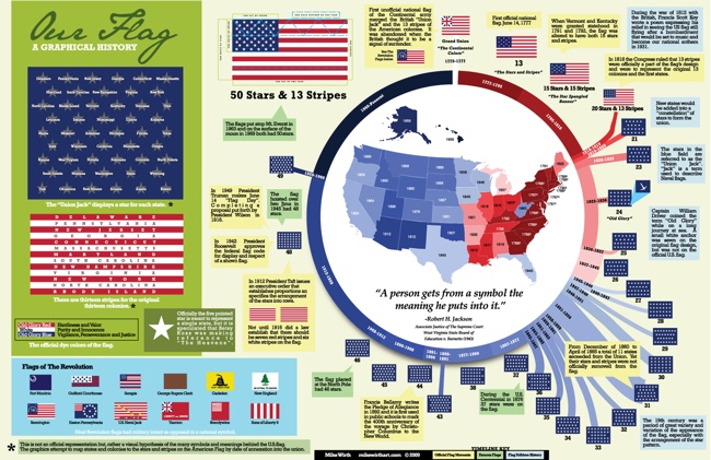
A great infographic for America's Independence Day from Mike Wirth.  The graphical history of the American Flag shows a circular timeline of when changes were made over the years and when stars were added.  I love additional information Mike included like the official folding pattern and the state each star represents by showing them chronologically.  Makes a great poster!


Tuesday
Jun302009

Skirt Lengths on Flickr + infographic tutorial


Wendy Ding created this infographic in 2007, and recently published a complete tutorial on how she created it on Digital Arts.

After collecting data on skirt lengths and their wearers and locations from flickr.com, this information piece was created to illustrate the statistics. A bar graph, area map with call-outs, and a legend all come together to explain the skirt wearers relationship.

This piece garnered an honourable mention from the 2007 Adobe Design Contest for the digital illustration category.
Thanks for sharing Wendy!

Monday
Jun292009

Stay the Same (Infographic Music Video)

Laurie Thinot directed this infographic music video "Stay The Same" by Autokratz.  She just earned recognition at the 19th Annual New Directors Showcase at Cannes.

A warped kalidescope of music video animation from the album Down & Out in Paris & London.


Links to videos from all of the winners are here.

Friday
Jun262009

Imagine Leadership, great infographic video


Great work from our friends at XPLANE.com for the Harvard Business School! Thanks to both XPLAE and Harvard for making this video available to the public.

The inspiring and thought-provoking piece on global leadership was created in collaboration with Nitin Nohria, Richard P. Chapman Professor of Business Administration, and Co-Chair of the Leadership Initiative at Harvard Business School.

The video debuted earlier this month at Harvard Business School's "How Can Leadership Be Taught" symposium on June 9 and 10. We were honored to partner with Nitin to create a visually appealing, provocative piece that would inspire viewers to take action, get involved and be motivated to lead.

"Imagine Leadership" is six minutes long and available for viewing on YouTube http://www.youtube.com/watch?v=TuuTlQ0FzEU. Inspired by the popular "Did You Know? 2.0" video that we created, the new piece has similar qualities in how it visually represents key factoids, people and critical information. However, unlike "Did You Know," this piece combines illustration with graphics and photography, allowing the most appropriate visual content to represent each subject.

Wednesday
Jun242009

Disney: Inside the Matterhorn Infographic


From the OC Register, an infographic with an inside look at the Matterhorn at Disneyland in Anaheim, CA.  Celebrating its 50th anniversary, this is a rare inside look behind the scenes of a Disney ride.

Monday
Jun222009

Market Visual (BETA) knowledge maps


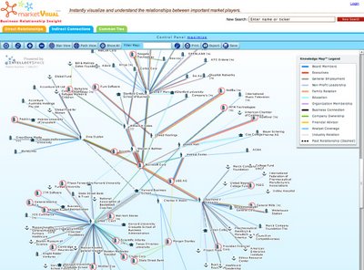
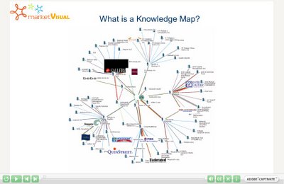
I came across Market Visual Knowledge Maps this morning.  It claims to still be in BETA, and it maps business relationships based on companies or people that you enter.  It seems to build these mind maps on the fly, and saves any maps that you have build so you can retrieve them later.


It's a service you have to pay for, but if you're looking through annual reports and SEC filings to find people and connections, this will save you a bunch of time.  There's a fully interactive sample map, as well as an introductory video.

Thursday
Jun182009

Videos online from the See Conference #4


A couple months ago (April 18th), the See Conference #4 was held in Wiesbaden, Germany.  This one-day event had a great lineup of speakers:  Aaron Koblin (Google Creative Lab), Julian Oliver (software artist), Gijs Joosen (ONL), Eric Rodenbeck (Stamen Design) and Prof. Dr. Gerhard Roth (University of Bremen).  The event was organized by Scholz & Volkmer (www.s-v.de).

The best part is that videos of the entire day of speakers are now available online from the event website at www.see-conference.com.  Some of the videos are in German, but Eric Rodenbeck, Julian Oliver, Gijs Joosen and Aaron Koblin are speaking English for their presentations.

Thanks Chantal!

Friday
Jun122009

Web Trend Map 4.0


The great team at InformationArchitects.com released their updated version of the Web Trend Map 4. (They should call it 4.0)   You can buy it as a poster for $49 from their website, or they have also made a high-resolution version available.
iA's Web Trend Map plots the leading Internet names onto the Tokyo Metro system.
Paying attention to the intersections, we grouped associated websites and ensured every domain is on a line that suits it.  As a result, the map produces a web of associations: some provocative, some curious, others ironically accurate.
Why Tokyo Metro?  Because it works.

Thursday
Jun112009

Sugar Stacks: How Much Sugar is in your Food?


SugarStacks.com is a website dedicated to showing you how much sugar is in the food we eat.  Using a simple visual of stacked sugar cubes, you can see the sugar content of many different types of food.  I love that it's simple and visually gets one point across really well.  There are words on website, but you really don't need them.

We've used regular sugar cubes (4 grams of sugar each) to show how the sugars in your favorite foods literally stack up, gram for gram.  Compare foods, find out where sugar is hiding, and see how much of the sweet stuff you're really eating.


Found on Infosthetics.com, and as they note, the website doesn't differentiate between types of sugars, the white sugar cubes are used to represent them all.

Friday
May222009

The Amazon Book Map


Now this is impressive.  Chris Harrison has created the Amazon Book Map using data scraped from Amazon and which books Amazon thinks are related to each other.
Aaron Swartz, who runs theinfo.org, contacted me back in January '08 with an interesting data set. He had built a list of 735,323 books by crawling Amazon. Of course a gigantic list is pretty boring, but Aaron had also captured similarity data between books. In particular, he had amassed a whopping 10,316,775 connections (edges) between books Amazon believed were related. This allowed me to throw the data into my old wikiviz engine to spatially layout a huge mosaic of books (I let it run for a 140 hours). Items that were noted as being similar had attractive forces, bringing them together, often into large groups. Unsurprisingly, when we color coded by Amazon book category, there was an obvious coalescence. The way various high-level categorizations mix and meet also seems fairly logical.
I produced a few versions of what I am dubbing the Amazon Book Map. The first visualization is a huge mosaic of book covers, tinted by their respective category colors. I can't produce this in one go at full resolution because the memory requires are enormous. The second version uses color-coded dots. 
As you zoom into the image, you can see its built using the book cover images with a color overlay depicting the category of the book.


Thanks to @anniesmidt on Twitter for the link to this one!