About
Randy Krum
President of InfoNewt.
Data Visualization and Infographic Design

Infographic Design

Infographics Design | Presentations
Consulting | Data Visualizations

DFW DataViz Meetup

Join the DFW Data Visualization and Infographics Meetup Group if you're in the Dallas/Fort Worth area!

Search the Cool Infographics site

Custom Search

Subscriptions:


Feedburner

The Cool Infographics® Gallery:

How to add the
Cool Infographics button to your:

Cool Infographics iOS icon

- iPhone
- iPad
- iPod Touch


Read on Flipboard for iPad and iPhone

Featured in the Tech & Science category

Flipboard icon

Twitter Feed
From the Bookstore

Caffeine Poster

The Caffeine Poster infographic

Entries in web (190)

Monday
Oct182010

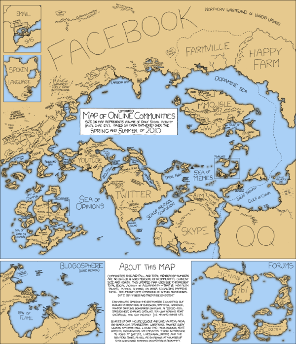
The Conversation Prism 3.0 for 2010

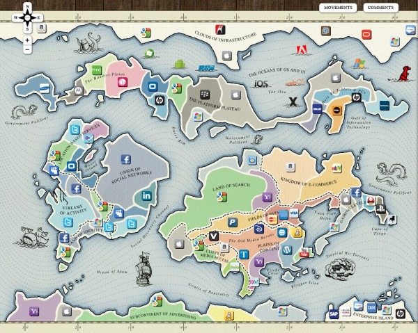
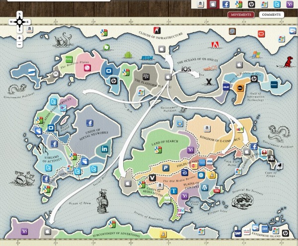
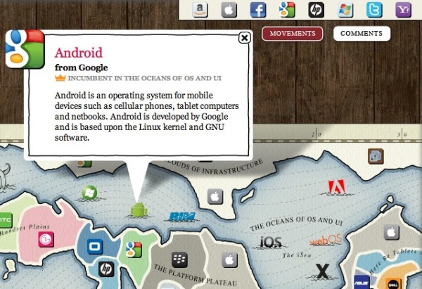
Brian Solis and JESS3 have released v3.0 of The Conversation Prism for 2010.  The Conversation Prism is a great infographic showing the major players in each of 28 different online conversation categories.  The original 1.0 version from August 2008 (image available on Flickr) only had 22 categories, and some of those only had one player.

You can buy the poster (I’ve got v2.0 hanging in my office) for $20, or there are also some great multi-pack deals for 3 posters for $40 or 4 posters for $50.

One of the best projects I’ve worked on is to use this idea to help companies map out their own corporate online strategy.  Which if these categories and tools are you trying to use to drive your business?  My advice, don’t try them all, be targeted about which ones are best to reach your target customers.  Use this as a guide, but make your own company-specific conversation prism.

Found on FastCoDesign by Cliff Kuang

Thursday
Oct142010

Map of Online Communities 2


This is one of my favorites.  xkcd has updated their Map of Online Communities for 2010!  This is an update from the original 2007 Map of Online Communities, and has changed quite a bit.

Communities rise and fall, and total membership numbers are no longer a good measure of a community’s current size and health.  This updated map uses sizes to represent total social activity in a community - that is, how much talking, playing, sharing or other socializing happens there.  This meant some comparing of apples and oranges, but I did my best and tried to be consistent.

You can also view the LARGE version, or pre-order the poster.

Monday
Oct042010

SoTech Infographic v1.0 - your feedback requested

The SoTech Infographic v1.0 was released during the Social Collective 2010 Conference in London last week as a visual way to show how social networks interact with the different functions of business.  The infographic was created by Hold, a Brighton based graphic design studio.

Introduced at Social Collective, Darika Ahrens, Shannon Boudjema + Paul Armstrong presented an infographic (created by http://www.wearehold.com) that demonstrates how social technologies work within a business + outside a business - 

The infographic is available in a number of formats, like PDF and JPG, Scribd and Slideshare.  An online copy of the presentation from the conference is below (using Prezi, a great visual presentation tool!).  I agree with their thoughts on using infographics as a conference tool as well.


Both on the SoTech Now website, and the email I got from Paul Armstrong, is the invitation to heavily critique this v1.0 of the infographic.  They would like to develop and release v2.0, but are looking to incorporate all of the feedback they can get.  Leave comments below or on the SoTechNow site with your own reactions.

Here are some of my initial thoughts (mainly on the design):

  • Very text heavy.
  • Readability is low.  I’m a fan of big infographics that allow you to zoom in and dig deeper into the details, but in this version, by the time you zoom in close enough the read the text, you’re too close to understand the context.
  • Use icons, at least for the different business functions
  • Show examples of sites in each of the “Social Tech” sections.  Otherwise it seems like wishful thinking that there is a product that successfully does each of these functions.
  • Show examples of the metrics.  Are these actually quantifiable?

I think the infographic does provide a great framework to either develop a social plan, or to evaluate an existing plan.  It would be fascinating to review a company’s efforts using this framework as an example of social media being used successfully (or not) by a corporation.

What do you think?

Thursday
Sep232010

Client Infographic: The Good News for Online Degrees


Good News for Online Degrees is a recent project InfoNewt (my company) designed for elearners.com to visualize the results of a survey of Human Resources professionals worldwide.

The results are good, as online degrees continue to gain credibility and popularity.  Designed as a companion infographic to the article “How Employers View Online Degrees” on the elearners.com website, the visual not only supports the article, but also stands on its own for posting on blogs.

I used a blend of pie charts, bar charts, circles and images to tell a story as you move down the visual.  The different visuals help separate the different questions that were asked in the survey, but always include the actual numbers as well.  For survey results, you want to be as transparent as possible by citing the source material, repeating the questions that were asked and using specific numbers to validate your visuals.

Personally, the most interesting results are in the stacked bar chart in the middle.  Online degrees have dramatically different levels of acceptance based on what level of role the applicant is applying for.

Available as a high-resolution GIF and PDF from the elearners.com site.

Cheers to Helen and everyone at elearners.com!

Thursday
Sep162010

The Most Powerful Colors on the Web


The Colors of the Web is a very cool infographic by ColourLovers.com.  Looking at the color distribution of the icons of the top 100 web brands.

When we released our report on the colors of the social web, based on data analyzed by our Twitter theme tool, we were surprised that blue was such a dominant color in people’s profile designs. Was Twitter’s default color influencing their design decisions? Or is blue really THE most popular and dominant color online? …We decided to look at the colors in the brands from the top 100 sites in the world to see if we could paint a more colorful picture.

Maybe a yellow icon wasn’t the best choice I’ve ever made…

Monday
Sep132010

FarmVille vs. Real Farms infographic

Designed by Shane Snow (@shanesnow) for Mashable.com, FarmVille vs. Real Farms takes a look at how the statistics behind the FarmVille phenomenon on Facebook compares to real world statistics about farming.

With all those millions of Facebook and iPhone users tending to virtual crops and sharing them with friends, have you ever wondered how their toils stack up against actual real-life farmers?

How does our output of digital (and decidedly less tasty) tomatoes compare with our worldwide production of real tomatoes? And perhaps most importantly, who are these casual croppers, and are they anything like their plow-toting counterparts?

We broke it down by the numbers and put some of these FarmVille trends in perspective for you.

Found on VizWorld 

Thursday
Sep092010

The Web 2.0 Points of Control Map


The Web 2.0 Summit Points of Control Map is a very cool, interactive map.  As part of the marketing for the upcoming Web 2.0 Summit (November 15-17 in San Francisco) they have released this interactive map that takes the metaphor of web companies/brands as countries on a map (from xkcd.com and flowtown.com) to a new level.

Pan and Zoom to explore the map, and click the icons to get some insight about each player and their position.

Then, turn on the comments view to discuss the map with others and add your own ideas!


By clicking on any of the company icons at the top, arrows are shown to indicate the business areas (continents) that the companies are trying to expand into (colonize).  You can turn them on one at a time, or turn many of them on at the same time.

Additionally, you can select any individual icon to get more details:

John Battelle has an in-depth post on the Web 2.0 Summit blog, Points of Control: The Map, about the creation of the map, and his hope that others will add to it in the future.

We’ve put the entire map under a Creative Commons Attribution-NonCommercial-ShareAlike 3.0 Unported License, which means we want you to take this idea and add to it, making it better. Once our amazing development partners at Blend Interactive catch their breath, we also plan to release the code and documentation, so you can create your own maps as well.

Our thanks to the team at Blend who worked with me to bring this vision to reality, and to Janetti Chon, my producer, who kept it on track, and the entire team at Web 2.0 for bearing with us as we brought this first iteration to fruition.

Found on VizWorld.com and VizThink.com 

Friday
Sep032010

The 2010 Social Networking Map


The team at Flowtown.com designed the 2010 Social Networking Map as an update to the Map of Online Communities by xkcd.com in early 2007.  Social networking has certainly advanced in the last three years (even in the last three days!), so the update shows a lot of changes in geography.

It does seem a little premature to claim this is the map of social media for 2010 with five months left to go.  A lot can happen in five months (like the Apple PING service announced this week).

Monday
Aug302010

Icons of the Web

Icons of the Web is a massive image that portrays icons of the top websites on the Internet.  Sizing their favicons based on the site traffic according to Alexa, they were able to get 288,945 good icon images out of the top 1,000,000 sites.

A large-scale scan of the top million web sites (per Alexa traffic data) was performed in early 2010 using the Nmap Security Scanner and its scripting engine.

We retrieved each site’s icon by first parsing the HTML for a link tag and then falling back to /favicon.ico if that failed. 328,427 unique icons were collected, of which 288,945 were proper images. The remaining 39,482 were error strings and other non-image files. Our original goal was just to improve our http-favicon.nse script, but we had enough fun browsing so many icons that we used them to create the visualization below.

The area of each icon is proportional to the sum of the reach of all sites using that icon. When both a bare domain name and its “www.” counterpart used the same icon, only one of them was counted. The smallest icons—those corresponding to sites with approximately 0.0001% reach—are scaled to 16x16 pixels. The largest icon (Google) is 11,936 x 11,936 pixels, and the whole diagram is 37,440 x 37,440. Since your web browser would choke on that, we have created the interactive viewer below (click and drag to pan, double-click to zoom, or type in a site name to go right to it).


You can use the online search engine to locate a particular site icon, and OF COURSE I had to look for the Cool Infographics icon.  Found it!


Programming and design was done by David Fifield and scanning performed by Brandon Enright.

Found on Social Media Graphics

Friday
Aug272010

Google(graphic) - Google's Acquisition Appetite

From Scores.org, a data-heavy Google(graphic) by Jess Bachman, Google’s Acquisition Appetite.  Visualizing almost 10 years of Google’s acquisitions and investments, and there’s hardly a month that Google didn’t invest in something.

I like the multiple dimensions to the data.  Three columns show how the acquisition helped Google, the colors of each acquisition show what assets were gained, an additional circle shows the value of the acquisition (if it is known) and of course the timeline aspect.

Great job Jess!  I’d love to see you keep this updated somewhere.