About
Randy Krum
President of InfoNewt.
Data Visualization and Infographic Design

Infographic Design

Infographics Design | Presentations
Consulting | Data Visualizations

DFW DataViz Meetup

Join the DFW Data Visualization and Infographics Meetup Group if you're in the Dallas/Fort Worth area!

Search the Cool Infographics site

Custom Search

Subscriptions:


Feedburner

The Cool Infographics® Gallery:

How to add the
Cool Infographics button to your:

Cool Infographics iOS icon

- iPhone
- iPad
- iPod Touch


Read on Flipboard for iPad and iPhone

Featured in the Tech & Science category

Flipboard icon

Twitter Feed
From the Bookstore

Caffeine Poster

The Caffeine Poster infographic

Entries in world (200)

Friday
May272011

The Information Blanket

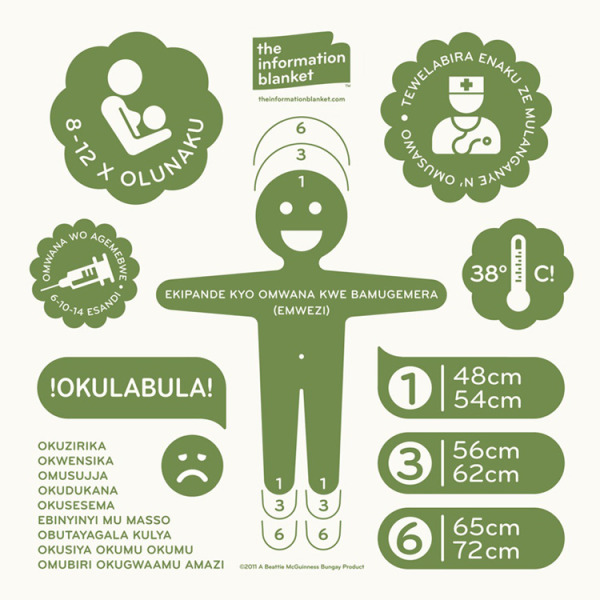
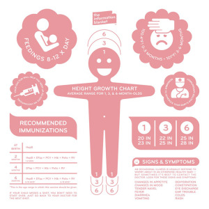
The Information Blanket is a very cool project conceived and produced by Beattie McGuinness Bungay New York.  Intended as a charity blanket to be donated to kids in under-developed countries, the blanket is printed with information to help the mothers learn about their baby’s health.  The blankets include information about breastfeeding, immunization vaccinations, body temperature and warning signs of illness, all printed in the local language.

There are two ways to participate.  You can buy one for yourself, and one will be donated automatically ($60) or you can just donate one to a child Uganda ($25).  The ones you buy for your self are in English (pink or blue), and the ones that will be distributed in Uganda are in Lugandan (green).


the story of our blanket is one of care and responsible craftsmanship. it begins with green-sensitive 100% double knit north carolina cotton. soft and durable, it meets the strictest u.s. environmental standards on dyes and finishing. when it’s ready, the fabric is pre-shrunk and shipped to new york city where local craftsmen cut it to swaddling size and double lock stitch the edges. the informational graphics are then screen-printed using non-toxic water based inks. the result is a blanket of the highest individual quality.

Our design includes a growth chart with average ranges for one, three and six months, breastfeeding and vaccination frequency, high temperature alert, doctors appointment reminder and a list of illness warning signs.


Found on Twitter via @katerryna and Creativity-Online.com

Tuesday
May242011

U.S. Education vs. The World

U.S. Education vs. The World is a very cool infographic from MAT@USC.  You can imagine this data as a boring series of bar charts in an academic report, but the colorful, visual design here is fantastic.  The winding connecting lines can make it a little difficult for the reader to understand the data, but I think it also draws the reader in like a simple puzzle.

We’ve put together this infographic that compares the United States’ education spend and performance versus eleven countries.  The U.S. is the clear leader in total annual spending, but ranks 9th in Science performance and 10th in Math.

Thanks to Sarah for sending in the link!

Wednesday
Mar232011

Japan: The Earthquake & The Tsunami [infographic]

Japan:The Earthquake & The Tsunami is a good infographic design from the team at DigitalSurgeons.com.  I like the simple color scheme, and the mix of different types of visuals for the different pieces of data.  Maps, bar charts, icon grids and a ruler all help put the currently available information into perspective.

The bottom also lists some of the major support links for people that would like to help.

Thanks to Peter for sending in the link!

Tuesday
Mar152011

Hans Rosling: Visualizing Mortality History [video infographics]

Hans Rosling, known for some of his famous TED Talks, here tries a little augmented reality with his animated charts showing life expectancy and wealth all over the world for the last 200 years.  120,000 data visualized in this 4 minute video clip from his The Joy of Stats documentary for the BBC.

Hans Rosling’s famous lectures combine enormous quantities of public data with a sport’s commentator’s style to reveal the story of the world’s past, present and future development. Now he explores stats in a way he has never done before - using augmented reality animation. In this spectacular section of ‘The Joy of Stats’ he tells the story of the world in 200 countries over 200 years using 120,000 numbers - in just four minutes. Plotting life expectancy against income for every country since 1810, Hans shows how the world we live in is radically different from the world most of us imagine.

Thanks Udi for sending in the link!

Tuesday
Feb082011

What Kind of Pasta is on Your Plate? #infographic

What kind of pasta is on my plate?
What kind of pasta is on your plate? by Charming Italy

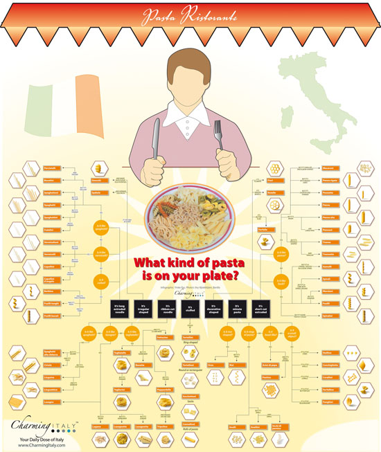
Came across this great family tree/decision tree to help you identify the different kinds of pasta from CharmingItaly.com.  What Kind of Pasta is on Your Plate? breaks the pasta types down into shape families and uses some nice visuals to help you identify your pasta.

I’m an avid reader of Coolinfographics.com - some of the infographics you mentioned on your blog inspired me to create one for our blog as well. Unlike the usual chart- and fact filled graphics, we decided to create a somewhat educational infographic. It highlights the most common and/ or popular types of pasta, and helps you to identify the type of pasta on your plate.

I wish they would hang this up in the pasta aisle in the grocery store!

Thanks to Paolo for sending in the link!

Monday
Jan242011

Small Business: By The Numbers


Intuit brings us By The Numbers: Small Business in the U.S. and Abroad.  I like the mix of 2D and 3D visuals, but the visuals at the bottom seem odd.  Showing different statistics for a handful of countries instead of comparing the same statistics across countries makes that part harder to understand.  I would guess that was dependent on what data was available for the different countries.

Inflation and currency exchange play large factors in the cost to start-up a new business abroad compared with the United States. If you’re considering starting up a small business, the below infographic breaks down start-up costs, ease of business and success rates broken down by country, as well as a view of small business around the globe.

I appreciate that they cite their sources, but I wish I could give credit to the designer, who isn’t listed on the infographic.

As a small business owner myself, I hope I fall on the good side of the survival statistics!

Thanks for sendng the link Rachael!

Tuesday
Dec142010

Christmas in the World 2010


20 fun Christmas fact rolled into the Christmas in the World infographic, from the Venere Travel Blog.

I didn’t remember that the Statue of Liberty was a Christmas gift…

Tuesday
Dec072010

Do You Answer the Cell Phone During Sex?


The Shocking Demographics of Cell Phone Use from Wilson Electronics provides this answer (15% say “YES!” apparently hoping someone more interesting is calling…) and more surprising statistics about how cell phone use has grown in the last 10 years.  

The infographic was sent in to Mashable.com, and I can’t find any trace of it on the Wilson Electronics site.

Wilson Electronics, Inc. sent us this interesting (rather large) infographic outlining the demographics of cellphone use (click for full version).

The infographic illustrates, among other things, the number of cellphones per capita in various countries, the rate of cellphone adoption in the U.S. during the past decade and the acceptability of certain behaviors regarding cellphone use.

Sadly, there is no credit for the designer, but I found it on Twitter, tweeted by @invoke

Wednesday
Nov172010

Rogue Infographics - The Empowered E-Patient Translated into Chinese


I found one of my recent client infographics, The Empowered E-Patient, translated and posted on a Chinese site, www.mazingtech.com (along with many others), but it’s not a version that I designed.  I also had to view the site using this link with Google Translate.  Someone has downloaded the original image file, translated all of the text into Chinese and then reposted the infographic.

Let me start by saying that although I designed the original infographic, I don’t think I have a big problem with someone else translating it and republishing it without my permission (or involvement) in this way.  It was done very well, and the client I designed it for feels the same way.

Here you can see the original and the translated version side-by-side:


You can see that someone spent some time with an image editing program trying to do this right and make it look official.  The Chinese text is the same size and color as the original English, and was very carefully positioned.  The visuals were left intact, as were all of the logos, website addresses and even the copyright information.  

Technically, I think this would be considered a copyright violation, but it’s not like another site is claiming ownership or directing traffic to a new, different destination site.  Because of the care that was taken, if this infographic is reaching more people because of the translation, it would be successfully driving more awareness and traffic to the PathOfTheBlueEye.com site.  That was the whole point of the original infographic in the first place!

One issue is that because I wasn’t part of the translation process, I don’t know that it was translated correctly.  If there actually is some existing demand to view this in Chinese, I could have offered that service to my client to make sure that we were happy with the translation.

It’s worth noting, that there are MANY English infographics that have translated into Chinese on this site, but the navigation to find them is very difficult.  Here are a few more from other designers that I have posted before on Cool Infographics, but have been translated and reposted in Chinese.  (You can click the titles to see the original English version I posted)


WTF is HTML5, and Why Should We Care?

Apple, Adobe Flash and H.264

The Visual FAQ of SEO infographic

Wednesday
Nov032010

How Coffee Affects the Global Economy


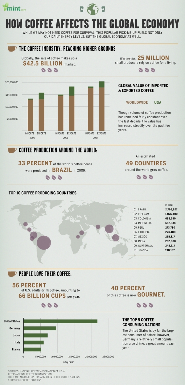
How Coffee Affects the Global Economy is a new infographic on Mint.com and designed by Column Five Media.

We don’t technically need coffee to survive (though many would argue just the opposite), yet this popular pick-me-up fuels not only our daily energy levels, but the global economy as well. The coffee industry thrives in countries like Brazil, Vietnam and Colombia: the world’s leading coffee exporters. Meanwhile, coffee drinkers around the world love their daily morning brew like no other drink. In the United States alone, we consume more than 66 billion cups of coffee per year. Some of us love our java so much, in fact, that we even observe a national coffee holiday, September 29.

There are a handful of statistics included that aren’t visualized, which does seem odd.  For example, “40% of this coffee is now gourmet” could easily have been visualized.