About
Randy Krum
President of InfoNewt.
Data Visualization and Infographic Design

Infographic Design

Infographics Design | Presentations
Consulting | Data Visualizations

DFW DataViz Meetup

Join the DFW Data Visualization and Infographics Meetup Group if you're in the Dallas/Fort Worth area!

Search the Cool Infographics site

Custom Search

Subscriptions:


Feedburner

The Cool Infographics® Gallery:

How to add the
Cool Infographics button to your:

Cool Infographics iOS icon

- iPhone
- iPad
- iPod Touch


Read on Flipboard for iPad and iPhone

Featured in the Tech & Science category

Flipboard icon

Twitter Feed
From the Bookstore

Caffeine Poster

The Caffeine Poster infographic

Entries in world (200)

Monday
May102010

BP Oil Relief Plan Infographic

BP has released this infographic, Relief Wells & Subsea Containment, showing how they plan to seal the oil well leak in the Gulf of Mexico, and the current progress at 8,788ft.

British Petroleum intends to drill two wells designed to intersect the original wellbore above the oil reservoir. This will allow heavy fluid to be pumped into the well which will stop the flow of oil from the reservoir. Cement will then be pumped down to permanently seal the well.

BP needs to cement 7 casings into place before the relief well can intersect with the main drill pipe which is pouring approximately 5,000 barrels of oil per day into the ocean. They have completed 3 casings, with 4 remaining. They have reached a drill depth of just below 10,000 feet, with another 8,000 feet remaining. At about 12,000 feet they will begin angling toward the center of the damaged oil pipe.

BP has estimated that the project will require 90 days to complete the first relief well.

Original post on HollywoodBackstage.com, found on VizWorld.com

Thursday
May062010

The State of the Internet [infographic]


The State of the Internet is an infographic by Focus.com that shows mostly demographic information about who is on the Internet today.  I really like the “100 Circles” style to show percentages; it’s a far cry better than pie charts or bar charts.  The data is gathered from multiple sources, so it’s nice to see one infographic that shows it all.

Here we take a look at exactly who is using the Internet the most, how they are using it and how much the amount of usage is increasing. At a glance, we can see that there are the same number of men and women who use the Internet. However, their age, educational background and level of income may influence how much time they spend online.

Thursday
Apr222010

China's Global Investments - interactive map


Jon Bruner from Forbes.com has designed and posted an interactive timeline/map of the major investments China has made all over the world in the last five years.

When you first see the map, it’s an animated timeline that highlights which countries China invested in each month since March 2005.  The animation completes when it reaches December 2009, and then you can select a particular year by clicking on the total investment bars across the bottom or see the details behind any particular investment by mousing over one of the bubbles.  The bubble sizes represent the size of the investments.

Since 2005 Chinese firms and arms of the Chinese government have invested hundreds of billions of dollars in foreign companies and raw materials. Each dot on this map tracks one of those investments, with larger dots representing larger investments. Explore the map by rolling over and clicking on the dots and timeline.

Thanks Jon for the link!

Friday
Apr162010

Social Media Prism 2.0 - German Version

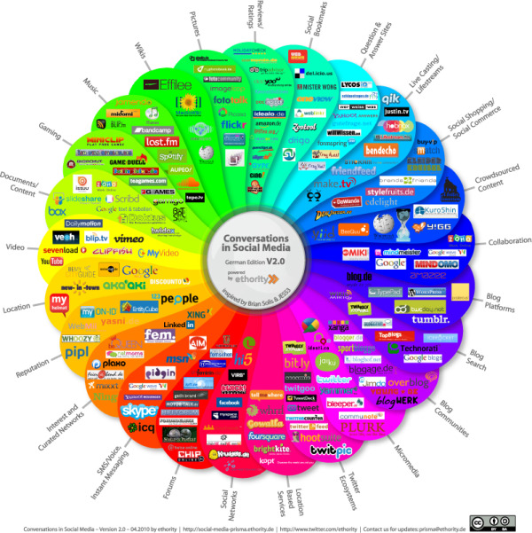
The group at Ethority has taken the Conversation Prism from JESS3 and Brian Solis, and revised it to show the German social media scene.

The team from ethority, inspired by Brian Solis and JESS3’s Conversation Prism: The Art of Listening, Learning and Sharing, created a version designed specifically for the German market. The prism shows the landscape of social media in Germany with all the relevant conversation channels.

Also, the prism has been updated and expanded using many of the suggestions from the comments and emails.

Found on Social Media Graphics

Friday
Apr022010

The State of the Internet [infographic video]

JESS3 / The State of The Internet from JESS3 on Vimeo.


The State of the Internet is a great infographic video by JESS3 for the JESS3 lecture at AIGA Baltimore in Feb 2010.  

Wednesday
Mar312010

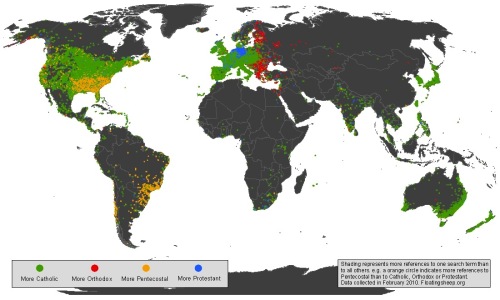
The World Christianity Maps

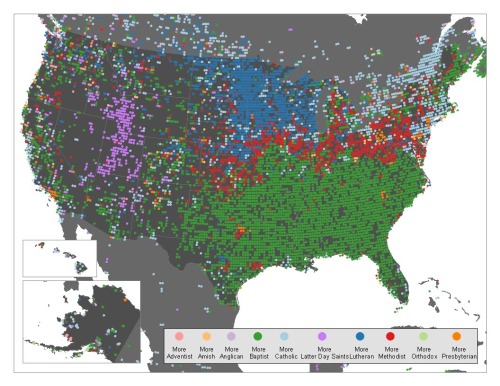
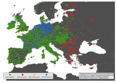
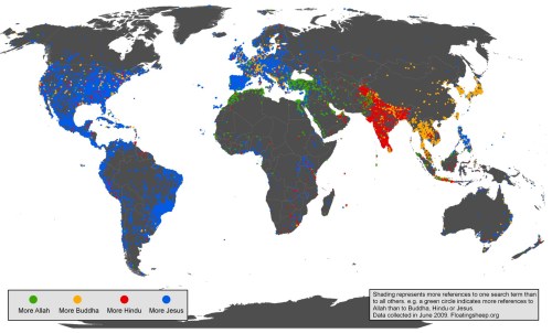
From FloatingSheep.com, this is the Christianity Map that maps the volume of searches related to the different branches of Christianity across the globe.  The great cartographers from Floating Sheep published three maps showing the world, the U.S. and Europe.

…discovered patterns that are incredibly clear. Catholics are most visible in much of the Northeast and Canada, with Lutherans taking the Midwest, Baptists the Southeast, and Mormons unsurprisingly taking much of the mountain states. Methodists, interestingly, seem to primarily be most visible in a thin red line between the Southern Baptists and everyone else.

Taking a closer look at Europe, there is a fascinating split between Orthodox Eastern Europe, Protestant Germany, and Catholic everywhere else. In places such as the UK that contain more Protestants than Catholics it is likely that people aren’t using the actual term “Protestant” as a signifier of their religion.

These are a more detailed look specifically at Christianity after some of their earlier work on the Google Geographies of Religion that look at searches for the different figures of religion across the globe.

Found on the GOOD Blog and The Atlantic.

Friday
Mar262010

Japan - The Strange Country [infographic video]

Japan-The Strange Country (English ver.) from Kenichi on Vimeo.

Created by Kenichi Tanaka for his final thesis project, Japan - The Strange Conutry is an infographic video exploring the statistics about Japan and the Japanese people. Available in both English and Japanese language versions.

You can see Kenichi’s work on his design website or his blog.


Thanks to mobarts for the link!

Tuesday
Mar092010

The Writing on the Wall

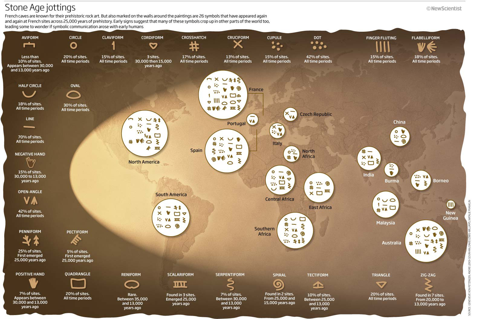
From an article in New Scientist titled “The writing on the cave wall”, this infographic shows that many symbols and figures used in cave-wall paintings have similar forms.

What emerged was startling: 26 signs, all drawn in the same style, appeared again and again at numerous sites (see illustration). Admittedly, some of the symbols are pretty basic, like straight lines, circles and triangles, but the fact that many of the more complex designs also appeared in several places hinted to von Petzinger and Nowell that they were meaningful - perhaps even the seeds of written communication.

A group of 26 symbols crops up at Stone Age sites throughout the world – are these the origin of the written word?

Found on Chart Porn

Friday
Feb262010

The History of Olympic Pictograms [video]


NYTimes.com posted this video by designer Steven Heller called “Olympic Pictograms Through the Ages”.  You may not agree with Steven’s opinions on which icons were better than others, but it is fascinating that every city for every olympics has tried to redesign the icons to add their own visual personality (with the exception of Montreal in 1976 that reused the icons from 1972).

Designer Steven Heller traces the evolution of the tiny symbols for each Olympic sport since their appearance in 1936.


Found on FlowingData and VizWorld

Friday
Feb192010

Emily Schwartzman Wins Haiti Infographic Contest!

Emily Schwartzman has won the GOOD contest to design an infographic about the earthquake impact to Haiti.  A high-resolution version is available on the GOOD site.

We’re proud to announce the winner of our latest infographic contest, where we asked readers to design an infographic about the recent earthquake in Haiti. We at GOOD conferred with Aaron Perry-Zucker of Design for Haiti, and we’ve come to a decision.

Emily Schwartzman—whose graphic, “Aftermath of the Haiti Earthquake,” clearly and concisely depicts both the human toll of the earthquake and the scope of the earthquake itself—is our winner. Schwartzman will take home our prize package, including a GOOD T-shirt and a free subscription. You’ll be able to see her infographic in print in our next issue as well as on the Design for Haiti site.

Excellent job Emily!