About
Randy Krum
President of InfoNewt.
Data Visualization and Infographic Design

Infographic Design

Infographics Design | Presentations
Consulting | Data Visualizations

DFW DataViz Meetup

Join the DFW Data Visualization and Infographics Meetup Group if you're in the Dallas/Fort Worth area!

Search the Cool Infographics site

Custom Search

Subscriptions:


Feedburner

The Cool Infographics® Gallery:

How to add the
Cool Infographics button to your:

Cool Infographics iOS icon

- iPhone
- iPad
- iPod Touch


Read on Flipboard for iPad and iPhone

Featured in the Tech & Science category

Flipboard icon

Twitter Feed
From the Bookstore

Caffeine Poster

The Caffeine Poster infographic

Entries in world (200)

Tuesday
Sep152009

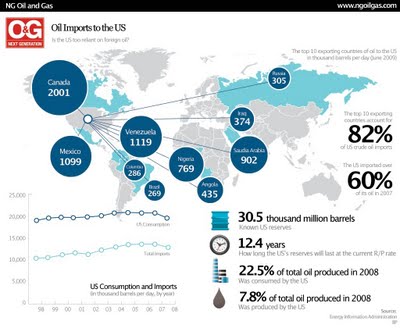
Is the U.S. Too Dependent on Foreign Oil? (infographic)


The U.S. imports 60% of its oil requirements, and this infographic map shows the top 10 countries that are sending us their oil.  I think it will actually be quite surprising to most Americans how little is imported from the Middle East.
As much as 66 percent of all US crude oil is imported from other countries, and the amount of oil imported from OPEC nations is roughly equal to the amount of oil produced domestically. Petroleum, natural gas and coal are the primary sources of energy consumed in the United States because they are the most energy rich resources available. So far, renewables have only been capable of providing a small portion of total energy consumption, and their contribution to energy consumption has remained limited over the last two decades. However, with increasing government and private focus on green energy sources, renewables are likely to go from strength to strength in the near future.
Here's the original article by Callum James from ngoilgas.com.

Monday
Sep142009

Obama's Worldwide Stamps of Approval infographic


From our friends at GOOD transparency, is a simple infographic showing President Obama's worldwide approval rating.  I like the use of stamps to help identify the countries around the world, and that the order is representative of highest approval to lowest approval ratings.  I think this graphic lacks the use of illustration to convey the data.  The actual approval ratings are only communicated with the numbers without any graphic representation.
During the campaign, President Obama argued that his election would help restore the image the rest of the world has of United States.  In the six months since his election, his approval ratings at home have slipped, though they remain high. Around the rest of the world, opinion is mixed. A recent study by WorldPublicOpinion.org asked people in 21 countries whether they had confidence that Obama would “do the right thing” when it came to world affairs. Our latest Transparency is a look at their responses.
One other criticism would be that the text implies that we should be looking at how worldwide opinion has changed since Obama's election, but the data is actually only a snapshot of opinions six months after the election.  No indication is this is higher or lower than the opinions at the time of his election.

A collaboration between GOOD and Michael Newhouse at Newhouse Design.

Thanks Michelle for the link!

Thursday
Sep102009

HealthMap: The Global Disease Alert Map


HealthMap.org is an online map tool that locates any reports of disease from a selection of news sources.  Available in multiple languages, HealthMap is a great use of the Google Maps API.  In fact, HealthMap is funded by Google, which explains why they are so dependent on the Google Maps data.
HealthMap brings together disparate data sources to achieve a unified and comprehensive view of the current global state of infectious diseases and their effect on human and animal health. This freely available Web site integrates outbreak data of varying reliability, ranging from news sources (such as Google News) to curated personal accounts (such as ProMED) to validated official alerts (such as World Health Organization). Through an automated text processing system, the data is aggregated by disease and displayed by location for user-friendly access to the original alert. HealthMap provides a jumping-off point for real-time information on emerging infectious diseases and has particular interest for public health officials and international travelers.
They also recently launched an iPhone app called Outbreaks Near Me, available for free in the iTunes app store.  The app allows you to view the maps from your iPhone and get alerts for outbreaks in your area.

Friday
Sep042009

New Hans Rosling video, using GapMinder (Must see!)

New TED Talk video of Hans Rosling talking to the U.S. State Department, "Let my dataset change your mindset".  Using the GapMinder software that was purchased by Google, Hans shows the third world isn't as far behind the U.S. as most people believe.

Wednesday
Sep022009

Surface Area Required to Power the World with Solar Power


From LandArtGenerator.org, a world map visualizing the surface area required to power the world's electricity requirements using solar power alone in 2030, using current solar panel technology.  It's getting a lot of traffic on digg, reddit and Twitter too.

Also, check out the same idea, but for off shore wind power.

Wednesday
Aug262009

What is the GDP per Capita for Every Country?


Cool interactive chart on Snippets.com that shows the GDP per Capita of every country (so it claims).  It has a number of predefined groupings like Continent, UN Members, OPEC, Communist, Largest Area, etc to show comparisons.
The interactive chart below represents the GDP per capita for each country. Click on any of the buttons to view the data for that particular group of nations. You can highlight a particular country by selecting it in the dropdown box.  The data was compiled from the 2008 CIA World Factbook.

Thanks for the link Jerry!

Wednesday
Jul292009

Overpopulation: The Making of a Myth [infographic video]

Thursday
Jul232009

Hellmann's - It's Time for Real [infographic video]

Friday
Jun262009

Imagine Leadership, great infographic video


Great work from our friends at XPLANE.com for the Harvard Business School! Thanks to both XPLAE and Harvard for making this video available to the public.

The inspiring and thought-provoking piece on global leadership was created in collaboration with Nitin Nohria, Richard P. Chapman Professor of Business Administration, and Co-Chair of the Leadership Initiative at Harvard Business School.

The video debuted earlier this month at Harvard Business School's "How Can Leadership Be Taught" symposium on June 9 and 10. We were honored to partner with Nitin to create a visually appealing, provocative piece that would inspire viewers to take action, get involved and be motivated to lead.

"Imagine Leadership" is six minutes long and available for viewing on YouTube http://www.youtube.com/watch?v=TuuTlQ0FzEU. Inspired by the popular "Did You Know? 2.0" video that we created, the new piece has similar qualities in how it visually represents key factoids, people and critical information. However, unlike "Did You Know," this piece combines illustration with graphics and photography, allowing the most appropriate visual content to represent each subject.

Thursday
May212009

What is Wolfram|Alpha?

I'm not sure I understand what Wolfram|Alpha is yet, but so far it's pretty impressive.  Developed by Stephen Wolfram and his team, it claims to be a "computational knowledge engine".  The input box looks like a search engine, but it is definitely NOT a search engine.


When you type in a question, it attempts to show you all of the relevant data it can find.  It is actually calculating and charting this information real-time in order to present it to you.  Because its built on top of the Mathematica Engine, it can also handle math problems.


I think this will be an important tool for many designers of infographics, because you can get some of your raw data directly from Wolfram|Alpha.  As they add more data into the system over time, this will become one of your best resources for information.  They have a pretty extensive page of examples by category that is a great place to start.  Also watch the short video by Stephen Wolfram showing what the system can do.