About
Randy Krum
President of InfoNewt.
Data Visualization and Infographic Design

Infographic Design

Infographics Design | Presentations
Consulting | Data Visualizations

DFW DataViz Meetup

Join the DFW Data Visualization and Infographics Meetup Group if you're in the Dallas/Fort Worth area!

Search the Cool Infographics site

Custom Search

Subscriptions:


Feedburner

The Cool Infographics® Gallery:

How to add the
Cool Infographics button to your:

Cool Infographics iOS icon

- iPhone
- iPad
- iPod Touch


Read on Flipboard for iPad and iPhone

Featured in the Tech & Science category

Flipboard icon

Twitter Feed
From the Bookstore

Caffeine Poster

The Caffeine Poster infographic

Entries in world (200)

Wednesday
Feb032010

Periodic Table of Professional Cycling


Cosmo Catalano has created the Periodic Table of Professional Cycling for his cycling website, Cyclocosm.com.

The data lends itself surprisingly well to the periodic table format. Horizontal periods correspond closely to the prestige of each event, while vertical series indicate geographic location. Multi-day races are on the left hand side of the chart, one-day events on the right.

Thank Cosmo, via http://cyclocosm.com/periodic_table/

Tuesday
Feb022010

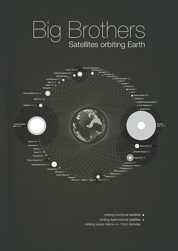
Big Brothers: Satellites Orbiting Earth

Michael Paukner has created a great infographic, Big Brothers: Satellites Orbiting Earth.  Visually showing which countries own all of the space junk currently orbiting Earth (functional, dysfunctional and floating debris).  We apparently have Saturn-envy as we attempt to create rings around our planet.

You’ve got to feel bad for countries like Chile, who used to have a single working satellite in orbit, but the warranty ran out and it doesn’t function anymore.

View the high-resolution image on Flickr.

Sunday
Jan312010

Infographic Contest from GOOD Magazine!

A new infographic contest from GOOD Magazine.  Design an infographic looking at the scope and aid given in relation to the earthquake in Haiti.  Deadline is February 9th.  See the GOOD site for complete details and inspiration!

the OBJECTIVE
Highlight the scope of the Haiti earthquake, as well as the aid given to help recover from the disaster.

the ASSIGNMENT
Create an infographic that explores some or all of the following: the toll of the earthquake, why the earthquake was so devastating, the recovery efforts, and the world’s donations of money and aid. We’re offering this contest in collaboration with 
Design for Haiti (a new site by Aaron Perry-Zucker, the man behind Design for Obama and the accompanying bookDesign for Obama—Posters for Change: A Grassroots Anthology), which is collecting information graphics about Haiti. The judging will be done by Perry-Zucker and the editors of GOOD.

the REQUIREMENTS
Send us an e-mail at projects[at]goodinc[dot]com with your infographic or post it to 
GOOD’s Community Blog with the tag “February 2010 Transparency Contest.” It can be in any image format, but it should be high enough resolution that it can be printed at 300 dpi. Make sure to include your sources, and a brief (one- or two-sentence) introduction to your concept. We’ll take submissions now through February 9. The winning entry will be announced on February 16, featured on our homepage and on the Design for Haiti site, and printed in the next issue of GOOD. We’ll send a GOOD T-shirt and a free subscription (or gift subscription) to the winner.

Thanks Tina for the link!

Friday
Jan152010

World Progress Report poster - Available for one week ONLY


Nathan Yau at FlowingPrints has released a new poster, the World Progress Report.  It’s available for one week ONLY, and then he’s going to release the printer to start printing them up.  Orders will only be taken until January 21st.  Each 24”x30” poster is signed and numbered, and one can be yours for $26 + shipping & handling.

Nathan is doing another great thing.  All proceeds go to UNICEF’s relief effort in Haiti!

One more thing…for the first 50 people who pre-order: a free copy of Atley’s “How America Learns” poster!


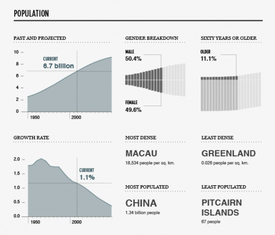
UNdata provides a catalog of 27 United Nations statistical databases and 60 million records about the past, present, and future state of the world. Topics include demographics, life expectancy, labor levels, poverty, and a lot more. What does all that data mean though? World Progress Report, the latest from FlowingPrints, offers a look into the expansive UN collection.

In whole, the report tells a story of how we live and die, and the stuff in between.


Check out some of the great details in the poster:


Thursday
Jan142010

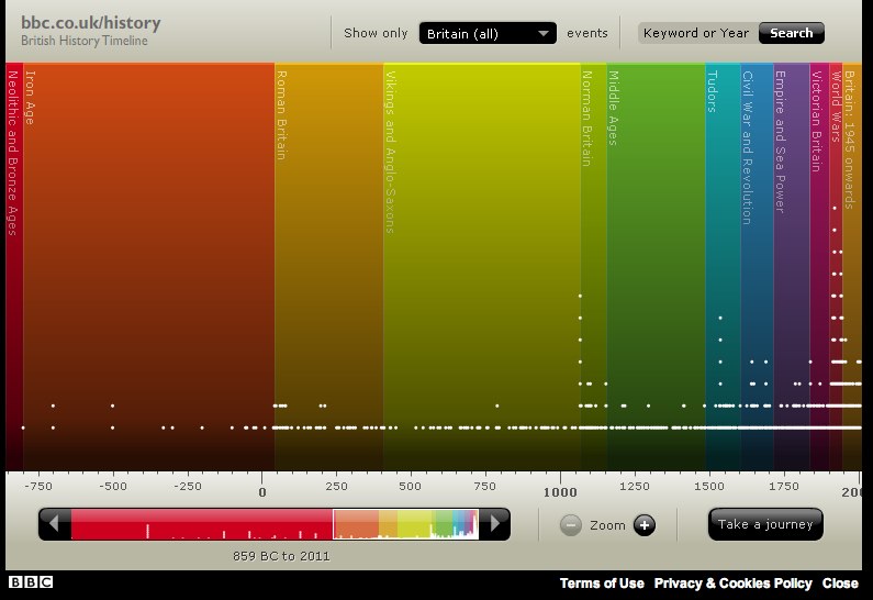
The British History Visual Timeline


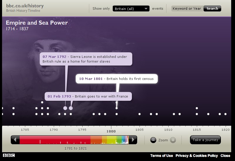
The BBC has put up a great interactive, visual British History Timeline.  Each dot represents a signnificant event.  Clicking a color “era” zooms the timeline to just that time period.

Mousing over the individual dots shows the specific event details and timing.


You can also select a particular region of the UK, or search for a specific year or keyword.

Thursday
Jan072010

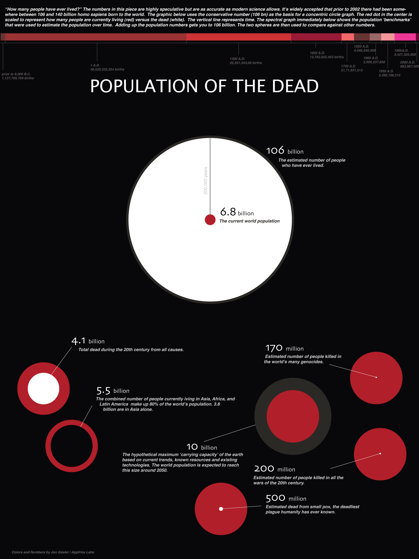
Population of the Dead - infographic


Jon Gosier, from Appfrica.com, created this infographic, Population of the Dead, to help visualize the question “How many people have ever lived?”  Across the top is also a timeline of births, that helps demonstrate how quickly the population has accelerated in the last few hundred years.


Text from the image:

The numbers are highly speculative but are as accurate as modern science allows. It’s widely accepted that prior to 2002 there had been somewhere between 106 and 140 billion homo sapiens born to the world. The graphic below uses the conservative number (106 bn) as the basis for a concentric circle graph. The red dot in the center is scaled to represent how many people are currently living (red) versus the dead (white). The vertical line represents time. The spectral graph shows the population ‘benchmarks’ that were used to estimate the population over time. Adding up the population numbers gets you to 106 billion. The two spheres are then used to compare against other numbers.

Wednesday
Dec092009

The Origins and Paths of Epidemics


This world map shows the origins and spreading paths of Malaria, Leprosy and Small Pox. No legend, but the implication is that as the main arteries diminish in width down to small capillaries represents the number of infection cases.  Key dates and locations are also identified with event description.

There is no designer byline on the graphic, but map is credited to Haisam Hussein.  I don't see the map in the gallery on Haisam's website, but he is given credit for the map on Lapham's Quarterly.

Found on digg.com.

Thursday
Oct222009

Left vs. Right Ideology Concept Map


David McCandless and Stefanie Posavec from Information Is Beautiful have created this Left vs. Right concept map to help explain the differences in political opinions.
Of course, the political spectrum is not quite so polarised. Actually, it’s more of a diamond shape, apparently. But this is how it’s mostly presented via the media – left wing vs. right wing, liberal vs. conservative, Labour vs Tory. And perhaps in our minds too… 
This kind of visual approach to mapping concepts really excites me. I like the way it coaxes me to entertain two apparently contradictory value systems at the same time. Or, in other words, I like the way it f**ks with my head.


Using this blank template, David and Stefanie created two versions  One for the U.S. (top) and one for the World (below).
There are two versions with different colours: a US and a World version. This is because the US and Switzerland are the only countries in the world where red = right wing and blue = left wing. Grrr!


Found on VizWorld and Information Is Beautiful.

Friday
Oct022009

China's 60th Anniversary - Then and Now


From the October issue of Fast Company,
Don't get all worked up by the headline, Sinophiles. We're talking about the 60th birthday of the founding of the People's Republic, which Mao Zedong declared on October 1, 1949. Here's a look at China then and now.
Most people would have used a bar chart, but a little good design work makes this a compelling infographic.

Not easy to find the designer credit, but the infographic is from Nicholas Felton.

Monday
Sep282009

Running The Numbers, New Book from Chris Jordan!


After finding the video last week, I also found that Chris Jordan has published a book of his work called "Running The Numbers".  I couldn't help myself, I had to buy a copy.  It's available on Amazon.com and directly from Chris Jordan's site.

Chris Jordan's photography is focused on visualizing the huge numbers and statistics from life in America.  His photos put the large quantities into a visual scale that our brains can understand.

Here's a link that will help support Cool Infographics too.