About
Randy Krum
President of InfoNewt.
Data Visualization and Infographic Design

Infographic Design

Infographics Design | Presentations
Consulting | Data Visualizations

DFW DataViz Meetup

Join the DFW Data Visualization and Infographics Meetup Group if you're in the Dallas/Fort Worth area!

Search the Cool Infographics site

Custom Search

Subscriptions:


Feedburner

The Cool Infographics® Gallery:

How to add the
Cool Infographics button to your:

Cool Infographics iOS icon

- iPhone
- iPad
- iPod Touch


Read on Flipboard for iPad and iPhone

Featured in the Tech & Science category

Flipboard icon

Twitter Feed
From the Bookstore

Caffeine Poster

The Caffeine Poster infographic

Entries in world (200)

Thursday
May142009

Who is Coming to America?


From GOOD magazine.  If you look closely, this is essentially a bar chart dressed up, but it's the dressing up into the shape of the U.S. flag that catches your eye.  I love it!
Immigration may have taken a back seat during the financial crisis, but the issue still needs resolving. While illegal immigrants sneaking over the border is still a primary concern, it’s good to know who came to our country legally, and from where. Our latest Transparency is a look at the 20 countries from which the most people came to America in 2008, how many immigrants already had family here, and how many received asylum when they arrived on our shores.
Found on SimpleComplexity.net, thanks Nathan!

Wednesday
Apr292009

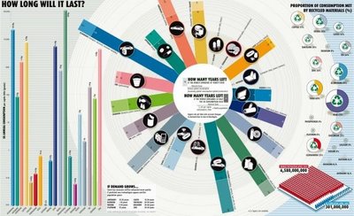
How Long Will It Last?


Good infographic from the New Scientist showing how many years we have left of our key natural resources.  Essentially these are basic bar and pie charts, but dressed up to make the overall graphic more compelling.  The message is still clear though, and the author gets his point across very strongly.

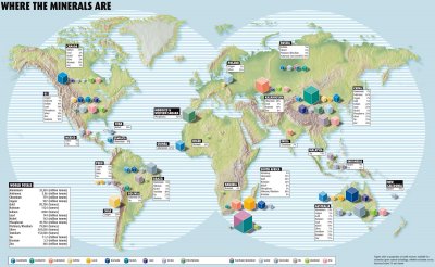
This comes from a 2007 article in the New Scientist called "Earth's Natural Wealth: an Audit" that include two more infographics as well.  The first is a map of where in the world are these natural resources are.


The next is a bubble graphic showing the scale of how much of each resource an average American will consume during their lifetime.


The Source listed on the first infographic: Armin Reller, University of Augsburg, Tom Graedel, Yale University

Found on FlowingData.com and numerous Twitter references.  Thanks Nathan.

Friday
Apr102009

Free The Vote! (Spanish)


Infographic video from NSM in Santiago de Chile for the Free The Vote Campaign. I don't speak Spanish, so I'm not exactly sure what it says...

Thanks Marco, for broadening my horizons!

Thursday
Apr022009

Build Your Own Infographic World Map


Why is another world popoulation map website Cool?  Because on GunnMap, by Gunn Interactive, you can load your own data.   There are a few example data sets preloaded like population, GDP growth, military spending and birth rate, but the best part is that you can paste in your own data to create a custom world map.

Here's a quick demo video from Arthur Gunn on how to use the site by pasting in data from the CIA website to create a new map:


GunnMap demo from Arthur Gunn on Vimeo.

Thanks Paul for the link!

Monday
Mar302009

Did You Know? Version 3.0

Version 3.0 of this great infographic video by Karl Fisch (modified by Scott McLeod).  If you like this one, you can still see the prior versions 1.0 and 2.0.

Friday
Mar132009

Humans!

Watch more cool animation and creative cartoons at aniBoom

Here's a fun one for Friday.  Humans!  by Reza Rasoli.  Reminds me of The Matrix when Mr. Smith calls the humans a virus on the world.

Humans! is a 60 second global awareness PSA sensationalizing the excessive, all-consuming nature of the human being. This cute and naive Earth stands no chance against such an insatiable parasite. Witness its utter demise in a fun and sickening kind of way.
Thanks Hannu for the link!

Tuesday
Mar032009

TimeSpace - World


From The Washington Post, TimeSpace-World is an experiment in a visual way to see news stories from around the world.  You can specify the time period during a day that you want to see with the slider, and then click the stories to zoom into the map.  You can also enter search terms to view a smaller set of relevant stories.

TimeSpace is an interactive map that allows you to navigate articles, photos, video and commentary from around the globe. Discover news hot-spots where coverage is clustered. Use the timeline to illustrate peaks in coverage, and customize your news searches to a particular day or specific hour. (Many Washington Post stories appear at midnight; others are published throughout the day as news happens). Click the ? In the upper right for help.

 Link found from Mitul69 on Twitter

Tuesday
Feb242009

Space Debris video


Sticking with the Space Debris theme, the ESA (European Space Agency) has this hi-res video on their website showing how crowded Earth orbit has become from 1968-2000.  Same issue as the image yesterday, that the objects are not to scale.  At this scale you would expect constant collisions, but at actual scale you wouldn't be able to see any objects at all.
In this animation, catalogued space debris are shown accumulating around Earth in 4-year increments, including payloads, rocket bodies, and fragments. While the debris objects are not shown to scale, the representation of their density is accurate.

Monday
Feb232009

Space Debris image


Great image from MSNBC PhotoBlog that tries to demonstrate how much space junk we have put into orbit around Earth.  I think the downside of this image is that the satellites aren't to scale.  If they were all this large, they would be running into each other all the time.

If you have Windows, you can see this high-res version with Microsoft HDView, but it doesn't work on a Mac.  I was able to see it with Parallels running on my MacBook.

A computer-generated artist's impression released by the European Space Agency (ESA) depicts an approximation of 12,000 objects in orbit around the Earth. A communications satellite belonging to US company Iridium collided with a defunct Russian military satellite on February 12, 2009.  (ESA via AFP - Getty Images/)
Thanks Karen for sending in the link!

Wednesday
Feb182009

Mapped Up - Visual News ScreenSaver


From lifehacker.com, MappedUp is a visual RSS Reader/ScreenSaver that displays the location of news stories on a pixel map of the world.  MappedUp is a free download for Windows and Mac OS X.