About
Randy Krum
President of InfoNewt.
Data Visualization and Infographic Design

Infographic Design

Infographics Design | Presentations
Consulting | Data Visualizations

DFW DataViz Meetup

Join the DFW Data Visualization and Infographics Meetup Group if you're in the Dallas/Fort Worth area!

Search the Cool Infographics site

Custom Search

Subscriptions:


Feedburner

The Cool Infographics® Gallery:

How to add the
Cool Infographics button to your:

Cool Infographics iOS icon

- iPhone
- iPad
- iPod Touch


Read on Flipboard for iPad and iPhone

Featured in the Tech & Science category

Flipboard icon

Twitter Feed
From the Bookstore

Caffeine Poster

The Caffeine Poster infographic

Saturday
Nov292008

How Star Wars Changed the World


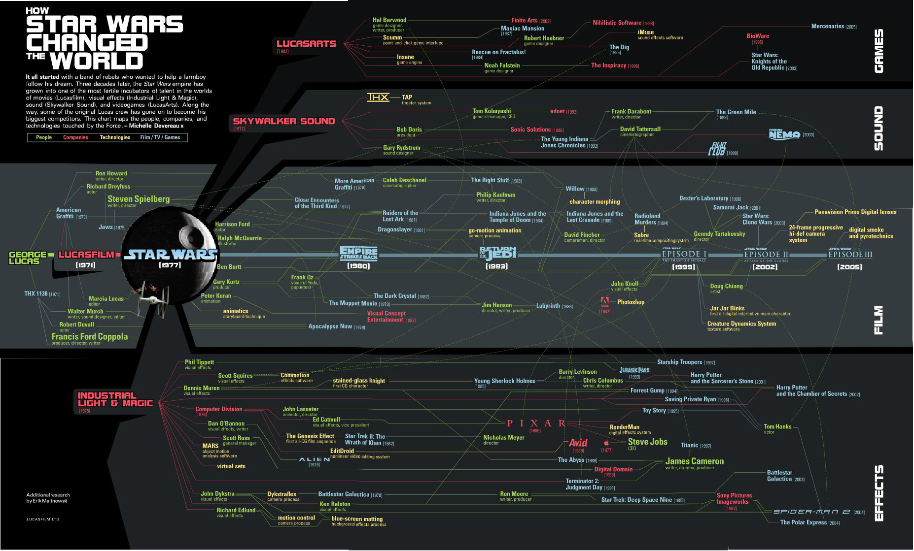
The original Star Wars has certainly gone on to produce more than just sequels.  It has created the people and the technologies that are now considered the best in the industry.  Michelle Devereaux created this family tree for Wired magazine back in 2005 and I love how the line colors indicate people, technologies and company connections, but the tree is organized into movies, sound, effects and technologies.

I actually believe the tree is incomplete.  I think Star Wars had far greater reach and influence that what Michelle mapped out here.

It all started with a band of rebels who wanted to help a farmboy follow his dream.  Three decades later, the Star Wars empire has grown into one of the most fertile incubators of talent in the worlds of movies (Lucasfilm), visual effects (Industrial Light & Magic), sound (Skywalker Sound), and videogames (LucasArts).  Along the way, some of the original Lucas crew has gone on to become his biggest competitors.  This chart maps the people, companies and technologies touched by the Force. - Michelle Devereaux
Thanks Alwyn!

Wednesday
Nov262008

Welcome to the world baby...Processing


In my email yesterday I received a note announcing the release of Processing 1.0.  It's very exciting to see this project release to the world.  There have been many beta versions leading up to this release (162 versions in fact), but for those interested in creating your own infographics this is big news.  What is Processing, you ask?
Processing is an open source programming language and environment for people who want to program images, animation, and interactions. It is used by students, artists, designers, researchers, and hobbyists for learning, prototyping, and production. It is created to teach fundamentals of computer programming within a visual context and to serve as a software sketchbook and professional production tool. Processing is an alternative to proprietary software tools in the same domain.
Processing is free to download and available for GNU/Linux, Mac OS X, and Windows.
Some of the infographics I have highlighted here on Cool Infographics have been created with the earlier versions of Processing, and I'm hoping for more to come.

Wednesday
Nov192008

The history of olympic medals

 
Grace Lee is a Junior at Parsons, the New School for Design in New York City.  She went back and visually laid out all of the medals won be every country in every Olympics since Athens in 1896.  Across the bottom it also shows how many nations participated each year and how many athletes were involved.  This was a project in her Information Design class, and she did a fabulous job!
The games have always brought of this world together in peace, leaving behind any racial or cultural boundaries.  The Olympic games create a time when the world can be smaller and united as a human race, rather than separate nations.  With the summer games in Beijing, China, and the upcoming games in Vancouver, Canada, the Olympic games will continue to be a time of friendly competition.

Thanks Grace.  I love how this project turned out.

By popular request I have uploaded the full PDF version here.

Monday
Nov172008

A Visual Guide to the Financial Crisis


This is a tall flow chart helping describe the financial crisis, from blog.mint.com.

Thanks Alwyn!

Thursday
Nov132008

Seasonal Visual Timelines


Roberto Rovira, and assistant professor of landscape architecture at the Florida International University's, School of Architecture, was kind enough to allow me to share some of his work with the readers of Cool Infographics.
 
Working as a consultant, these seasonal timelines were developed to show the activities and the plants used in a proposal for a project he led called "Envisioning Hudson Square" on the Hudson River near Manhattan, NY.
 
The first one shows the time of year that different activities would be active in this green area during the year like bicycling, bird watching and ice skating.  It also shows the different wildlife that would be present during the year like blue heron, striped bass and snowy egrets. Using the visual timeline you can see how the different activities overlap and that there would always be some type of activity during the year.
 
The second timeline from the same project show the proposed plant and trees to be used in the project, and with the use of the visual timeline shows their color and appearance throughout the year.
 
Graphics by Roberto Rovira, RLA, with assistance from landscape designer Kelly Woodward. Roberto is Assistant Professor in Landscape Architecture at Florida International University (www.fiu.edu/~soa) and Senior Landscape Architect consultant for ArquitectonicaGEO (www.arquitectonicageo.com), a Miami-based landscape and planning firm. He led GEO's design team and developed the concepts for 'Hudson Square Prints Green!', a proposal for a 30-block New York City district on Manhattan's West Side, adjacent to the Hudson River.

Tuesday
Nov042008

Create Your Own Electoral Map


Since today is Election Day, the nytimes.com has a neat feature that lets you create your own Electoral Map.  Ireally like that it also gives you the option (seen above) to view the country with teh states sized by electoral votes or by geography (below).


It's been preloaded with the NYTimes.com breakdown of how the states may fall today, and which states are still undecided.  It's a little misleading because there are more undecided states, but they have assumed they will lean as the have historically.  It also allows you to change them on your own so you can see the effect on the overall election.

When your done playing, you can also see the NYTimes version of the map that includes the states that are leaning, but are not yet truly decided.


As you can see, the NYTimes.com site is predicting a Democratic win.  Let's see what really happens today.

Monday
Nov032008

Where your Apple Tax goes...


A little humor Monday morning from the brilliant minds behind The Joy of Tech.  Click the link to see the full version.

Saturday
Nov012008

Wine Flavor Visualization

A great visualization by Carl Tashian on tashian.com that connects different wine types with the flavors and notes of each.
What is the relationship between wine varieties and flavor components? This visualization attempts to show the strength of these relationships. I culled descriptive flavor words from over 5,000 published wine tasting notes written between 1995-2000 in a major Australian wine magazine.
Via Information Aesthetics.

Thursday
Oct302008

The Future of Food


Wired magazine has a great series of nine infographics from the November issue about the world's food supply problems.
Forty years ago, advances in fertilizers and pesticides boosted crop yield and fed a growing planet. Today, demand for food fueled by rises in worldwide consumption of meat and protein is again outpacing farmers ability to keep up. It's time for the next Green Revolution.
Thanks for the link Ethel!  Here are a few more.  Check them all out on Wired.com.


Wednesday
Oct292008

Classic infographic from 1823!


Here's a classic from 1823!  It a hand drawn infographic titled "Comparative Heights of the Principal Mountains and Lengths of the Principal Rivers of The World" by WR Gardner.  The high resolution image is on Flickr, but the post about the image is on bibliodyssey.blogspot.com.

This one makes a great poster!  Thanks Roi for sharing in the comments.