


Friday
Oct032008
The Age of Pop
 Randy
Randy

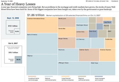
![]()

Join the DFW Data Visualization and Infographics Meetup Group if you're in the Dallas/Fort Worth area!

The Cool Infographics® Gallery:
How to add the
Cool Infographics button to your:

- iPhone
- iPad
- iPod Touch
Read on Flipboard for iPad and iPhone
Featured in the Tech & Science category


Josef Müller-Brockmann was a Swiss graphic designer and teacher, mostly recognised for his simple designs and his clean use of typography, notably Helvetica. This visualization is the result of a personal web research about Josef Müller-Brockmann and the international typographical style. It contains 3 key elements: (1) the research of information on the web, (2) chronological information on Josef Muller-Brockmann's life and links to the last part, and finally the last part (3) is composed of a critical article based on information found online. The project is in french.Thanks to Filipe for sending in the link!
Found on infosthetics.com

Thanks for sending in the link Garrett (also posted on Capturing Ephemera)!

In the modern laptop era, any monkey with Pro Tools can make a mashup. But Pittsburgh-based computer maestro Girl Talk (known to the IRS as Gregg Gillis) has turned the cut-and-paste process into a jams-packed jigsaw puzzle. His latest album, Feed the Animals (released digitally in June with hard copies out September 23), brims with 300 song snippets in just over 50 minutes (compared to around 250 in his previous effort). "People want to see the bar raised," Gillis says. Below, a beat-by-beat breakdown of a single track.Thanks Daniel for the link!

This page contains the prediction for S&P 500 Index minimum and maximum daily closing prices over the next 40 trading days.
It is predicted that S&P 500 Index will not close under 1,178 and over 1,295 between the dates September 19, 2008 and November 14, 2008. This prediction method was accurate for 71.0% and 95.0% of the cases (for minimum and maximum predictions, respectively) within an error margin of +-5% in the past.


First, I'll share this one from Disney. The Laugh System Diagram is from the queue area in the Monsters, Inc. Laugh Floor. I wish they sold it as a poster. It seems simple, but I was amazed watching a five year-old explain it in great detail to her parents.
Of course, there are some inside connections too. The yellow car in the bottom right corner is the car from the animated short on the DVD "Mike's New Car".


