About
Randy Krum
President of InfoNewt.
Data Visualization and Infographic Design

Infographic Design

Infographics Design | Presentations
Consulting | Data Visualizations

DFW DataViz Meetup

Join the DFW Data Visualization and Infographics Meetup Group if you're in the Dallas/Fort Worth area!

Search the Cool Infographics site

Custom Search

Subscriptions:


Feedburner

The Cool Infographics® Gallery:

How to add the
Cool Infographics button to your:

Cool Infographics iOS icon

- iPhone
- iPad
- iPod Touch


Read on Flipboard for iPad and iPhone

Featured in the Tech & Science category

Flipboard icon

Twitter Feed
From the Bookstore

Caffeine Poster

The Caffeine Poster infographic

Friday
Sep282012

The History of Mickey Mouse

The History of Mickey Mouse infographic

Mickey Mouse hasn’t just survived for 80 years, he has thrived. The History of Mickey Mouse infographic from Goin2Travel.com has condensed this famous mouse life style into a highlight timeline.

Mickey Mouse is the most recognizable Disney character on the planet. After more than 80 years of stardom, we thought it would be fun to review the history of this iconic mouse. From humble beginnings during the “roaring twenties”, surviving and even flourishing during the “great depression” right up to the digital age present, he and his fellow, Disney stars, are favorites of children everywhere.

So whether your planning a visit to Disney World Orlando, or just a fan,  sit back, relax, and enjoy this visual history trip through time of Mickey Mouse.

They did a good job of showing the reader actual images and photos of Mickey through the years, and I like the use of Mickey Hands as the arrowheads on the connecting lines.  

The biggest issue is that many of the images are so far away from the correct year along the righthand side, that it’s very hard to follow the connecting lines.  You really don’t want images from the 1950s visually placed next to 1970s on the timeline.  I would suggest putting the years down the middle and placing the event images on both sides so they can be adjacent to the actual time on the timeline.

The URL at the bottom should be a link to the original infographic instead of the frontpage of the company site.  You want readers to be able to find the original infographic when it’s not correctly linked on the Web.

Wednesday
Sep262012

How Much Does SEO Cost?

How Much Does SEO Cost? infographic

How Much Does SEO Cost? is generally a mystery in the online marketing world.  The range is certainly big, from under $50/month up to the unbelievable price of over $250,000/month!  This informative infographic shares the results of custom research from SEOmoz, and was designed by AYTM.

How much does SEO cost? How much time do you have to discuss the various models and prices out there! However, a new survey sheds some light on the subject.

Over 500 people and companies who offer search engine optimization services were asked about how their models. Turns out, it’s most common to charge $100 to $150 per hour, in the US. But by-the-hour consulting is only one of four nearly co-equal ways of charging.

Also popular is project-based pricing, where the average price is between $2,500 to $5,000, in the US. That’s also the same average price for those who buy on a monthly retainer basis. Fixed prices on a contract basis is also a popular way that SEO is sold, but no averages were provided.

The survey was conducted by SEOmoz and compiled into the infographic below by AYTM:

From a design standpoint, there are a lot of things I like about this infographic.  

The consistent columns for regions of the world make the layout very easy to follow.  The data is also organized nicely by starting with basic demographic data to provide a foundation to the reader before getting into “The Main Event” - the main research results.

The data visualizations are fairly simple, and very easy for the reader to understand.  I also like the variety of data visualization methods; no one wants to see all bar charts.  The color scheme is also simple, which visually implies a certain level of authority.  By taking complex data and designing simple visualizations, the design shows the readers that SEOmoz has a clear understanding of the content.

The actual values are not included in the design, which is disappointing.  Since this was custom primary research, I have no way to validate the data visualizations without seeing the data, and that reduces the credibility of the entire design.  From a sharing perspective, it’s hard to quote interesting statistics in a text Tweet or Facebook post without having the numbers to work with.

Legends are Evil!  My biggest complaint is their use of legends in a few sections.  In those charts, the colors are visually hard to differentiate, and the reader has to work very hard to understand which pie slice or bar goes with each color.  This is only a problem in the Agency Type and Common Client Types sections.  The rest do a good job of connecting the data labels directly to the visualization.

The footer should include some type of copyright statement, and the URL for readers to find the original infographic landing page.

Found on Visual Loop

Monday
Sep242012

Star Wars Infographic Flowcharts

Star Wars infographics

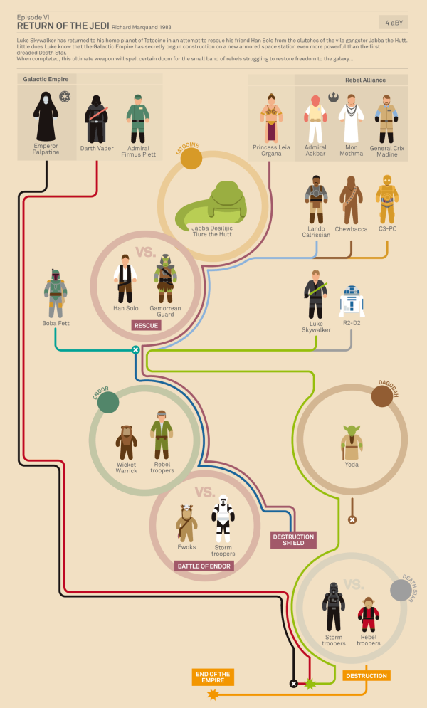
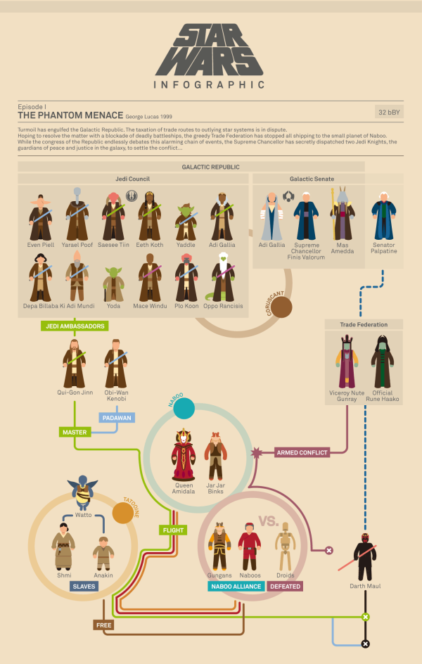
Marc Morera has designed some amazing Star Wars infographics charting the character progression, deaths and conflicts in the Star Wars movies, the animated series, comic books and major novels.  On the landing page, you will find them organized chronologically, so the Animated Series fits in between movies II and III.

Characters are illustrated as recognizable isotypes.  Each character’s plot line is color-coded, and the lines from the appropriate characters converge at circles representing the major conflicts along each story timeline. 

Star Wars infographics

The two examples shown here are reduced in size to fit on the blog, so go check out all of them on Marc Murera’s site for high-resolution versions.

Thursday
Sep202012

Is Google+ a Ghost Town?

Is Google+ a Ghost Town? infographic

Google+, The newest trend? Or the newest flop? Umpf gets to the bottom of this mystery with a little research and reports it’s results with an infographic! The Google+, Ghost Town? infographic does more than just report the Google+ statistics, it compares them to other key social networks.

There’s been many articles written about how good, bad and indifferent Google+ is.  But our favourite debate is the ongoing It’s Really Popular Vs It’s A Ghost Town one.

So what’s the truth?  Our findings and infographic (see below) appear to suggest the latter: despite its large number of accounts, G+ is bottom of the list of social network users’ favoured channels.

Google, of course, claims it is fast-growing and really popular.  Why wouldn’t they? And, of course, there is research to support that argument. But does this chart, left, for example, which shows the rise in G+ unique visitors, tell the whole truth?

So, we decided to do our own research.  It is by no means exhaustive and is only meant as a snapshot view, so judge for yourself.

Certainly a trending topic lately, but also a really good infographic design.  Of course it’s framed in a Google+ news feed style layout.  Easy to read and colorful.  I like the color coding related to the different social network logos, even though some of those blue colors are hard to differentiate.

In the Users bar chart, I love the use of color, putting the data right in the bars and using the logos on the axis to eliminate any need for a legend.  Good data visualizations design!

In the “Users Likely to Share” I would have liked to see some sizing of the icons to match the data. Instead, they put the icon illustrations into rank order, continued the consistent color coding and clearly identified 1st, 2nd, 3rd, etc.

The section with all of the doughnut charts (reminiscent of the Google+ Circles icon) also continues the consistent color coding.  I’m sure it a rounding issue, but many of the charts only add up to 99.9% instead of 100%.

At the bottom, the two things missing are some type of copyright license as well as the URL linking back to the original infographic landing page.

Thanks to Jon for sending in the link!

Wednesday
Sep192012

Sip Statistics 2012

Sip Statistics 2012 infographic

A great way to wrap up the summer, the Sip Statistics infographic was a joint design project with Hotels.comTGIFriday’s and InfoNewt (my company).

The Hotels.com® Sip StatisticsTM uses data from T.G.I. Friday’s to help travelers do as the locals do and follow their drink-clinations by identifying favorite drinks in popular cities. T.G.I. Friday’s has also provided cool new summer drink recipes below to keep that summer feeling going all year round. 

The design combines Hotels.com Average Daily Room Rate information from the top U.S. cities with the geographic popularity of TGIFriday’s top summer drinks in those same cities.  A fun, engaging way to share some internal information only available from these two companies.

The room rates are clearly compared in rank order with the bar graph linked to the map locations, and the most popular drinks are also shown in rank order for each city using both unique drink galss icons and color coding.  The icons and color coding are carried down the design to the recipe section, where the drink content proportions are shown with a pie chart visualization.

Thanks to the teams at both Hotels.com and TGIFriday’s!

Tuesday
Sep182012

How Does A Touchscreen Phone Work?

How Does A Touchscreen Phone Work? infographic

This is the reason why your iPhone won’t work with gloves but your Samsung U600 will! The How Does A Touchscreen Phone Work? infographic from mycricket.com compares phones with the three different types of touch screens. 

Ever wonder why some touch screen phones cost more than others? Or why you can’t seem to get the touch screen on your smartphone to work if you’re wearing a glove? Most people don’t know that there are three different types of touch screen technologies available: resistive, capacitive, and infrared. Learn about the different benefits and capabilities to make sure you get the touch screen phone you’re looking for.

This is a really good comparison infographic design.  Each feature is clearly illustrated for the reader, the text descriptions are minimal and it’s very easy to read top-to-bottom.

I had trouble finding the original because the URL link to the original landing page was not included at the bottom of the design (always include the URL!), and there should be some type of copyright or Creative Common license.  Not really a problem, but I’m surprised the design doesn’t include any mention of the Cricket Wireless brand or logo.

Thanks to Sam for sending in the link!

Friday
Sep142012

Life of a Cask: Wine to Whiskey

 Life of a Cask: Wine to Whiskey infographic

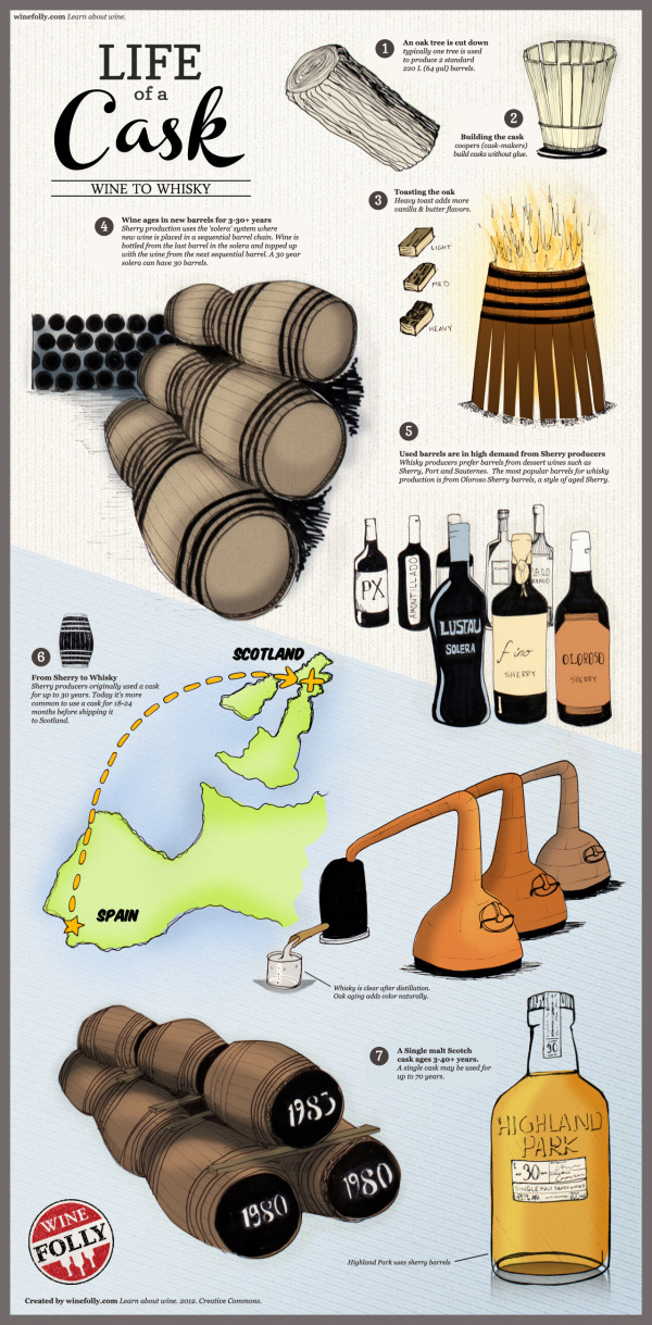
Wow! Who knew that the Cask would be so valuable! It is a key ingredient to making our favorite wine and whiskeys! See how Scotch depends on Sherry in the infographic Life of a Cask: Wine to Whiskey from winefolly.com.

An infographic on the life of a cask, from wine to whiskey. Find out where casks start their life and see how Scotch is dependent on Sherry.

Cask Facts

  • Used wine barrels are in high demand for Scotch and whisky production.
  • Distilleries prefer Oloroso Sherry casks and other dessert wine casks such as Port and Sauternes for aging whisky.
  • Sherry producers use larger casks called Hogheads (250 L) and Butts (500 L).
  • Some distilleries own forests in America where they source quercus alba (white oak) to produce casks.
  • Distilleries often loan unused casks to Sherry producers to ‘season’ them.
A Single malt Scotch cask ages 3-40+ years. A single cask may be used for up to 70 years

Nice visual explanation.  Easy to follow with a focused message that isn’t crowded with a bunch of additional factoids.  

The text is a little too small to read without zooming in closer, and there should be a URL at the bottom linking back to the original infographic landing page.  Otherwise, how can people find the original version they can read when a blog doesn’t link back correctly?

Just in time for the weekend too, it’s making my thirsty…

Thanks to Justin for sending in the link!

Tuesday
Sep112012

What is an Infographic? (explained with LEGOs)

 What is an Infographic? infographic

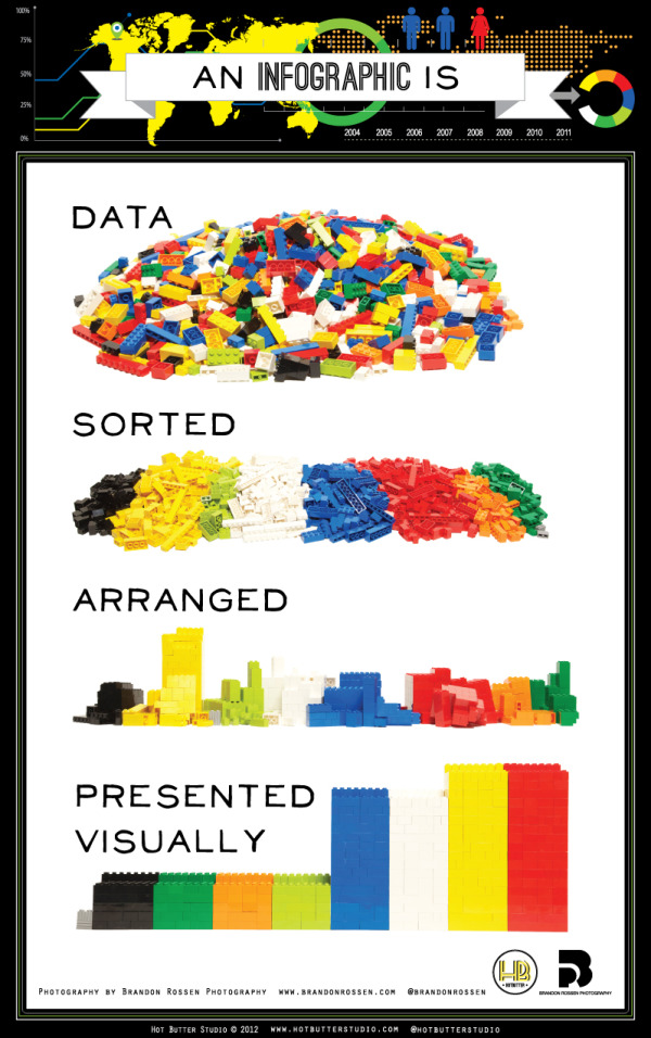
This infographic from Hot Butter Studio presents the idea of infographics in, well, an infographic! What is an Infographic? Data sorted, arranged, and presented visually! (And in a fun LEGO design!)

This is an infographic about what is an infographic. Using Lego blocks and photography we wanted to show that.a good infographic is simple and requires very little text.

Simple and fun, this is a really good design that has had some phenomenal success in social media sharing.

Thanks to Karyn for sending in the link!

Monday
Sep102012

BYOD: The Good, the Bad and the Ugly

 BYOD: The Good the Bad the Ugly infographic

“BYOD” Bring Your own Device. A great idea that can easily turn messy. Biztech has introduced the BYOD: The Good, the Bad and the Ugly infographic asking you to answer 6 easy but important questions before you launch into a BYOD situation. 

If your company is considering allowing employees to bring their own devices to work, make sure you have a game plan in place.

BYOD has freed up many enterprises from the responsibility of exclusively purchasing and maintaining computing devices, such as notebooks, tablets and smartphones, but companies still need to have policies set in place to make things work.

BizTech magazine has put together an infographic that highlights six core questions every company should consider before moving forward with BYOD:

  1. Who buys the devices?
  2. What’s the right policy?
  3. What’s the employee’s role?
  4. What’s the impact on IT?
  5. How do we tackle security?
  6. How about apps?

For each of these questions, we’ve outlined a good answer, which we’d advise you to follow; a bad answer, which probably isn’t the best way to handle things; and an ugly answer, which should be avoided at all costs. Hopefully, this will help your company remain on the pleasant side of this growing workplace trend.

The organization in this design is really well done.  After explaining the concept of BYOD, the infographic walks the reader through six questions and provides some stats and information about each aspect.  The text is short, the illustrations are relevant and entertaining and the information is valuable to companies.

One of the data visualizations is hard for the readers to understand.  Highlighting 72% of employers as six people icons is very odd (Use 10 icons for percentages), but then they correctly used 10 icons when visualization 70% of Cisco employees.  At the bottom of the infographic image, it’s missing a URL to the original infographic landing lage, and a copyright statement.

Thanks to Ricky for sending in the link!

Friday
Sep072012

Visual History of Cooper Black

Visual HIstory of Cooper Black infographic

Where’s Waldo?  More like where’s Cooper Black?  The font is everywhere! The Visual History of Cooper Black infographic was created by fibers.com to show their love for Cooper Black.

You might not know it, but you’ve seen Cooper Black. On the shop-front, in naughty magazines, album covers and candy wrappers - this depression era novelty font gets around. And why wouldn’t it, it’s curvaceous and friendly, as the type designer who created this font said, “It’s a typeface for farsighted printers with nearsighted customers.

We think Cooper Black is just lovely, with a rich and robust history - so we put that history down visually with this infographic. 

What a great topic and design!  This topic just screams for the design to show the reader actual examples of Cooper Black in action, and the use of images in the timeline does just that.  The design is focused on telling just one story, the timeline, and is fun & easy to read.

Thanks to Alia for sending in the link!