About
Randy Krum
President of InfoNewt.
Data Visualization and Infographic Design

Infographic Design

Infographics Design | Presentations
Consulting | Data Visualizations

DFW DataViz Meetup

Join the DFW Data Visualization and Infographics Meetup Group if you're in the Dallas/Fort Worth area!

Search the Cool Infographics site

Custom Search

Subscriptions:


Feedburner

The Cool Infographics® Gallery:

How to add the
Cool Infographics button to your:

Cool Infographics iOS icon

- iPhone
- iPad
- iPod Touch


Read on Flipboard for iPad and iPhone

Featured in the Tech & Science category

Flipboard icon

Twitter Feed
From the Bookstore

Caffeine Poster

The Caffeine Poster infographic

Monday
Aug132012

Cellular Jerks: Where are your Mobile Manners?

Cellular Jerks infographic

So how in tune are you with your technology? Do you take calls on the toilet? Do you sleep with your phone on your bed? See what percent of the U.S. you fall into with the Cellular Jerks infographic from onlinecollege.org.

If you’re considering the pursuit on an online education, chances are you’re pretty plugged into the Internet and technology world.  Modern students everywhere are increasingly engaged with their tech devices, and with the rapid rise of mobile Internet access, many are even able to gain access to the materials and resources they need to study on the go.

 But this easy access might very well be both a blessing and a curse: The rise of mobile access has given rise to savvy, plugged-in individuals, but it may very well also have given rise to another being entirely, namely, the cellphone jerk.  Everyone seems to know someone or interact with a person who just doesn’t seem to have any mobile manners.  From loud conversations at inappropriate times to rude texting at an awkward moment, it seems like more and more people are getting lost in their own cell phone interactions. So attached are people to their cell phones that sometimes, those little devices end up in some interesting places.

 Don’t feel like you’re that addicted?  Check out the following infographic and see for yourself: You might be surprised to realize that you could be a cellular jerk, too.

I like this one because of the fun use of illustration to make the statistics more personal and can relate them to our everyday lives.

Many of the statistics are just shown in text instead of visualized, and most designers don’t understand that by not visualizing those values, it makes them visually “less important” to the readers.  This is especially true the further down the infographic you get, which also implies the project was rushed or the designer got lazy deeper into the design.

The clear Creative Commons license in the infographic is fantastic.  The URL directly to the original infographic landing page should have also been included.

Found on Online College.org 

Thursday
Aug092012

The Greatest Human and Digital Viruses of All Time

 The Greatest Human and Digital Viruses of All Time infographic

Viruses. We all hate them. If they aren’t slowings us down physically, they are slowing down our computers. See the best of the worst on uniblue’s The Greatest Viruses of All Time infographic from Uniblue’s free resource libraries site liutilities.com.

“If you think you are too small to make a difference, try sleeping with a mosquito.” โ€• Dalai Lama XIV

Viruses are inevitably small in nature, yet engineered to unleash intense and often terrifying devastation. They leave a costly aftermath whether it’s the irreparable loss of human life, or millions (sometimes billions) of dollars in lost revenue and property.

We have gone through history to find the worst viruses of them all; little creatures and scripts that have taken advantage of social and economic situations to propagate and amplify their prowess in mayhem and destruction.

Join us in this brief journey through time, spanning back as early as 1348 where we shall meet the darkest and most wicked viruses to ever afflict mankind.

This is a really elegant design that does a fantastic job of telling a story and walking the reader through the information.

Mostly text and illustrations, there aren’t many numerical data point to visualize.  The few numbers there are to work with, could have been visualized better to give them context and help the readers understand them better.  Why are 21 human icons shown to represent “75,000,000 to 200,000,000 dead” from the Black Death plague?

At the bottom should be some type of copyright (or Creative Commons) statement, and the URL for readers to find the original infographic landing page.

Designed by Derek Fenech, thanks for sending in the link!

Monday
Aug062012

New Feature: DataVis & Infographic Designer Job Openings

Infographic Designer Jobs

I recently added a new feature page here on the Cool Infographics blog called Cool Jobs.  The Jobs page is open for anyone to post freelance, part-time and full-time opportunities for data visualization and infographic designers.  Posting an opening on the Jobs page is FREE, and you should include a job description, a link to the opportunity, and contact information in the main body of your post.

Friday
Aug032012

Celebrating their First $1,000,000 of Custom Made Products

Celebrating their First $1,000,000 of Custom Made Products infographic

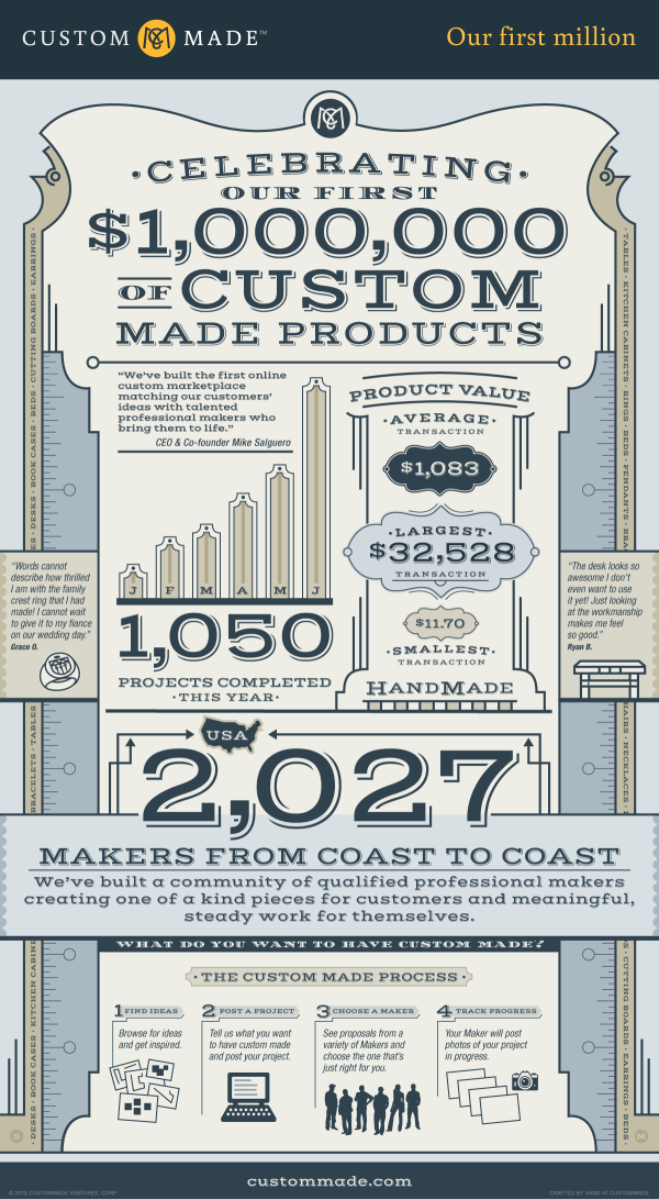
In its first six months CustomMade.com made their first million of custom products! They take their clients ideas and match them with professionals to get the job done.  Their Celebrating Our First $1,000,000 of Custom Made Products infographic shows their process and success. 

Over the first six months of 2012, we here at CustomMade have been thrilled to witness the growth of the first entirely custom online marketplace.  Our team has been constantly working to improve the site experience and our ability to match customer’s idea’s with the talented professional makers who can bring them to life.  Recently we paused for a moment and realized we were about to pass an important milestone for our marketplace – $1,000,000 worth of custom made products!

Along the way we’ve seen some amazing custom creations ranging from $32,000 custom kitchen cabinets to an $11 hand carved wooden pendant. We’ve seen rings made out of vinyl records, rings with amazing details from a family crest, and even an engagement ring in the shape of R2D2 (which any Star Wars fan would love).  Our makers have brought to life a children’s bed in the shape of a slipper, amazing custom humidors, and even a custom cat bunk bed!  You can browse all of our projects in progress on the site, or browse over 35,000 completed projects.

This work is being done by over 2,000 professional makers across the U.S. and Canada.  They include furniture makers, jewelers, ceramicists, glass blowers, metal workers, leather tanners, and much more.  These makers represent that true craftsmanship still exists today and that consumers are able to not just purchase an item off the shelf, but to create an heirloom that can be cherished for years to come.  We are proud to support these local makers and the products they create, and are looking forward to seeing what unique items they make next!

I love the classic, clothes-tailor style that dominates the overall design.

My biggest complaint with this design is the lack of data visualizations.  Big fonts are NOT data visualizations.  Visualization put the values into context for the reader by comparing them to another value so the reader can understand if a number really is big or small.

I love that the infographic itself was “Crafted by hand”, but in the spirit of the business, they should have given the designer credit by name.

Thanks to Zach for sending in the link!

Thursday
Aug022012

Find the Best Airline Fees

Find the Best Airline Fees infographic

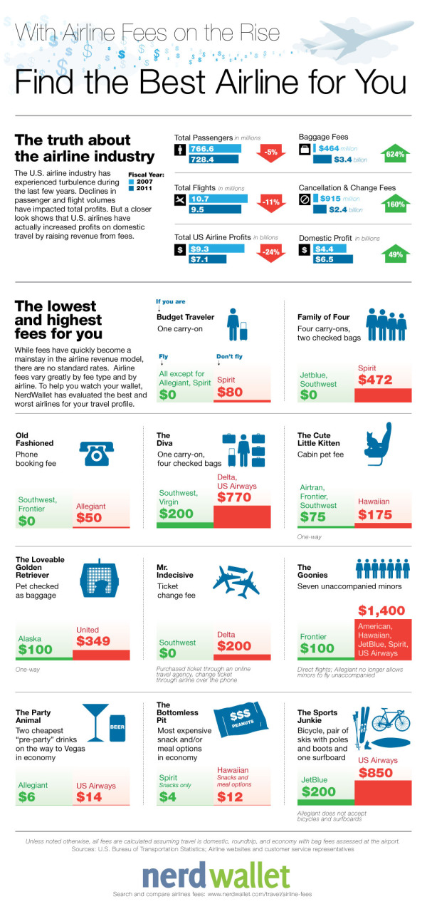
Traveling is a pleasure that we don’t want to give up, but costs keep rising! Find the Best Airline For You infographic from Nerd Wallet lets you know which airline to travel on depending on your traveling habits to keep the costs down!

U.S. airlines continue to increase fees - more fees and higher fees.  However, there are no standards or regulations when it comes to airline fees so travelers don’t know what to expect.  Fee prices range widely by airline, and there is little transparency on the terms of each fee.  For example, some fees are charged based on how stops are made, while others are billed as flat fees.  Some fees have a base rate but increase from the time of booking to boarding the plane.  
As a result, cost comparison is extremely difficult, especially when travelers are evaluating multiple airlines.  To make matters worse, fees are not properly disclosed – they are hidden within multiple layers on airlines’ websites and shrouded by vague wording.  NerdWallet gathered the data and analyzed each fee across all major U.S. airlines.  To help travelers save money, we defined several traveler profiles and calculated fees on a comparable basis to determine which airline is best (and worst) for each type of traveler.

There are a handful of things I like about this one.  

  • The main thing is that throughout all of the Lowest/Highest comparisons, the scale of the bar charts is kept consistent.  This allows the reader to easier understand how much money is related to each travel fee.
  • The green-red (good-bad) color scheme is instantly understandable to the reader.
  • The icons (all in blue) are easy to understand.  By keeping them all a consistent solid blue color, they are kept simple and don’t create a bunch of “visual noise” that would distract the reader.
  • Sources are listed at the bottom
  • The direct URL to the original infographic is included at the bottom so readers can find the high-resolution original no matter where they find it posted on the Internet.

I would suggest using the airline logos, even in a solid color, to make it easier for the readers to pick out the airlines they recognize.

Thanks to Annie for sending in the link!

Wednesday
Aug012012

VISA London Economic Outlook

VISA London Economic Outlook infographic

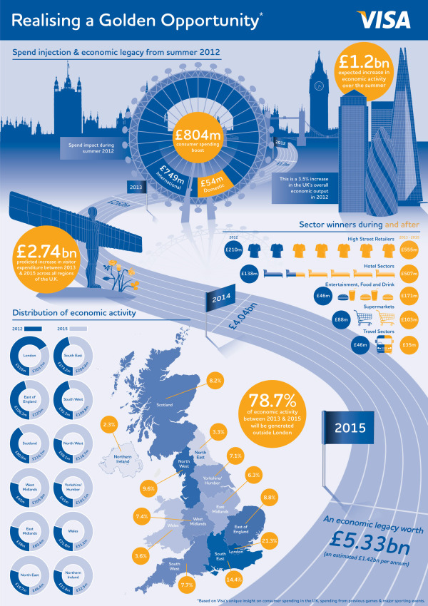
VISA was smart and jumped on the London band wagon.  Designed by Bright Blue Day, the VISA London Economic Outlook infographic from Visa Europe shows a summary of the Olympics impact report.

The London 2012 Olympic and Paralympic Games will deliver an £804m consumer spending injection for the UK this summer and an economic legacy worth £5.33bn by 2015, according to Visa’s report, “Realising a Golden Opportunity: Visa Europe’s London 2012 Olympic and Paralympic Games Expenditure and Economic Impact Report”.

The report looks at the consumer expenditure and economic output related to the Games and its distribution across the country. It is based on Visa’s unique insight into consumer spending in the UK and spending data from previous Games and major sporting events.

We have also produced a unique infographic providing an easily-digested visual summary of the report’s findings.

This is a great use of an infographic as an executive summary of a much larger report.  This builds awareness, interest and traffic to a report that VISA Europe obviously spent a lot of money to sponsor.

A few thoughts about the infographic design:

  • The call-out circles surrounding the map of the UK should be sized to match their values.
  • The doughnut charts don’t work for the Distribution of Economic Activity.  The percentages are too close together, so all of the doughnuts look almost the same.  I think a pair of bars for each location, but keeping the scale consistent across all locations would have worked much better.
  • I love the icons for the business sectors
  • The color scheme is fantastic!  Simple, directly tied to VISA and makes the overall design bold without being gaudy.
  • The monument silhouettes from London are easily recognizable, and work nicely in the background without drawing too much attention.
  • The bottom should have a clear copyright, and the direct URL link to the original infographic landing page.

They also created a short infographic video based on the static infographic:


The infographic is available as a high-resolution JPG image file or a high-resolution PDF.

The designer at Bright Blue Day was Ollie Flippence.  Great job Ollie!  Thanks for sending in the link!

Tuesday
Jul312012

Evolution of the F1 Car: Video & Infographic

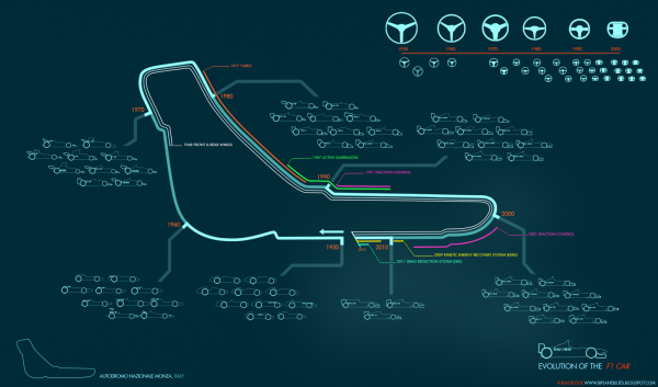
This is totally cool!  Here is an infographic animation created by Rufus Blacklock of his infographic Evolution of the F1 Car. You can find his original video on biplaneblues.blogspot.com.

All done :) here you can watch 60 years of F1 design condensed into a minute. Each car is the winning chassis from the respective seasons. The music is ‘Together’ by She.


Evolution of the F1 Car infographic 

Here is the original Evolution of the F1 Car infographic that the video was based off of. Found at biplaneblues.blogspot.com.

Woo finished! This map tracks the history of F1 cars across the circuit at Monza. Hopefully its clear enough… its my first infographic, let me know if you have any keen ideas to improve readability.

The cars are grouped into decades, around the track you can follow various innovations and driver aids, some which became banned. Top right is steering wheel development.


Monday
Jul302012

Olympic Swimming 2012: Faster, Better, Stronger

Olympic Swimming 2012: Faster, Better, Stronger infographic

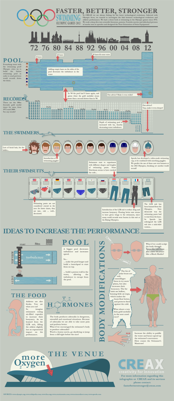
CREAX created this infographic for their June 2012 newsletter. Every day, they analyse tens of thousands of patents and look for clues of “the next breakthrough innovation” in all kinds of industries.  In their Olympic Swimming 2012: Faster, Better, Stronger infographic, they combined their knowledge of innovation with the upcoming olympics.  The infographic links the performances of swimmers with technology in swimming gear, pools and venues for the last 10 Olympics, and their predictions for the future.

At CREAX we are always fishing for the latest technological evolutions. Infected with Olympic fever, we wanted to investigate the link between technological evolutions and athletic performance. We had a closer look at swimming in the Olympic games since 1972. We took a deep dive into scientific literature, patents, Youtube movies and old school pictures of macho men in speedos and designed the Next Generation of Swim Equipment!

This design had a number of really cool data visualization styles that are nicely customized to the data they represent.  Just remember that the 2012 data is their suggestion, not the actual data from the current Olympics!

  • I like that each visualization matches the timeline across the top for consistency, and the monument silhouettes are great for each location.
  • The timeline of swimming pool lanes is great, as the overal width changed over the years.
  • I liked the depth of the swimming pool as an inverted bar chart, but the small icons of Speedo swimsuits are totally unnecessary and detract from the data.
  • Love the isotype hair styles
  • I like actually seeing designs of the swim suit styles, and I guess the flags are for the gold medal winner for each Olympics?

Overall, a good design.  The text blocks are too small to be full-justified.  A copyright statement and the URL to the high-resolution original infographic should be included at the bottom.

Thanks to Frederik for sending in the link!

Thursday
Jul262012

2012 London Olympic Venues

2012 London Olympic Venues infographic

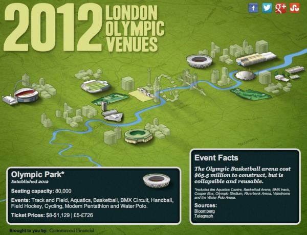
The 2012 London Olympic Venues from Cottonwood Financial’s CashStore.com site is an interactive infographic design showing facts and information about each of the main event locations in London.

The 2012 London Olympics are rapidly approaching, and they’re set to become the most expensive games yet with a budget of $14.5 billion. So what can Olympic attendees expect this year? Impressive landmarks, state of the art facilities, millions of sports fans and of course the best athletes in the world competing for the title of Olympic Champion.

Click the venues for more information on the events and ticket prices (figures in U.S. dollars and British pounds) for each one.

I really like the interactivity, but I think they used way too much text.  All of the statistics (like seating capacity and ticket prices) should have been visualized to make it easy for the reader to see.  Event icons and the Olympics are always tied together, so lining up this year’s icon designs instead of the text event names would have been more visually appealing as well.

The reader clicks on each of the venues to bring up different information, but the building illustration is the only indicator showing which venue the information is referring .  A connecting line or a highlight color to indicate which building is currently being displayed would have helped out tremendously.

It’s all designed in HTML5 too, so all of the interactivity works on mobile devices (like the iPad) as well!  Very cool!

I’m very jealous if you’re going to any of these events, but this guide could give you some idea of what to expect when you get there.

Thanks to Joe for sending in the link!

Tuesday
Jul242012

How Banks Make Money From Home Loans

How Banks Make Money From Home Loans infographic

How Banks Make Money From Home Loans is explained right here in this infographic from Tomorrow Finance. We are even given the outstanding figure of $13.4 trillion of outstanding mortgage debt.

What the Frac?

How banks make money from home loans.

Fractional Reserve Banking refers to a banking system which requires the commercial banks to keep only a portion of the money deposited with them as reserves. The bank pays interest on all deposits made by its customers and uses the deposited money to make new loans.

This design does a good job of showing the audience the scale of the amount of money involved.  Each $100 stack of bills is carefully used to visualize the amount of money being used in the explanation, and it makes a bigger impact by making it visual.

The sources are carefully documented and all of the visualizations appear to match the numerical values.  At the bottom should be some type of copyright or Creative Commons statement, and the text URL back to the original infographic to help readers find the high-resolution version when they see posts of this on other sites.

The designer here did a really good job of telling a simple, focused story in the the infographic that is quick and easy for readers to understand.