About
Randy Krum
President of InfoNewt.
Data Visualization and Infographic Design

Infographic Design

Infographics Design | Presentations
Consulting | Data Visualizations

DFW DataViz Meetup

Join the DFW Data Visualization and Infographics Meetup Group if you're in the Dallas/Fort Worth area!

Search the Cool Infographics site

Custom Search

Subscriptions:


Feedburner

The Cool Infographics® Gallery:

How to add the
Cool Infographics button to your:

Cool Infographics iOS icon

- iPhone
- iPad
- iPod Touch


Read on Flipboard for iPad and iPhone

Featured in the Tech & Science category

Flipboard icon

Twitter Feed
From the Bookstore

Caffeine Poster

The Caffeine Poster infographic

Wednesday
Jun272012

12 Things To Do After You've Written A New Blog Post


12 Things To Do After You've Written A New Blog Post infographic

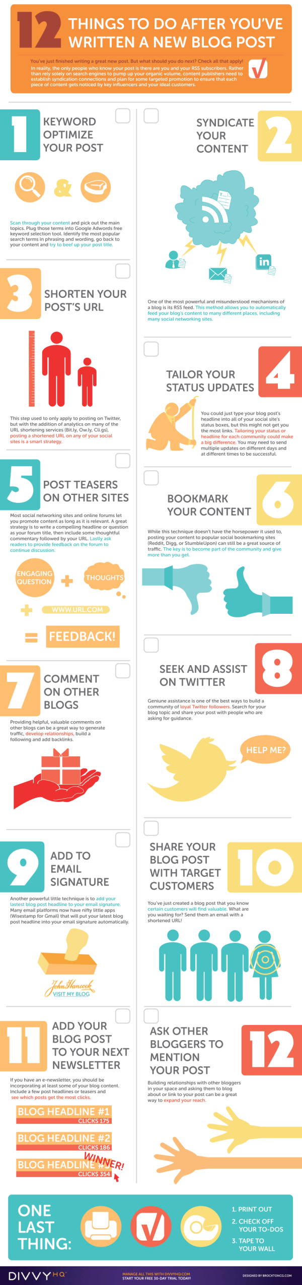
The 12 Things To Do After You’ve Written A New Blog Post infographic from DivvyHQ is a self help guide that everyone who likes to post blogs could use. Also, it’s in a comically large printable design that I recommend! Instructions are below.

In early 2011, I was asked to guest blog for the Content Marketing Institute, which actually came from a consistent blog commenting strategy that I have executed for years. With their heavy focus on “how-to” content, I whipped up a post on the “12 Things You Need to Do After Writing a New Blog Post”. The checklist-style post was well received with thousands of retweets, likes and shares.

Now fast forward to March 2012. The infographic craze is in full swing, so I was perusing my content archives looking for something that I could turn into a good visual. I quickly recalled many CMI comments talking about how they had printed out the text-based checklist and had it pinned to their cube wall. BINGO! The rest is history…in the making.

Printing Instructions

  1. Click the infographic above to open the PDF version.
  2. Save it to your computer/hard drive.
  3. Open the PDF in Adobe Acrobat or any PDF Reader application.
  4. Hit Print.
  5. In the PDF print setting dialog box, look for “Tile Scale” or “Print Scale” and set the percentage to 54%. Your print preview should now be showing that the infographic will print on three 8.5 x 11 sheets. If not, adjust the scale percentage until it fits.
  6. Hit Print.
  7. Tape the pages together.
  8. Check your to-dos.
  9. Hang it on your wall.
  10. If you need help managing your blog or social media activities, you may want to try our 30-day free trial.

There’s no data shown in this design, it’s more of a process flow infographic.  Although it would have been nice in the infographic version of Brody’s process to show some of the stats behind why each of these activities is valuable to online marketing.

As a process infographic design, the content is very cool and the design matches.  It’s easy-to-read, icon illustrations support the content, minimal text descriptions and I love the added instructions to print it out across three pages to become a reference guide in the real world.

Wednesday
Jun272012

How to Properly Use Sunscreen


STACK How To Use Sunscreen Properly infographic

How-to topics are popular infographic designs, and How To Properly Use Sunscreen is a great topic to cover.  From STACK.com.  It’s over 100°F (over 37°C) here in Texas this week, so this is a very appropriate topic to share.

Most people know they should use sunscreen to protect themselves from the sun’s harmful rays. Unfortunately, few are fully aware of how to properly use sunscreen. This is particularly true of athletes who train and compete in the sun throughout the summer.

If you’re spending long hours in the heat this summer, sunscreen could become your most important piece of training equipment. Check out the graphic below to learn how to select the right SPF, understand application and find out how different conditions impact the need to use and reapply sunscreen. Don’t find yourself sunburned on the sideline this summer because you failed to educate yourself on how to properly use sunscreen.

As strong as the topic is, I see a number of design improvements that could be made:

  • The stats need to be visualized!  The definition of SPF would have been a great data visualization comparing one hour in the sun without sunscreen to 15 hours in the sun with SPF 15.
  • I love the varying degrees of transparency in the shadows behind the shield illustrations for the different levels of SPF
  • Overall, there’s too much text.  More than a normal reader will take the time to read.
Tuesday
Jun262012

Ruby on Rails Popularity Index 2012

Ruby on Rails Popularity Index 2012

Ruby on Rails isn’t about the gem, but to some people it is just as valuable. It allows people to enter the basic programming world as painless as possible. The Ruby on Rails Popularity Index 2012 infographic created by exist.com (found on infographicjournal.com) illustrating its popularity!

Ruby on Rails has taken the web development world by storm since its first full release in 2005. Yet with new web platforms arriving each day, usage share of frameworks has become quite fragmented. So in this post, I compiled the latest trends and figures of Ruby on Rails from different sources, as well as some stats of the Ruby language.

Here’s an infographic we’ve created that visualizes how far Ruby on Rails has gotten since its release in 2005.

This design from Exist.com comes from Philippines, so there are a couple English grammars errors like “oftenly”, which isn’t a real word.  The design does a good job gathering a number of stats from different sources together to show the general trend of growing usage of Ruby on Rails over the last 5 years or so.

Tuesday
Jun262012

Client: Avoid the Dip from IPO Lockups

Wealthfront Lockup Avoid the Dip infographic

Avoid the Dip: The Effect of Lockup on Stock Price is a new infographic InfoNewt designed for Wealthfront.

A flood tide of shares is hitting the market in May and June, as a number of the high-profile tech IPOs from the fall emerge from lockup periods, including Jive Software (JIVE), Zynga (ZNGA) and Angie’s List (ANGI).

If you’re one of the employees of the 28 companies whose lockups are expiring in May or June, you’re wondering how to diversify your portfolio and when to sell.

Here’s our research on the question of what to do in the days immediately following the lockup expiration, presented visually to help you see the dip that typically follows the end of the lockup.*

As valuable financial information to many employees of the tech companies going IPO this year, Wealthfront looked back at 254 prior technology company IPOs to chart “The Dip” that consistently have a price dip the first day after the Lockup ends.

Don’t understand what a Lockup is?  That’s explained in the infographic as well.

Thanks to the team at Wealthfront!

Thursday
Jun212012

Kelly Slater: Greatest Athlete of All Time?

Quiksilver - Kelly Slater Infographic

Kelly Slater: Greatest Athlete of All Time? is a design collaboration between InfoNewt (my company) and the design team at Quiksilver.

It is common knowledge among our tribe that June 20th is recognized as International Surfing Day so who better to celebrate then Kelly Slater, 11X ASP World Champion. In the spirit of ISD, we’ve created an Infographic comparing Slater to athletes from traditional sports who have made history and measured their achievements to our Champ’s. Have a look and decide for yourself if Slater truly is “The Greatest Athlete of All Time”.

Do you think Kelly Slater is “The Greatest Athlete of All Time”? If yes, share this with your friends and get ready for summer with a pair of Kelly’s Cypher Nomad Boardshorts.

Of course it’s difficult to compare athletes from different sports, but Kelly Slater’s surfing achievements are truly impressive.  Despite being both the youngest and the oldest to win the ASP World Champion title, holding three Guinness World Records, winning 11 Would Tour Championships and winning events in 11 different countries, Kelly Slater has never been on the cover of Sports Illustrated.  :(

Here are some of the design aspects that this infographic gets right:

  • The key message is communicated within the first couple of seconds.  Even if a reader doesn’t read the whole infographic, they will leave understanding the key message.
  • Visually appealling with vivid, colorful images, but still easy to read top-to-bottom.
  • Intergrated the visual brand style of Quiksilver using photos, with the data visualizations about his career.
  • Good mix of different data visualization styles that are unique to the data they communicate
  • The key parts at the bottom are all there.  Data sources, brand logo, copyright statement and the URL to the original, full-size infographic.

The data for this design was the key challenge, and finding similar titles or awards in the other sports inspires discussion and debate among readers of the infographic.  Whether it’s on Facebook, Twitter or blog comments, this design draws in readers and invites everyone to share their own opinion.

Check out the full-size infographic HERE, and you can voice your own opinion about Kelly Slater in the comments below.

Thanks to the team at Quiksilver for being fantastic to work with!

Wednesday
Jun202012

The Trivi.al Side of Trivia

The Trivi.al Side of Trivia

Here’s some trivia on trivia! The history of trivia is mapped out in a board game fasion in The Trivi.al Side of Trivia infographic from trivi.al. The game we love is now an app! 

We’re a few days away from releasing our app Trivi.al. It’s in the hands of Apple now and we wanted to share with you an Infographic that we put together on the history of trivia called “The Trivi.al Side of Trivia.

It’s a fascinating industry with a lot of cool tidbits of knowledge we’ve throughly enjoyed learning about. And, this journey has led us to meet so really cool people from all over the world. We’ve talked with people from New York to London to Warsaw, Poland and many more in between. We’ve loved the journey so far and we hope it continues to grow as we introduce you to the app. Stay tuned and if you enjoy the infographic leave us a comment below. We’ll have some printed versions soon so if your interested let us know. Thanks

As a great way to promote thier new iOS app, Trivi.al created an infographic timeline history fo trivia that starts with taverns (places of ill repute) in Roman times and follows the trail throughout history leading up to their app launch.

Not much in the way of data visualizations, but the illustrations of celbrities, games and gameshows draw in the reader to see if they can recognize any of them.  Cool promotional infographic. 

Thanks to Joey for sending in the link!

Tuesday
Jun192012

11 Steps To Voice-Over Success

11 Steps To Voice-Over Success

Interested in trying to make money as an audio voice-over actor?  Thanks to 11 Steps to Voice-Over Success infographic from Voices.com, now you know how to get started!

Voice over actors give life to animation works, enlighten us through film narration and bring energy to radio commercials. The industry is estimated to be worth $12.3 billion worldwide, and is growing because of new digital mediums such as mobile radio, apps with audio podcasting. If you’re interested in voice acting, learn the 11 steps to voice-over success in this amazing infographic.

This design combines a process flow, some data visualizations, some illustrations and text descriptions in an easy to follow layout.  The large colored blocks for each step resemble following a board game path to make it simple for the reader to follow the process.

I think the design could have reduced the amount text much further.  I think there’s too much detail included to be quick to digest for the readers.  At the bottom there should have been the URL link to the original, full-size infographic (in addition to the Voices.com front page) and a copyright statement.

This design visualizes an 11-step process, and a good comparison would be the 10-step process design for How Affiliate Marketing Works I designed last year.  My approach was to give the reader the basics of the process, and then let them go to the website to get more details.  This design attempts to give the reader more complete information about each step of the process.  What do you think?

Thanks to Ashley for sending in the link!

Tuesday
Jun192012

Infographic Contest Winner: #Blame Twitter

A big congratulations to Tim Cooley!  Tim won the PosterBrain Design the Future contest with the entry above called #Blame Twitter, which is essentially a parody infographic.

From Tim:

All claims in this infographic are obviously false in nature and are solely intended for the comedic entertainment of readers. We <3 Twitter.

From PosterBrain:

We are sending a HUGE shout out to Tim Cooley for winning our Design the Future Infographic Contest! His infographic, #Blame Twitter, is very creative, informative, visually pleasing, and incredibly well done! We will definitely think twice about what, and how often, we tweet! Congrats again Tim, and thanks to everyone who participated!

Tim took the real data provided for the contest, but fictitiously correlated it to Twitter statistics.  In a classic example that “Correlation does not imply causation”, Tim visualized the real-world statistics as if they were caused by Twitter.  For example, it is true in the real-world that nearly 13,000 hectares of forest is lost every day, but it has nothing to do with the 233,370,615 Tweets every day.

Tim won an iPad2 for his winning infographic!  You can see all of the contest entries on the PosterBrain Facebook Contest Photo Album.

Please fell free to retweet this post without harming the environment…

Monday
Jun182012

Client Infographic: U.S. Motorcycle Helmet Laws

Client Infographic U.S. Motorcycle Helmet Laws

This was a fun project to work on.  The Helmet Laws infographic is a visual reference for all motorcycle riders of the state-by-state helmet laws in the U.S., and also includes a few fact about the states with the highest fines and longest jail time as punishment for breaking those laws.  It’s a light-hearted design meant to make the complex mix of legal requirements easier to understand, because often riders don’t take the time to understand the laws as they cross state borders.

We are actively pursuing lawsuits for injured Michigan motorcyclists and wanted to create an infographic that would be a great resource for riders! The Helmet Laws infographic also displays which states have the highest fines and maximum jail time for violating their helmet law. You should share this infographic with other avid bikers who may be taking a ride across state lines

Only three states have no helmet laws at all (Iowa, Illinois and New Hampshire), and 20 states have strict, mandatory helmet laws.  The remaining 28 states fall somewhere in between (Total of 51 because the District of Columbia is included).

Client Infographic U.S. Motorcycle Helmet Laws Wallet Card

FREE Wallet Cards!  (No longer available)


As an added bonus, small wallet-size card (like a credit card) were printed by Buckfire Law that show just the map visualization and are available FREE to anyone that requests them!  These are meant for any motorcycle rider in the country to carry as a quick reference guide while riding.  You can find the instructions to request a free card on the Motorcycle page of the Buckfire site.  Scroll down past the infographic on their site and you’ll find the link to the online form.  Fill it out, and they will mail one to you for free, so share with anyone you know that rides.

Client Infographic U.S. Motorcycle Helmet Laws Wallet Card Photo

InfoNewt worked with Buckfire & Buckfire Law to develop the design and the wallet card program.  Thanks to the team at Buckfire for being great to work with!

Friday
Jun152012

200+ Infographic Resumes, an escalating trend

Pinterest Board of Infographic Visual ResumesPinterest Board of Infographic Resumes

Back in January of 2010, I posted 16 Infographic Resumes, A Visual Trend that highlighted the start of the trend of infographics and data visualization moving into resumes.  Why 16?  Because that’s how many good examples I could find at the time on the Internet to showcase the concept.  Two and a half years later, that post continues to be one of the most viewed blog posts on Cool Infographics with an average of 3,500 views every month.  A 2.5 year-old blog post!

Since then, the idea of infographic visual resumes has exploded.  I have continued to gather links to infographic resumes, and my collection is now over 200 examples of infographic resumes that have been published online.  Instead of trying to post them here on the blog like I did in 2010, I’m experimenting by creating a Pinterest Board dedicated to sharing Infographic Visual Resumes.  I will continue to add resumes and grow the board, so follow the board if you want to see new ones as they are addded.  If you know of any that I should include, add the link in the comments or send a link through the Contact form with “Infographic Resume” in the Subject line. 

The Cinderella Story example is the Chris Spurlock resume shown below.  The story is that Chris was a graduating Journalism major at Missouri School of Journalism in early 2011, and created his infographic resume because he wanted to pursue data journalism as a career.  It was posted on the J-School blog, but quickly went viral on the Internet.  As a result, he was hired as an Infographic Design Editor for the Huffington Post!

Chris Spurlock infographic resume

I haven’t made any distintion between good and bad designs on the Pinterest board, because all of the designs can give you good ideas about types of data visualizations you can include in your own design.  The only distinction I have made is that they have to include some type of data visualization to be considered infographic.  There are many, many great graphic designer visual resumes that aren’t “infographic” so they aren’t included on the board.

Also, I have attempted to link each design back to the original owner’s site (like Chris’ resume above), but for many the public posting is on a portfolio site like Behance or Visual.ly.  If any of these should be linking to a different location, please send me a note through the Contact page, and I’ll get them linking to the correct places.

It’s definitely worth mentioning that there are a whole bunch of new online sites launching to capitalize on this growing trend.  The service they offer is to create an automatic infographic resume for you, usually based on your LinkedIN profile.  Vizualize.me, re.vu, Kinzaa, ResumUP and cvgram.me all create an infographic resume for you using their pre-designed templates.  I’ve tried to only include a couple examples from each service because 50 resumes based on the same template won’t provide you more inspiration to design your own.  My opinion is that these sites and templates are currently new enough to help your resume stand out, but very quickly the risk is that the templates will become recognized (like PowerPoint templates).

I’m planning a separate, future post about the best practices when designing your own infographic resume, but I wanted to shared the Pinterest Board with you as a resource for inspiration.

Please add a comment with your thoughts about the future of infographic resumes!