Another great TEDTalk from Hans Rosling called Religions and Babies about the growth of the world population.
Hans Rosling had a question: Do some religions have a higher birth rate than others — and how does this affect global population growth? Speaking at the TEDxSummit in Doha, Qatar, he graphs data over time and across religions. With his trademark humor and sharp insight, Hans reaches a surprising conclusion on world fertility rates.
In Hans Rosling’s hands, data sings. Global trends in health and economics come to vivid life. And the big picture of global development—with some surprisingly good news—snaps into sharp focus.
Wielding the datavis tool Gapminder, Professor Rosling is a master at using data visualization to tell his story.
The video is also avilable on YouTube for portable devices:
Have you ever watched NASCAR? Apparently, its the 2nd most popular professional spectator sport in the U.S.! However, if you haven’t, the NASCAR 101: The Beginner’s Guide to NASCAR infographic from Quicken Loans Racing gives an illustrated breakdown of the 2012 Sprint Cup Series.
By now you’ve heard that Quicken Loans is dipping our toes in the whole NASCAR sponsorship world. We’re new to the whole thing, so we decided to put our creative heads together and make a super cool, fun-for-your-eyeballs NASCAR 101 infographic to explain the basics of NASCAR!
Maybe you’re new to racing and could use an introduction?
Maybe you’re a superfan and you want to help your uninformed friends/family members/random people on the street realize the awesomeness of stock car racing?
Maybe you like beautifully-designed artwork that is not only pleasing to the eyes but chock full of neat info?
Check it out.
This is a cool infographic design that does a fantastic job of communicating the basics. Bold color scheme that uses the black background and textures to embody racing. Simple, clear visualizations that are easy for the reader to understand. Not too many stats or information crowded into the design to keep the overall design clean.
At the bottom, there should be a copyright statement and the URL to final the original landing page. I linked back to the original landing page here, but not everyone will.
There have been literally thousands of different gun models, but The Evolution of the Handgun infographic from GunVault.com covers most of the major advancements in handgun design.
I really like the first two sections of this design, and I think the last section was unnecessary. The timeline and the gun specifications sections do a good job of laying out the data and keeping it simple. The barrel length and the calibers of each model work very nicely. Since the # of Rounds data is quantitative, I would suggest visualizing that as a series of circles instead of a solid bar to better communicate quantity.
The last section adds a lot of text, repeats the data from the second section and makes the overall infographic gratuitously long. The flags showing the country of origin could easily have been added to the earlier sections.
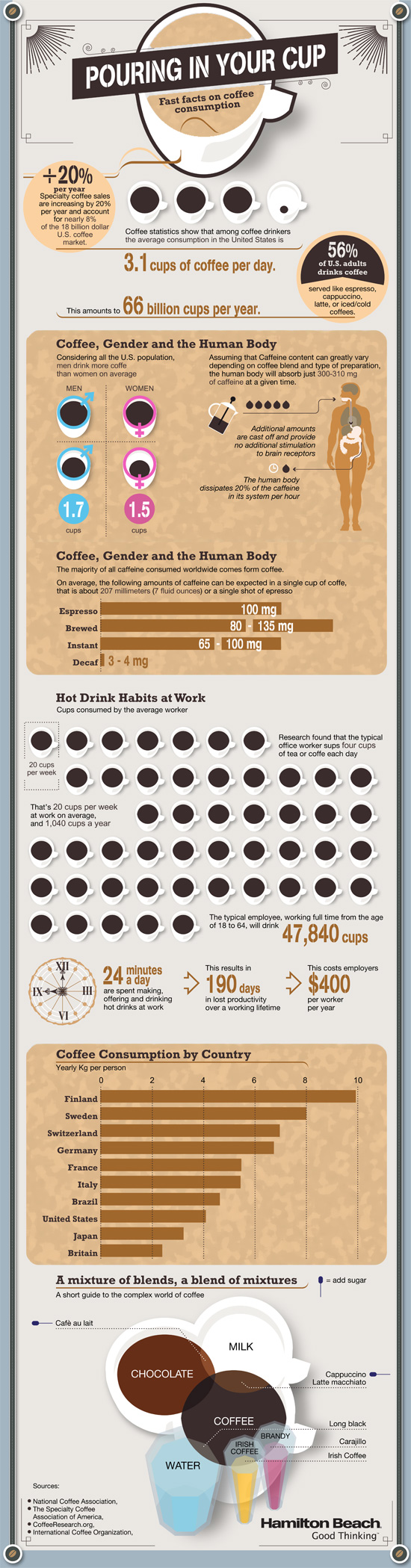
This is a good example of a company publishing an informative, marketing infographic about a topic related to their products (coffee makers), without feeling like a sales pitch or ad for their products. However, I don’t think there is a clear story told by the infographic. It’s generally a bunch of coffee and caffeine statistics put together in an infographic without a clear message.
I like the design and the simple color palette. Most of the visualizations are clear and easy to understand except the bunch of coffee cups lined up in the middle. I think each cup is supposed to represent the 20 cups/week the average office worker drinks, and all of the cups together is supposed to represent a year of coffee consumption. When you line up images like this, the rows really should have only 10 images each for the reader to easily understand the quantity. So, there should be 52 cups to represent the whole year, but there are only 48 cups shown.
There are a handful of stand-alone statistics that are just shown in text, that could have been visualized. The clock image shown next to the stats “24 minutes a day” should have had a highlighted portion showing 24 minutes. I like the male/female symbols used on the coffee cups, and the Venn-diagram style of coffee blends is great.
I’m going to go pour myself my third cup of coffee this morning…
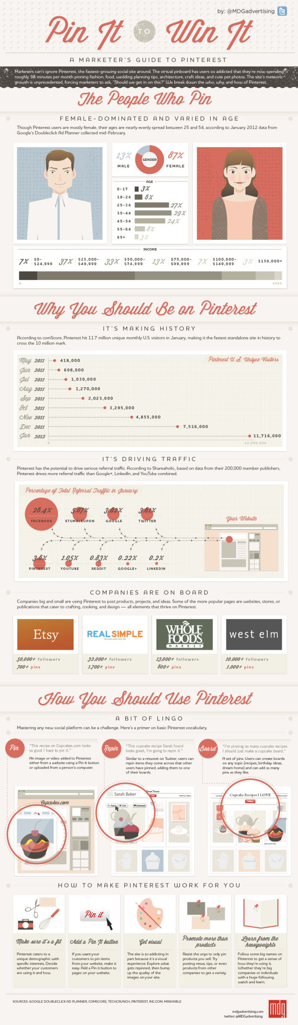
MDG Advertising has produced an engaging video highlighting the facts, figures, and findings from its popular “Pin It To Win It” infographic.
The video details the social site’s demographics, growth, and potential to drive abundant traffic to company websites. Pinterest is especially popular with the most highly coveted markets—about 60 percent are female and 80 percent are in the 25 to 54 age demographic. Plus, Pinterest drives more referral traffic than Google+, LinkedIn, and YouTube combined.
The video goes on to cover the brands, both large and small, on board the pinboard phenomenon, such as Whole Foods, Etsy, West Elm, and Real Simple. These companies reflect the cooking, décor, and crafts interests that are prevalent among the Pinterest audience.
In addition, the video helps marketers navigate Pinterest’s features and terminology by demonstrating the “pin,” “repinning,” and “board.” It also shows how companies can leverage Pinterest for maximum response and referral traffic, whether by improving their image quality or promoting more than just a product line.
Only a couple companies have begun to leverage the research and time put into developing a static infographic, by using that same data to produce an infographic video that reaches a whole new audience. It’s a very effective way to get the most out of the data research that was already done as part of designing the original infographic.
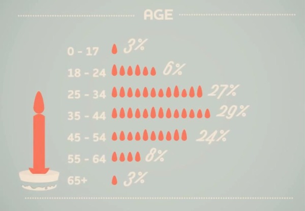
The most disappointing thing is that whoever did the video production got the data visualizations wrong. Since when is 6 six times as big as 3? And 27 only twice as big as 6?
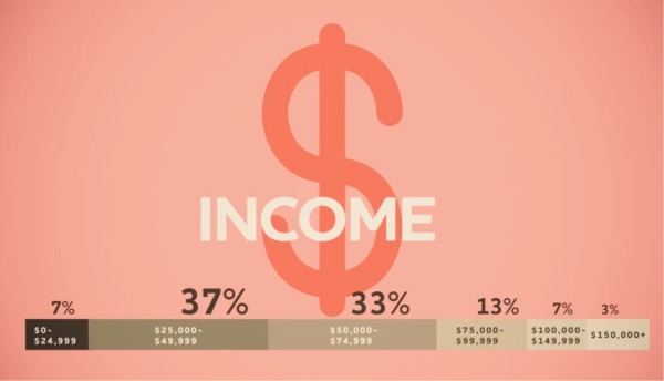
3% and 7% sections of the stacked bar can’t be the same size. In fact, 3% looks a little bit bigger to make room for the text.
Here’s the original static infographic, Pin It To Win It, where they got the data visualizations correct. I’m guessing that the infographic designer was not involved in the video production.
Did you know that 60% of Americans wear jeans to work? That the custom retail e-commerce market will grow by 5,000% by 2016? The INDi Unzipped infographic from INDi Denim fills us in on the jeans we fill out!
We make custom jeans for men and women that can be fully customized in terms of style and fit. We created the infographic to show that custom is a HUGE trend in the e-commerce space and that INDi is a leader of this trend.
This is essentially a visual business plan for INDi Denim. The infographic shows the data all about the jeans industry, the future growth of custom jeans and about INDi Denim in particular. I would guess that the primary audience for this one is the investors and customers of INDi, but that’s a fantastic use of an infographic design!
The only thing missing from the bottom of the design, is the URL to the full-size infographic on the INDi blog. Designers need to include the URL to the infographic so reader can find the original when the infographic gets shared, but isn’t linked back to the INDi page.
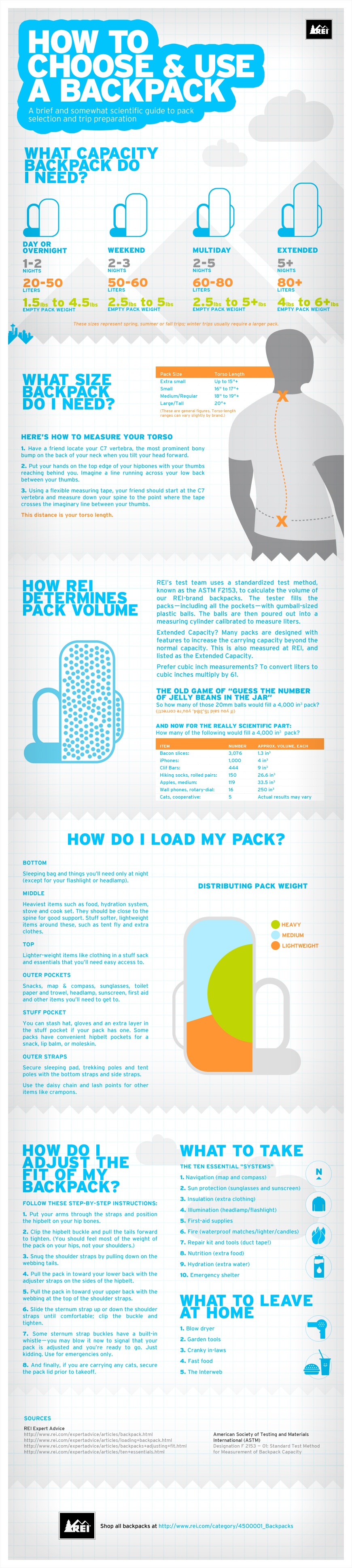
Everyone loves the great outdoors! Well… until something doesn’t go as planned… With the informative How to Choose & Use a Backpack infographic from REI, enjoying roughing it without having to, you know, rough it.
Need a break from the daily multitasking merry-go-round? Trade in your digital devices for boots and backpacks—they’re your ticket to off-the-grid adventures and the wonders of the backcountry! With the right pack and a little preparation, you can head out for a day hike or a through-hike and say “CUL8R” to the daily grind.
Many consumer products have an educational piece to them, and the challenge for a retailer is to educate their customers without feeling like a hard-sell ad. This infographic does a great job of educating and informing their audience without listing available products, brands or any pricing. It’s just purely informative, and adds to REI’s brand credibility.
The design is a little text-heavy for my taste, but it’s packed with information. Some of the data in the text of the design could also have been visualized to make it easier for the reader to comprehend. Weight ranges, lengths and the number of items that fit in the backpack would have been great visuals.
I don’t mind the URL link to the REI Backpack products page, but there should also be the URL to the original infographic landing page. When people share this online with their firends as an informative piece, they will want to share the infographic URL. There should also be a copyright statement at the bottom.
In March 2012, JP Rangaswami gave a short TEDTalk in Austin, TX, Information Is Food, about treating information similar to how we treat food.
How do we consume data? At TED@SXSWi, technologist JP Rangaswami muses on our relationship to information, and offers a surprising and sharp insight: we treat it like food.
With a background in economics and journalism, JP Rangaswami has been a technology innovator and chief information officer for many leading financial firms. As an advocate for open source and disruptive technologies, Rangaswami has been a leading force in the success of multiple startups, including School of Everything, Salesforce.com and Ribbit. He blogs (unmissably) at Confused of Calcutta.
This is an interesting concept, and was appealing to me because I talk about humans evolving into Informavores in my presentations about infographics and data visualization.
The analogy is that we have food consumption issues that cause health problems, and we can have information overload issues that can cause issues with understanding and our belief systems. I loved the quote from the presentation posing the question: “Are we going to reach the stage where information has a percentage of fact associated with it?”
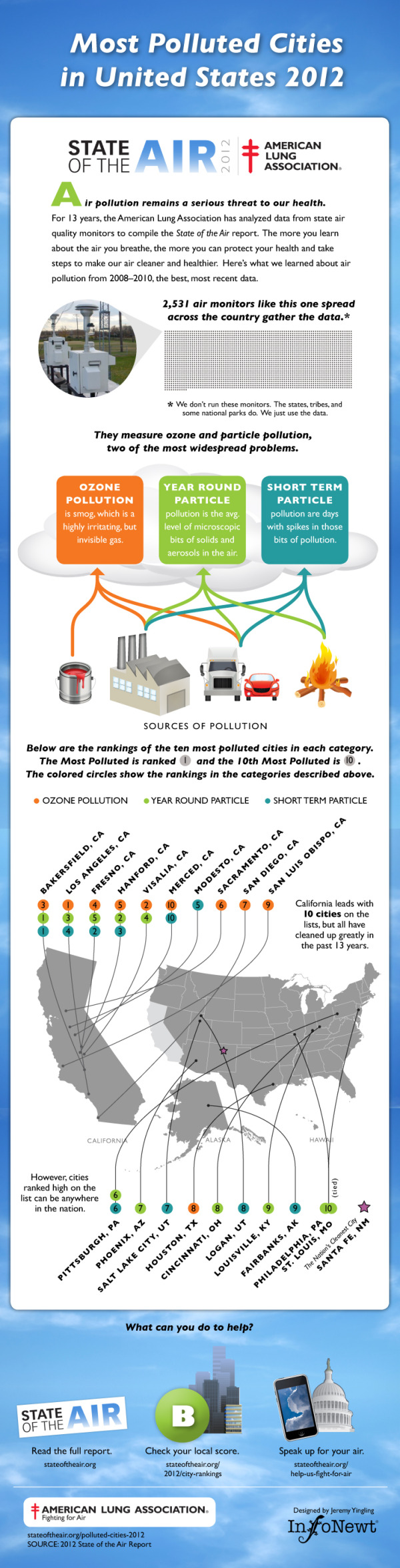
Air pollution remains a serious threat to our health.
For 13 years, the American Lung Association has analyzed data from state air quality monitors to compile the State of the Air report. The more you learn about the air you breathe, the more you can protect your health and take steps to make our air cleaner and healthier. Here’s what we learned about air pollution from 2008–2010, the best, most recent data.
InfoNewt, with designer Jeremy Yingling, helped the American Lung Association look through their data to pull out one clear story to use in the infographic design. The three-part story starts with an introduction to the problem (what is air pollution and how is it measured), the main visual shows the testing results from the three different types of air pollution on the map of the U.S. and ends with a call-to-action with what readers can do with this information.
The full 179-page report is available online here, but a big report with tables of data doesn’t convey a clear, understandable message to the general public. The use of an infographic to summarize one part of the report and put the data into context that even kids can understand is a very effective way for the American Lung Association to reach a much broader audience.
There is a lot more information contained in the report, but the key to success here was focusing on visualizing just one story (where is the worst air pollution?) very clearly.
Thanks to the team at the American Lung Association for being great to work with!


 Randy
Randy