About
Randy Krum
President of InfoNewt.
Data Visualization and Infographic Design

Infographic Design

Infographics Design | Presentations
Consulting | Data Visualizations

DFW DataViz Meetup

Join the DFW Data Visualization and Infographics Meetup Group if you're in the Dallas/Fort Worth area!

Search the Cool Infographics site

Custom Search

Subscriptions:


Feedburner

The Cool Infographics® Gallery:

How to add the
Cool Infographics button to your:

Cool Infographics iOS icon

- iPhone
- iPad
- iPod Touch


Read on Flipboard for iPad and iPhone

Featured in the Tech & Science category

Flipboard icon

Twitter Feed
From the Bookstore

Caffeine Poster

The Caffeine Poster infographic

Entries by Randy (1654)

Monday
Sep172007

Human Trafficking

Found on VisualComplexity.com, this disturbing poster examines global human trafficking.

"It depicts each country's level of involvement (from Very High to Very Low) as either a country of destination or origin. The project concentrates on the smuggling of people from one country to another - mainly illegally. In many cases these people are forced to do work that is illegal, such as prostitution or child labor."
The poster was created by Taulant Bushi, and the original image is here.

Sunday
Sep162007

The Elegant Universe


Following my earlier post on Imagining the Tenth Dimension, I found that NOVA has put the entire 3-hour show The Elegant Universe on their website.


The show is full of different visual methods to visual strings, gravity, the scale of particles and multiple dimensions. Brian Greene really did a fantastic job with this show based on his book on the same name.

Thursday
Sep132007

The Amazon System


How does Amazon turn your online book order into a physical shipment to your doorstep? One of a handful of great infographics from Ron Oden on the ronoden.com site.

Wednesday
Sep122007

searchCrystal

Check this one out! The graphic above is an embedded object from searchCrystal that lets you search multiple sources for images (or other forms of information). I've preloaded it to search for "inforgraphics" from GoogleImages, Flickr, AskImages, YahooImages and MSNImages. When you dig a little deeper, you can choose the different sources you are searching from, save searches, share results with others, etc.

The arrangement shows the overlap of the results from multiple sites. Simple navigation like scrolling over images enlarges them, and clicking takes you to the source image.

Also works for video, blogs, tags, news, etc...blah, blah, blah. We only care about images don't we?

Wednesday
Sep122007

Personal Pies


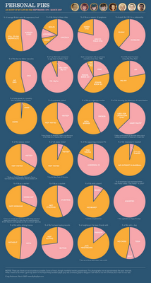
Craig Robinson from Flip Flop Flyin' charted his current existence with the use of pie charts in his Personal Pies project. Although amusing to look through, I think this demonstrates really well how shallow pie charts are, and how much information depth can be lost with charts.

Monday
Sep102007

The Bloomberg Makeover

Three design firms took on the challenge of re-designing the Bloomberg terminal interface, and the results were fantastic. The challenge came from Portfolio.com. The original article is here, but the fantasy terminals are here with an interactive interface that lets you highlight and zoom in on particular features. The design above is from thehappycorp.com and is my personal favorite.

Bloomberg claims to be constantly improving their interface design, but it still looks like runs on DOS and is straight out of the 80's.


Here is the desing from IDEO.com:


And one from Ziba.com:

Monday
Sep102007

Analytics according to Captain Kirk


This is fun one from Matt Bailey, founder of SiteLogic.com.

You can read his full description here, but the point is the use of images in the chart so you can visualize the relationship between separate pieces of information. Phasers represent fights in each episode, Kirk's photo represents affairs during the episode with Captain Kirk and the colored shirts show fatalities of an actor in that colored shirt in that particular episode. Proving once and for all that being a red-shirted ensign is a hazardous job on the Enterprise.

Sunday
Sep092007

The Wealthiest Americans Ever


From the NYTimes in July 2007, an interactive infographic ranking the Wealthiest Americans after you convert their fortunes to today's dollars using the relative share of G.D.P.

Scrolling your pointer over the photos or the fortune amount shows more detail of the individual. Lots of black & white portraits! Only current rich folk Bill Gates and Warren Buffet made the list with color portraits.

Friday
Sep072007

The Cosmic Calendar


This last December was the 10th anniversary of Carl Sagan's death. One of his most popular episodes of Cosmos was titled The Dragons of Eden where he first described his Cosmic Calendar. This website from discovery.com has a simple image showing the Cosmic Calendar as Carl described it. A few websites are selling posters of the Cosmic Calendar, like AllPosters.com.

The premise is that if you compress the entire history of the universe into a calendar year, homo sapiens only exist in the last 6 minutes, and the last second represents the last 400+ years of human history.

You can see Cosmos, and hear Carl describe it on YouTube here:

Thursday
Sep062007

Running the Numbers


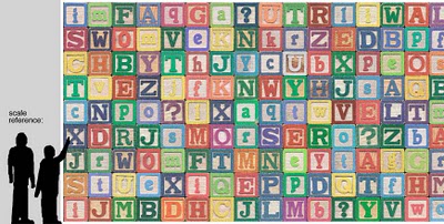
Chris Jordan has created some fantastic photographic artwork depicting the massive scale of some statistics about American life. This is where infographics actually become artwork.

The image above "Depicts nine million wooden ABC blocks, equal to the number of American children with no health insurance coverage in 2007." The complete image is 16 feet tall x 32 feet wide.

There are 17 different images available to view on his website. You can see the images magnified there to show the small pieces that each image is made from. Each image is based on an actual statistic about American life.

FYI: This series will be exhibited at the Paul Kopeikin Gallery in Los Angeles, opening Sep 8. More info at www.paulkopeikingallery.com.