About
Randy Krum
President of InfoNewt.
Data Visualization and Infographic Design

Infographic Design

Infographics Design | Presentations
Consulting | Data Visualizations

DFW DataViz Meetup

Join the DFW Data Visualization and Infographics Meetup Group if you're in the Dallas/Fort Worth area!

Search the Cool Infographics site

Custom Search

Subscriptions:


Feedburner

The Cool Infographics® Gallery:

How to add the
Cool Infographics button to your:

Cool Infographics iOS icon

- iPhone
- iPad
- iPod Touch


Read on Flipboard for iPad and iPhone

Featured in the Tech & Science category

Flipboard icon

Twitter Feed
From the Bookstore

Caffeine Poster

The Caffeine Poster infographic

Entries by Randy (1654)

Wednesday
Sep052007

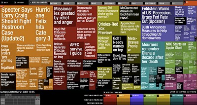
Marumushi News Map


Marumushi.com has a fantastic News Map using the treemap visualization style. This is one of the best implementations of a treemap that I have found. Updated every 6 hours, it groups news stories (from the Google news aggregator) by overall category (technology, world, sports, etc.). You can choose to show the news map from 11 different countries, and the color shading of each block represents how old that particular news story is. Hovering your mouse over any square shows the whole title, and clicking takes you directly to the story.

Tuesday
Sep042007

Microsoft Car HUD


Found on arstechnica.com, this one has me really excited. I have been disappointed for at least two decades that real HUDs (Heads-Up Displays) have not become standard, or even available as a third party product for our cars. Now a US patent application from Microsoft has been published showing a possible future HUD for your car.

More than just your speed, with today's technology we should have things like incoming caller-id, compass direction, outside temperature, current playing music title, live GPS map and distance to the car in front of us showing around the edges of our windshields.

We can only cross our fingers and hope that this would some day become a reality.

Monday
Sep032007

VizThink Conference 2008


Early registration to the VizThink 2008 conference will end on September 15th. The conference is in San Francisco Jan 27-29. I won't be able to attend, but I hear that this is a great conference for people who make a living creating visual presentations, infographics, brainstorming sketches, etc.

Out friend David Gray from XPLANE is one of the conference facilitators (speakers).

A big THANKS to the folks at VizThink for adding a link to Cool Infographics on their VizThink Blog!

Sunday
Sep022007

World Population Density


This is a prime example of how seeing the data visually is better than reading numbers. Here is a population density map from Wikipedia.

We have heard that China and India have most of the human population in the world, but here you can really see and understand how much. Reading that China's population is four times that of the U.S. is much harder than really seeing it on a map.

The Wikipedia page on World Population has some other great information too.

Sunday
Sep022007

World Clock Counter


You've seen these counters on highway billboards and other websites before. The World Clock from poodwaddle.com combines many of these counters together into one dashboard.

I've added a smaller version to the bottom of the right pane here on on the blog.

Sunday
Sep022007

Visual Tire Pressure


Infographics don't have to be complicated. This is a very simple, real-world example of an infographic system to monitor the tire pressure on your car called Accu-Pressure Caps. A set of four gauges screw onto your tire's valve stems, and the air pressure pushes the green indicator completely out. As tire pressure begins to drop, so does the green indicator revealing a yellow indicator, and ultimately the red indicator. The key here is to buy the set of caps to match the tire pressure you want to maintain on your car.

An alternative is from aviationupgrade.com, which is a battery operated version. These always start with the tire pressure when you screw them on, and when the pressure drops by 4psi the LED light on the end starts blinking to get your attention.

Thursday
Aug302007

What does 16 Million colors look like?


From David Naylor's blog, a color map that includes all 16.8 million RGB colors.

Thursday
Aug302007

Katrina's Blame Game


Following the Katrina Diaspora graphic, here's another one related to Hurricane Katrina that maps the blame from different key figures and celebrities. I found this on mylifestream.net and originally from nytimes.com in October 2005.

Tuesday
Aug282007

A Day of Diggs


This one is really interesting. Stamen Design took one day of digg.com and visualized the user activity. The explanation is really cool, and can be found here on content.stamen.com. Stamen works with Digg on a number of the tools available in Digg Labs.

Red dots represent people that have been on Digg for a while, yellow is a good mix, and blue is new users. So when a story is predominantly blue, it represents a story that is attracting a bunch of new users to Digg.

Monday
Aug272007

Katrina's Diaspora

Originally from the nytimes.com in October 2005, I found this map graphic on mylifestream.net. This shows the geographic distribution of applications to FEMA for aid from Katrina victims. Presumably, that means the application locations imply where displaced Louisiana residents moved to.