About
Randy Krum
President of InfoNewt.
Data Visualization and Infographic Design

Infographic Design

Infographics Design | Presentations
Consulting | Data Visualizations

DFW DataViz Meetup

Join the DFW Data Visualization and Infographics Meetup Group if you're in the Dallas/Fort Worth area!

Search the Cool Infographics site

Custom Search

Subscriptions:


Feedburner

The Cool Infographics® Gallery:

How to add the
Cool Infographics button to your:

Cool Infographics iOS icon

- iPhone
- iPad
- iPod Touch


Read on Flipboard for iPad and iPhone

Featured in the Tech & Science category

Flipboard icon

Twitter Feed
From the Bookstore

Caffeine Poster

The Caffeine Poster infographic

Entries in apple (56)

Monday
Feb142011

The (visual) Anatomy of an Apple Email


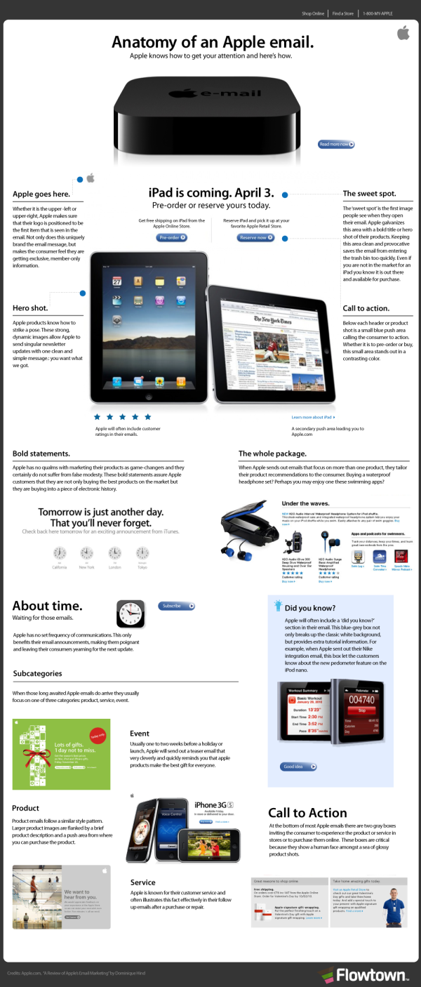
You know how unique Apple emails are when they show up in your Inbox.  The Anatomy of an Apple Email, from Flowtown, does a great job of visually explaining the layout and elements in an infographic with the look and feel of an Apple email.

The emails sent by Apple to consumers are riddled with trademark characteristics, including multiple ‘Calls To Action,’ as well as the beloved ‘Hero Shot.’ Here is a breakdown of each of these characteristics and a summary of their general purpose.

Found on Social Media Graphics

Monday
Dec202010

The History of Apple’s iPod: An Infographic


From DigitalSurgeons comes The History of Apple’s iPod, an infographic timeline.  This one has been sitting in my submissions inbox for months, and I’m only now getting around to posing it (sorry guys).

I specifically like the multiple levels of information included.  Of course you can see images of the iPods that were released every year, but surrounding that is some of the information that was shared by Apple about the iTunes business, how many iPods were sold, how many songs were sold, when new services were offered (like HD video) and more recently things like apps and Ping.

Nice job guys!

Wednesday
Sep292010

The World Without Apple


The World Without Apple, from Infographic Labs is a great design.  The main feature combines the history of Apple’s products in a timeline with its stock prices and new product introduction prices.  Also included are some statistics about the app store and all of the different aspects to Apple’s business.

The AppleGazette team asked us to analyse the complete product timeline and stock value of the Cupertino based company. The result is another stunning graphic, first published at AppleGazette.


Thursday
Jul292010

Apple iPhone Statistics 2010 infographic video

The Apple iPhone Statistics 2010 infographic video by Creative Licence Digital (an iPhone app development firm) takes a look at the numbers behind the iPhone phenomenon.

I pose this question to my readers: Is this infographics?  I think it walks a fine line between being artistic and infographic.  While a lot of numbers are shown and communicated to the viewers, they aren’t represented in any graphic form, just text.  What do you think?

Thanks to Darren for sending in the link.

Friday
Jun182010

iPad Meets the Competition (infographic)

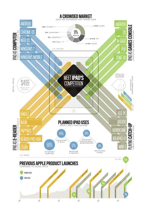
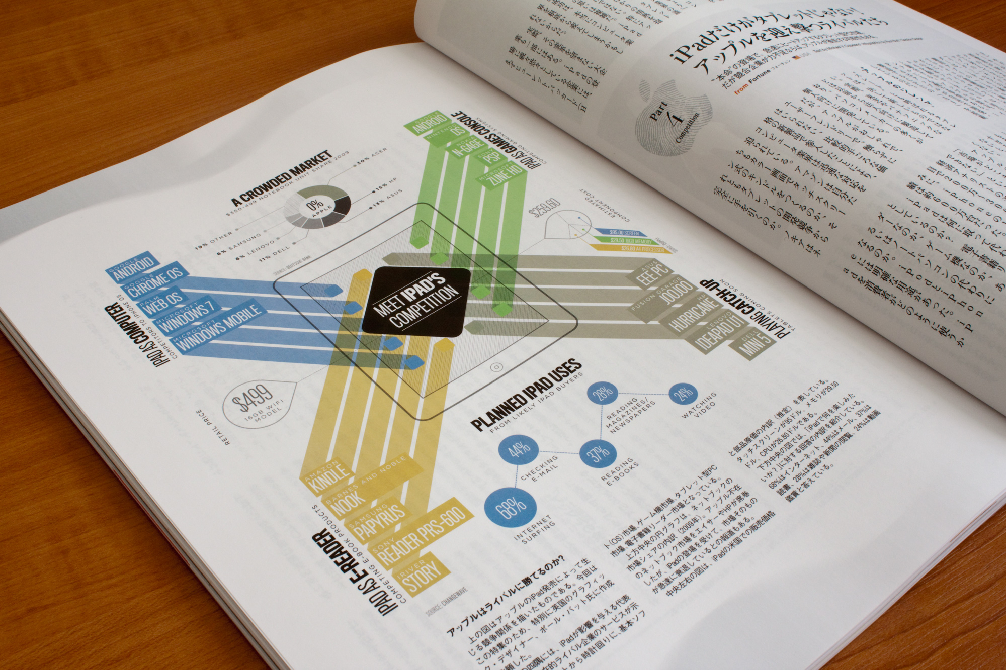
From SectionDesign, iPad Meets the Competition is great design that looks at the products in the market that will compete with the iPad in four different product categories.

This infographic was commissioned by Courrier Japon Magazine in Tokyo and is based on the article “The iPad Changes Everything” originally published by Fortune Magazine. It was printed in the July 2010 Issue.

It illustrates the introduction of the iPad and how many devices in different markets are now finding themselves in direction competion to the power of the iPad and the Apps Store. All data was researched by myself, and the graphic was later split onto two pages to better fit the flow of the article.


Found on FlowingData.com

Wednesday
Jun092010

iPhone 3GS vs. iPhone 4 infographic


From the iPhone team at Mahalo, the iPhone 4 vs. iPhone 3G infographic does a good job covering the bases on what’s new about the new iPhone.  But Jason Calacanis asked at the end of the post “any ideas of how to improve?”  So I offer my infographic suggestions:

  1. Visualize the data accurately.  It the battery section the bars shown are 8 bars for 5 hours and 12 bars for 7 hours.  Based on that scale, the 7 hours should only be 11.2 bars. Matching the numbers exactly with 5 and 7 bards would be easier for the readers to comprehend. The small bar chart in between is redundant.
  2. Do something to visualize the increase in processor speed and RAM.  Don’t just list numbers.
  3. Do something to visualize the megapixels of the camera, don’t just list the numbers.  A square showing the area covered by each resolution would be good.
  4. Same with the screen resolution, do something to visualize how many more pixels or on the display
  5. The 24% thinner looks like an after thought, make size and dimensions its own category
  6. Don’t show 8GB, 16GB and 32GB memory cards all the same size.  Visualize the differences.

 What would you suggest as improvements?

Thursday
Jun032010

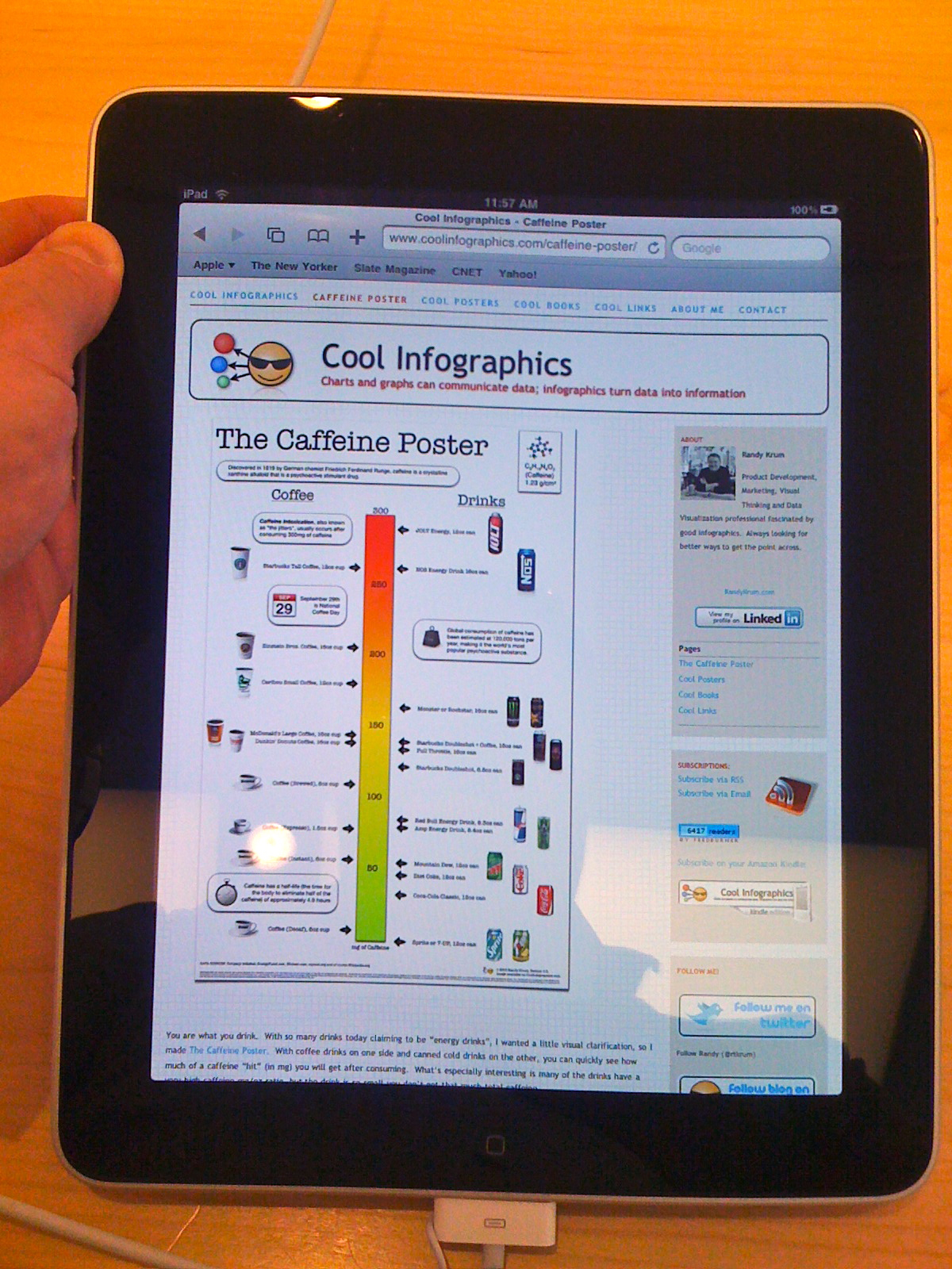
Cool Infographics on an iPad at the Apple Store

At the Southlake Apple Store

I was at the Southlake Apple Store today because the battery in my Black MacBook was dying.  In fact, it was swelling up, getting extremely hot and randomly shutting the MacBook down.  That was a problem.  The laptop is 3 1/2 years old, which it puts it 2 years beyond the AppleCare warranty, so I had to buy a new battery.  The Apple genius told me that usually this type of battery last 260 cycles, and mine had lasted 484 cycles.  Not bad.

While I was there, I had to play with one of the new iPads, and of course had to make sure that Cool Infographics was displaying correctly.  Not only was it displaying correctly, but the display on the iPad makes the blog look amazing!

Here’s how to setup an icon on your iPad, iPhone or iPod Touch for the Cool Infographics blog: (screen shots from my iPhone)
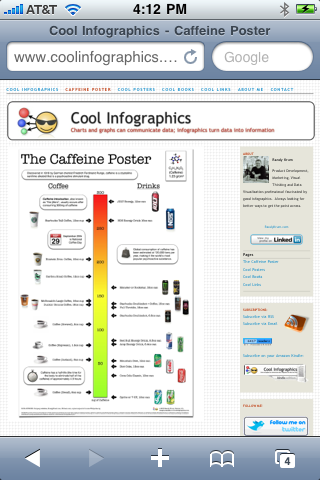
 

Step 1:

View CoolInfographics.com in the Safari app and press the “+” icon at the bottom of the screen.
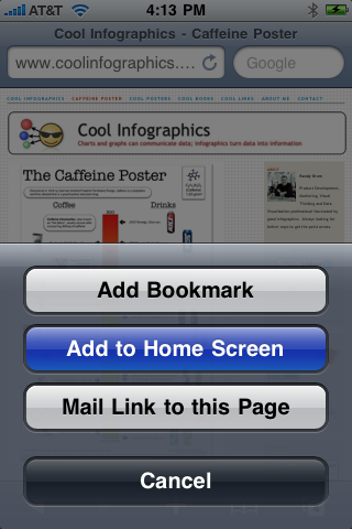


Step 2:

Press the “Add to Home Screen” button.
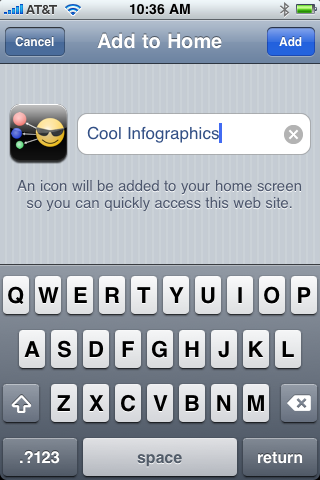


Step 3:

Edit the name you want to display, and press “Add”.  (The icon is loaded automatically)
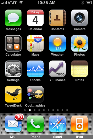


That’s it!  You can move the icon to any of your screens, and always have easy access to the Cool Infographics blog.


Monday
May102010

Apple, Adobe Flash and H.264 - an infographic explanation

Enrique Serrano (@eserranocom) designed this tall banner-style infographic, Apple, Flash and H.264, to help explain the conflict between Apple and Adobe Flash.  There’s a lot of history between these two mega-companies, and even after Apple posted Steve Job’s Thoughts on Flash, it’s still not easy to understand what’s going on.

Since so much has been said about not having Flash support in the devices of Apple(mainly the Apple iPhone and the iPad) I put together as much facts as possible about Apple, Adobe, the iPhone and Flash, plus some on video codecs including Theora, H.264 and HTML 5 video.

I hope these infographics help you better understand the big picture with the current situation of these technologies and companies.

Mixing a timeline, bar charts, 100 circles, a couple pie charts and some illustrations, Enrique does a good job of covering most of the angles between Apple and Adobe.

Originally posted on Treble Click, found on Social Media Graphics.

Thursday
May062010

Fanboys: A Visual Field Guide

From PCWorld.com, the Visual Field Guide to Fanboys is a humorous look at techie fanboys of all types.

What is a fanboy? Here’s one definition from the Urban Dictionary: “A passionate fan of various elements of geek culture (e.g. sci-fi, comics, Star Wars, video games, anime, hobbits, Magic the Gathering, etc.), but who lets his passion override social graces.”

For each one we give you 14 key attributes, such as what sort of clothing they wear, what they drink, what they drive, what turns them on, and what enrages them. We give you just enough to differentiate between species quickly and accurately.

Link found on Chemicalism

Tuesday
Apr272010

The Apple Field Guide

Our friends at Column Five Media created this humorous Apple Field Guide for Fast Company.

The question isn’t, “Do you use Apple devices,” but “Which one?” And “Where?” Here’s a cut-out-and-keep cheat sheet.