About
Randy Krum
President of InfoNewt.
Data Visualization and Infographic Design

Infographic Design

Infographics Design | Presentations
Consulting | Data Visualizations

DFW DataViz Meetup

Join the DFW Data Visualization and Infographics Meetup Group if you're in the Dallas/Fort Worth area!

Search the Cool Infographics site

Custom Search

Subscriptions:


Feedburner

The Cool Infographics® Gallery:

How to add the
Cool Infographics button to your:

Cool Infographics iOS icon

- iPhone
- iPad
- iPod Touch


Read on Flipboard for iPad and iPhone

Featured in the Tech & Science category

Flipboard icon

Twitter Feed
From the Bookstore

Caffeine Poster

The Caffeine Poster infographic

Entries in apple (56)

Monday
Oct172011

Animated History of the iPhone

CNET UK brings us this infographic video, The Animated History of the iPhone.  I love this style of animated, infographic video, and they did a great job with this one.  Some of the data goes by quickly, but that just means you’ll have to watch it again.

What’s better than an infographic? A video infographic, that’s what. In anticipation of the announcement of the iPhone 5, currently tipped to be on 4 October, we’ve made a gorgeous animated video charting the history of the iPhone. (Editor’s note: this turned out to be the iPhone 4S, so have a look at our preview while you’re here)

We’ve divided the iPhone into its component parts and charted how the technological and design developments of the past few decades have influenced the look, feel and features of the different models so far. If you want to know what connects the Walkman to Tim Berners-Lee to the NeXTcube, you’ve come to the right place.

We’ve seen previous, popular videos in this design style (like the music video to Remind Me by Royksopp and the Little Red Riding Hood project).  In fact the brief image of the world map in the iPhone video looks like the same illustration as the Royksopp video.  It just highlights California instead of the UK.  If you’re going to be inspired by an infographic video, they picked one of my favorites.

Found posted on Facebook by Griffin Technologies.

Also now available on YouTube:

Monday
Sep262011

App Store Wars infographic


The App Store Wars infographic comes to us from WebpageFX.com and shows us a comparison between smartphone app stores available today.

We compared the Apple App Store, Android Market, Blackberry App World, and the Nokia, Palm and Windows Phone 7 application directories. Statistics include OS distribution, percentage of paid vs. free apps in each directory, average apps downloaded by device, average app cost, and total 2010 revenue from all apps sold.

A couple things I like and don’t like about thius design.  Of course, I like the Star Wars reference in the design, and the timeline is simple and easy to comprehend. 

I like the appropriate phone icons lined up to show the Smartphone Distribution, but it’s hard for the reader to understand when you line them up 18 across.  We all think in base-10, so they should be 10 across, or even 20 if you want to make it that wide.  Not 18.

I do think they missed a number of opportunities to visualize the comparisons when they only used numbers.  Big numbers don’t qualify as a data visualization in a good infographic.  How many apps used per phone?  Average price paid per app on each phone platform?  The total 2010 Mobile App Revunue comparisons to provide scale are lost without visualizations.

Thanks to Trevin for sending in the link.  Also found on MacTrast!


Wednesday
Sep072011

10 Infographics and Visualization Apps for iOS

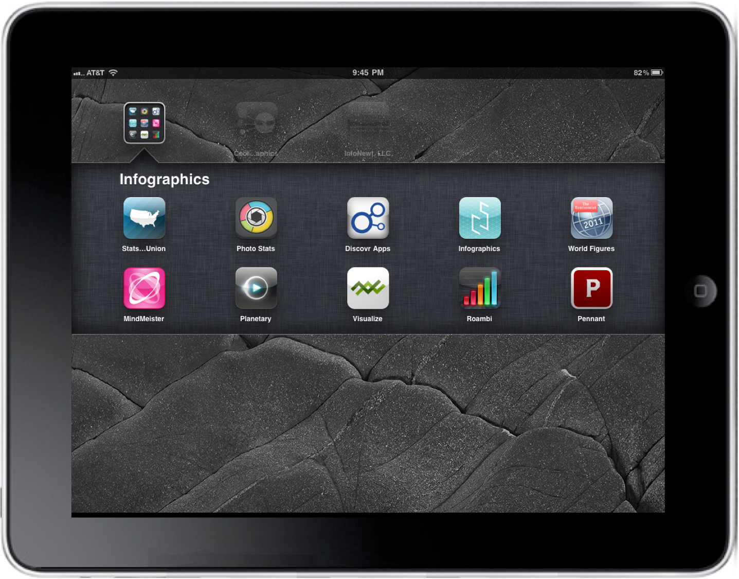
As infographics continue to evolve and grow in popularity, so do the different ways we can view them.  A bunch of infographic specific apps have begun showing up on mobile devices. The functions of these apps include viewing world statistics, infographic design portfolios, company dashboards, creating mind maps, finding new apps and exploring your music collection visually.

Today we look at 10 Infographic Apps for iOS devices (in no particular order):


1. Stats of the Union  (FREE)

(iPad ONLY)

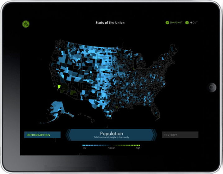
Stats of the Union is a data visualization app from Ben Fry, Fathom Information Design and GE.  Summarizing the census data by county, you can easily explore Births, Deaths, Diseases, Demographics, etc.

Explore the nation’s vital signsโ€•from life expectancy to access to medical careโ€•and make your own conclusions about America’s health. See a stat you’d like to share? Save it as a snapshot.

Stats of the Union is powered by the Community Health Status Indicators (CHSI) report, which consists of data from federal agencies including the Census Bureau, Department of Health & Human Services, Department of Labor and the Environmental Protection Agency.


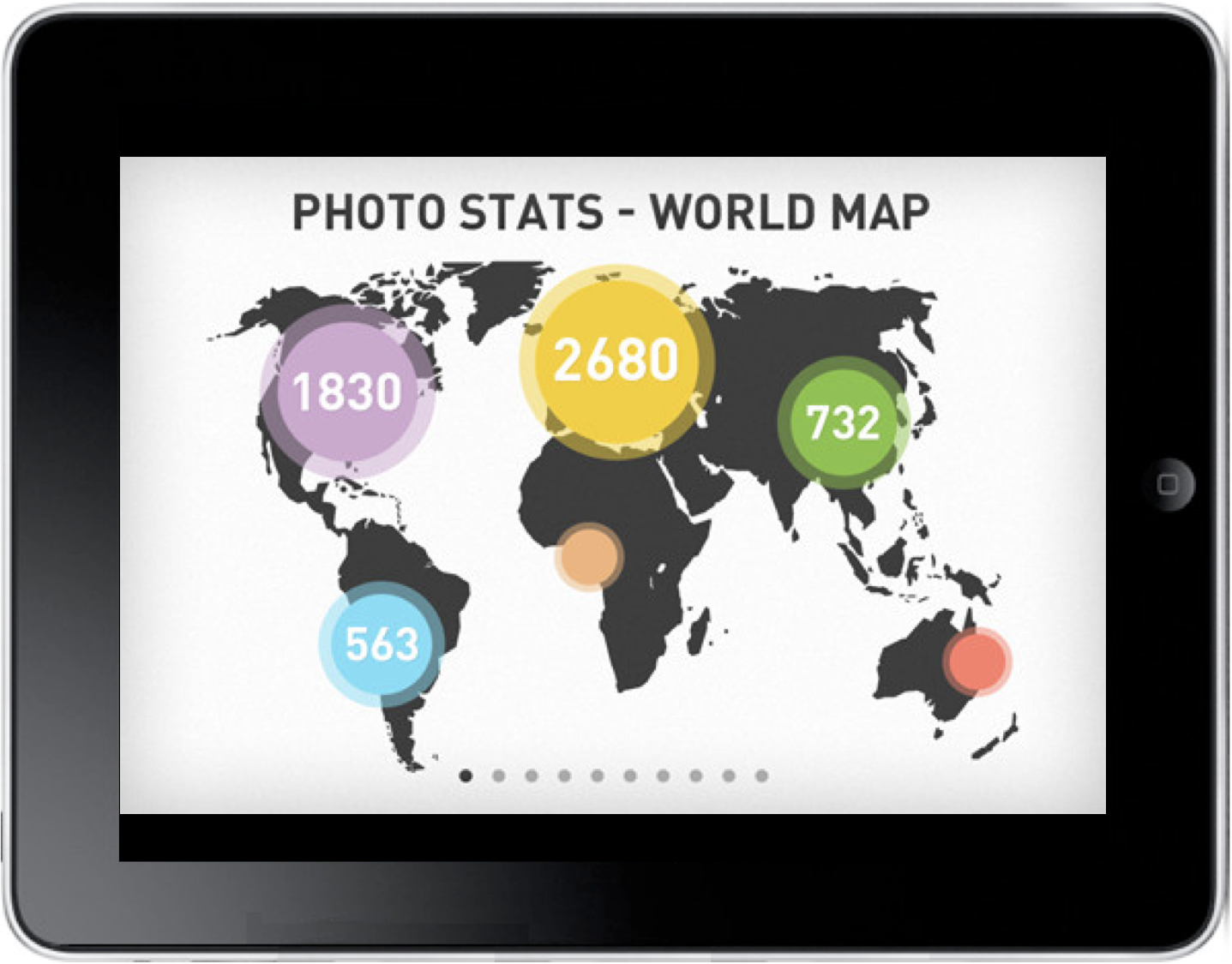
2. Photo Stats ($0.99)

(iPhone, iPad and iPod Touch)

A very cool app from Dear Future Astronaut AB.  The Photo Stats app analyzes all of the photos on your iDevice and creates 11 different personal visualizations using the meta data of the photos.  Then, with the click of a button, it will combine these data visualizations into one cohesive infographic that you can save or post directly to Facebook or Twitter.

Create cool infographics about how, when and where you take photos on iPhone. Visualize your iPhoneography habits, learn how to make better photos and show off photo skills to your friends.


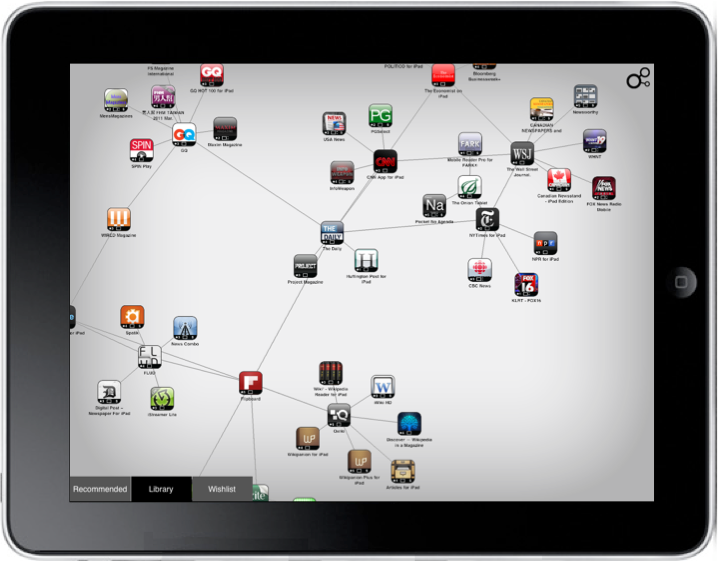
3. Discovr Apps ($0.99)

(iPhone, iPad and iPod Touch)

Discovr Apps is a great, interactive mind map of related iOS apps, and works as a discovery tool to find new apps.  Starting with one of your exisiting apps, the recommended apps or using the search, the app shows you related apps.  Tap any of the to expand the related apps, and continue to explore deeper into any app displayed on the screen.

The author, Jammbox, has applied this same exploration user interface to Music with Discovr Music ($1.99) to find similar music and artists.

Simply search for an app that you like or choose from one of our featured apps. We’ll show you how the apps you choose are connected in a massive, never-ending map of the App Store, and we’ll give you great recommendations for other apps to download. 

When you find an app you like you can read the app descriptions, check out the screenshots and ratings, or buy it directly from the App Store. You can also share your favorite apps and maps with your friends via Twitter, Facebook or email.


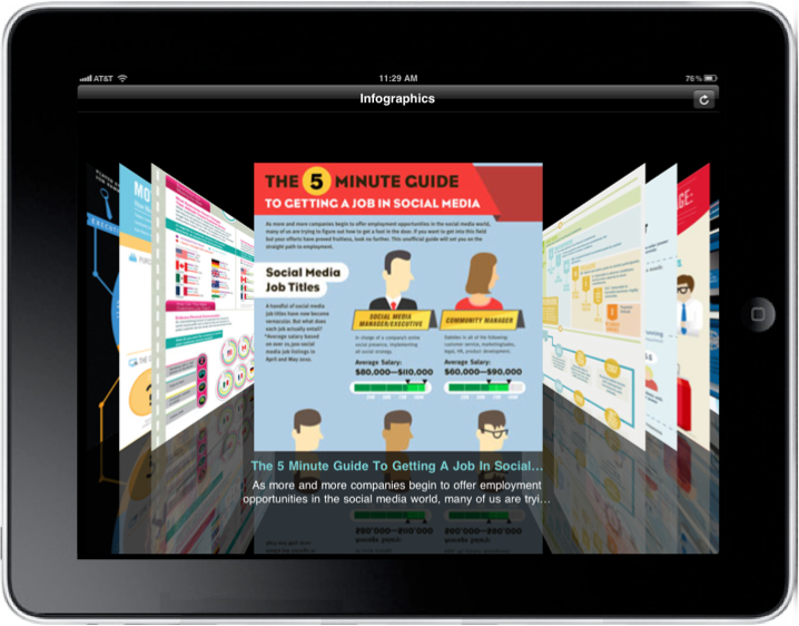
4. Infographics, by Column Five Media (FREE)

(iPhone, iPad and iPod Touch)

From the infographic design firm, Column Five Media, the Infographics app is a visual portfolio showcasing many of their designs.  I love the coverflow mode when you view the list in landscape.

We have really appreciated everyone who is staying connected through our Infographics newsletter, and we are happy to bring fresh infographics to you for the iPad and iPhone with our brand new Infographics app, which you can download for free. If you have a chance to check it out on an iPad, that is definitely the way to go for the best browsing experience, but the iPhone version will give you some mobile eye candy as well. This is version 1.0 and there are a lot of new features in the works along with a version for Droid coming soon.


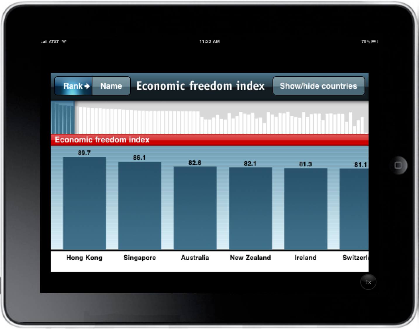
5. The Economist World in Figures 2011 Edition ($0.99)

(iPhone, iPad and iPod Touch)

From a collaboration between The Economist and XPLANE | Dachis Group, comes The World in Figures 2011 Edition.  This app lets the user view global data and compare world statistics between countries.

“The process definitely challenged our designers, making us consider new ways to enhance functionality around how data was being presented, while also fostering intuitive interaction between the user and the application,” said Parker Lee, executive vice president, global account services, Dachis Group. “The end result really does put a new face on information.”


6. MindMeister for iPad ($7.99) or MindMeister for iPhone (FREE)

(iPhone, iPad and iPod Touch)

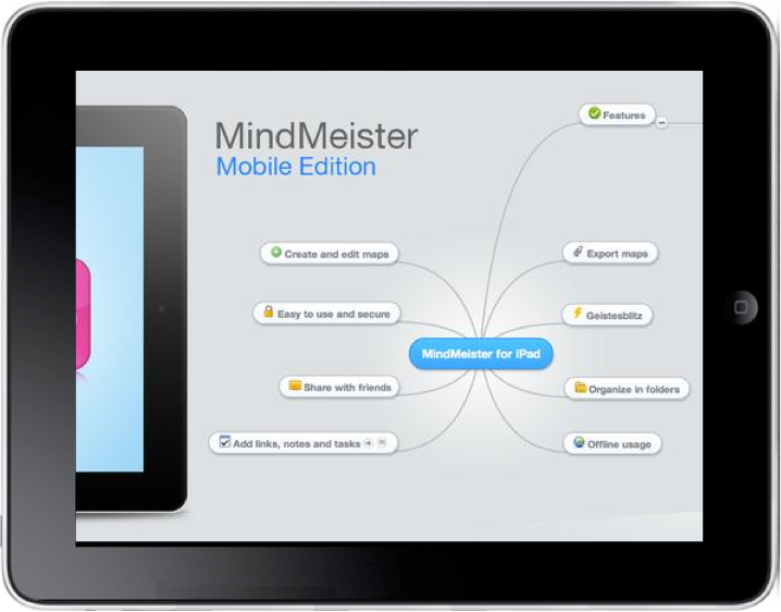
MindMeister started as an online mind mapping service that allows you to build, collaborate and share mind maps online.  With the iOS apps you can access your online maps and edit them from your mobile device.  Works with a free MindMeister account, but more features are available to members of MindMeisterPro.

Easily create, view and edit conceptual mind maps from this intuitive app, and then share them with friends and colleagues online. Automatic synchronization with the online MindMeister service ensures that your creations are with you wherever you go. This sync allows you to continue working on your ideas in our award-winning and full-featured web interface, on your own or together with your friends.


 7. Planetary (FREE)

(iPad ONLY)

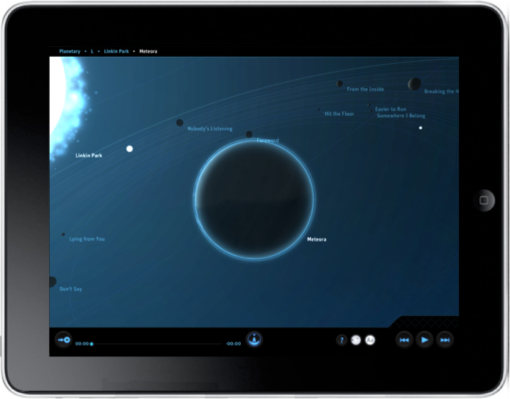
Planetary is a very cool app that visualizes your entire music library (as loaded on your iPad) as a galaxy.  Stars are artist, planets are albums and moon are individual tracks.  You can playback the tracks from the app, so it also makes a good visualizer.  They even did the calculations to base each moon’s speed on it’s track length, so when you play a song it lasts one complete orbit.  There a lot more behind the scenes information on the Bloom Blog.

Planetary is an all-new, stunningly beautiful way to explore your music collection, available only on iPad. Fly through a 3D universe dynamically created by information about the recording artists you love. Visit planets that represent your favorite albums and control the playback of your music on iPad by browsing and selecting astronomical objects.


8. Adobe SiteCatalyst Visualize (FREE*)

(iPad ONLY)

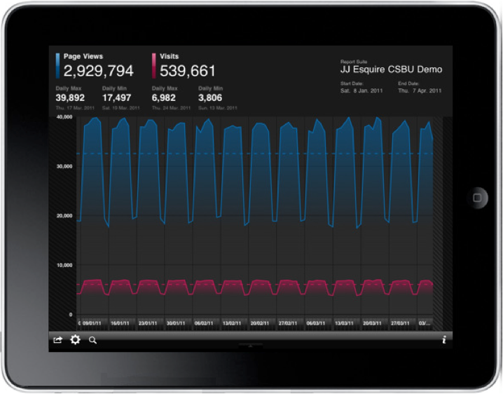
This only works if you are an existing Adobe SiteCatalyst customer (which isn’t free), but if you are, the Adobe SiteCatalyst Visualize app will allow you to explore your web stats in a handful of different, visual ways.

Adobe SiteCatalyst Visualize enables active data exploration via trend analysis of key metrics. Business analysts and marketers can use “multi-touch” capabilities to zoom and focus on specific data points within the last 90 days. In addition, using a visual “word cloud” of the most frequently selected metrics, marketers can easily add or change metrics to customize the presentation of data. Finally, marketers can easily share the analysis by sending report views via email or connecting to an external display for presentations.

*Please Note: You must be an existing Adobe SiteCatalyst customer with valid login privileges to use the application.


9. Roambi - Visualize (FREE)

(iPhone, iPad and iPod Touch)

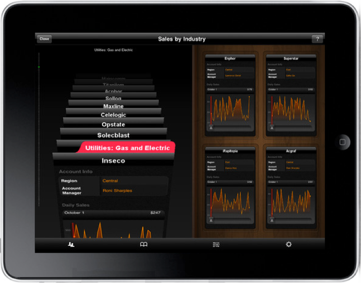
Roambi - Visualize is a mobile dashboard app that lets you explore different business reports and data visualizations.  You can view data from Microsoft Excel or CSV/HTML data sources for free, or there are a couple paid levels of the Roambi Publishing Service that offer many more data source options.

Roambi is an innovative app that quickly transforms your business reports and data – from many popular business applications – into secure, interactive mobile dashboards, instantly delivered to any iPhone or iPad. It lets you easily view and interact with up-to-the-minute company information – giving you the insight you need for on-the-go analysis, impromptu presentations and smart decision-making. Roambi puts the pulse of your business, in the palm of your hand.


 10. Pennant ($4.99)

(iPad ONLY)

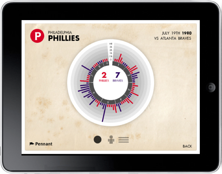
Pennant is a beautiful app that visualizes over 50 years of baseball history (from 1952-2010) with some beautiful visual designs.

Pennant is an interactive history of baseball like none other seen before. Using Pennant’s rich interface fans can browse and view data from over 115,000 games that have taken place from 1952 to 2010. For more info as well as a video preview please visit http://www.pennant.cc
 

Did I miss any that I should include in a future post?  This is absolutely only the beginning, so expect to see more in the future.

Thursday
Aug182011

The Power of Data Visualization: iPhone Tracking

Inofrmation is power.  Data visualization has the power to change the world!  Change our habits, our laws, our business strategies and what we understand about the world around us.  Our understanding of data forms the foundation of how we make choices, form opinions, and at least one study claims that up to 80% of the human brain is wired just to interpret and remember visual data.

Anyone reading this blog has a basic understanding that data visualization makes things easier to understand.  It puts data into context and allows the viewer to see large data sets summarized in a much smaller space.  I’ve avoided updating to the latest iOS on my iPhone until I could put together this post since it’s such a great example of how visualizing data turns it into information that people can use.

Earlier this year, Alasdair Allan and Pete Warden announced at the Where 2.0 conference that Apple’s iPhones were tracking all of your location data in an open, accessbile file on your computer.  ALL of the location data since the phone was first turned on, which could be years of data.  Heavily covered by the press, you can see their announcement here.  The reason I bring this up on Cool Infographics, is that I believe the visualization itself is what caused this to become a major media event sometimes referred to as “Locationgate.”

Some industry and forensic experts knew about this data already, and many others had tried to to make the public aware of it without any success.  Just telling people that your cell phone is storing location data doesn’t make it real and personal enogh to get the press and the public to care.  In fact, there have been other stories that Google’s Android and Microsoft’s Windows Phone 7 also gather this tracking data, but only Apple’s data was turned into a visualization and captured attention.

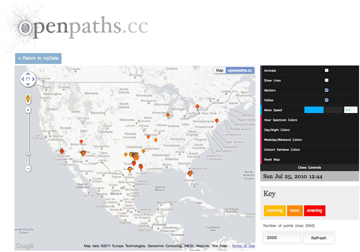
Alasdair and Pete wrote a simple application that anyone could download and use to see their own location data visualized on a map.  This not only made the story more understandable but it made it personal because I could see my own data.

We’d been discussing doing a visualization of mobile data, and while he was researching into what was available, Alasdair discovered this file. At first we weren’t sure how much data was there, but after we dug further and visualized the extracted data, it became clear that there was a scary amount of detail on our movements. It also became obvious that at least some other people knew about it, but it wasn’t being publicized.

iPhoneTracker is an open-source project that visualizes the location data that your iOS device is recording.

Created by Alasdair Allan and Pete Warden using the OpenStreetMap and OpenHeatMap frameworks.


As you can see above, they were even nice with data, and aggregated it into a simple grid that isn’t the actual GPS locations or location of the cell towers.  (This shows my trip to DisneyWorld in Florida)  The size of the circles shows the frequency of data points within that specific location.  So the visual shows an approximate location, but the actual data file on the iPhone was much more detailed.  Of course, the application was open source, so others started playing with the code and created much more detailed versions of the software.  Here’s that same data using the Creepy Edition of iPhoneTracker:


I believe that this use of data visualization to communicate the story was the primary factor that caused a media furor, lawsuits, press releases, interviews, government hearings and proposals to change our laws.

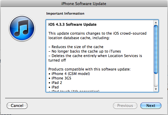
Apple posted an official press release responding to all of the attention and released a software update that deletes most of the historical data.  Sadly, the next time I update my iPhone, the historical data will all be erased.  Personally, I wish I had the option to continue to gather my own data because I’m into this sort of thing.  This file is now also encrypted if you turn on “Encrypt iPhone Backup” so it’s no longer easily accessible.


What’s the point?  Data visualization can be used to make your information relevant to your audience and get their attention.  Don’t just tell people your story, show them.


Friday
Jul222011

35 Years of Apple Products - Visual History

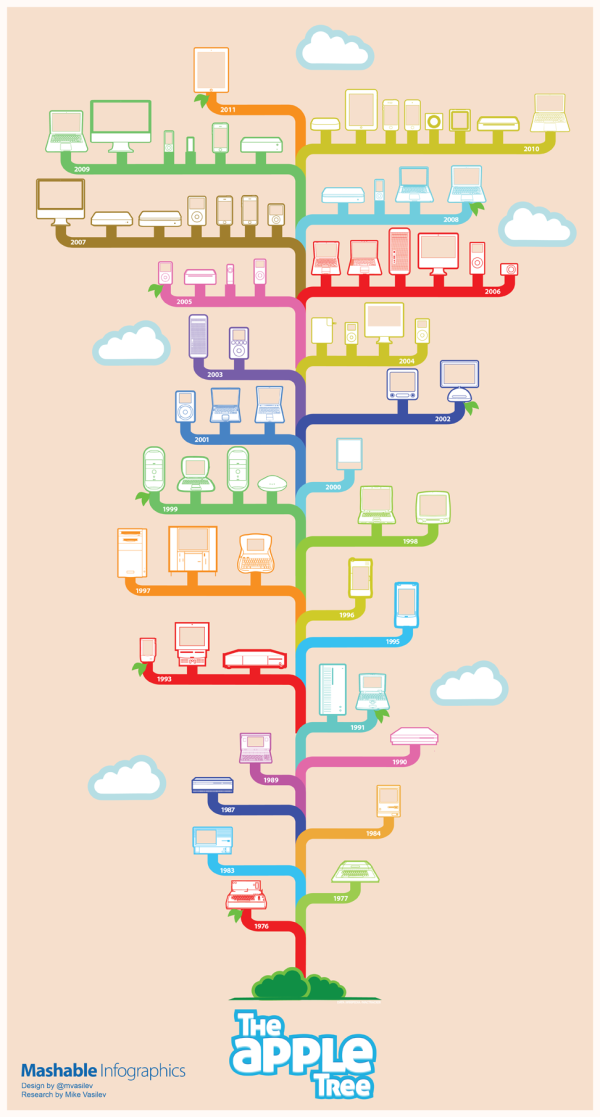
From Mashable come The Apple Tree, a visual, iconic timeline 35 years of Apple product releases.  Designed by Mike Vasilev (@mvasilev on Twitter).

When it comes to industrial design, few consumer electronics or computer makers have the legacy or influence of Apple, Inc. In the last 35 years, Apple has introduced a myriad of products and devices, some very successful, some, not so much.

Artist Mike Vasilev created this infographic for Mashable, highlighting the major Apple product releases and design changes from 1976 through 2011.

I love how recognizeable all of the product illustrations are.  I’ve owned way too many of these products over the years.

Found on Social Media Graphics.

Thursday
Jun302011

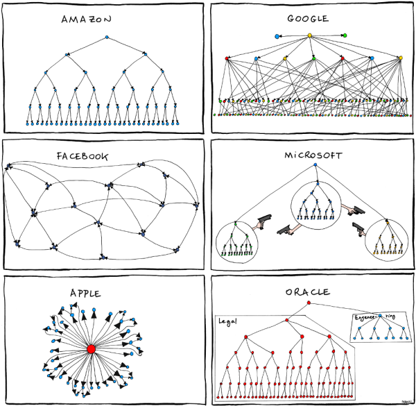
Humor: Corporate Organizational Charts

From Bonkers World, Organizational Charts is a very funny look at the corporate cultures and structures for some very high-profile tech companies using hand-drawn organization charts as the visual language.

Found on Daring Fireball.

Wednesday
May252011

Apple Approves 500,000 Apps...and counting


To celebrate Apple (unofficially) reaching the 500,000 apps milestone, 148Apps, Chillingo and Chomp got together to create an infographic.  The 500,000 Apps infographic uses a cool blend of visual styles to explore the history of Apple’s App Store.

Early this morning, Apple approved app number 500,000.  For that, we salute the hard working developers and the enthusiastic community of app seekers (you!).

Because Chomp wouldn’t be here without all of these glorious apps plus our amazing community of app seekers, we’ve put together an infographic highlighting an array of app milestones along the way, including apps you’ve loved since the beginning.

Pie chart, timeline, bar chart, area chart, doughnut chart, stacked area chart and plain old BIG NUMBERS combine together to tell the story of the Apple App Store.

I’m disappointed that the data sources aren’t listed on the infographics.  That opens up the discussion to challenge the numbers and the validity of the overall infographic.

Cool design by Stefanie Kraus (@stefaniekraus)

Three cheers for Team Chomp member, Stefanie, who is responsible for ‘beautifying’ all of the 150+ data points into what is now being dubbed the longest (and most stunning) infographic you may ever see. 

Don’t worry Stefanie, I’ve seen LONGER infographics…


Found on The Unofficial Apple Weblog

Thursday
Apr282011

Self-Described Mac vs. PC People infographic

Profile of a Self-Described Mac Person vs. PC Person is a fun infographic looking at personality and preference differences.  Based on 388,315 survey respondents from Hunch.com, it illustrates topics like who throws parties, math aptitude, taste in art, cocktail drinks of choice and would they ride a Vespa or a Harley.

Our latest data project was to analyze how self-described Mac and PC people are different. The infographic below, designed by the talented folks at Column Five Media, breaks it down.

Back in ye olden days of Hunch — November 2009 — we explored the differences in personality, aesthetic tastes, and media preferences between Mac and PC users. Since then, the Hunch user base and question pool have grown many times over. The 2009 report started with more than 76,000 responses to its base “Mac or PC?” question. The same question now has nearly 400,000 responses. This is all in the context of the more than 80 million “Teach Hunch About You” questions which have been answered on Hunch to date.

From a research standpoint, even though the number of respondents is high, these are voluntary survey participants that haven’t gone through a screening process.  So while the results are fun, I don’t think they can be considered a statistically accurate representation of the population as a whole.

Very funny, and a great job by the design team at Column Five Media!  Found on FlowingData and Visual News

Friday
Apr152011

Client Infographics: Wine iPhone Apps


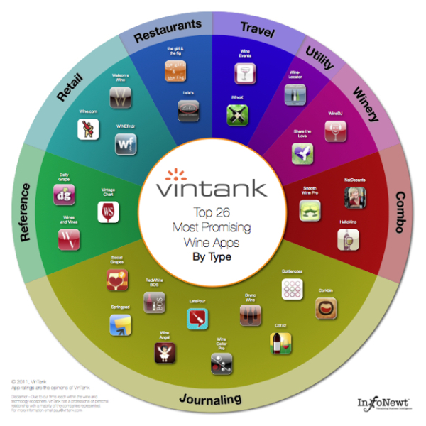
Two infographics InfoNewt (my company) designed recently for the great folks at VinTank.com, a think tank for the wine industry.  Are There Any Good Wine Apps for the iPhone? summarizes the highlights of the data that VinTank gathered from the iTunes Store.  Sorting through 452 wine apps is a lot for a consumer to figure out (intimidating!), so they broke them up by price, rating, business model and type of app.

We took it upon ourselves to evaluate all 452 wine related application available for the iPhone. That is more than six times the amount of wine related applications that was available on our last iPhone Report over a year ago. Each application went through an expansive 20-point inspection that surfaced strengths and weaknesses of their model, UEX, innovation, consumer value, winery value and much more.

You will also notice that we chose do a visual representation of all the data collected, because let’s face it, not only is our attention spans less with amount of content that requires our attention but also because infographics are pretty cool and definitely the trend to display deep rich amounts of numbers, information and data!

The second infographic displays the Top 26 Most Promising Wine Apps, as judged by VinTank.  These are grouped by type of app, and if you view the larger version you can click on any of the icons to be taken to the iTunes page to learn more about the app.

The team at VinTank obviously put a ton of effort into gathering data and evaluating all 452 apps so they could share this information with the public. 

After all that analysis it was clear to us that there were definitely leaders in the mobile space that showed the most promise. It is important to note that some of due to our deep reach within the wine and technology ecosphere, we have professional or personal relationships with a majority of the Top 26 that have been outlined. This however, does not change our view about how exciting it will be to see how all of them continue to improve their platforms and in fact, we excluded many other app companies that we also work with.

The Top 26 spectrum chart is an interactive version where you can learn more about each application and download their app directly should you choose to do so, or if you don’t already have it. Go ahead give it a try!

Even for data very limited to a specific target audience, an infographic is a fantastic tool to make the information interesting and easy to comprehend by the readers. 

Thanks to Paul and Evan for being great to work with.

Friday
Mar252011

Infographic iPhone 5 Rumor Roundup


From the French site, NowhereElse.fr, comes an infographic iPhone 5 Rumor Roundup.  I like how each rumor has an appropriate image, and a rating of how likely they think the feature will make it into the next iPhone.

I posted the English version, but the French version is available here.

A design collaboration between Düne and Sosoa.  (I always appreciate when infographics list the designer(s) so I can also give them credit and links)

Thanks to Miguel for sharing it on Google Buzz!