About
Randy Krum
President of InfoNewt.
Data Visualization and Infographic Design

Infographic Design

Infographics Design | Presentations
Consulting | Data Visualizations

DFW DataViz Meetup

Join the DFW Data Visualization and Infographics Meetup Group if you're in the Dallas/Fort Worth area!

Search the Cool Infographics site

Custom Search

Subscriptions:


Feedburner

The Cool Infographics® Gallery:

How to add the
Cool Infographics button to your:

Cool Infographics iOS icon

- iPhone
- iPad
- iPod Touch


Read on Flipboard for iPad and iPhone

Featured in the Tech & Science category

Flipboard icon

Twitter Feed
From the Bookstore

Caffeine Poster

The Caffeine Poster infographic

Entries in brand (49)

Monday
Apr022012

Interactive Infographic: Coca-Cola vs. Pepsi


The Coke VS. Pepsi: The Cola Wars infographic from cnntees.com. Which side are you on?

For over a century Coke and Pepsi have been at each other’s throats in a constant struggle for a bigger piece of the billion-dollar soda market. 

Along the way the companies have picked up a slew of loyalists and fans, adamant that their cola reigns supreme. While there are countless spots online to check out the history of either company we decided to put together an interactive infographic, putting all cola war highlights together in one spot.

This is a really fascinating experiment with infographic design.  Although it appears to be a static infographic, it’s actually interactive.  If you look closely, there are two videos built directly into the middle of the infographic that play when clicked.  The growth chart at the top is also interactive.  Click on a decade, and then choose the specific year, and it displays events in each companies history related to that time period.

The interactivity is so subtle though, most people will probably miss it without me spelling it out in the title and here in the commentary.

The financial stats section is a really poor use of pie charts in the bottle caps.  The logo images work, but pie charts are for visualizing percentages.  Here, they forced the data into the cute visual, but it makes the data confusing and hard to understand.    Are the charts visualizing the percentages of each expense related to total revenue, or just arbitrarily visualizing the values to represent the comparison between the two companies?  No percentages are shown, and no values are shown for the values of the total pie.  This is forcing a round peg into a square hole.

At the bottom, it’s missing a URL to the original blog post (so readers that find this on the Internet can find the original high-resolution infographic), a copyright statement, a trademark statement and a credit to the designer.

Thanks to Ron for sending in the link!

Wednesday
Mar282012

Client Infographic: The Mobile Advantage

Nuance Communications has released a new infographic, The Mobile Advantage, sharing the results of their own mobile consumer preference research.  Designed by InfoNewt, this infographic design tells the story of how important mobile apps are to brands.

If you’re a consumer-facing organization hoping to use mobile to build a strong, long-lasting relationship with your customers, there’s some good news!  A new survey shows that smartphone owners are increasingly downloading not just games but customer service apps - especially from their mobile carrier, bank and favorite retailers. In fact, 84% of consumers surveyed generally prefer to use a company’s mobile app for routine inquiries (checking balance, check flight status, etc.) rather than calling the company on the phone. 

As a B2B communication tool, this infographic does a great job sharing the key findings from the research statistics.  Since Nuance performed the research behind how apps form positive customer service experiences for customers, the infographic is a good tool to share that unique knowledge with their customers.

Broken into a three-part story, the design starts with some basic information about the growth of mobile devices.  The center section focuses on the huge impact on the customers’ view of a company when they have a customer service app.  And finally, the last section explores what customers would like to see in a customer service app.

Thanks to the team at Nuance for being outstanding to work with!

Tuesday
Mar202012

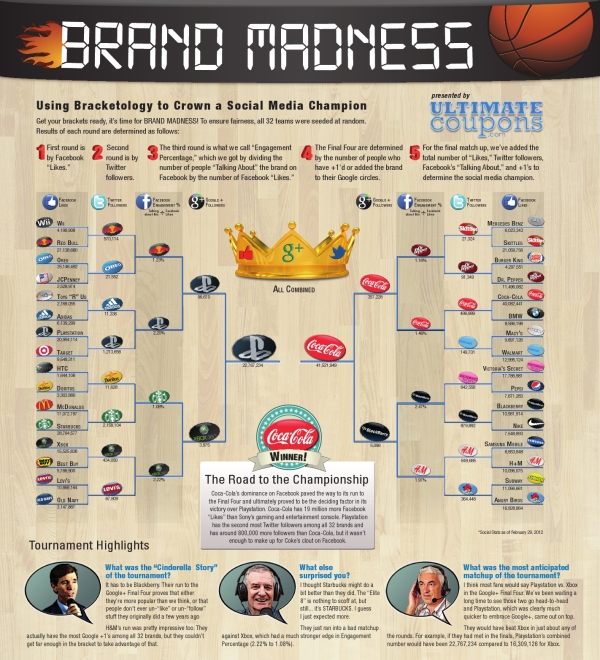
Brand Madness! Social Media Bracketology

Brand Madness! Using Bracketology to Crown a Social Media Champion is a fun infographic design during the NCAA basketball tournament that uses social media scores to determine winning match-ups.  From UltimateCoupons.com, this design is a great example of taking boring data (Facebook likes and Twitter followers are available to anyone) and using infographic design to make it fun and engaging to the readers.

March Madness has officially arrived, but the UltimateCoupons.com team has Brand Madness! While everyone else’s mind is on basketball, we decided to fill out a bracket pitting 32 of the world’s most popular brand names against each other with the winners and losers being decided by social media popularity.

This is a great use of the visual company logos and the bracket structure to show the readers all of the match-ups, and you can look closer to see the actual numbers if you want to.  Only a year or two ago, this type of blog post would have been all text and a table of numbers, but this is a simple and very effective use of design to grab the readers’ attention.

Thanks to Scarlett for sending in the link!

Thursday
Mar082012

Airbnb's Global Growth

Airbnb has released a fantastic infographic, Airbnb’s Global Growth, sharing their own stats about their phenominal growth from August 2008 to February 2012.

Airbnb started in Brian and Joe’s San Francisco apartment. Today, more than five million nights have been booked on Airbnb. And although Airbnb’s roots are in the USA, more than 75% of all reservations last year were international - where either the traveler or host (or both!) was outside the United States. Check out our infographic celebrating the international growth that you’ve powered.

I think an infographic is a great way for a company to share it’s story with it’s executives, it’s shareholders, the press and the public in general.  Infographics are visual storytelling, and every company has a story to tell.

The design is beautiful!  They’ve included a wide variety of data visualization types: area chart, doughnut chart, maps, bars and illustrations.  The one complaint I have is that too many of the stats are just shown in large text.  Large fonts don’t make good data visualizations.

They made an interesting choice and included the URL for a separate page on their website about the Airbnb service, instead of linking back to the original infographic.  I know they want to promote their service, but I think this is a mistake, because a reader has to search through their blog posts to find the infographic.  A couple things missing from the bottom: a copyright statement and credit to the designer.

Thanks to Slavik for sending in the link!

Friday
Mar022012

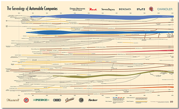
The Genealogy of Automobile Companies 

A brand new infographic poster designed by Larry Gormley at HistoryShots.comThe Genealogy of U.S. Automobile Companies visualizes over 100 years or corporate history of car company mergers, acquisitions and closures.

A flowing history of more than 100 automobile companies across the complete time span of the automobile industry. From 1900 to 1925 over 3,300 organizations were formed to produce automobiles in the United States. In 1910 alone 400 new startups entered the industry. Most attempts lasted less than two years. While car sales exploded (from 1910 to 2010 US sales rose from 200,000 to 11.5 million cars) the strongest entrepreneurs bought out rivals and combined forces. Today, ten companies account for about 90% of all US automobile sales.

This graphic uncovers and explains how the industry was created and how it arrived at its present form. At the core is a full genealogy of over 100 companies from the Big Five to the small defunct companies. Folded into the genealogy is the relative market share of US sales for each company.

The Big Five car companies have unique colors, and all of the other companies are color-coded into categories of he trest of the Top 20, defunct companies and other interesting or famous companies.  The thickness of the lines change over time to represent market share.

You can buy a copy of the 38” x 23” poster for $29.95 over at HistoryShots.com

Thanks to Larry for sending in the link!  Great design!

Monday
Feb132012

The Social Brand Value of the World's Leading Brands

The Social Brand Value of the World’s Leading Brands infographic from Sociagility.

In November 2011, we looked at the social brand value of 50 of the world’s leading brands, creating a revised top 50 ranking according to their social media performance, as measured by our PRINT Index™ KPI.

The PRINT system compares brands on five key dimensions or ‘attributes’ of social media performance – popularity, receptiveness, interaction, network reach and trust – across multiple platforms. The Sociagility Top 50 report analyses the social brand value of the world’s leading brands and the competitive influences that determine their social media performance. Here’s a visual representation of just some of the report highlights.

I really like both the topic, and the design of this infographic.  The colors are bright, and appealing.  In the Top 20 Brand Leaders, I suggest that using the actual brand logos would have made the bar chart easier to understand.  It’s interesting that beyond the first section, the actual values aren’t shown along with the visualizations. I really like the circles comparison of the three attributes of each brand.

Also, “Legends are Evil”.  The color coding by market is at least a secondary level of data, but the legend still makes the reader work harder by looking back-and-forth to understand the meaning behind the colors.  It’s even harder as you move down the infographic, because the color coding continues, but the legend is way up near the top.  You could put icons or the text into the color bars themselves, and the reader would figure out the color coding scheme. 

At the bottom, a copyright and the URL of the original infographic would make it easier for readers to find the original posting.  Some credit to the designer would be nice as well.

Found on DR4WARD.

Wednesday
Oct052011

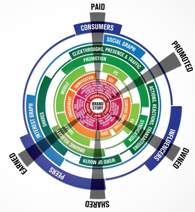
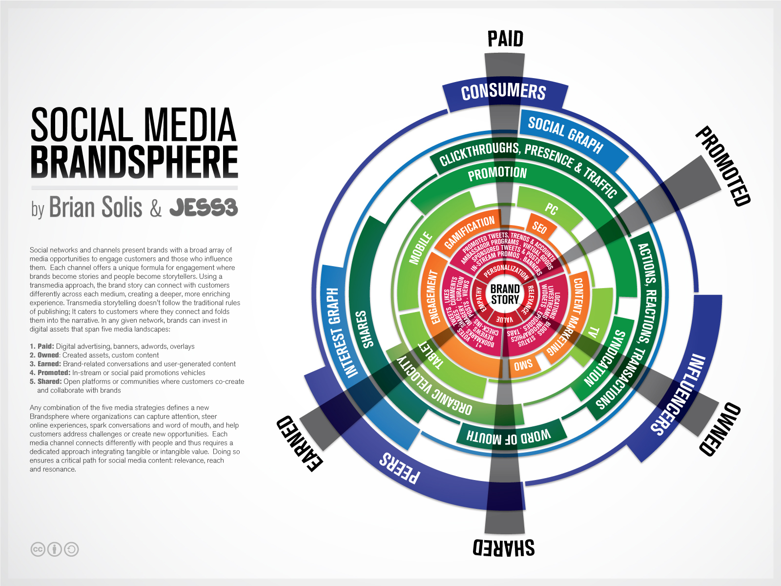
Social Media Brandsphere

The Social Media Brandsphere is a new collaboration between Brian Solis and JESS3.  The Brandsphere explores how brand storytelling can cross different communication mediums. 

Over on the JESS3 blog, they’ve posted 10 of the different early versions and concepts of the Brandsphere so you can see some of the behind-the-scenes design process at work. 

Social networks and channels present brands with a broad array of media opportunities to engage customers and those who influence them. Each channel offers a unique formula for engagement where brands become stories and people become storytellers. Using a transmedia approach, the brand story can connect with customers differently across each medium, creating a deeper, more enriching experience. Transmedia storytelling doesn’t follow the traditional rules of publishing; it caters to customers where they connect and folds them into the narrative. In any given network, brands can invest in digital assets that span five media landscapes:

1. Paid: Digital advertising, banners, adwords, overlays

2. Owned: Created assets, custom content

3. Earned: Brand-related conversations and user-generated content

4: Promoted: in-stream or social paid promotions vehicles (e.g. Twitter’s Promoted products and Facebook’s Sponsored Stories)

5. Shared: Open platforms or communities where customers co-create and collaborate with brands. (e.g. Dell’s IdeaStorm and Starbuck’s MyStarbucksIdea.)

Any combination of the five media strategies defines a new Brandsphere where or

ganizations can capture attention, steer online experiences, spark conversations and word of mouth can help customers address challenges or create new opportunities. Each media channel connects differently with people and thus requires a dedicated approach integrating tangible and intangible value. Doing so ensures a critical path for social media content: relevance, reach and resonance.


Available as a poster on the Conversation Prism site

Wednesday
Sep212011

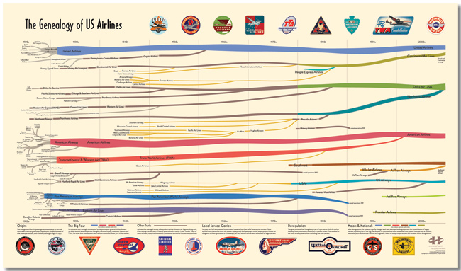
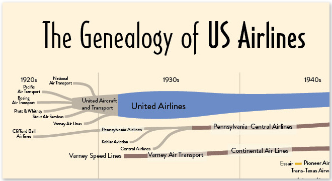
The Genealogy of U.S. Airlines


A new infographic poster designed by Larry Gormley at HistoryShots.comThe Genealogy of U.S. Airlines visualizes over 90 years or corporate history of airline mergers, acquisitions and closures.  Over 100 different airlines have consolidated down the seven shown still in existence today. 

The carriers are color coded and line widths represent market share for any particular year.

Over its short history, the US airline industry has experienced many dynamic phases of expansion and consolidation. From its origins in the 1920s, when air mail carriers started to transport passengers, to the creation (with the not so gentle prodding of the government) of the Big Four (American, United, TWA, and Eastern), from the rise of the local service carriers to deregulation and the most recent wave of mergers and acquisitions, the industry continues to fascinate both the casual traveler and the aviation buff.

The purpose of this graphic is to uncover and explain how the industry was created and how it arrived at its present form. At the core is a full genealogy of over 100 US airlines from the major airlines to the small local service carriers. Folded into the genealogy is the relative market share of passenger traffic for each airline. This allows the viewer to understand how the industry was controlled for many decades by the Big Four and how this dominance was quickly replaced by a number of other airlines.

You can buy a copy of the poster for $29.95 over at HistoryShots.com

Thursday
Jun162011

The Business of Giving


The design of The Business of Giving from SocialCast does a good job of walking the reader through a story about companies donating to charities.  However, they could have done more to visualize the scope of donations instead of just including the dollars values in text.

In the Popular Causes section, I would have built the icons right into the pie chart.  They don’t serve much purpose on their own next to the chart.

I love the puzzle piece images used for Partnerships.

Designed by Column Five Media

Friday
Nov122010

The Brutal Decline of Yahoo!

Here’s a fun one from Scores.org The Brutal Decline of Yahoo! examines the troubled history of Yahoo! in search, advertising and acquisitions.

Designed by our friend, Jess Bachman, this one relies heavily on visuals related to the events on the timeline over the last 16 years.  A little text heavy for my tastes, but I had forgotten at least half of this stuff that Yahoo! messed up.  It’s a little amazing that they’re still as big as they are.