


Monday
Mar022009
Taking the Train
 Randy
RandyThanks Li, for sending in the link!

![]()

Join the DFW Data Visualization and Infographics Meetup Group if you're in the Dallas/Fort Worth area!

The Cool Infographics® Gallery:
How to add the
Cool Infographics button to your:

- iPhone
- iPad
- iPod Touch
Read on Flipboard for iPad and iPhone
Featured in the Tech & Science category


Thanks Li, for sending in the link!
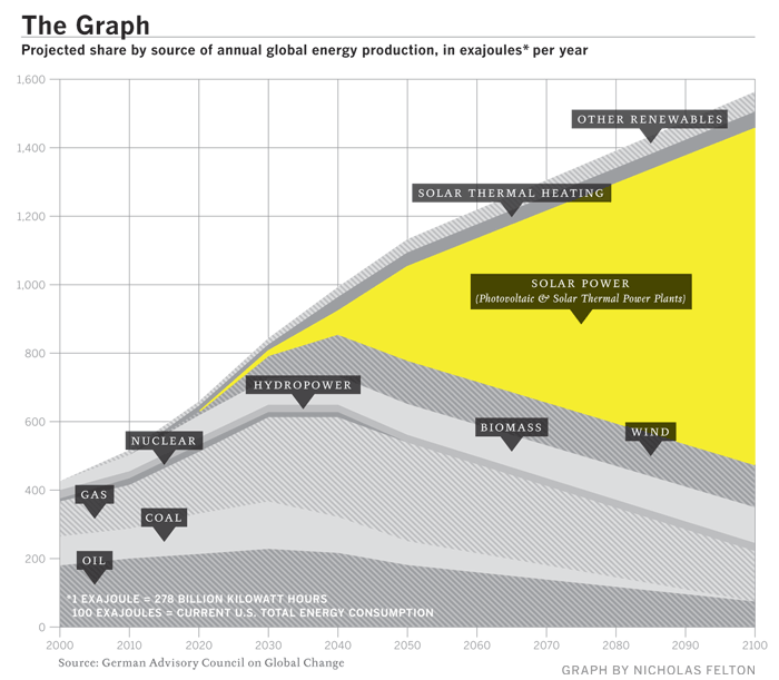
The Graph was created by a scientific organization that counsels the German government, but it has since become a prized piece of propaganda, embedded in glossy brochures and PowerPoint presentations by solar companies from California to gray-skied Saxony. At the left-hand, present-tense end of the scale, solar power is a microscopic pencil line of gold against the thick, dark bands of oil and natural gas and coal, an accurate representation of the 0.04% of the world's electricity produced by solar power as of 2006. The band grows slowly thicker for 20 years or so, and then around 2040 a dramatic inversion occurs. The mountain-peak lines indicating the various fossil fuels all fall steeply away, leaving a widening maw of golden light as solar power expands to fill the space. By 2060, solar power is the largest single band, and by 2100 it is by far the majority share.
Great work Mike!
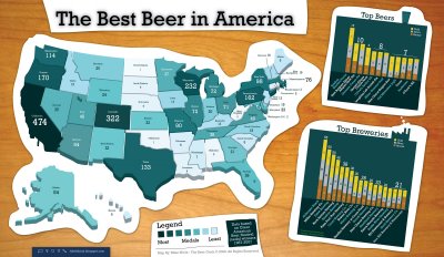
UPDATE: Mike has put up an updated version of the Best Beer in America map.


Found on See What You Mean
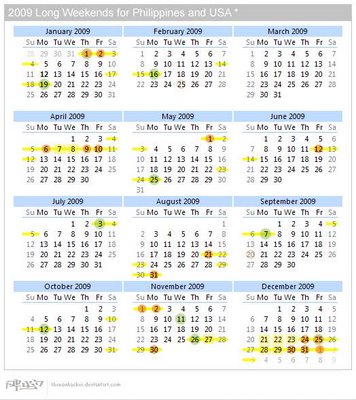
It's also good to plan vacation time...
Great job Alwyn!
Back in July, Seth Godin posted his"three laws of great graphs" for PowerPoint presentations. I may not agree with Seth's laws, but I thought it worth sharing for discussion.
1. One Story: While I don't agree for all infographics, I do agree with this specifically for giving PowerPoint presentation. Steve Jobs is a master at this, or the master is whoever makes his keynote presentations.
2. No Bar Charts: I don't disagree that there are some horrible bar charts out there, but I don't think they should be eliminated altogether. They have their place, and since they are the default chart in PowerPoint they often get used when another type of chart would be more appropriate.
3. Motion: I'll cautiously agree with this one. Animation in PowerPoint is often distracting, but can be used as Seth describes. Don't get caught up in slide transitions, but use animation to highlight the point you are trying to convey to your audience.
I actually believe the tree is incomplete. I think Star Wars had far greater reach and influence that what Michelle mapped out here.
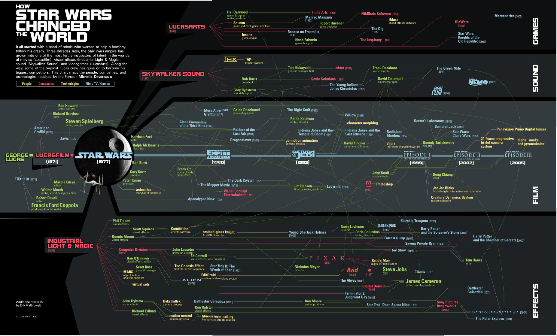
It all started with a band of rebels who wanted to help a farmboy follow his dream. Three decades later, the Star Wars empire has grown into one of the most fertile incubators of talent in the worlds of movies (Lucasfilm), visual effects (Industrial Light & Magic), sound (Skywalker Sound), and videogames (LucasArts). Along the way, some of the original Lucas crew has gone on to become his biggest competitors. This chart maps the people, companies and technologies touched by the Force. - Michelle DevereauxThanks Alwyn!


"Death and Taxes:2009" is a representational poster of the federal discretionary budget; the amount of money that is spent at the discretion of your elected representatives in Congress. Basically, your federal income taxes. The data is from the President's budget request for 2009. It will be debated, amended, and approved by Congress by October 1st to begin the fiscal year.The Death and Taxes poster from 2007 was my initial post on Cool Infographics, so I'm very excited to see this update. Now the 2009 version is available to purchase as a poster here.
The poster provides a uniquely revealing look at our national priorities, that fluctuate yearly, according to the wishes of the President, the power of Congress, and the will of the people. If you pay taxes, then you have paid for a small part of everything in the poster.

