About
Randy Krum
President of InfoNewt.
Data Visualization and Infographic Design

Infographic Design

Infographics Design | Presentations
Consulting | Data Visualizations

DFW DataViz Meetup

Join the DFW Data Visualization and Infographics Meetup Group if you're in the Dallas/Fort Worth area!

Search the Cool Infographics site

Custom Search

Subscriptions:


Feedburner

The Cool Infographics® Gallery:

How to add the
Cool Infographics button to your:

Cool Infographics iOS icon

- iPhone
- iPad
- iPod Touch


Read on Flipboard for iPad and iPhone

Featured in the Tech & Science category

Flipboard icon

Twitter Feed
From the Bookstore

Caffeine Poster

The Caffeine Poster infographic

Entries in charts (150)

Monday
Jul132009

The GOOD Magazine Transparencies Archive


I've posted about a number of the infographics from the GOOD Magazine Transparency series on the blog before, but the great team there has now made their archive of graphics available as a set on Flickr!

Thanks to Amrit Richmond, the Art Editor at GOOD Magazine, for sending the link!

Saturday
Jul112009

How Much is a Petabyte?


From Mozy.com, a pretty large infographic (as you might expect from the name).
We store a lot of data here at Mozy (15+ petabytes, in fact), but how much is that really? We put together this series of stats to help you understand just how much data that really is. Enjoy!
Thanks Matthew!

Tuesday
May262009

Get Your Geek Chart!


Rtkrum's Geek Chart

Recently I found the Geek Charts BETA, which looks up your usernames on a few of the popular social sites, and charts out your usage. It's charting all activity within the last 30 days.

The embedded chart is also live, so it will change over time.

Thursday
May212009

What is Wolfram|Alpha?

I'm not sure I understand what Wolfram|Alpha is yet, but so far it's pretty impressive.  Developed by Stephen Wolfram and his team, it claims to be a "computational knowledge engine".  The input box looks like a search engine, but it is definitely NOT a search engine.


When you type in a question, it attempts to show you all of the relevant data it can find.  It is actually calculating and charting this information real-time in order to present it to you.  Because its built on top of the Mathematica Engine, it can also handle math problems.


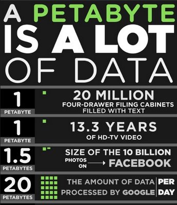
I think this will be an important tool for many designers of infographics, because you can get some of your raw data directly from Wolfram|Alpha.  As they add more data into the system over time, this will become one of your best resources for information.  They have a pretty extensive page of examples by category that is a great place to start.  Also watch the short video by Stephen Wolfram showing what the system can do.

Thursday
May142009

Who is Coming to America?


From GOOD magazine.  If you look closely, this is essentially a bar chart dressed up, but it's the dressing up into the shape of the U.S. flag that catches your eye.  I love it!
Immigration may have taken a back seat during the financial crisis, but the issue still needs resolving. While illegal immigrants sneaking over the border is still a primary concern, it’s good to know who came to our country legally, and from where. Our latest Transparency is a look at the 20 countries from which the most people came to America in 2008, how many immigrants already had family here, and how many received asylum when they arrived on our shores.
Found on SimpleComplexity.net, thanks Nathan!

Wednesday
Apr292009

How Long Will It Last?


Good infographic from the New Scientist showing how many years we have left of our key natural resources.  Essentially these are basic bar and pie charts, but dressed up to make the overall graphic more compelling.  The message is still clear though, and the author gets his point across very strongly.

This comes from a 2007 article in the New Scientist called "Earth's Natural Wealth: an Audit" that include two more infographics as well.  The first is a map of where in the world are these natural resources are.


The next is a bubble graphic showing the scale of how much of each resource an average American will consume during their lifetime.


The Source listed on the first infographic: Armin Reller, University of Augsburg, Tom Graedel, Yale University

Found on FlowingData.com and numerous Twitter references.  Thanks Nathan.

Wednesday
Apr222009

How do College Students Spend Money?


 I certainly don't remember having 40% of my budget as "discretionary" when I was in college!

This is from the Westwood College website, but I don't see a specific creator listed.

Tuesday
Mar312009

Periodic Table of Typefaces


Created by Cameron Wilde/SquidSpot, The Periodic Table of Typefaces lays out the top ranked type fonts.  Makes a great poster for the office.


I found this over on Visual Think Map

Tuesday
Mar242009

The Trilogy Meter


Dan Meth did a great job creating his own personal Trilogy Meter showing his personal enjoyment of movies released as a trilogy.  This shows that Dan never likes the 3rd movie as much, so he should just stop spending the money.

Although this is based on Dan's personal ratings for each movie, there's no reason why something like this couldn't be done with more official data like critic ratings or box office dollars.

Thanks for the link Jesper and Daniel!

Thursday
Mar052009

Chart Chooser


A quick reference guide (in the form of a mind map) by Andrew Abela on choosing the right type of chart for the type of message you are trying to communicate with your data.

Found on Digital Inspiration

Page 1 ... 7 8 9 10 11 ... 15 Next 10 Entries »