Who Owns the Media Companies?
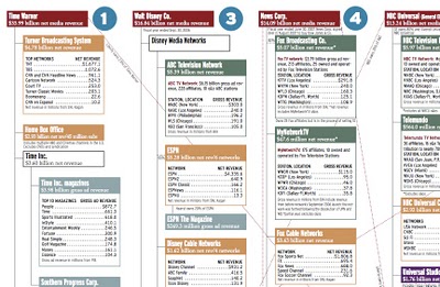
Similar to my earlier post about Who Owns the Car Companies?, I found that Advertising Age magazine has created a poster showing the ownership in the media companies.
You thought the car companies were complicated...
Join the DFW Data Visualization and Infographics Meetup Group if you're in the Dallas/Fort Worth area!

The Cool Infographics® Gallery:
How to add the
Cool Infographics button to your:
- iPhone
- iPad
- iPod Touch
Read on Flipboard for iPad and iPhone
Featured in the Tech & Science category

Similar to my earlier post about Who Owns the Car Companies?, I found that Advertising Age magazine has created a poster showing the ownership in the media companies.
You thought the car companies were complicated...

A new visualization from the same group that did the earlier visualization of Wikipedia revision activity. This one focused on science and tech related articles. The mystery is the significance of the blue/green band that crosses the map.
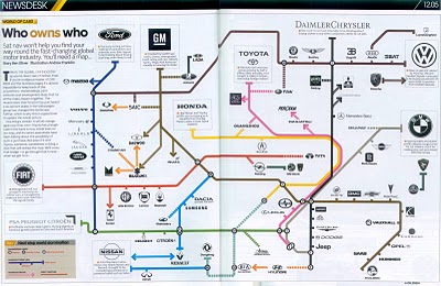 I found three different images showing the complex network of ownership between the automotive companies. Three different attempts at making these complex relationships easier to understand. This first one is a scan from a magazine, but I can't find any reference to which actual magazine it came from. Charted out like a subway map, it's pretty easy to follow.
This next one from Too Many Cars is charted like a family tree, or a mind map. It's the easiest the follow, but probably the least aesthetically pleasing. Online the image is broken into smaller pictures so you can zoom closer, but is also available as a large poster in PNG or PDF formats. The data for this one is from 2006, and is the most current of the three.
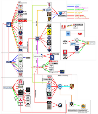
This last graphic claims to show the ownership mix in the auto industry as a form of bubble chart, but I can't find any date or source data link. I think the bubble sizes represent something, like size of the company or ownership, but I can't tell. So I can't tell how accurate this is. The image is on Tinypic.
A complete music video made of infographics! It’s pretty good too! The song is “Remind Me” by Royksopp, and the video continuously blends one infographic into the next. Let’s hope real life is more than a series of graphics about the choices we make.
Found on the Data Mining blog.

Wired magazine calls infographics like this "infoporn". I guess you could call this a version of a bubble chart, but it shows a comparison of what people knew in 1989 vs. 2007. Separately it shows knowledge of three questions based on the respondent's usual source of news.
I can't tell how big the sample size was, or what type of people they interviewed. It quotes the source as the Pew Research Center for the People & the Press, but that alone isn't enough to make it credible.
From Many Eyes, this bubble chart shows the number of plastic surgery procedures per 100 people, by nation. Let's just say, the U.S. is one of the smaller countries measured this way.
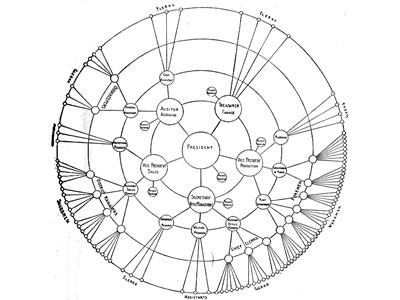 Found on Visual Complexity, this chart from 1924 is an interesting variation of an organization chart. With the authoritarian leader in the center, the subordinates are mapped outward from the center. Rings at different radii show peer level responsibility.

A good one from BusinessWeek.com. This chart shows the participation in the various Web 2.0 activities by age group.
As part of Gen X, these graphs look like a tidal wave rising up behind me.
 charts,
  internet,
  population,
  web
web 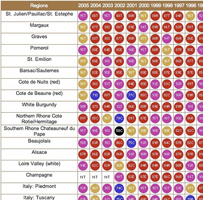
From eRobertParker.com, the online Wine Advocate Vintage Guide. Fascinating guide of wines from 1970-2005. Wines are grouped by region and year, and each group is scored and given a letter code to identify the current maturity status of those wines (like Ready to Drink, Too Old and Early Maturing). The color coding represents ranges of the numeric scores.
The guide is interactive, so clicking on any of the rating circles brings you to a list of the specific wines grouped together for that region. For the specific wines, you can see their individual name, score, maturity level and price range.
A PDF version of the guide is available here for download.
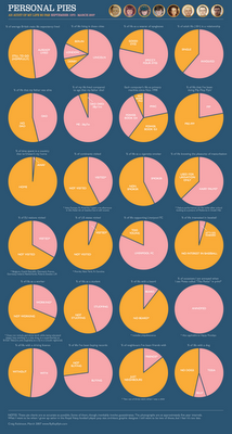
Craig Robinson from Flip Flop Flyin' charted his current existence with the use of pie charts in his Personal Pies project. Although amusing to look through, I think this demonstrates really well how shallow pie charts are, and how much information depth can be lost with charts.