LifeMap
 Ritwik Dey charted out his life from age 6 to 24 as an infographic timeline project, and shared it on Flickr.
I just discovered Visual Think Map, which is where I found a link to the LifeMap. I added it to my blogroll on the right.
Join the DFW Data Visualization and Infographics Meetup Group if you're in the Dallas/Fort Worth area!

The Cool Infographics® Gallery:
How to add the
Cool Infographics button to your:
- iPhone
- iPad
- iPod Touch
Read on Flipboard for iPad and iPhone
Featured in the Tech & Science category
 Ritwik Dey charted out his life from age 6 to 24 as an infographic timeline project, and shared it on Flickr.
I just discovered Visual Think Map, which is where I found a link to the LifeMap. I added it to my blogroll on the right.

From the nytimes.com, this graphic visually represents how average consumer spending breaks down, and the color code shows how much spending in that category has changed in the last year. For example, Gasoline is 5.2% of an average consumer's spending, and it has risen 26% from 2007 to 2008.
As far as I can tell, this is actually a treemap, but in a new shape. More details pop-up when you mouse over each of the individual shapes.
Thanks to Tony, for sending in the link.

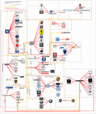
TooManyCars.com has updated their family tree style poster of how all of the car companies are related. The latest updates were as of 4/1/08. They have also changed to better software used to zoom into the poster. Each of rectangles you see on the images will zoom in close so you can read the details about the connections.
They've really done a good job tracking down the specific types of relationships and the ownership portions between the companies. High-res PNG or PDF files are also available.

From readwriteweb.com, an area chart showing the decline of Tech stories made popular on digg.com. Although initially the front page of digg.com was totally dominated by Tech stories and the primary users were tech geeks, the World & Business category is now the reigning king with the most stories made popular.
To put this into context, on 1 January 2006 tech stories made up 78% of the total popular stories (i.e. stories that made it onto the digg frontpage). By end of March 2008, that percentage had dropped to 18-20%.

Here you can see the same information charted as total number of stories made popular instead of percentages.

Great chart by Phil Howard from Good Magazine showing which of the large food processing companies own some of the most popular organic food brands. Pepsi owns Naked Juice?
Found on digg.com after I heard about it on the diggnation podcast.
 Digg,
Digg,  brand,
  charts,
  corporations,
  environment,
  food,
food,  grocery,
  health
  From blog.doloreslabs.com, they showed 1,300 different colors to people on Mechanical Turk, and asked them to name the color.
The above picture contains about 1,300 colors and the names for them that Turkers gave. Each is printed in its color and positioned on a color wheel. Just looking around, there sure seem to be different regions for different names. But there are also rich sets of modifiers (”light”, “dark”, “sea”), multiword names (”army green”), and fun obscure ones (”cerulean”).They also created a Color Label Explorer tool to only show those color names that match your search term, but still keep them in place on the color wheel graphic.

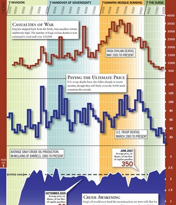
From foreignpolicy.com, a really tall chart showing statistical information covering the last five years of the Iraq war. I'm not sure I like the idea of this big chart that covers so many different types of data. The information on the bottom half of the chart tends to get lost to the reader.
 From nytimes.com. This is a very cool way to visualize the spike in movie ticket revenue when movies are released in theaters, and then slow down quickly after the first week. The graphic covers 1986-2007, and when you look back you can only find a few movies that maintained high ticket sales for more than a couple weeks. Star Wars Episode 1 and Titanic both had high sales for almost 6 weeks. Highlight and click any "wave" to see the details for that movie.
Summer blockbusters and holiday hits make up the bulk of box office revenue each year, while contenders for the top Oscar awards tend to attract smaller audiences that build over time. Here's a look at how movies have fared at the box office, after adjusting for inflation.Thanks for sending in the link Dániel!

New interactive map on CareerBuilder.com charts the results of user survey data on how gruntled (or disgruntled) people are with their jobs across the country. You can even narrow the map results to a particular industry.
The map doesn't change that often, but when you roll your mouse over the map, it highlights the cities where the score has changed.
Thanks Kevin for the email.
 ad,
ad,  charts,
  compensation,
  corporations,
  history,
  map,
map,  personal,
  relative