


Monday
Feb112008
The Timeline of "Cool"
 Randy
Randy
Found on Wikipedia, this is the timeline of what was "Cool" from 1500 A.D. through today. Apparently, the Beatles aren't cool anymore...

![]()

Join the DFW Data Visualization and Infographics Meetup Group if you're in the Dallas/Fort Worth area!

The Cool Infographics® Gallery:
How to add the
Cool Infographics button to your:

- iPhone
- iPad
- iPod Touch
Read on Flipboard for iPad and iPhone
Featured in the Tech & Science category


Found on Wikipedia, this is the timeline of what was "Cool" from 1500 A.D. through today. Apparently, the Beatles aren't cool anymore...
Breaking News: Series Of Concentric Circles Emanating From Glowing Red Dot
This had one had me laughing out loud. From theonion.com, a news parody of how disasters are covered on TV using infographics. Watch out for those circles!
Found on Infosthetics.

Wired magazine has this infographic flow chart of what happens after someone posts on their blog. From aggregators to text scrapers, your posts live a life of their own on the Internet.
You click Publish and lean back to admire your work. Imperceptibly and all but instantaneously, your post slips into a vast and recursive network of software agents, where it is crawled, indexed, mined, scraped, republished, and propagated throughout the Web.It's on their multimedia section of the website, but the only multimedia aspect it has is zoom, which is a little disappointing.
Thanks Oliver for sending me the link!

Nicholas Felton has published his new 2007 Annual Report. I love the way he breaks down his own personal life into maps and charts. I had just posted about his 2006 Annual Report last month.
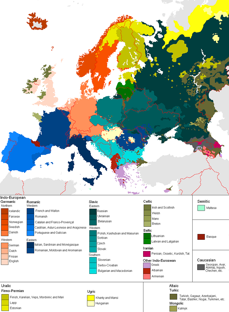
This is a great map, found on Photobucket.com uploaded by the user pizzler. In the U.S. we understand that other countries sometimes speak foreign languages, but we have the advantage that all 50 states speak the same language (or at least a similar version of the same language). So it's somewhat of an abstract concept to most Americans. And European geography isn't exactly a major topic in the U.S. school system, so most people don't understand how many countries there are, and especially how small some of them are.
This visual map really helps convey the diversity within the EU. It maps 46 languages across the European continent, and I know there are more. I can't imagine how difficult it must be for the EU to actually get anything done between countries.

Found originally on Digg Images, this one is hosted on Steven Hilton's website (the author).
I guess you could call this a Mind Map style, but it's more like a Battlefield style infographic. I really like how it shows the products that multiple competitors are challenging Microsoft with and the associated product on the Microsoft side that is being challenged.

I can't tell if Savvygraph.com is part of Amazon.com, or if this is a separate company running this. It takes any Amazon.com search terms you enter and charts the results on an X-Y chart showing the Average Rating and the total Number of Ratings.
It's fairly interactive. You can limit the price range using the sliders at the top, and when you hover over any of the pins you get the product image. Clicking on the pin takes you to that item on Amazon.com. Clicking on any of the links on the right limit the search to a smaller subset based on your choice (like a particular brand).
EDIT: I did receive an email from the author who confirmed that the site is totally separate from Amazon.com. Thanks Dave.
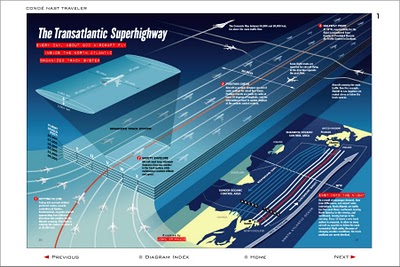
I never really thought about it, but I'm sure the flight patterns over the Atlantic are actually this tightly controlled. Now the news that President Bush made some of the military flight paths available over the holidays makes more sense. The Transatlantic Superhighway is one of the diagrams on John Grimwade's Information Graphics site.
 Nicholas Felton (www.feltron.com) has created his own personal 2006 Annual Report, looking back at his life during 2006 and using maps, charts, timelines and facts to visually track his activities. With pages dedicated to photos, travel, drinking, reading and food, he plots out his one-year history.

From aaplinvestors.net, more than a simple line chart of sales, its a timeline that highlights major events so you can easily visualize their impact. Even though its simple, I use this type of timeline all the time.
