About
Randy Krum
President of InfoNewt.
Data Visualization and Infographic Design

Infographic Design

Infographics Design | Presentations
Consulting | Data Visualizations

DFW DataViz Meetup

Join the DFW Data Visualization and Infographics Meetup Group if you're in the Dallas/Fort Worth area!

Search the Cool Infographics site

Custom Search

Subscriptions:


Feedburner

The Cool Infographics® Gallery:

How to add the
Cool Infographics button to your:

Cool Infographics iOS icon

- iPhone
- iPad
- iPod Touch


Read on Flipboard for iPad and iPhone

Featured in the Tech & Science category

Flipboard icon

Twitter Feed
From the Bookstore

Caffeine Poster

The Caffeine Poster infographic

Entries in design (479)

Monday
Apr112011

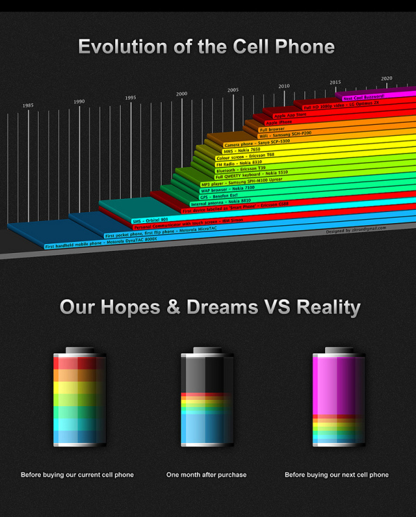
Evolution of the Cell Phone #infographic

A cool infographic design, the Evolution of the Cell Phone by Zitron takes a light-hearted look at the timeline of phone features and the phones that first had each feature.  The second part of the infographic, Our Hopes and Dreams, takes a humorous stab at how the reality of our cell phones rarely lives up to our expectations (until the next Buzzword comes along!).

Friday
Mar252011

Infographic iPhone 5 Rumor Roundup


From the French site, NowhereElse.fr, comes an infographic iPhone 5 Rumor Roundup.  I like how each rumor has an appropriate image, and a rating of how likely they think the feature will make it into the next iPhone.

I posted the English version, but the French version is available here.

A design collaboration between Düne and Sosoa.  (I always appreciate when infographics list the designer(s) so I can also give them credit and links)

Thanks to Miguel for sharing it on Google Buzz!

Wednesday
Mar232011

Japan: The Earthquake & The Tsunami [infographic]

Japan:The Earthquake & The Tsunami is a good infographic design from the team at DigitalSurgeons.com.  I like the simple color scheme, and the mix of different types of visuals for the different pieces of data.  Maps, bar charts, icon grids and a ruler all help put the currently available information into perspective.

The bottom also lists some of the major support links for people that would like to help.

Thanks to Peter for sending in the link!

Wednesday
Mar162011

A (Future) Day of Glass

A Day of Glass video of the future from Corning Glass.  A lot of augmented reality and infographics in our daily lives of the future…

Monday
Mar142011

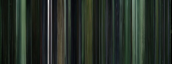
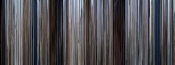
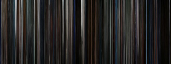
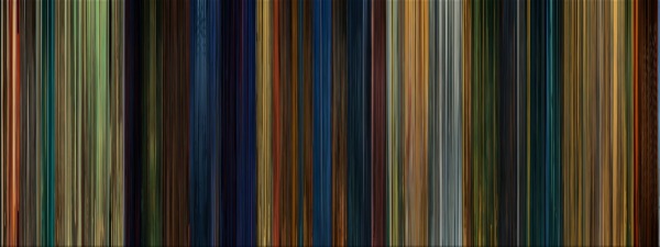
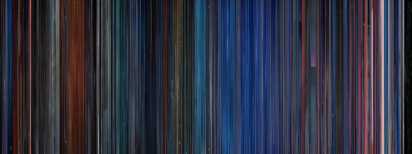
Moviebarcodes: Whole Movies at a Single Glance

Moviebarcodes is a tumblr blog from an unknown author that posts these images generated from different movies.  Each frame of the movie is stretched tall and thin to create this single image from an entire movie.  The one above is from The Matrix, and you can see the green tint they used every time they were “in the Matrix”.

From Wired:

The person behind MovieBarcode, who wouldn’t reveal their identity or what they do for a living, told Wired.co.uk that the creative process can take a few hours on the slightly aged machine they are being processed on, “depending on the length of the movie and the quality of the outcome”.

Movies on the blog are chosen “due to the expected result, not for the movies themselves”. Besides colourful movies, the blog author prefers “movies with long shots such as Kubrick, Hitchcock and Weerasethakul, which can result in unique and interesting moviebarcodes”.

Although, some of them don’t seem to reveal anything interesting, a few of these did give some insights into the movie visuals.

They spent a lot of time at sea in Jaws:
 

The Dark Knight was a very dark, almost colorless movie:
 

Kung Fu Panda was very colorful:
 

You can see the time spent in the digital, neon-blue world of TRON (1982):
 

Found on Wired.co.uk, VisualJournalism, FlowingData and Chart Porn.

Friday
Mar112011

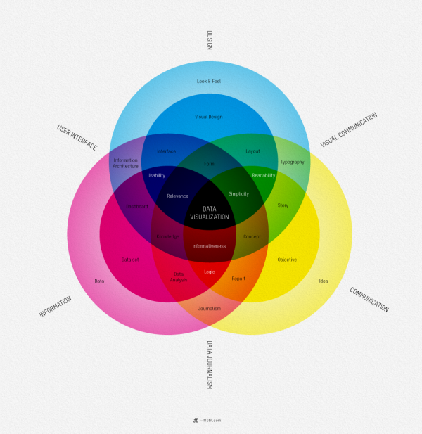
What is Data Visualization?


I love this map of What Is Data Visualization? from Sébastien Pierre, founder of ffunction.  It lays out the different aspects of information design, and acts as a fantastic guide to the vocabulary used in the design community.

ReadQWriteCloud has a good interview article with Pierre on his thoughts behind designing the infographic.

Pierre:

“Will it be interactive or static? Will it be used as a tool or to illustrate something? Depending on how we position the visualization, it will be more demanding on UI aspects or on visual aspects. Dashboards, online reports and interactive web visualizations need a solid understanding of UI design, while infographics and print reports require a strong foundation of typography, layout and visual communication.”

Found on ReadWriteCloud and ChartPorn

Wednesday
Mar092011

The Present and Future State of Music

A State of the Art, The Present and Future State of Music (long title, I know) from 3GM.hu looks at the current statistics behind music streaming and consumption.

Personally, I can’t believe the statistic that 85% of listening is still consumed from the Radio?!?  I haven’t listened to an actual radio station for years!  I listen to everything through my iPhone.

Tuesday
Mar082011

The Infographic Noob Guide to Online Marketing

The Noob Guide to Online Marketing - Infographic

The Noob Guide to Online Marketing is a 6-month plan for non-marketers to use as a reference guide to succeed in online marketing.  Based on information and an article from Oli Gardner on SEOMOZ.org, the infographic was designed by Unbounce.com.

“Get me to page 1 of Google, while emailing our customers a bi-weekly newsletter, engaging influencers on Twitter, maintaining a captive Facebook audience, capturing new leads, and putting out 3 blog posts a week.” Harsh? Yes. Familiar? Definitely.

  • Part 1 is a cogged wheel showing 50 tasks broken down by discipline. If you print it out you can tear off each cog or mark the little check boxes as you complete each task.
  • Part 2 is a six month course to teach you how to become an internet marketer whether you’ve done it before or not. Compress the timeline if you’re a workaholic. It also contains a traffic timeline showing the effect certain actions will have on your inbound traffic growth.

 Found on Social Media Graphics and Visual Loop

Friday
Mar042011

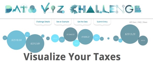
Google Data Viz Challenge: Visualize Your Taxes

Google has partnered with Eyebeam to sponsor the Data Viz Challenge: Visualize Your Taxes using data provided by WhatWePayFor.com.  I really like the data viz styles used as a font, similar to the Goole Doodles.

Every year, Americans fill out income tax forms and make a payment to the IRS. It’s an important civic duty, but it is also a lot of money. Where does it all go? Using data provided by WhatWePayFor.com, we challenge you to create a data visualization that will make it easier for U.S. citizens to understand how the government spends our tax money.

The Prize: $10,000 in prizes with $5,000 for the top entry.  Winning entries will featured on the DataVizChallenge.org website, the Official Google BlogEyebeam.org and Fast Company’s design blog, Co.Design.

The Deadline: Submit your entries by midnight of March 27, 2011. Finalists will be announced the week of April 11, and winners will be publicly announced on Tax Day (April 18, 2011). 

Participants must be residents of the U.S., which is an issue for many would-be designers.

Found on Infographics News, VizWorld and Infosthetics

Thursday
Mar032011

The Infographic History of SxSW

To help commemorate the 25th birthday of the South by Southwest (SxSW) conference this year, Eloqua teamed up with JESS3 to create this huge circular timeline.  Memorable moments and events are described around the outside, while the attendance of the three main conference topics (music, film, interactive) are visualized in the middle.  It was so large, i had to drop it into Zoom.it to make it interactive.  You can download the high-resolution PDF file here.

we collaborated with design partner JESS3 to produce an infographic, titled “The History of SXSW,” which celebrates the festival’s impact on the cultures of music, film and technology.  We also dug up (and visualized) a massive number of did-you-know facts about the epic festival.

SxSW started in 1986 with only 700 people attending, but has exploded in the last few years to draw in over 36,000 people to Austin, TX.  This year, SxSW will be held March 11-20.

Thanks to Abby for sending it in, and it was also a very popular post on Mashable.