About
Randy Krum
President of InfoNewt.
Data Visualization and Infographic Design

Infographic Design

Infographics Design | Presentations
Consulting | Data Visualizations

DFW DataViz Meetup

Join the DFW Data Visualization and Infographics Meetup Group if you're in the Dallas/Fort Worth area!

Search the Cool Infographics site

Custom Search

Subscriptions:


Feedburner

The Cool Infographics® Gallery:

How to add the
Cool Infographics button to your:

Cool Infographics iOS icon

- iPhone
- iPad
- iPod Touch


Read on Flipboard for iPad and iPhone

Featured in the Tech & Science category

Flipboard icon

Twitter Feed
From the Bookstore

Caffeine Poster

The Caffeine Poster infographic

Entries in health (118)

Wednesday
Jun152011

Caffè Italiano: 50 Types of Italian Coffee


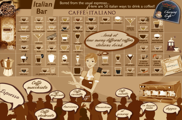
Caffè Italiano is another mouth-watering infographic from CharmingItaly.com.  I love how they took what could have been a standard drink ingredients visualization one step further and designed it as a menu board for an Italian coffee bar.

For Italians, coffee break is a sort of ritual in which the conviviality is a key point. Around a good coffee you can have a chat, take a few minutes for yourself and relax. It’s not just about inserting something into the stomach.

For Italians, drinking a good coffee is a pleasure: it is something to be sipped and not to be swallowed down; it is something to relish in the fullness of its flavour.

This is why a bad coffee gets Italians in a bad mood, while a good coffee can make their day!

When you enter an Italian Bar, around the clock, pay attention on what’s around you: we bet you won’t find 10 people ordering the same type of coffee!

The types of coffee in the Infographic are written in Italian, so you will be able to order them in the right way at the Bar!

The only problem is that there isn’t any guide or legend for the reader to understand the meaning behind the different colored portions of each drink.  They look carefully designed to be accurate to the how the drinks are mixed, but that effort is lost without an explanation.

Thanks to Paolo for sending in the link!

Friday
May272011

The Information Blanket

The Information Blanket is a very cool project conceived and produced by Beattie McGuinness Bungay New York.  Intended as a charity blanket to be donated to kids in under-developed countries, the blanket is printed with information to help the mothers learn about their baby’s health.  The blankets include information about breastfeeding, immunization vaccinations, body temperature and warning signs of illness, all printed in the local language.

There are two ways to participate.  You can buy one for yourself, and one will be donated automatically ($60) or you can just donate one to a child Uganda ($25).  The ones you buy for your self are in English (pink or blue), and the ones that will be distributed in Uganda are in Lugandan (green).


the story of our blanket is one of care and responsible craftsmanship. it begins with green-sensitive 100% double knit north carolina cotton. soft and durable, it meets the strictest u.s. environmental standards on dyes and finishing. when it’s ready, the fabric is pre-shrunk and shipped to new york city where local craftsmen cut it to swaddling size and double lock stitch the edges. the informational graphics are then screen-printed using non-toxic water based inks. the result is a blanket of the highest individual quality.

Our design includes a growth chart with average ranges for one, three and six months, breastfeeding and vaccination frequency, high temperature alert, doctors appointment reminder and a list of illness warning signs.


Found on Twitter via @katerryna and Creativity-Online.com

Tuesday
May102011

Sitting All Day is Killing You [infographic]

Sitting is Killing You
Via: Medical Billing And Coding

You might want to stand up for this…

From MedicalBillingandCoding.org comes a new infographic about the health risks of sitting all day: Sitting Is Killing You.  A fun look at how sitting down will shorten your life.

As we enter the second decade of the 21st century, there is one thing nearly all modern Americans have in common: we sit all the time. Though our great shift towards computer-based work has done great things for productivity, it has, unfortunately, done terrible things for our health. From increased risk of heart disease and obesity in the long term, to sharply hampered cholesterol maintenance in the short term, the negative health effects of sitting are starting to weigh heavily against the benefits. Even the medical field – the greatest advocates and reducing sitting time – is plagued by this new health issue. Though doctors and nurses get plenty of walking time, it usually falls to the secretaries, billers, and coders to do all the sitting. And, as we can see, something has to change.

I wish some of the data visualizations had been designed better, but the overall infographic tells a story to the reader, and gets the point across well.  I would remove the data legends and axis labels, and put the data right into the charts.

Great design elements of non-rectangular sections and illustrations that break boundaries.  Long list of data sources, but there should be a designer credit. 

Found on Mashable.

Tuesday
Mar222011

The Radiation Dose Chart

The Radiation Dose Chart from XKCD.com is very cool.  Not part of the usual stream of comics, this is a more scientific chart from Randall Monroe helping to visualize the facts about radiation exposure.

There’s a lot of discussion of radiation from the Fukushima plants, along with comparisons to Three Mile Island and Chernobyl. Radiation levels are often described as “<X> times the normal level” or “<Y>% over the legal limit,” which can be pretty confusing.

Ellen, a friend of mine who’s a student at Reed and Senior Reactor Operator at the Reed Research Reactor, has been spending the last few days answering questions about radiation dosage virtually nonstop (I’ve actually seen her interrupt them with “brb, reactor”). She suggested a chart might help put different amounts of radiation into perspective, and so with her help, I put one together.

I’m not an expert in radiation and I’m sure I’ve got a lot of mistakes in here, but there’s so much wild misinformation out there that I figured a broad comparison of different types of dosages might be good anyway. I don’t include too much about the Fukushima reactor because the situation seems to be changing by the hour, but I hope the chart provides some helpful context.

Found on Bad Astronomy, Daring Fireball, FlowingData and VizWorld.

Tuesday
Mar152011

Hans Rosling: Visualizing Mortality History [video infographics]

Hans Rosling, known for some of his famous TED Talks, here tries a little augmented reality with his animated charts showing life expectancy and wealth all over the world for the last 200 years.  120,000 data visualized in this 4 minute video clip from his The Joy of Stats documentary for the BBC.

Hans Rosling’s famous lectures combine enormous quantities of public data with a sport’s commentator’s style to reveal the story of the world’s past, present and future development. Now he explores stats in a way he has never done before - using augmented reality animation. In this spectacular section of ‘The Joy of Stats’ he tells the story of the world in 200 countries over 200 years using 120,000 numbers - in just four minutes. Plotting life expectancy against income for every country since 1810, Hans shows how the world we live in is radically different from the world most of us imagine.

Thanks Udi for sending in the link!

Wednesday
Mar022011

Blood Simple: Designing Infographic Health Reports

Blood Simple, by Steven Leckart, is a great article in the recent issue (Dec 2010) of WIRED magazine, and is also available to read online.  Three visual designers were challenged to design a better lab report to help make health information more approachable and understandable by patients.

…lab reports don’t have to be unintelligible. With some thought and design-minded thinking, tests can be as informative to patients as they are to physicians. With a little context and color, we can make sense of the numbers. And with a bit more understanding, patients can become participants in their own health.


These designs certainly aren’t perfect, but they very clearly illustrate the point that we should be able to help patients get a better grip around their own health information.  The last few decades have seen a tremendous shift in pushing the responsibility of a patient’s health back onto the patient without giving them a better way to understand the information. 

We consulted with Lisa Schwartz and Steven Woloshin, physicians at the Dartmouth Medical School Institute for Health Policy and Clinical Practice and experts in communicating data to patients, to make sure the right information gets onto the forms and the irrelevant stuff stays off. And we tapped three exceptional designers to reimagine how this information can be presented—limiting them to one printed page per report. Consider these a proof of concept, a refutation of the argument that ordinary people can’t handle their health (and inspiration, we hope, for the medical establishment).


I want my own Visual Health Report!

Thursday
Feb242011

WHAT?!? The Hearing Loss infographic


You Want to Lose Your Ears? is a cool infographic designed by Big Oak about common (and uncommon) sounds and their potential risk to your hearing.  I love the spiral visual as the sound examples get louder.  

Here we have a graphic that brilliantly displays the effects of hearing loss and how to cope with it. The graphic points out that the four main ways people lose their ears are through listening to loud music, spending too much time in an industrial work place with power drills and the like, being exposed to the sounds of a racetrack, and being exposed to the sounds of guns firing for long periods of time. So, how do you know if your ears are being damaged? Well, if someone is standing three feet away from you, but you cannot hear the words coming out of their mouth, then odds are that you are probably in a situation where the noise level is dangerous.

Hopefully, a grenade isn’t a common experience for any of us, but if it is, let’s hope hearing loss is the worst of your worries!

Infographic Design by Big Oak for The Ear Plug Superstore & Audilio.com (Protection Auditive)

Found on InfographicsShowcase.com

Monday
Nov292010

Are You Vitamin D Deficient? - The Infographic

Another great one by David McCandless from InformationIsBeatiful.net.  Are You Vitamin D Deficient? looks at the growing research that shows how important Vitamin D is to our health.

I first got serious about Vitamin D after listening to Steve Gibson’s own experiences with Vitamin D on the Security Now podcast #209.  You can see more info at Steve’s Vitamin D page.

I take Vitamin D daily now.

Wednesday
Nov172010

Rogue Infographics - The Empowered E-Patient Translated into Chinese


I found one of my recent client infographics, The Empowered E-Patient, translated and posted on a Chinese site, www.mazingtech.com (along with many others), but it’s not a version that I designed.  I also had to view the site using this link with Google Translate.  Someone has downloaded the original image file, translated all of the text into Chinese and then reposted the infographic.

Let me start by saying that although I designed the original infographic, I don’t think I have a big problem with someone else translating it and republishing it without my permission (or involvement) in this way.  It was done very well, and the client I designed it for feels the same way.

Here you can see the original and the translated version side-by-side:


You can see that someone spent some time with an image editing program trying to do this right and make it look official.  The Chinese text is the same size and color as the original English, and was very carefully positioned.  The visuals were left intact, as were all of the logos, website addresses and even the copyright information.  

Technically, I think this would be considered a copyright violation, but it’s not like another site is claiming ownership or directing traffic to a new, different destination site.  Because of the care that was taken, if this infographic is reaching more people because of the translation, it would be successfully driving more awareness and traffic to the PathOfTheBlueEye.com site.  That was the whole point of the original infographic in the first place!

One issue is that because I wasn’t part of the translation process, I don’t know that it was translated correctly.  If there actually is some existing demand to view this in Chinese, I could have offered that service to my client to make sure that we were happy with the translation.

It’s worth noting, that there are MANY English infographics that have translated into Chinese on this site, but the navigation to find them is very difficult.  Here are a few more from other designers that I have posted before on Cool Infographics, but have been translated and reposted in Chinese.  (You can click the titles to see the original English version I posted)


WTF is HTML5, and Why Should We Care?

Apple, Adobe Flash and H.264

The Visual FAQ of SEO infographic

Tuesday
Nov022010

Client Infographic: The Empowered E-Patient


The Empowered E-Patient is a recent project InfoNewt (my company) did for the Path of the Blue Eye Project.  The statistics are compelling, and certainly support that e-patients are now mainstream.

In 2000, the Pew Internet and American Life Project found that 25% of Americans searched online for health information.  Today, 61% rely on the Web for medical and health content.  Americans’ growing reliance on Dr. Google and Nurse Yahoo! has led to profound changes in how health organizations and providers relate to and communicate with consumers.

Notably, this infographic provides information on e-patient social media communications from a Project-produced research report, “Communicating with the Empowered E-Patient.”  This report is available free of charge to individuals making regular contributions to the Project’s knowledge community, Living the Path.  Learn more about how to access this report here.


One of the challenges was defining not only what is an e-patient, but also what is the correct term to refer to these people looking up medical information online.  We ended up using Google to determine which terms are used most commonly, and the title ‘e-patient” was clearly the term used most often.

Thanks to Fard and the team at Enspektos.com.  There’s much more information available at the Path of the Blue Eye Project.

Page 1 ... 5 6 7 8 9 ... 12 Next 10 Entries »