About
Randy Krum
President of InfoNewt.
Data Visualization and Infographic Design

Infographic Design

Infographics Design | Presentations
Consulting | Data Visualizations

DFW DataViz Meetup

Join the DFW Data Visualization and Infographics Meetup Group if you're in the Dallas/Fort Worth area!

Search the Cool Infographics site

Custom Search

Subscriptions:


Feedburner

The Cool Infographics® Gallery:

How to add the
Cool Infographics button to your:

Cool Infographics iOS icon

- iPhone
- iPad
- iPod Touch


Read on Flipboard for iPad and iPhone

Featured in the Tech & Science category

Flipboard icon

Twitter Feed
From the Bookstore

Caffeine Poster

The Caffeine Poster infographic

Entries in history (262)

Monday
Apr232012

The Rise of the Slacktivist 

Ever had this feeling that you were a Slacktivist? Well wonder no more! The Rise of the Slacktivist infographic from sortable.com will put a rest to all your questions!

Is there any value in a Slacktivist? Can 500,000 people on twitter actually change something? Is hitting the streets and protesting the only real way to cause social change? Sortable takes a look at the rise of slacktivism, and the power this movement has.

This design does a good job of telling a story to the reader that is easy to understand in a linear fashion top-to-bottom.  It starts with the background of “What is a Slacktivist,” then shares a number of behavioral stats about Slacktivists, a few successful Slacktavist campaigns and finally the “10 Signs you might be a Slacktivist” is a self-check for the readers.

The illustrations are mostly relevant, and the overall design isn’t too crowded with information.  I don’t understand some of uses of the social media icons, like why is Twitter representative of volunteering and Facebook representative of taking part in events?  They missed the opportunity to visualize some of their data point too, like the Red Cross stats related to the Haiti earthquake.  Even at least an illustration of five days on a calendar would help.

Even though there are a lot of Sources, they were thorough and correctly included them in the infographic design.  They are also listed on the landing page, but none of that text gets carried along when someone reposts the infographic.

The bottom of the design is missing a copyright statement, and it would be nice to give the designer credit.  Readers are generally more receptive to a design when the designer is mentioned because it comes from somebody and not just a corporation.

Thanks to Brenden for sending in the link!

Wednesday
Apr112012

Defense of the Ancients (DotA) Infographic

The Defense of the Ancients (DotA) infographic from GameArena.com takes game enthusiasts through a brief history of how the game came about!

Dota, Defence of the Ancients, is the latest hype in gaming. Initially developed as a modified game in Starcraft, the concept has now grown globally and has even made its way into professional competitions. Popular game titles that have implemented the “DotA” concept include Warcraft 3, DotA Allstars, DemiGod, League of Legends, Heroes of Newerth and Realm of the Titans. Two more upcoming titles that will certainly get the gaming world’s attention are DotA 2 and Blizzard DotA.

So what is DotA exactly? Our trusty graphics boffins have once again created the infographic below for the complete history on how the new genre came about.

The design style is certainly relevant to the game look-and-feel itself.  The timeline is odd that some events don’t have specific dates identified.  The use if icon illustrations for different concepts and company/game logos on the timeline helps the reader.  I would have liked to see some of the stats behind the game and its popularity.

Thanks to Eric for sending in the link!

Friday
Apr062012

Augusta National Golf Club - Then and Now

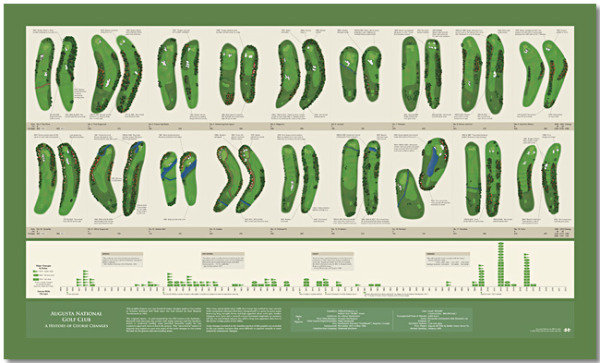
Bill Younker from Historyshots.com has designed a new infographic poster!  Augusta National Golf Club- Then and Now, shows how the famous golf course has changed since its first Masters Tournament 79 years ago!

Augusta National Golf Club has undergone continuous modification since hosting its first Masters Tournament in 1934. This graphic depicts the more than 100 major changes made to the course over the past 79 years. At the top is a visual side-by-side comparison of each hole for 1934 and 2012. Below the hole comparisons is a timeline that maps tee, fairway and green area changes year-by-year. The combination of visual comparison and detailed timeline provides a sweeping overview of all the major changes made since 1934.

This is a great design that demonstrates how simple visuals can be used to show the viewer differences between the hole designs.  By showing a terrain map of each hole then and now, side-by-side, the poster is easy for viewers to compare the changes and enjoy.

You can buy the 40” x 24” inch poster for $34.95 and definitely check out the zooming viewer to see the poster up close at Historyshots.com.

Great job Bill!

Thursday
Apr052012

The Fiction to Reality Timeline

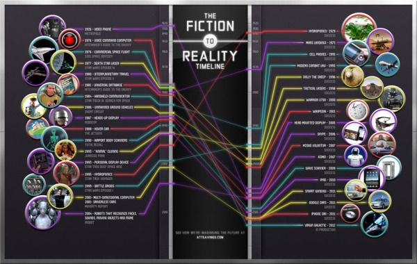
The Fiction to Reality Timeline infographic from attsavings.com brings all of cool gadgets from the future in movies into the present.  Anything is possible!

Do you remember “Star Trek” and all the great gadgets the crew members used in each episode? Or the fancy gizmos from “The Jetsons” or “Minority Report?” Ever wonder when, or if, we’ll invent technology like what we’ve seen in the fictional universe? Satisfy your craving for fictional tech with The Fiction to Reality Timeline.

Although I disagree that some of their actual technology references are the first time certain technologies have appeared in the modern world, the overall message is clear.  Things like Heads-Up Displays have been around in fighter cockpits for much longer, and the iPad wasn’t the first portable display device, just the first mainstream commercially successful device.

I couldn’t figure out if the line colors had any meaning.  Are they color-coded to match some type of category?

Where’s my flying car?!?

Thanks to Ryan for sending the link!

Monday
Apr022012

Interactive Infographic: Coca-Cola vs. Pepsi


The Coke VS. Pepsi: The Cola Wars infographic from cnntees.com. Which side are you on?

For over a century Coke and Pepsi have been at each other’s throats in a constant struggle for a bigger piece of the billion-dollar soda market. 

Along the way the companies have picked up a slew of loyalists and fans, adamant that their cola reigns supreme. While there are countless spots online to check out the history of either company we decided to put together an interactive infographic, putting all cola war highlights together in one spot.

This is a really fascinating experiment with infographic design.  Although it appears to be a static infographic, it’s actually interactive.  If you look closely, there are two videos built directly into the middle of the infographic that play when clicked.  The growth chart at the top is also interactive.  Click on a decade, and then choose the specific year, and it displays events in each companies history related to that time period.

The interactivity is so subtle though, most people will probably miss it without me spelling it out in the title and here in the commentary.

The financial stats section is a really poor use of pie charts in the bottle caps.  The logo images work, but pie charts are for visualizing percentages.  Here, they forced the data into the cute visual, but it makes the data confusing and hard to understand.    Are the charts visualizing the percentages of each expense related to total revenue, or just arbitrarily visualizing the values to represent the comparison between the two companies?  No percentages are shown, and no values are shown for the values of the total pie.  This is forcing a round peg into a square hole.

At the bottom, it’s missing a URL to the original blog post (so readers that find this on the Internet can find the original high-resolution infographic), a copyright statement, a trademark statement and a credit to the designer.

Thanks to Ron for sending in the link!

Friday
Mar162012

Client Infographic: Streamlining your Digital Life with the new iPad

With the Apple event last week announcing the release of the new iPad, the Streamlining your Digital Life with the new iPad infographic from NextWorth takes a look at the history of the electronic devices that the iPad has replaced in our lives.  A true multifunctional device, the iPad has replaced many of our separate gadgets.

The digital world is converging on a revolutionary all-in-one device, the powerful, brand-new iPad. These are the iconic portable devices that led to (and are to some extent being replaced by) Apple’s innovation.

The lines are color coded to connect the types of devices in the timeline, and show any devices that had multiple functions of their own (like the Eee PC 701).  Using a treemap in the iPad image, it also shows the amount of time spent using the different functions on the iPad from average consumers.  The use of illustrations instead of photographs of all these devices keeps the design simple and focused on communicating the data.

Finally, using their own internal data, an assortment of prices are shown of the current maximum values that consumers can get by trading in their now-obsolete gadgets.  With a handful of the right gadgets, you could easily get enough money back to pay for a brand new iPad!

All of the essential information is included in the design: data sources, brand logo, URL of the original high-resolution infographic landing page, company logo, copyright statement and even a mention of the designer (nice job Jeremy!).

This was an infographic design from my own company, InfoNewt, and of course, the team at NextWorth was fantastic to work with!

Tuesday
Mar132012

10 Irish Inventions that Changed the World

With St. Patrick’s Day coming up this weekend, I thought i would share the 10 Irish Inventions that Changed the World infographic from GoIreland.com explores 10 of the greatest Irish inventions ever.

Ireland: The land of saints and scholars, right? Well, sort-of. Whatever about saints, this little island has certainly produced its fair share of clever clogs. For a country that makes no secret of some pretty audacious claims to fame (we even tried to claim that Barack Obama guy as one of our own!!), we have been remarkably quiet about some outstanding Irish inventions.

Modern chemistry? Tick. Color photography? Tick. Both Irish inventions, and, as you can see from the infographic, there are many more. And when it comes to refreshing beverages, it’s not just Guinness that should come to mind. Raise a toast to soda water and chocolate milk, both Irish inventions to rival the black stuff.

Certainly more narrative than data visualizations, but they picked some fun and interesting inventions to include.  There doesn’t seem to be any rhyme or reason to the sequence of events; they’re certainly not in chronological order.  I did notice that in the Atomic Bomb section, the visualization for 600,000 Volts actually shows 800,000 Volts.

Three things are missing from the bottom of the design: a copyright statement, the URL where readers can find the original infographic landing page and credit to the designer(s).

Thanks to Aidan for sending in the link!

Monday
Mar122012

The Learning Power of LEGO


The Learning Power of LEGO infographic from onlinecollege.org brings to light the uses of LEGOs in education as well as a brief history of Lego Bricks.


Lego is a range of construction toys first created by Ole Kirk Christiansen in the 1940s in Denmark. Beginning as a set of stackable, interlocking blocks, Lego has evolved into the company’s global flagship product of colorful plastic pieces that can be assembled and re-assembled in infinite ways. The blocks are so popular with children that LEGO has designed educational products and curricula, and teachers are using them in their classrooms.

This is a bright and colorful design, just like LEGOs themselves. Easy to follow the information down the page, but uses too much text in my opinion.

The second section, Statistics, should have used some data visualizations to show the numbers visually. I think they missed an opportunity here to use Legos themselves to visualize the numbers. Hidden in here is the idea that LEGO should be considered the World’s Largest Producer of Tires (which I find astonishing), and a quick visual looking at the world's tire companies would have been great!

The bottom does a good job listing the data sources and the producing company logo, but is missing a URL to the original infographic posting and some type of copyright statement.

Thanks to Stella for sending in the link!

Friday
Mar092012

Rock of Ages: The Evolution of SxSW

Rock of Ages: The Evolution of SxSW from Music Festival to Interactive Launch Pad is a new infographic from Rocksauce Studios just in time for SxSW 2012 this weekend.

Since 1987, SXSW has morphed into an interactive, film and music conference and festival that brought together 19,364 attendees in 2011.

Austin-based app development firm, Rocksauce Studios, has created an infographic that dissects the interactive portion of SXSW, and proves why this conference is the new popular techie playground.  

The topics and cited statistics covered in “The Evolution of SXSW from Music Festival to Interactive Launch Pad” include:

- History of SXSW
- 2011 Attendance Demographics
- Top 10 Types of Business of Interactive Registrants  
- Geographic Breakdown of Total Interactive Registrants
- Successful SXSW Startup Launches
- Recent SXSW Web Awards  / Interactive Awards Winners
- Reasons So Many Companies Chose to Launch at SXSW
- The Accelerator

You can read more about the development of the infographic on Silicon Angle

This design does a really good job with the visual basics.  Showing the icons/logos of the startup companies, illustrating the business types, mapping the conference registrants. The overall design tells a good story top-to-bottom to the readers, and it’s easy to follow the flow of information.

Three things stood out to me that could be improved:

  • There are a lot of data values in the text of the timeline that should have been visualized.
  • The three shapes showing the amount of Interactive Conference Participants, Conference Sessions and Interactive Media in Attendance all of different values, but the shapes are not sized to match those values.
  • The last section “The Accelerator” seems to fall apart as all text, even though there are some good data values there that should have been visualized.

Thanks to Kelly for sending in the link!

Thursday
Mar082012

Airbnb's Global Growth

Airbnb has released a fantastic infographic, Airbnb’s Global Growth, sharing their own stats about their phenominal growth from August 2008 to February 2012.

Airbnb started in Brian and Joe’s San Francisco apartment. Today, more than five million nights have been booked on Airbnb. And although Airbnb’s roots are in the USA, more than 75% of all reservations last year were international - where either the traveler or host (or both!) was outside the United States. Check out our infographic celebrating the international growth that you’ve powered.

I think an infographic is a great way for a company to share it’s story with it’s executives, it’s shareholders, the press and the public in general.  Infographics are visual storytelling, and every company has a story to tell.

The design is beautiful!  They’ve included a wide variety of data visualization types: area chart, doughnut chart, maps, bars and illustrations.  The one complaint I have is that too many of the stats are just shown in large text.  Large fonts don’t make good data visualizations.

They made an interesting choice and included the URL for a separate page on their website about the Airbnb service, instead of linking back to the original infographic.  I know they want to promote their service, but I think this is a mistake, because a reader has to search through their blog posts to find the infographic.  A couple things missing from the bottom: a copyright statement and credit to the designer.

Thanks to Slavik for sending in the link!