About
Randy Krum
President of InfoNewt.
Data Visualization and Infographic Design

Infographic Design

Infographics Design | Presentations
Consulting | Data Visualizations

DFW DataViz Meetup

Join the DFW Data Visualization and Infographics Meetup Group if you're in the Dallas/Fort Worth area!

Search the Cool Infographics site

Custom Search

Subscriptions:


Feedburner

The Cool Infographics® Gallery:

How to add the
Cool Infographics button to your:

Cool Infographics iOS icon

- iPhone
- iPad
- iPod Touch


Read on Flipboard for iPad and iPhone

Featured in the Tech & Science category

Flipboard icon

Twitter Feed
From the Bookstore

Caffeine Poster

The Caffeine Poster infographic

Entries in history (262)

Friday
Mar022012

The Genealogy of Automobile Companies 

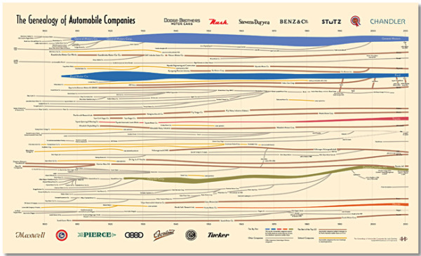
A brand new infographic poster designed by Larry Gormley at HistoryShots.comThe Genealogy of U.S. Automobile Companies visualizes over 100 years or corporate history of car company mergers, acquisitions and closures.

A flowing history of more than 100 automobile companies across the complete time span of the automobile industry. From 1900 to 1925 over 3,300 organizations were formed to produce automobiles in the United States. In 1910 alone 400 new startups entered the industry. Most attempts lasted less than two years. While car sales exploded (from 1910 to 2010 US sales rose from 200,000 to 11.5 million cars) the strongest entrepreneurs bought out rivals and combined forces. Today, ten companies account for about 90% of all US automobile sales.

This graphic uncovers and explains how the industry was created and how it arrived at its present form. At the core is a full genealogy of over 100 companies from the Big Five to the small defunct companies. Folded into the genealogy is the relative market share of US sales for each company.

The Big Five car companies have unique colors, and all of the other companies are color-coded into categories of he trest of the Top 20, defunct companies and other interesting or famous companies.  The thickness of the lines change over time to represent market share.

You can buy a copy of the 38” x 23” poster for $29.95 over at HistoryShots.com

Thanks to Larry for sending in the link!  Great design!

Wednesday
Jan112012

Calendar Visualization of Fatal Car Crashes

I really like this data visualization from Nathan Yau at FlowingData.comVehicles Involved in Fatal Crashes 2010 takes a new look at the statistics released by the U.S. National Highway Traffic Safety Administration.  Instead of plotting them on a traditional map, Nathan looked at the time data.

After seeing this map on The Guardian, I was curious about what other data was available from the National Highway Traffic Safety Association. It turns out there’s a lot and it’s relatively easy to access via FTP. What’s most surprising is that it’s detailed and fairly complete, with columns for weather, number of people involved, date and time of accidents, and a lot more.

The above shows vehicles involved in fatal crashes in 2010 (which is different from number of crashes or number of fatalities). This data was just released last month, at the end of 2011 oddly enough. It’s a calendar view with months stacked on top of one another and darker days indicate more vehicles involved.

- Nathan Yau

As was suggested by others in the comments on FlowingData, I agree that since the weekends have the higher incidence rate, starting the week with Monday and moving Sunday to the last column may show that a little bit clearer.

Nathan has made all of the data avaialble for anyone that would like to try a visualization themselves.  Student project?

Monday
Jan092012

Everything You Need To Know About CES


The Consumer Electronics Show (CES) is this week in Las Vegas, NV (Jan 10-13).  Sortable.com has released this cool infographic, “Everything You Need To Know About CES” showing the history of the events, and some of the stats behind putting the show on every year.

The International Consumer Electronics Show is the biggest tech event of the year, with an expected 140,000+ visitors and 2,700 exhibitors who are planning more than 20,000 product announcements over a 4 day period. Sortable.com wanted to take a look at the history of CES and just how big the show really is.

I really love how the timeline shows the reader images of the actual products that were the key product launches at various times throughout the show’s history. 

A few things that make good infographic designs were left out.

  • The copyright.  Is this free to the public to reproduce, edit, publish and use for commercial purposes?
  • The URL of the infographic’s main landing page.  This always makes it easier for readers to find the original.
  • List the data sources, where did the stats come from?  Why should I believe your data?
  • The staggered timeline is disconcerting to readers.  The years should be evenly spaced out along the timeline.
  • Give the Designer credit

Thanks to Brenden for sending in the link!

Tuesday
Jan032012

The Timeline of Doctor Who

A highly detailed historical Timeline of Doctor Who from Cabletv.com!

Check out this complete timeline of Doctor Who from 1963 to present, including episodes, seasons, companions, villains, and more. Scroll down to follow all the Doctor’s adventures through time. A Fantastic resource for any Doctor Who fan.

First and formost it’s a timeline of the Doctor Who episodes from 1963-2011.  I’ve posted earlier Doctor Who related infograpics here before (The Doctor Who infographic), but none that contained this level of detail.  From left-to-right you have seasons, episodes, which Doctor, which companions, key villains and additional facts.  When you view the timeline on the original page, the episode titles are also listed on the left side and aligned with the infographic.

There are a couple design changes I would propose that would have made the data easier to understand.  One of the things I love is that there is no legend, or any need for one.  All of the descriptions for the color-coding and data visualizations is included in the visual designs.  However, some of the color-coding is inconsistent.  The color for Rose Tyler as the first of the modern companions is green in the timeline, but then additional facts about Rose are colored blue in the last column.  This is also true about the character of the The Master, and other companions, where a consistent color-coding would have made the connections easier for the reader to understand.

Thanks to James for sending in the link!

Thursday
Dec082011

The Rise of Minecraft

This infographic from Jess Bachman at Visual.ly comes The Rise of Minecraft.  The vertical timeline shows the meteroic rise in popularity of the new game from Mojang.

November 18, 2011 marks the Minecraft release out of beta. Follow the rise of Minecraft, from it’s humble beginnings as a one-man experimental project to its overwhelming success in the gaming industry accruing over $1 million in weekly sales. With close to $0 spent on advertising, Minecraft’s popularity can be marked by this year’s sold-out MineCon event in Las Vegas, NV, on November 18 & 19.

I love the 8-bit design style to match the game itself.

Friday
Dec022011

Client Infographic: The Visual History of Christmas Trees

The Visual History of Christmas Trees is a new infographic from ChristmasTreeMarket.com.  Designed by InfoNewt and designer Jeremy Yingling, this one creates a visual timeline of the major milestones for the Christmas Tree mostly focused on the last 100 years.

The history of the Christmas tree has garnered a lot of fascinating points over the years. A tradition with humble beginnings in 15th century Latvia, the festive tower of foliage has grown to be one of the holiday season’s most beloved symbols. From the first decorated tree in 1600 to Gubbio, Italy’s 650-meter tall wonder, get a glimpse of Christmas tree history through this handy visual guide from Christmas Tree Market.

This one was a lot of fun, and of course is timed to be appropriate for the holidays.  I love how this design turned out, and it was a unique topic that had not received a thorough infographic treatment before.  The design challenge was letting the images shine, keeping the text to a minimum, but still providing the reader with a lot of interesting information.

No matter which side of the Live Tree vs. Artificial Tree debate you fall on, you'll find lots of good information in the infographic.  I bet you'll even learn something you didn't know.  I'm still fascinated by the upside-down Christmas Tree!

Tuesday
Nov222011

Crazy for Black Friday Deals


In honor of our upcoming shopping holiday, Crazy for Black Friday Deals from BradsDeals takes a look at some of the stats behind Black Friday (day after Thanksgiving) shoppers.

BradsDeals created a Crazy for Black Friday Deals infographic to illustrate historical Black Friday figures as well as the shopping trends and predictions for this year’s holiday.

If you live in Minnesota, congratulations, you live in the most Black Friday crazy state in the country. And while Black Friday fans in major cities like New York, Los Angeles and Chicago may be more likely to cruise Black Friday deals on their smart phones than shoppers in smaller towns, the Dallas suburb of Carrollton blows everyone out of the water with 60% of Black Friday searches happening on mobile devices. WOW.

I live near Carrollton, but I wouldn’t consider it a particularly tech-savvy area.  Apparently, they’re good with mobile shopping…who knew?

Of course, I get tons of Black Friday infographics submitted to the site, but I really liked the design of this one.  The information is visualized in a clear, easy-to-understand design. The visuals are simple and relate to the data.  Maps for cities, calendar for days shppers make plans, doughnut diagrams for percentages and silhouettes of top products.

On the other hand, there doesn’t seem to be a cohesive story to this infographic.  It’s a collection of disconnected data points about top cities, mobile trends, top products and when shoppers make plans.  Also, the design is missing a list of the data sources, the URL for readers to find the original posting, a copyright or creative commons claim and recognition of the designer.  Why should we trust any of these statistics?

Thanks to Amanda for sending in the link!

Monday
Nov212011

The Insanely Great History of Apple

The Insanely Great History of Apple is a cool new poster from PopChartLabs.com, where you can purchase the $25, 18”x24” poster for yourself (and many other great ones).

The world’s most comprehensive mapping of Apple products, this print shows every computer released by Apple in the last thirty years, from the original Mac through the MacBook Air. Products are sorted according to type, including the connections between various form factors which have arisen as Apple has invented—and reinvented—insanely great products.

Found on VisualNews

Monday
Nov072011

The Infographic History of Spices

Turn Up the Heat: Worldwide History of Spice from recipe-finder.com brings together a whole bunch of related infomrmation into one infographic.

They say that money makes the world go round. While that might just be true today, centuries ago, spices made the world go round. Spices used to be worth so much that people set about to conquer new territories in search for these flavor enhancers. Today, basic spices may not fetch so much in the market (although saffron will still cost you an arm and two legs), but they are used just as much in kitchens around the world.

The information in here is fantastic, but a few design problems make this a little harder to understand than it should be.  The sized-circles over the map…what do the sizes mean?  From an overall design aspect, it’s missing a clear title, license and URL to the original posting.

I can eat jalapeno peppers in a lot of the food here in Texas, but anything over about 6,000 on the Scoville Scale is out of my league!

Thanks to @franky for sharing this on Twitter.

Friday
Oct282011

An Ode to Horror Cult Classics (1933-2006)

Yep, Halloween is a great time of year, and CheapSally.com brings us a new timeline history of horror movies with OH, The Horror! An Ode to Horror Cult Classics.

We all love to be a little scared sometimes, and Halloween is the perfect day for that. We get to enjoy all of the frightening festivities:  creepy carnivals, haunted houses, trick or treating and of course, horror film marathons. The Halloween Horror Films infographic takes us back to some of our most feared nightmares. Look at 35 of the most popular cult classics, their rotten tomatoes ratings, the original movie budget and their gross domestic box office revenue. See which movies made the cut to become the Top 15 Highest Ranked Horror Films of All Time.

Thanks to Cameron for sending in the link!