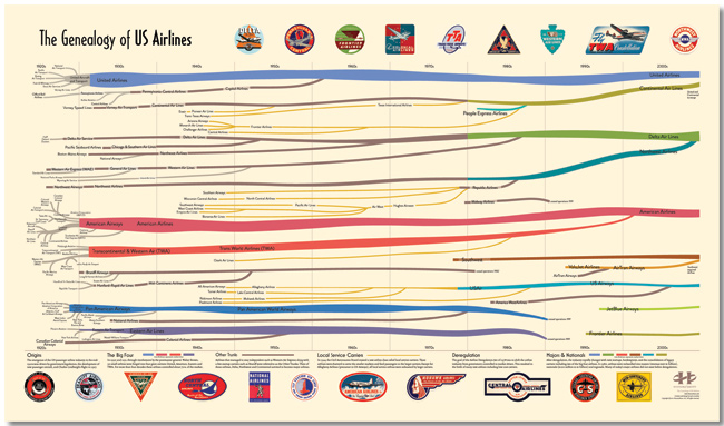
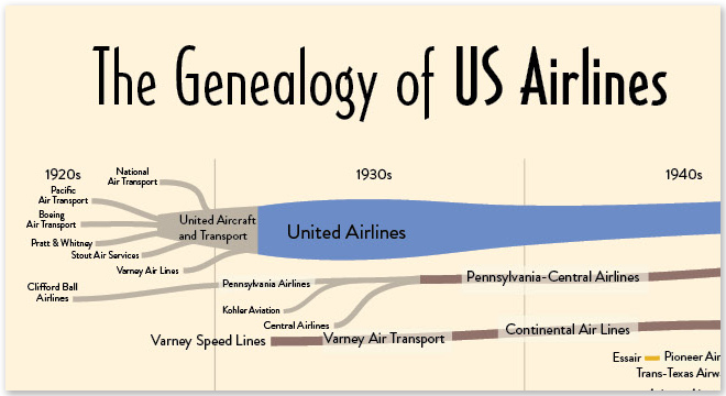
The Evolution of the Web
 Randy
Randy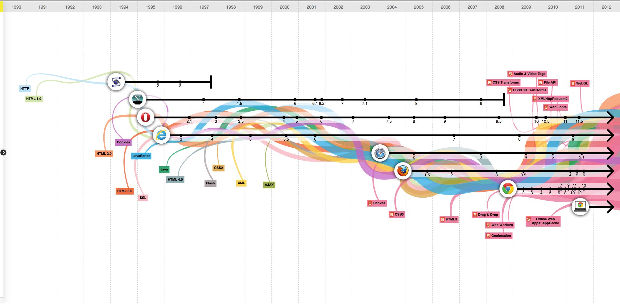
The Evolution of the Web is a cool, interactive visualization from the Google Chrome team (along with Hyperakt and Vizzuality) that explores the evolution of web browsers over the last 20 years.
Over time web technologies have evolved to give web developers the ability to create new generations of useful and immersive web experiences. Today’s web is a result of the ongoing efforts of an open web community that helps define these web technologies, like HTML5, CSS3 and WebGL and ensure that they’re supported in all web browsers.
The color bands in this visualization represent the interaction between web technologies and browsers, which brings to life the many powerful web apps that we use daily.
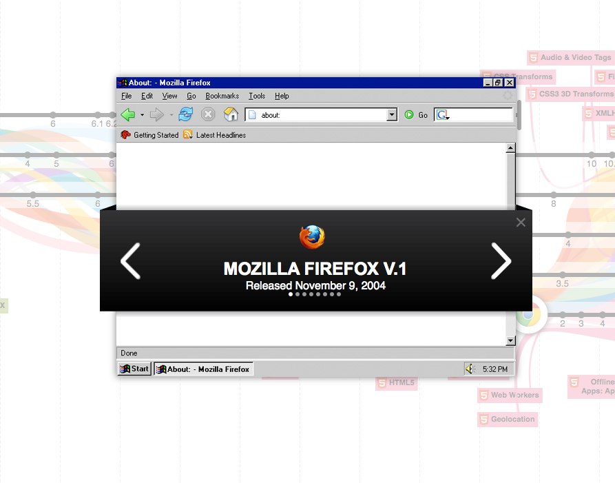
Clicking on any of the browser icons brings up a cool visual history of the window design for each version.
Although there is a lot of data showning the version releases along the timeline, part of this design is just pretty. The flowing colored bands seems to grow bigger over time implying increased usage of each technology, but their placement behind the broser lines doesn’t actual show which technologies were used by each browser.
In fact, there’s a subtle marketing spin that has all of the lines converging behind the Google Chrome logo in 2008 and then exploding into the future. And the HTML5 line seems to imply that it will take over the Internet in 2012.
Found on Flowing Data.