About
Randy Krum
President of InfoNewt.
Data Visualization and Infographic Design

Infographic Design

Infographics Design | Presentations
Consulting | Data Visualizations

DFW DataViz Meetup

Join the DFW Data Visualization and Infographics Meetup Group if you're in the Dallas/Fort Worth area!

Search the Cool Infographics site

Custom Search

Subscriptions:


Feedburner

The Cool Infographics® Gallery:

How to add the
Cool Infographics button to your:

Cool Infographics iOS icon

- iPhone
- iPad
- iPod Touch


Read on Flipboard for iPad and iPhone

Featured in the Tech & Science category

Flipboard icon

Twitter Feed
From the Bookstore

Caffeine Poster

The Caffeine Poster infographic

Entries in interview (20)

Tuesday
Jun242014

HelpMeViz: DataViz Community Feedback for Your Charts

HelpMeViz: DataViz Community Feedback for Your Charts

Have you ever struggled with which type of chart to use in your presentation? Or how to get Excel to display the chart the way you want it to appear?  Or don’t know what software will create the data visualization you would like to use?

Jon Schwabish is a data visualization specialist, and in 2013 he launched a new website to help everyone become better at data visualization called HelpMeViz.  The HelpMeViz site invites you to submit your data visualization projects to get feedback from the community.  The community is encouraged to offer suggestions, critiques and debate ideas about chart formats, software tricks, visual applications and visualization methods that can be valuable feedback to make your data more understandable and impactful.


The data visualization community consists of people who use data and design to tackle a variety of issues and challenges. Outside of a few specific blogs and tutorials however, there isn’t a place where that community can provide in-depth comments and criticism on data visualization projects. This site is designed to facilitate discussion, debate, and collaboration from the data visualization community.

The site is open to anyone who is searching for feedback on their visualization designs, from seasoned designers and data visualization specialists to individual analysts searching to improve their graphic displays. All types of visualizations are welcome: simple, single line or bar charts to full-blown infographics to interactive visualizations.

If you have a chart that just isn’t working, or getting your message across to your audience, you can upload it to the site, and get really useful, actionable advice from the Community.

Mapping Program Participation by State

Jon is currently the Senior Researcher and Data Visualization Expert at the Urban Institute in Washington, DC, and he took some time to answer a few interview questions from me about the HelpMeViz site:

Cool Infographics: Who is the target audience of the site?

Jon Schwabish: The site was created for anyone—truly anyone—to seek feedback or submit comments. I want anyone to be able to use the site—from the data visualization expert to the experienced JavaScript programmer to the research assistant using Excel. To attract that broad audience, I decided against using established tools or sites like Flickr, Pinterest, Behance, or Dribbble. Many of those sites require users to create an account, or have some other barrier to easy entry and I wanted to avoid those types of barriers. Additionally, I felt that sites like Stack Overflow and GitHub appeared too difficult for the everyday user. So, although it’s often said that you should refine your audience, I wanted to go broad here to make it as accessible as possible.


Cool Infographics: How often do people post new visualization questions to HelpMeViz.com?

Jon Schwabish: To date, I’ve posted at least one visualization per week. There have been a few weeks when I’ve been able to do more. Interactive visualizations and ones that have a unique design question—for example, how to create something in Excel—generate the most interest.


Cool Infographics: Are you having success getting the audience to engage and recommend design ideas?

Jon Schwabish: For the most part, I haven’t had to engage the audience much on my own; community members have taken most of the initiative to engage with the content, making light work for me on that end. I’d like to see more requests on the design side—questions about font or color or layout. To date, requests have been primarily about tools and creation of the visualization. But I think a lot of people would benefit from asking basic design-style questions.


Cool Infographics: Does it take much of your own time to participate and keep the site running?

Jon Schwabish: It doesn’t take too much of my own time, but that will change, I hope, as the amount of content increases. I oftentimes have to rewrite the text to clarify the challenge or goal. Sometimes I need to tweak an image or extract an image from a larger document. I rarely fiddle with the data—if the person who submitted the visualization could use it to create the graphic, then it’s probably close enough for others to use. I’ll usually correspond with the submitter once or twice to make sure he or she is okay with my edits and then I post the submission.


Cool Infographics: What are the best examples of successful projects posted to the site?

Jon Schwabish: There have been a number of interesting challenges.

Perhaps the thing I’m most excited about for the site right now is the live Hackathon that will be held on Saturday, June 28, with Bread for the World Institute. We are inviting 25 coders, designers, and data scientists to help the Institute with two data visualization challenges. I will be live blogging the event and will make the data available on the HelpMeViz site so that anyone around the world can join the discussion and provide his or her own visualization suggestions.

This site is truly made for everyone, and I encourage you to check it out.  The feedback can range from Excel charting tips to visualization programming code.  You can upload your own charting challenges, offer recommendations on other people’s charts or just lurk and learn from the advice of other experts.

If you’re in the DC area, be sure to check out the HelpMeViz Hackathon event on Saturday, June 28th! HelpMeViz will bring together coders, data scientists, and data visualizers in Washington, DC, to help Bread for the World Institute with two data visualization challenges for its 2015 Hunger Report, which focuses on why women’s empowerment is essential to ending global hunger.

Thanks to Jon for creating this incredible resource, and taking the time to answer a few questions!

Friday
Jul262013

Death & Taxes 2014 Poster and Interview

Death & Taxes 2014 poster infographic

The new 2014 Death & Taxes poster has been released, and it is fantastic!  Visualizing the President’s proposed budget for next year, each department and major expense item is represented with proportionally sized circles so the viewer can understand how big they are in comparison to the rest of the budget.

You can purchase the 24” x 36” printed poster for $24.95.

Since 2004, Death and Taxes has been depicting the federal budget and has grown into a powerhouse of information.

For the FY2014 budget, this poster contains over 500 departments, agencies, programs and just about everything else the government can spend money on. It is still the single most open and accessible record of government spending ever created. All in six square feet. 

Previously, the Death & Taxes series has been a project of Jess Bachman (ByJess.net), but this year the series has been taken over by the great team at Timeplots.  Owner Nathaniel Pearlman graciously spent some time answering some of my questions:

Cool Infographics: What’s new in the 2014 design of Death & Taxes?

Nathaniel Pearlman: Timeplots is continuing the Death & Taxes poster franchise, taking it over from its creator, Jess Bachman. We agreed to do this before the scheduled release of the FY2014 budget. To produce the poster efficiently and meet the expectations of an audience already familiar with its look and feel, we minimized big changes and largely stayed with Jess’s design aesthetic. We kept the location of departments, labeled and colored expenditure numbers in the same format; and, the Office of Governmental Ethics is still the smallest circle plotted on the poster. We did, however, make some subtle design changes.

In the bottom-right corner we converted pie charts to a bar chart. We also changed the “For Comparison” section bubble charts to horizontal bar charts. Bars also serve as a visual clue that the information here is different and you see immediately that they differ from the bubbles depicting the discretionary budget in the main area of the poster. We also unified the presentation style throughout the poster. We also omitted the “How much does it cost you” section. 

Cool Infographics: The Death & Taxes poster design is now being made by the team at Timeplots, what are the major differences from the prior posters that were designed by Jess Bachman?   

Nathaniel Pearlman: Timeplots has a four year history of visualizing complex data with compelling design. We have diverse skills and resources and may introduce changes in future posters like dark type against a lighter background for ease of reading; advancing visual unity either by replacing the photos with icons, or by making all color photographs more duotone, or monochromatic; and finally, crafting the type in the header section so that it has more personality. We are also thinking about how to improve the substance of the poster. We would love to hear feedback or suggestions for improvement from your readers.

Cool Infographics: When did the 2014 data become available, and how long did it take you design the poster?

Nathaniel Pearlman: The data was released on April 11, 2013. To prepare, we wrote some data queries and scripts based on the 2013 data about one week before the release. Once we got the 2014 data, we just ran the 2013 scripts. It took about two days to get all of the circles in place on the poster. The design and crafting took longer. The poster went out for review to experts about a month after the we got the data. Of course we were working on many other projects in between as well.

Cool Infographics: What software applications were used for the Death & Taxes poster design?

Nathaniel Pearlman: Scripting and plotting were done in R—an open source statistical application that we have used for other Timeplots posters. The design completed in Adobe Illustrator. Jess created the previous Death and Taxes with Excel and Photoshop, so there was no code or design template we could borrow or reuse. Our programming and design process was new to Death & Taxes, but we decided to go this route because this process would present data more accurately and make future updating much easier.

Cool Infographics: What’s the most interesting thing you learned from the 2014 data?

Nathaniel Pearlman: We guess it shouldn’t be a surprise, but data shows how trivial in the context of the whole budget are some of the biggest political tangles. Things like the National Endowment for the Humanities or the Corporation for Public Broadcasting are very small by comparison to big ticket items.  The nice thing about the poster is that each viewer will be able to reach their own conclusions, based on the area of they wish to investigate or focus upon. Each department, each item, has its own story. 

Cool Infographics: Where do you have them printed, what are the printing specs and why?

Nathaniel Pearlman: The 2014 poster is on a 36” by 24” sized, 80 lb. cover paper. We use a local printer for offset printing and through a process of several proofs we have more control over the colors and the final look and feel of the print. The 2014 poster is slightly lighter than the 2012 one. The lighter paper can roll more easily into tubes without getting creases.

Cool Infographics: Social media has always been a big part of marketing the Death & Taxes poster.  What are your plans to promote the 2014 poster?

Nathaniel Pearlman: Social media is important to us. We have been receiving supportive comments and thoughtful suggestions through a number of channels. Death & Taxes has its own Facebook channel: (https://www.facebook.com/pages/Death-and-Taxes/373639641532). You can also follow Timeplots on Twitter (@timeplots) and Facebook (https://www.facebook.com/timeplots) to receive notice of latest news. Keep your eyes open to these places.

Graphicacy, (the consulting arm of Timeplots) is also working on an interactive version using the same budget data to pair with the poster. That interactive, presenting the same information, will enable interested viewers to explore the federal budget online.

The poster now sells at Timeplots and Amazon.  

Cool Infographics: Prior versions have been available online in a zooming viewer.  Is the 2014 version also available in this format?  What zooming tool is being used?

Nathaniel Pearlman: Yes, you are able to zoom on a watermarked version of the 2014 poster on our Timeplots site. The zoom tool is the default for our shopping content management system, and it allows for crystal-clear views of the information, watermarks aside. While you will have a good sense for the design and presentation of the poster by viewing it online and zooming-in on its details, we believe the print poster will surprise you with its vibrant colors on smooth paper, sharp type, and scale.

 You can also check out Jess Bachman’s thoughts about the new version in his blog post on Visual.ly

Monday
Jan142013

SEO & Infographics - an Interview with Eric Enge

Eric Enge, Author and SEO GuruRecently, I had an amazing opportunity to interview Eric Enge about SEO & Infographics.  Eric has incredible insight in the world of SEO as a consultant, author, speaker and entrepreneur.

Eric Enge is the CEO of Stone Temple Consulting, a consulting company that provides a full range of Internet marketing optimization services including: strategic business planning, on page search engine optimization, link building, content optimization, conversion optimization, social media optimization, user engagement, and pay-per-click campaign development and optimization. Eric is co-author of the book The Art of SEO, a speaker at numerous search marketing events, and a contributing author to Search Engine LandSearch Engine Watch, and SEOmoz

 The interview covers some of the hottest topics that impact the infographics design industry today:

  • Infographics as part of a content marketing strategy
  • How Google’s changes to their algorithm impacts infographics
  • Infographics relevance and accuracy
  • Using attribution links, anchor text and embed code for infographics
  • Infographics on Pinterest 

You can read the complete interview on the InfoNewt blog

Tuesday
Sep042012

2011 Wisconsin Crash Calendar & Interview

2011 Wisconsin Crash Calendar infographic

I love this infographic design!  Designed by Joni Graves, a Program Director at the University of Wisconsin-Madison Department of Engineering Professional Development (that’s a mouthful!).  I highly recommend downloading the PDF version and taking a closer look on your own.

The original version and a few variations are available on a couple different official sites:

The Wisconsin Bureau of Transportation Safety (BOTS) uses printed copies of the infographic calendar at meetings around the state with various groups to generate discussions about what causes crashes and how to interpret what the data shows.

This design is a great example of how visualizing the data allows the readers to see patterns in the data and much more easily understand the stories behind the data.  The color coding makes it easy to compare the data subsets, and the consistent layout to match a traditional paper calendar is very easy to follow.

There are so many findings you can quickly see in the big dataset.  Some are obvious, but many are surprising.  For example, you can clearly see…

  • Alcohol-related crashes happen primarily on weekends, and fairly consistently throughout the year.
  • Deer Season is clearly identified in Oct-Nov.
  • There was something special about July 1st…
  • Motorcycle, Work Zone and Bicycle crashes occur during the Summer months.
  • Ice, Snow, Wet Road crashes are highest in Jan-Feb, but what happened on April19th?  Late Winter storm?
  • Speed related crashes are primarily reported in the Winter months.
  • Fatal crashes are evenly spread throughout the year

Joni was also willing to answer some interview questions about this project and her design process:

Cool Infographics: What software applications did you use to create the Crash Calendar?

Joni Graves: EXCEL 2010 using Pivot Tables. Presentation advancements incorporate Microsoft’s PowerPivot using SharePoint.

Cool Infographics: Was the design created in cooperation with the Wisconsin Transportation Information Center, or was it an independent project? 

Joni Graves: I’m a Program Director at the UW-Madison Department of Engineering Professional Development and part of the WI LTAP (FHWA’s Local Transportation Assistance Program) / Wisconsin Transportation Information Center (TIC).

Cool Infographics: How long did the design take you to create?

Joni Graves: It’s a longer story, if you’re interested, but the skinny is that I started working on the Crash Calendar format in mid-April and previewed it at a meeting the end of the month. I had a learning curve with some of the intricacies, and spent about 200 hours on it during that two weeks! Since then it’s taken on a life of its own — and I am delighted by that!

Cool Infographics: Would you describe your design process?

Joni Graves: I would be happy to elaborate on this but, as an inveterate designer / tinkerer, I’ll confess that I’m always discovering some new way of formatting / displaying the data, and disappointed that there’s never enough time to do the new ideas justice …

Cool Infographics: What’s the most interesting thing you learned from the data?

Joni Graves: I’ve certainly enjoyed the design process! More importantly, it’s been incredibly satisfying to see people engage w/ the data using this intuitive representation, or to read their comments, because it’s apparent that it helps make the data far more accessible! And I have loved the comments / responses.

Cool Infographics: What was the hardest part behind designing the Crash Calendar?

Joni Graves: As I noted, there’s been a fascinating learning curve. But the hardest part has been stopping! As noted above, I’m always trying to “improve” it — and always running out of time.

Cool Infographics: What should we expect from future versions of the design?

Joni Graves: We currently have a multi-year version, a web-demo site, and a working 2012 version. I’m very excited about incorporating choropleth maps. Although it’s a very interesting “historic” document, the real goal is to provide a resource that is far more timely and potentially predictive for local users. 

I’m really excited about our plans to webize it, because the real idea is to expand it as a national project — using multi-year FARS data, WI data, and data from other interested states — and we really want to “unleash” it for others to actively use. 

Cool Infographics: Challenges?

Joni Graves: There’s been a wonderful response — and we are trying to figure out how to actually fund an expanded project w/ enhancements!

One additional thing to note was that Joni was inspired to create the whole design project by Nathan Yau’s post on Vehicles involved in fatal crashes in 2010 (which I posted about here earlier this year), and I think she has done a great job building Nathan’s initial visualization into some something much more powerful and effective.

Thanks to Joni for sharing!

Friday
Jul062012

Informotion: Animated Infographics - Interview & Book Giveaway

Informotion: Animated Infographicsfrom Informotion: Animated Graphics, Copyright Gestalten 2012

The Informotion: Animated Infographics book edited by Tim Finke, Sebastian Manger and Stefan Fichtel was just released from Gestalten, and only recently appeared in the U.S.  I also have a promotional copy of the book to giveaway!  So keep reading until the end to find out how to get a chance to win the book.

Informotion: Animated Infographicsfrom Informotion: Animated Graphics, Copyright Gestalten 2012

This is the only book I am aware of that focuses on infographic animation and video production.  The book covers topics like Forms of Representation, Storyboarding, Animation, Voice-Over Narration and Content.  The book also highlights at least 25 animated infographic videos, and takes a deep look at how they were made.

At the nexus of design and journalism, the field of information graphics offers some of the most exciting and dynamic work for creatives. Today, even more so than static versions, animated information graphics are serving to communicate complex correlations succinctly. The production of such animations on the basis of up-to-the-minute data is already common practice in select TV programs. Now, these moving formats are finding wider application in television and on the internet, as well as on an increasing number of mobile devices, and in public places. They can be seen in editorial contexts and in the areas of advertising and corporate communication.

Informotion is the first book to document the fundamentals needed to create compelling animated infographics and to explain them with numerous examples. It focuses on key aspects of visualizing data, current forms of information graphics, and future possibilities for moving images. The publication also outlines the factors that improve the viewer’s ability to absorb information.


Informotion: Animated Infographicsfrom Informotion: Animated Graphics, Copyright Gestalten 2012


Sebastian Manger was kind enough to provide some of his time to answer a series of interview questions about the future of infographic videos and production of the book:

CI: What brought you, Tim Finke, and Stefan Fichtel together to collaborate on the book?

Sebastian

 Manger: Tim and I both studied communication design at the University of Applied Sciences in Potsdam near Berlin. Our collaboration on many projects during our studies welded us together as team, and so we decided to do our master’s thesis as a joint project as well. This thesis formed the initial basis for Informotion. During our research for the book we came into contact with Stefan Fichtel. We initially just wanted to interview him about his experiences in the field of information graphics, but we then wound up working with him more closely.

CI: You cover this briefly in the book, but how do you define the difference between data visualizations and infographics?

Sebastian

 Manger: Data visualization is mostly based on a very complex set of data, which is then transmitted by tools such as processing into a graphical representation. Examples can include user behavior in a certain context or the air traffic in a given airspace. In our opinion, an infographic is more concentrated on a particular piece of information that needs to be communicated. In contrast to data visualization, infographics often boil something down to one core message that is then conveyed.

CI: Who do you see as the primary audience for the book?

Sebastian Manger: The book is a guide for designing animated infographics. Therefore, the primary target group is, of course, designers who create those. But Informotion is actually also interesting for any designer who deals with the transfer of information through moving images because it deals with our general perception of animation. The book introduces the range of tools now available for implementing animated infographics and explains their appropriate use. 

In addition, Informotion is also very interesting for journalists. They can gain valuable insight into how the information they first researched can be processed into an animation. This insight can then help avoid misunderstandings in any future collaboration.

CI: How difficult was it to select the videos in the book and did you get support from the companies that produced the videos?

Sebastian Manger: In some cases, the choice was indeed very difficult—especially when we needed examples focusing on a particular means of implementation. In those cases, we needed scenes that showed exactly what was meant without getting overlayed by other effects or information. In our thesis, which was the original inspiration for the book, we simply created such specific examples ourselves. For Informotion, however, we wanted to always use current examples from actual practice.

Once we found a fitting example, it was usually quite easy to convince the agency or studio to participate in the book. It was, however, sometimes a bit difficult to figure out who exactly was the author of a certain animation.

CI: Based on what you have observed, is there a “best practice” method for releasing an infographic video on the Internet?

Sebastian Manger: As the field of animated infographics is still quite young, it is currently very difficult to speak of a “best practice” example. We do hope that our book can help generate such an example one day.

CI: Do you believe that infographic videos are a stronger tool than static image or interactive infographics? 

Sebastian Manger: Yes, we do. People’s viewing habits are changing more and more. Ever more videos are appearing on the internet (YouTube, Vimeo, etc). The viewer is already getting used to absorbing information more passively. This environment is very favorable for the use of animated infographics. A certain fact can be presented to viewers in a simple manner without the need for them to toil through charts or diagrams themselves.

But herein also lies a danger or a special responsibility for the designer of an animated infographic. Under these conditions, a given set of information must always be reduced to a few details. In a static infographic, a statistic for example, viewers can make conclusions by themselves—provided, of course, that they take the time to do so.

CI: How quickly are infographic videos growing as a communication tool?

Sebastian Manger: In our research over the last few years we have ascertained a clear increase in the use of animated infographics. A simple indicator of this, for example, is the increasing number of videos tagged as “animated infographics” on YouTube or Vimeo. The number of websites and blogs that feature animated infographics is also growing continuously.

In addition, infographic design elements are being used more and more frequently in music videos, commercials, main titles, etc. This paves the way for consumers to deal with infographics as a means of implementation. Of course, the use of graphic elements in these fields is currently mostly limited to decoration, but why can’t it expand over the next few years and become more professional? These circumstances are causing viewing habits to change. Designers not only have a significant interest in these changes, but are also a contributing factor to them.

CI: What do you see as the future of infographic videos?

Sebastian Manger: We expect that the trend just described in our previous answer will continue and that animated infographics will be used even more frequently—especially in fields such as reporting but also in advertising. For most people, the use of information graphics is an indicator of seriousness. However, interactive graphics and data visualization will certainly play a huge role too.

CI: How difficult was it to put together a paper book about the highly visual topic of infographic videos?

Sebastian Manger: Not very difficult. Informotion includes a login code for accessing a password-protected website from where you can watch all the referenced videos in full length. In the printed book we use screenshots from and explanations of these videos to identify and explain current theories and means of implementation.

CI: Do you have any plans for a video infographic about video infographics in the future?

Sebastian

 Manger: Not until you came up with this question, but we’ll surely think about now!


Free Copy of the Book:

I have two copies of the book to give away to readers of Cool Infographics.  To enter you name into the hat, tweet a link to this blog post on Twitter and include the hashtag #informotionbook so I can find the Tweets.  At noon on Friday, July 13, 2012, I will randomly choose two people from the Tweets to receive a copy of the book.  You need to be following me (@rtkrum) on Twitter so I can send you a Direct Message (DM) if you are selected.

Here’s an example Tweet that would qualify:

Check out Informotion, the new book about animated infographic videos bit.ly/OdaGTg #informotionbook

Thanks to Sebastian for all his hard work, and participating with the interview.

Tuesday
Apr242012

Gov 2.0 Infographic: Bringing the Tobacco Control Act to Life


In 2011, Enspektos, a health marketing communications innovation consultancy, invited InfoNewt (my company) to be involved in a special project the firm was leading on behalf of the Food and Drug Administration’s (FDA) Center for Tobacco Products (CTP).  As a new federal agency, the CTP is tasked with regulating tobacco products and preventing tobacco use – especially among youth.

During the project, we collaborated with the CTP to help create The Family Smoking Prevention and Tobacco Control Act: Facts, History and Milestones, an infographic timeline that covers the past and future actions related to the Tobacco Control Act passed in 2009.

The Family Smoking Prevention and Tobacco Control Act (Tobacco Control Act) is an important piece of legislation with many requirements. This infographic illustrates the history, rationale and major events associated with the Act. The Tobacco Control Act provides all of the events, deadlines and requirements in full and should be used as the final resource for information about the Act.

The infographic is yet another example of Gov 2.0, or the effort to utilize a range of digital technologies to improve government transparency and public understanding of how federal agencies function.  The original Tobacco Control Act is a 68-page document available online, but in actual practice that isn’t easily accessible or understandable by the general public.  The FDA has created several tools to help the public understand the Tobacco Control Act, like a snapshot overview of the Act, an interactive scrolling timeline viewer, a searchable interface and the infographic timeline.

On Wednesday, April 25th, the FDA is holding a LIVE webinar to share the different tools they have created to help everyone access and understand specific information from the 68-page law. 

Attend Our Live Webinar!

As you might expect from an official government publication, the design went through many iterations of review and revisions.  In my opinion, the final infographic is text-heavy, but strikes a balance between optimal design and content that was vetted and approved by many different individuals at the CTP. 

Fard Johnmar, Founder and President of Enspektos agreed to answer some questions about the project.

Cool Infographics: How do you think the infographic and other tools will aid public understanding of the Tobacco Control Act and the CTP? 

Fard Johnmar:  I think the infographic and other tools are an important step for the federal government.  Transforming dense and complicated legislation into simple, visually appealing information products is a very difficult process.  You have to balance the wish to make things clear and concise with a requirement that information be as accurate and complete as possible.  

We had two primary goals: The first was to improve the public’s understanding of the Tobacco Control Act.  The second was to get people within FDA comfortable with using new tools that help visually communicate important regulatory and public health information.  Now that this project is complete, I think FDA will be looking for other ways to communicate about its mission and activities in more visually appealing ways.

Cool Infographics: Do you see other health and medical organizations using visual communications techniques? 

Fard Johnmar: Absolutely.  In fact, since we published the Empowered E-Patient infographic a few years ago, I’ve seen a number of health organizations using infographics to communicate about a range of topics, including GE for its Healthymagination project (click here for a few sample infographics).

Cool Infographics:  How difficult was it to push the infographic through the FDA approval process

Fard Johnmar: As you can imagine, getting final approval for a novel visual project like this can be difficult for large organizations.  However, there was a real passion for the project from Sanjay Koyani, Senior Communications Advisor at the CTP and other members of his team.  They helped to successfully meet all of the legal requirements and answer the numerous questions posed by colleagues at the CTP.  Now there is a higher comfort level at the agency with utilizing these types of visual tools to tell the CTP story.

I truly appreciated being involved in the project, and think this is a really big step towards making the often overly complex information released through official government channels more understandable to more people.

Thanks to Enspektos and the team at the Center for Tobacco Products!

Monday
Sep272010

Infographics Feature: Advanced Photoshop Mag


Issue #73 of Advanced Photoshop Magazine (on sale now in the U.S.) includes a special feature on infographics starting on page 90.  There’s the feature article, and a separate step-by-step tutorial by Josh Overton.  Sadly, the article isn’t available online anywhere that I can find.


I did an interview for the feature article, including my thoughts on why infographics are growing in popularity and the process of creating infographics.  The article also includes thoughts from designers Mike Sudal, Bryon Thompson, Jude Buffum, Vic Kulihin, Samuel A. Minick and Raj Kamal.

Sadly, as sometimes happens in the editing process, none of my infographic images were included in the final article, and at least one of my responses was attributed to another designer. :(


I did find that Josh Overton has posted a scan of the tutorial on his site, and the source PSD file is available from the Advanced Photoshop tutorials website.

Monday
Aug022010

Automotive Family Tree: Update, Interview and Poster GIVEAWAY! #autotree

Andy Harris from TooManyCars.info has updated (a few times) his fantastic Automotive Family Tree map of who owns the car companies since the last time I posted about it a couple years ago.  The map is so big and detailed that you have to click on specific ownership corporations to zoom into just their connections.  The colored connection lines indicate the nature of each relationship (Joint Venture, License, Ownership or Sharing Technology).


You can enter to win a FREE copy of the printed poster by tweeting a link to this post on Twitter including the hashtag “#autotree” (without the quotes) by the end of the day on August 6th.  I’ve included the hashtag in the title, so you can enter by retweeting the post from my Twitter account.  One winner will be randomly chosen to receive a printed copy of the poster.  You have to be following me on Twitter so I can send you a direct message if you win.

The large version is available for a small donation to TooManyCars.info.  The PDF is available for $5, and the 36”x36” printed poster is available for $30.

Andy also agreed to answer a few interview questions about how he makes the Automotive Family Tree and it’s history.

Cool Infographics: What inspired you to create the Automotive Family Tree?

Andy Harris: About 8-10 years ago in a British auto magazine I saw a diagram showing the main connections between automotive manufactures (Ford owns Lincoln, GM owns Chevy, etc.). The more I thought about the diagram, the more info I wanted to know. I decided I want to learn HTML so I used the idea of the Automotive Family Tree as my learning curve.   


Cool Infographics: Do you do all of the design yourself?  What’s your background?

Andy Harris: I do all the design for the website and Automotive Family Tree myself. My day job is telecommunications engineering, however my background is in CAD. Bottom line, I draw maps showing where the telephone cable in the alley is located, type of cable, electronics, etc. I never really consider myself a design artist.   


Cool Infographics: What software applications do you use for the family tree?

Andy Harris: Because of my background in CAD, the large PDF is made using AutoCAD. But the smaller diagram for the website is done in OmniGraffle. So, my MacBook Air gets a work out switching between XP to use AutoCAD and OS X to use OmniGraffle.


Cool Infographics: How much traffic does having the infographic drive to your site, TooManyCars.info?

Andy Harris: When I first started my website, it was about car reviews. Then I switched to blogging a few years back. But the heart of my website has always been the Automotive Family Tree. This infographic is a major reason someone comes to my blog.


Cool Infographics: Are there any interesting places you know the poster is being displayed?

Andy Harris: The most interesting printed posted I sold to was someone in Russia and Turkey. My download PDF has also been sold around the world. But the most interesting request for the Automotive Family Tree was used in a Master Thesis from a student in Poland. However, one thing I’m proud of is being published in GQ magazine from Taiwan. The automotive industry is truly international!


Cool Infographics: What are some of the most surprising or interesting company relationships you’ve found by doing the family tree?

Andy Harris: I think the most surprising relationship in the family tree is the amount of change. There are joint-ventures everywhere because of the economy, and more and more sharing of technology between manufactures, making some strange bed-fellows. I’d say the new Renault-Mercedes-Benz connection is the most surprising.


Cool Infographics: How difficult is it to gather the company relationship data?

Andy Harris: I get this question many times, how long did it take you to make this? I really don’t like to think about it, but if I had to guess, 120 + hours in just gathering information, reconfirming, gathering more information, more confirmation and still gathering more information. I’ve recreated it two times. My first example was more simple and just using the major automotive manufactures from USA, Euro and Asia. Then as China grew, I added more automotive logos, more gathering of information and reconfirming. I’m not sure if it was difficult as much as time consuming. But putting this together became a labor of love.


Cool Infographics: What are the printing specs for the poster and why?

Andy Harris: I currently print at 36”x36”, I started as D-size or 24”x36”. As it grew 36”x36” was the most logical choice and the square print looks nice.


Cool Infographics: What’s the most interesting part of designing the Automotive Family Tree?

Andy Harris: I think one of the most interesting parts about the Automotive Family Tree, is the different types of people wanting to download the PDF. I’ve got request from a F1 engineering group, NUMMI manufacture marketing (before they closed), trading companies, automotive equipment manufacturers and oil companies. But not the petrol makers, think more like lubrications for engines and lubricants for manufacturing equipment. When I started this journey, I only wanted to inform the public that the automotive world is truly international, and now I get emails asking me to add more specialty manufacturers or even make custom inforgraphics.

Great job Andy!

Monday
Jul122010

VisMag Volume 3: Isometric and an Interview with Chris Watson #vismag3


Chris Watson, from Visual Think Map,  has released Visualisation Magazine Volume 3: Isometrics.  You can view it completely online, OR you can purchase a print copy from Amazon.com for $22.00.  This volume covers some of the great designers of isometric-style infographics that have been published in both print and online.

You can win a FREE copy of the printed book by tweeting a link to this post on Twitter using the hashtag “#vismag3” by the end of the day on July 16th.  A winner will be randomly chosen to receive a printed copy of the book.

Chris was very gracious, and has also agreed to answer a number of interview questions about his work and publishing Visualisation Magazine:


Cool Infographics: How often do you publish the volumes of Visualisation Magazine, and how many in the future do you already have the topic planned?

Chris Watson: I’d like the volumes to be more regular in their publication, and hopefully more consistent, but I got delayed with this one as I had other things taking my time. Greg Smith at serialconsign.com said to me in an email ”Nothing is ever definite (datewise) when it comes to publishing, web or otherwise”.

Yes, I have some future volumes planned.  The next issue was going to be a collaboration with Wes Grubbs at Pitch Interactive, but recently he has had to concentrate on work recently. We still have a potential list of contributors and work lined up to contact, including Greg for: Volume 5 | Large Data Visualisation: Form and Process

So, due to the delay, and wanting to keep it moving along, Logan Holmes, a colleague of mine, at the same college where I teach and just as passionate an admirer of infographics, suggested we do a volume on the less clinical, beautiful, finished, polished examples of data vis/infographics. Therefore, we thought let’s show the handmade, in-progress examples with less formal styles. They might be just humorous, making good observations of life, or challenging our visual thinking. http://visualisationmagazine.com/volume4_handmade.htm

The list is still being compiled and as yet no one is confirmed, but hopefully we can get permission for most of what we have seen. 


Cool Infographics: How long does it take to put together an issue of Visualisation Magazine like The Isometric Volume?

Chris Watson: It probably takes 2 weeks to put together when you have all the content. Allowing time to not see it for about a week and then come back to it so you can see your typo’s and be more judgemental as to its overall look, order etc.

But as I do it as a ‘hobby’, meaning to say it doesn’t pay me like my teaching job does.  I have to balance how many evenings I spend compiling, sourcing high-resolution files, rendering to the right file format for printers, etc. with how much time I spend with my partner.  Overall, it ends up taking about 2 months, 10-12 weeks.


Cool Infographics: What are your thoughts behind selling the printed version, but making a complete online version available for free?

Chris Watson: It’s intriguing you ask that.  My initial motivation to make the magazine was that I wanted a publication that was just on infographics and data vis because it is such a growing field with so many being produced. There are written journals such as IEEE with their vis week and there are conferences such as VizThink, but where is the style side?

You have one for typography – Eye, graphic design/advertising – Creative Review, illustration – Computer Arts and then their sister publication – Computer Arts Projects that varied their specialised content.

I would have loved to have printed it from the start, but just assumed you’d have to buy a bulk amount of copies. I thought I’d see if it got a following and then one day ask if they would buy, or invest in printing. Then, after circles with Pedro’s help we got lots of positive praise with thanks to you Randy for helping raise awareness on blogs.  Many of them asked ‘is there any chance of getting it printed?’.

One of them pointed out that there was a Print-on-demand service called Magcloud in the US through LinkedIn. Shame they didn’t ship over the pond (back then, I haven’t checked since). Anyhow researched about print-on-demand, and developed a visual comparison here http://visualisationmagazine.com/blogvisualthinkmap/2009/10/self-publishing-visualisation.html

So I could make it available to print through Create Space and cost me a proof copy, not a bulk batch that I had to try and sell and hope there was a demand for it.

I left it free to view online because it was my original intention.  It’s just great to see the work in print. I think Nathan at flowingdata.com about the same time started a print facility of just the posters, as apposed to a bound book.

I’d like a publisher to get behind it, market it, and print it bigger, as probably does anyone ;o).


Cool Infographics: What tools do you use to design and layout a volume.

Chris Watson: I use Adobe InDesign, Pedro was familiar with InDesign and I had trained with InDesign at college and being Adobe, the interface is familiar to Illustrator and Photoshop. I did the 1st volume/version on Adobe InDesign 2.0 and it has improved a lot to the CS4 version that it is rendered through now.

Photoshop renders the pictures and Create Space desires you to render your cover (front and back glossy outer cover) through it.  Their template for trim sizes is in .psd format.

The style of the layout and design was influenced by NeueGrafik and the swiss/basel school of design with J M Brockmann etc. that both Pedro and I loved. Clean white space and Helvetica font to not interfere with the infographics/data vis work.


Cool Infographics: How receptive were the different designers to being included and giving you the information you needed?

Chris Watson: Oh, they are the reason it works.  If they didn’t get back to me, I’d have no content. I don’t just want to feature them without permission and many instances I’d like higher resolution files for good quality prints. So huge thanks to everyone who contributes and responds back to my emails.

They are all generally very happy to feature their work. I don’t share their high res files with anyone other than the printers in a PDF, and you get some that go to above and beyond what I’d asked for to give me more content.

For instance, Arnaud from as-map.com on the last issue said, you should look and feature Paul Kahn’s work. Paul shared the passion for the magazine and sent me examples of his work (…& Associates), and a few images from a journal article that had been published. Then he mentioned I should look at Kris Lenk and speak to him about his work, as they both had created dynamic diagrams.

I contacted Kris and he sent me an article, images, work from his students at Rhode Island school of design. Same with Gareth at Trainiac.  He sent me loads, chased down copyrights, answered an interview sharing great insights and got Rob, a designer/colleague to answer them as well.

So they are all very generous with their time, and work, which I’m very thankful for and I guess it gives them and their business/work further exposure, kudos.

Many of them only ask that I clearly point out the owners/authors, offset one or two images not to show the entire image of their work because they also sell it commercially.  Some ask if I can send them a printed copy, which I’m trying to do with the slight amount of profit it makes. Needs to sell more to be able to order copies to be sent to people, as I don’t have any capital, just an abundance of time, enthusiasm and effort.


Cool Infographics: Was it difficult to coordinate the different Copyright and Creative Commons issues?

Chris Watson: Yes, to an extent.  I recently got a template for a printed written agreement form to send to people to try and safeguard against legal action and I hope it never arises.  I wouldn’t share or feature it without an email saying ‘yes ok’. The Circles and this Isometrics volumes were just people saying ‘yes, sure’.

To enable the online smooth nature of communication between me and the contributors, I found a fax to email site that people send to.  I get it as a PDF file so they could sign. The agreement slows the process down, and people worry about what they are signing. So still not sure if I will use it, I have an email with them saying ‘yes use it’.

Not sure I have seen any instances of how the creative commons has stood up in court. Not with sites like Flickr.com and Behance.net integrating it to license their work with a ‘I trust it if they do’ sort of attitude. They are good because I want to share it, non-commercial, attributed to the author.


Cool Infographics: Where do you have them printed, what are the printing specs and why?

Chris Watson: After comparing in the link from question 5, I use Create Space, setup by Amazon. Let everyone anywhere order a copy.

They have, like many of the others, preset sizes, and I assume they have costed it that way.  But I wanted the square format; I liked the other magazines previously mentioned such as Computer Arts Project and Creative Review. It’s sort of balanced and proportioned, much in the vein of NeueGrafik and a slightly cheaper end price for the buyer compared to A4 (less paper, less ink used I guess).

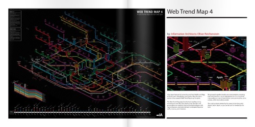
This square was 8.25 x 8.25 in their presets so had to tweak slightly to what I had original made for online.  I think I did 10 x 10 (inch). It took a bit of farcing trying to interpret their specs for dimensions with margins and bleed areas. Maybe it’s just me, but I eventually realised where they wanted the margins and bleed space and thankfully it didn’t make it smaller by too much. I have a template now, so didn’t take as long for the Isometric Volume. I sacrificed a little of the white page space from around the designs, the edge of the page to the edge of a box, bold line/title. But overall, I was extremely pleased with the binding, cutting and colours printed (I struggled mind you with dense black areas such as Web Trend Map or the Oscars visual by Wes,  It was hard to see the colour details).


Cool Infographics: How has the Issuu service to publish online worked for you?

Chris Watson: I liked it.  I need to figure out how to get the Flash used by Issuu.com to display on an iPad and smart phones. I think you can wrap it in HTML5 in some way.  I’ve seen a nice infographic I tumbled and need to investigate further.

You can get an app for Google Android to view publications as opposed to directly on my site, and I think they are making one for iPhone.

It’s good because I could customise it to remove certain functions from the interface such as downloading the PDF, embedding the whole document at their own site rather them view it at my site and hopefully subscribe to the mailing list to see future/previous issues.

It has this nice zoom capability, which at the beginning was good.  I’d like you to be able to zoom into visualisations that were really large and detailed such as the Web Trend Map and density designs work. It also let people share it through the Sharethis service or email to try to get the web 2.0 going and raise awareness of the publication.


Cool Infographics: What’s your favorite Isometric visualization?

Chris Watson: *smile* I’m not sure, its partly the reason I put them in a mag. There are various aspects of all the different ones featured.

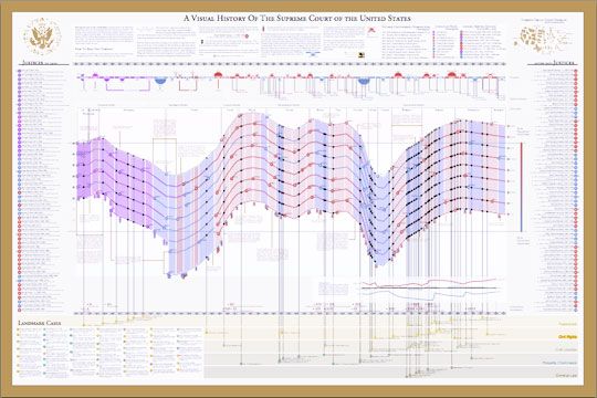
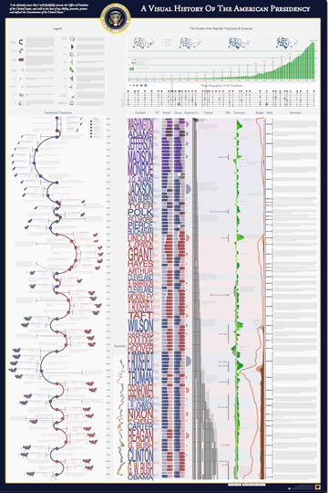
For instance I love the abstract creative nature of Eboy.  It’s a very graphic design (I trained and teach graphic design). They might not communicate specific info with a clear message or comparison like an infographic, but I love the visualisation of the websites into abstract non-physical (i.e. the world wide web/digital) space. Like the Web Trend Map, it takes the Internet from a conceptual space to an impression of absolute almost physical space.

The width dimension with the stacks for stability in the Web Trend Map is so good.

Love the idea of files been given a space in the same way like with Paul Kahn’s work, that you can navigate and see them as a whole in your computer (…for them a website).

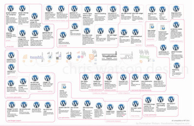
Love the physical space being depicted in a flow of processes with Funnel, Inc., and the complexity that Trainiac depicts and abstracts different departments in a business. The bold colors in a line graph with GOOD, inc. and Timko & Klick; very unique.

Arnuad’s CV style is brilliant too.  With the color-coding of how the skills have built up to be him as they stack in the middle.

Bit of an evasion to the question, but I do love these different successes.


Cool Infographics: What can we expect from Chris Watson and VisualThinkMap in the future?

Chris Watson: Hmm…  Busy, I might be sad but I keep trying to challenge how I visualise data, or visualise things that I think would greatly benefit. It’s strange but for a designer they are always striving to create new forms/reinvent old forms, create the new. It’s what drives me, so I try to make new forms, not just stylistically but that have function too.

I did a wayfinding project for a library at a college. Ultimately, they didn’t use it as I designed.  I didn’t really get asked to; I just wanted to make it better and spent longer than expected to make the design work for the place. It didn’t sit well with me as planned to let them use it for free.  I offered it to them really cheap but they didn’t want to pay.  It’s a shame, but you can’t blame them. Will post the look of that soon with some of the thinking behind the project.

I have recently completed this project that I need to get round to posting and telling the Wordpress community.  I want to see if they will use it, or consider it.

http://www.behance.net/gallery/My-Wordpress-Web-2_0/513412


I revamped the My Web 2.0 graphic as I have come across new services that I use since its inception.

http://www.behance.net/gallery/My-Web-2_0/379498


Working on the next issue with Logan Holmes of Visualisation Mag – Handmade/Informal – Volume 4 

I am collaborating with Logan on visualising poetry/creative writing with illustration/drawing and plan to make it into a bound book differently than that through Create Space. 

Logan, myself and another colleague (photographer) are planning projects that do blow our mind and hopefully are realised in the future.


Thursday
Jun102010

A Cool Interview with Nathaniel Pearlman (infographic designer)


With the release of the Visual History of the American Presidency last week, I asked Nathaniel Pearlman, infographic designer and President of Timeplots, LLC, if he would be willing to do a short interview.  Nathaniel was nice enough to answer a few questions about his infographic design process and his projects.

Nathaniel started the company in May 2009 and released the Visual History of the Supreme Court of the United States (SCOTUS) (which you see above) as their first infographic poster. 

Here’s the interview with Nathaniel:


Cool Infographics: What software applications do you use for the Timeplots posters?

Nathaniel Pearlman: So far we have programmed our graphics in the R language and done some final design work in Illustrator. I’m interested in hearing about other platforms to use for complex data and layout — especially other software applications that would allow us to create interactive and print versions from the same code base.


Cool Infographics: Can you describe your design process?

Nathaniel Pearlman: We start by asking ourselves what an informed audience would want to know about the subject we’re tackling. For example, for the presidential print, we asked ourselves, “Why is each president important? Why should people care about these guys? What is measurable about the context in which they served, and how could we show that?”

Then we go through a data collection phase: we take some time to see what data has already been collected on the subject, we catalog sources, and then we obtain data (and rights, if necessary) for the information we need. We wait until we have the hard data and have examined it and visualized it in several ways before we settle on what stories we can pull out of it.

The primary phase of the design process is iterative – there is a lot of trial and error. For example, we programmed (and scrapped) several major design ideas for our Senate print before settling on the current version. It turns out that our process is longer and more involved than I expected. Each print thus far has taken many months of data collection, design, and review. We also included quite a number of reviewers into our design process, folks with substantive expertise and designers as well.


Cool Infographics: What’s the most interesting thing you learned from the data?

Nathaniel Pearlman: I like the big picture: for me, the presidential print shows a historical view into the sweep of U.S. history — a marked contrast with the more journalistic, and immediate, take on the political and economic state of the nation that we are used to seeing in the news. It lengthened my perspective on current events, and I hope that it does so for those who purchase the print.

When you see the entire span of U.S. history visualized in just a few feet of space, you see the economy bouncing up and down, the parties jockeying back and forth, the budget bumping along. The ups and downs then seem fairly routine from this perspective, especially when compared to the sensationalism of our daily headlines. The other thing that really stands out is the growth of the country since 1789, both economically (in real GDP) and in population. As to the small picture: I love seeing details of each election — what percentage of the vote did Strom Thurmond get in 1948, for example, and which states did he win — so we tried to put each election into context with a scoreboard and electoral cartogram wrapped around the curve of party control of the executive.


Cool Infographics: What was the hardest part behind designing the Presidential poster?

Nathaniel Pearlman: When you see a finished product like ours, what you miss are the hundreds of decisions that were labored over as it was created. For me, the most difficult thing is deciding when I’m done. Every time I look at a new draft, I have ideas for changes that could be made. At some point I have to say “enough is enough; we are done.” The other hard part is writing the text that’s included on the print.. just crafting short explications of each presidency is difficult.


Cool Infographics: Where are some of your favorite places that have the SCOTUS poster on display?

Nathaniel Pearlman: We are happy that the U.S. Supreme Court library displays a framed print, and the gift shop in the Supreme Court building itself carries the print. We’ve also seen many purchases by legal luminaries — we’re not legal experts ourselves, so it’s nice to see that the experts appreciate our work. A son of a current justice bought one. Also, many high school teachers from across the country have purchased prints for their classrooms (we offer discounts for educators); it’s great to see teachers showing interest in using data visualization as an educational tool.


Cool Infographics: Where do you have the posters printed, what are the printing specs and why? 

Nathaniel Pearlman: We shopped around quite a bit for a printer, because we are fussy about the results – we wanted the quality of the paper to top-notch, we needed relatively fast turnaround and reliable fulfillment, and we wanted the printing process to be environmentally friendly — all of this, of course, at an affordable cost. We currently offset-print the posters in Maryland, at Whitmore printing, and they also do our fulfillment. (Ideally, we would like to find an affordable on-demand printer who can handle our large-scale posters and fulfillment. If we found this, we would be able to sell shorter-run prints; please send me any suggestions!)


Cool Infographics: Would you share some thoughts on running a business selling infographic posters?

Nathaniel Pearlman: I am enjoying Timeplots. As a profit-generating business, it is not for the faint-of-heart. I am lucky to have some time and space to try it, but it is unlikely to run in the black for quite some time. My first company, NGP Software, Inc. (www.ngpsoftware.com) is doing well and allows me to do this on the side.


Cool Infographics: How has the Timeplots On Demand side of the business been going with private clients? 

Nathaniel Pearlman: We’ve really enjoyed working with people who aren’t necessarily familiar with data visualization — everyone who we’ve worked with has been more than happy with the results. So — if anyone reading this has a project in mind, or if you want us to create a visualization for you or your institution — let us know!


Cool Infographics: How did the process of using Amazon Mechanical Turk for proofreading work for you?

Nathaniel Pearlman: Mechanical Turk is a good method for crowd-sourcing some kinds of work. We’ve used it for three separate projects now — twice for proofreading, and once for fact-checking research. We have gotten more hits than misses, so it’s been worthwhile. Eliza manages that process and has been impressed by the level of work she has received. The Mechanical Turk worker community (“turkers,” as they call themselves) are serious about their work, and it shows. In a couple cases, a “turker” found an error that we all missed: for example, when we posted the presidential print for proofreading, one turker pointed out that we listed Vice President John C. Breckinridge as “Breckenridge,” clearly misspelling his name. Another turker noted that we had described President Taylor as dying “halfway” through his term, when in fact it was a few months prior to “halfway.”


Cool Infographics: What should we expect in the future from Timeplots?

Nathaniel Pearlman: We have a rough list of fifty or sixty more projects we would love to do. After we launch the Senate print, we will decide what is next. I would love to hear from your audience what they would like to see, and we are always looking for collaborators, if someone would like to work with us on a project that they care about. We’re always open to new ideas!


Page 1 2