Thursday
Mar122009
Visualizing the Stimulus Bill
 Randy
Randy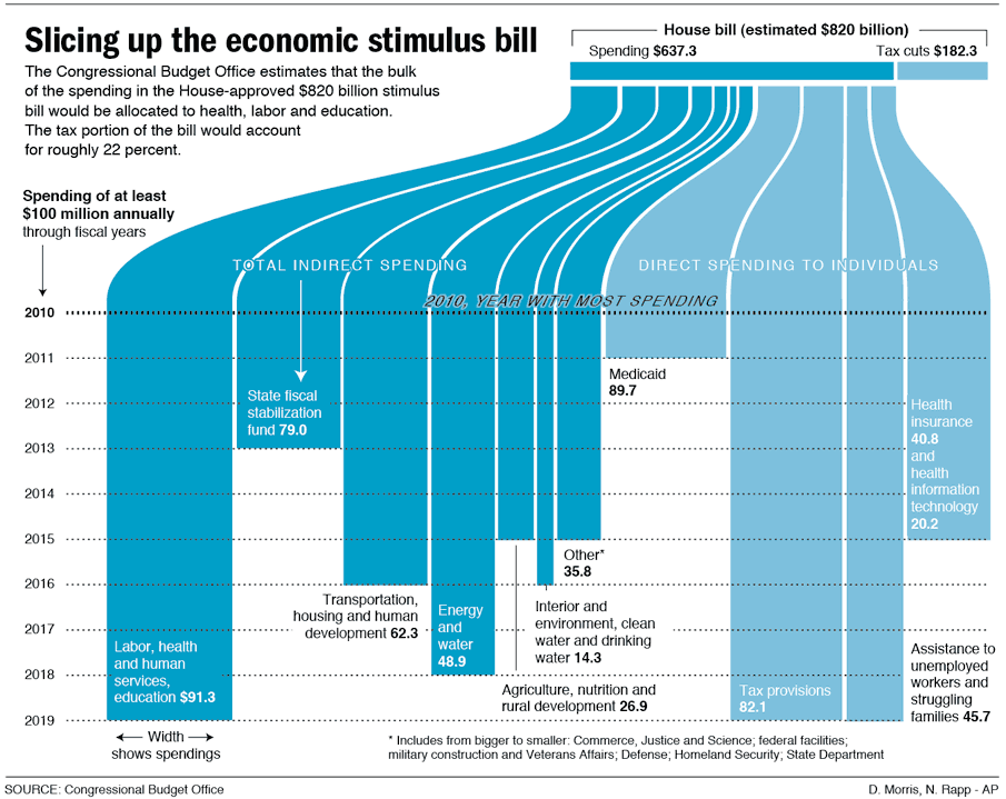
Here's a great, simple graphic that breaks down the stimulus bill.
Nicholas Rapp does some great infographic design work. Check out some of his other work at nicolasrapp.com

![]()

Join the DFW Data Visualization and Infographics Meetup Group if you're in the Dallas/Fort Worth area!

The Cool Infographics® Gallery:
How to add the
Cool Infographics button to your:

- iPhone
- iPad
- iPod Touch
Read on Flipboard for iPad and iPhone
Featured in the Tech & Science category


Nicholas Rapp does some great infographic design work. Check out some of his other work at nicolasrapp.com
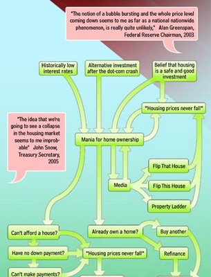
The Crisis of Credit Visualized from Jonathan Jarvis on Vimeo.
Video by Jonathan Jarvis, makes sense of the credit crisis. HD version is available at http://crisisofcredit.com/.
The goal of giving form to a complex situation like the credit crisis is to quickly supply the essence of the situation to those unfamiliar and uninitiated. This project was completed as part of my thesis work in the Media Design Program, a graduate studio at the Art Center College of Design in Pasadena, California.

Very detailed infographic from the Washington Post showing how the proposed stimulus package is broken out between ares of spending and tax cuts.
SOURCE: Congressional Budget Office | Reporting by Karen Yourish, graphic by Laura Stanton - The Washington Post - February 01, 2009The centerpiece of President Obama's domestic agenda is an $819 billion economic stimulus plan. The Senate will consider the measure this week, with an eye toward the amount of tax cuts and spending. Republicans and Democrats spar over what to consider a tax cut. An analysis by the nonpartisan Congressional Budget Office tallies the tax-cut portion to be significantly less than the one-third Democrats claim it to be.

Found on both Information Aesthetics and Visualizing Econmics.

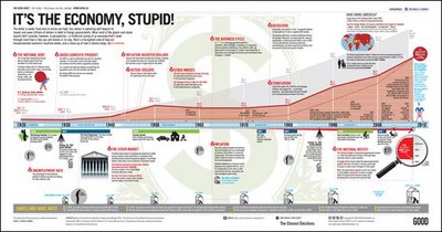
What most of the doom-and-gloom reports on our economy don’t provide is perspective—a historical survey of an economy that’s been through more than a few ups and downs in its day. Here’s a farsighted view of how our temperamental economic machine works, and a close-up of how it stands today.Thanks Adam!
Our friends over at XPLANE have done a fabulous video explaining what led up to the recent credit crisis in the U.S. economy. A great job simplifying a complex problem.
Thanks Parker, and great job to your team!
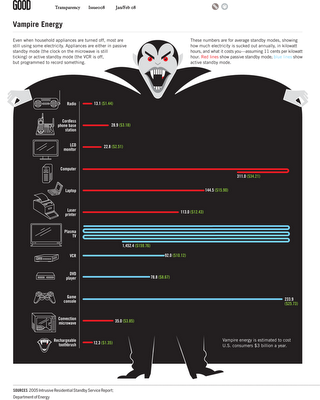
From GOOD magazine, they created an infographic video about Vampire Energy, all of the energy used by electronics in your house while you are not actively using them. The chart itself from the magazine is fairly simple chart, but I really like it. It's effective getting the message across with simple graphics.
Found on infosthetics.com