About
Randy Krum
President of InfoNewt.
Data Visualization and Infographic Design

Infographic Design

Infographics Design | Presentations
Consulting | Data Visualizations

DFW DataViz Meetup

Join the DFW Data Visualization and Infographics Meetup Group if you're in the Dallas/Fort Worth area!

Search the Cool Infographics site

Custom Search

Subscriptions:


Feedburner

The Cool Infographics® Gallery:

How to add the
Cool Infographics button to your:

Cool Infographics iOS icon

- iPhone
- iPad
- iPod Touch


Read on Flipboard for iPad and iPhone

Featured in the Tech & Science category

Flipboard icon

Twitter Feed
From the Bookstore

Caffeine Poster

The Caffeine Poster infographic

Entries in money (137)

Monday
Sep222008

Probabilistic Stock Market Forecast


I won't claim to understand or attempt to explain the math behind the investolution.com charts that predict the overall stock market for the next 40 days.
This page contains the prediction for S&P 500 Index minimum and maximum daily closing prices over the next 40 trading days.  

It is predicted that S&P 500 Index will not close under 1,178 and over 1,295 between the dates September 19, 2008 and November 14, 2008. This prediction method was accurate for 71.0% and 95.0% of the cases (for minimum and maximum predictions, respectively) within an error margin of +-5% in the past. 

Thanks Andrew for sending in the link.

Friday
Aug012008

Small Gambling Addiction Spending Visual

I love this very simple but powerful visual comparison of the gambling revenues and the money spent on gambling addiction support programs.  The author is only trying to communcate one point, and gets his message across very stongly.  I believe it was done by Tim Broderick, from the Daily Herald.

Found on InfographicsNews.blogspot.com.  Looks like

Wednesday
Jul022008

Map of Local Gas Prices

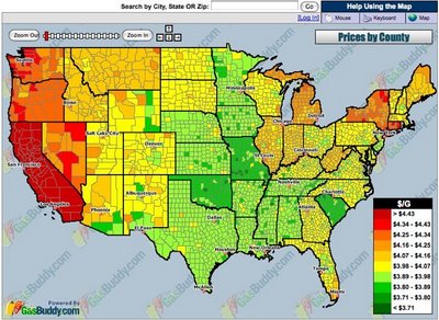
GasBuddy.com has a cool interactive temperature map of gas prices across the U.S. and Canada that allows you to zoom in to the street level to see prices at specific gas stations.  Prices are all removed from the database when they become over 72 hours old to keep the map current.


Thanks for sending in the link Karen!

Monday
Jun232008

Obama Funding Graphic


A small poster from our friends at XPLANE,

How Obama Reinvented Campaign Finance Barack Obama is the first major candidate to decline participation in the public financing system for presidential campaigns. He’s found a more effective way to raise money — by leveraging the power of the American people through online Social Networks.
Available as a PDF formatted for printing on 11x17 paper.

Monday
May262008

In the Shadow of Foreclosures


Great graphic from NYTimes.com showing the subprime mortgage foreclosures as a percentage of all subprime mortgages by geographic region of the country.

Monday
May052008

Where Does the Money Go?


From the nytimes.com, this graphic visually represents how average consumer spending breaks down, and the color code shows how much spending in that category has changed in the last year. For example, Gasoline is 5.2% of an average consumer's spending, and it has risen 26% from 2007 to 2008.

As far as I can tell, this is actually a treemap, but in a new shape. More details pop-up when you mouse over each of the individual shapes.

Thanks to Tony, for sending in the link.

Sunday
Apr272008

Who Owns the Car Companies? (UPDATE)


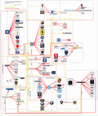
TooManyCars.com has updated their family tree style poster of how all of the car companies are related. The latest updates were as of 4/1/08. They have also changed to better software used to zoom into the poster. Each of rectangles you see on the images will zoom in close so you can read the details about the connections.

They've really done a good job tracking down the specific types of relationships and the ownership portions between the companies. High-res PNG or PDF files are also available.

Thursday
Apr172008

The Growth of Wal*Mart


Great video found on blog.kiwitobes.com that show the store expansion of Wal*Mart starting with the first store in 1962. Based on the publicly available data on freebase.com.

Saturday
Mar152008

The Ebb and Flow of Movies

From nytimes.com. This is a very cool way to visualize the spike in movie ticket revenue when movies are released in theaters, and then slow down quickly after the first week. The graphic covers 1986-2007, and when you look back you can only find a few movies that maintained high ticket sales for more than a couple weeks. Star Wars Episode 1 and Titanic both had high sales for almost 6 weeks. Highlight and click any "wave" to see the details for that movie.

Summer blockbusters and holiday hits make up the bulk of box office revenue each year, while contenders for the top Oscar awards tend to attract smaller audiences that build over time. Here's a look at how movies have fared at the box office, after adjusting for inflation.
Thanks for sending in the link Dániel!

Wednesday
Mar122008

Ocean's Thirteen infographics


I can't upload the video (for obvious copyright reasons), but the movie Ocean's Thirteen uses some cool infographics to show the real-time winnings at each table in the casino.