About
Randy Krum
President of InfoNewt.
Data Visualization and Infographic Design

Infographic Design

Infographics Design | Presentations
Consulting | Data Visualizations

DFW DataViz Meetup

Join the DFW Data Visualization and Infographics Meetup Group if you're in the Dallas/Fort Worth area!

Search the Cool Infographics site

Custom Search

Subscriptions:


Feedburner

The Cool Infographics® Gallery:

How to add the
Cool Infographics button to your:

Cool Infographics iOS icon

- iPhone
- iPad
- iPod Touch


Read on Flipboard for iPad and iPhone

Featured in the Tech & Science category

Flipboard icon

Twitter Feed
From the Bookstore

Caffeine Poster

The Caffeine Poster infographic

Entries in money (137)

Friday
Feb192010

Emily Schwartzman Wins Haiti Infographic Contest!

Emily Schwartzman has won the GOOD contest to design an infographic about the earthquake impact to Haiti.  A high-resolution version is available on the GOOD site.

We’re proud to announce the winner of our latest infographic contest, where we asked readers to design an infographic about the recent earthquake in Haiti. We at GOOD conferred with Aaron Perry-Zucker of Design for Haiti, and we’ve come to a decision.

Emily Schwartzman—whose graphic, “Aftermath of the Haiti Earthquake,” clearly and concisely depicts both the human toll of the earthquake and the scope of the earthquake itself—is our winner. Schwartzman will take home our prize package, including a GOOD T-shirt and a free subscription. You’ll be able to see her infographic in print in our next issue as well as on the Design for Haiti site.

Excellent job Emily!

Thursday
Feb182010

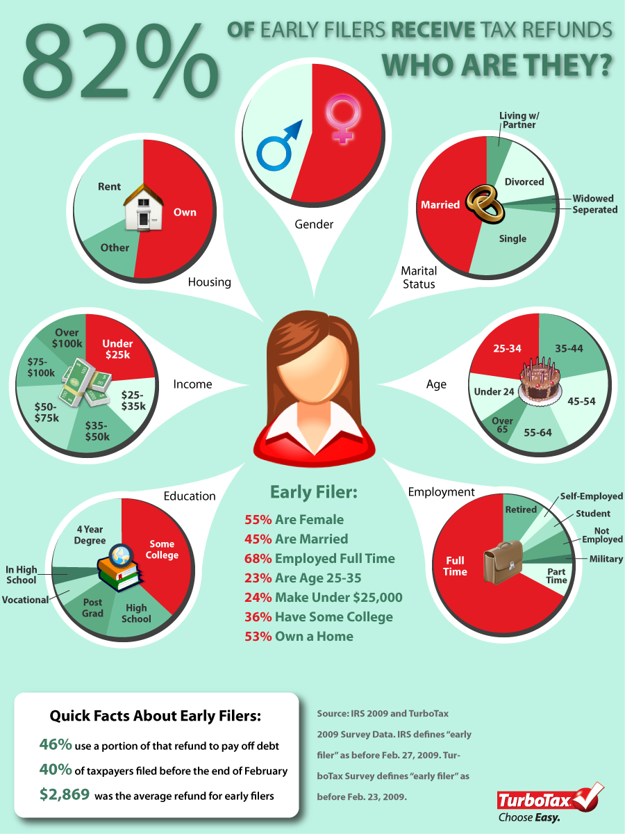
Early-Bird Taxpayers Get the Refund - infographic

$2,869 was the average refund for early filers in 2009 based on this infographic from TurboTax.  Designed by Column Five Media for Intuit.

Are you an early bird or a tax procrastinator? Did you know that people who file their income tax returns in February are among the most likely to get refunds – and larger ones at that?  TurboTax reports that 82% of taxpayers who filed before the end of February last year got money back, and on average, the refund for early filers is typically larger: $2,869 compared to $2,753 for returns filed through April 15th last year.


Forty percent of all tax returns last year were filed before the end of February. That means 60% missed out on some of the benefits of filing early such as putting money in your pocket faster – making your refund work for you.

Although I’m not a fan of the overuse of pie charts, I think it works in this case.  The infographic doesn’t have so many pie charts that it becomes confusing, so its very easy to wrap your head around who this typical TurboTax, early-filier consumer is.

Thanks Laura for the link!

Wednesday
Feb172010

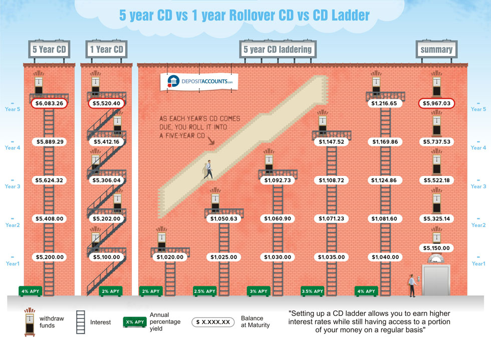
CD Laddering Investment infographic

Designed by Derri Hasmi for DepositAccounts.com, this CD Laddering infographic does a great job helping to explain the investment theory of CD laddering as compared to investing in standard CDs.

CD laddering is a strategy that allows you to take advantage of the higher cash rates offered by CDs, while at the same time ensuring that you have access to your money regularly. The most common type of CD ladder is the five year ladder. In this scenario, you open five different CDs. Let’s say that you check your savings account, and you have $15,000. You want to keep $5,000 for emergency purposes (move it to a high-yield savings account if it isn’t in one already), but use the remaining $10,000 to get your CD ladder started.

Thanks Jeremy!

Monday
Feb082010

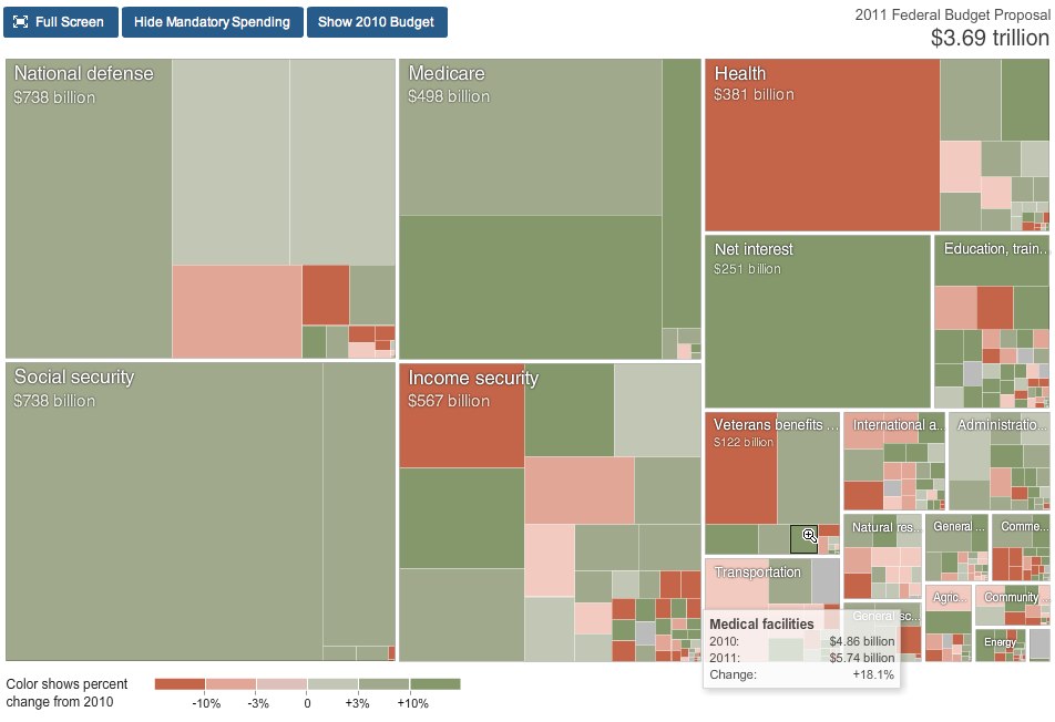
Obama's 2011 Budget Proposal Infographic

From NYTines.com, a treemap of Obama’s Budget Proposal color coded for increases and decreases from the prior year.

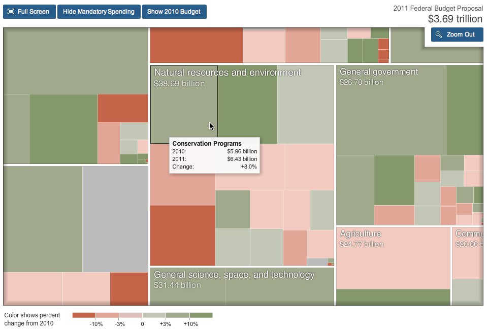
Rectangles in the chart are sized according to the amount of spending for that category. Color shows the change in spending from 2010.

Red indicates budget cuts, and green indicates increases in spending.  It’s a little bit interactive, allowing you to zoom into specific parts of the budget, and see detials by hovering the mouse over squares.

Designed by Shan Carter and Amanda Cox.

Found on FlowingData.

Thursday
Jan212010

Don't Flush Your Credit Down the Drain (infographic)

Don’t Flush Your Credit Down the Drain is a new graphic designed for SpendOnLife.com.  Using the metaphor of “flushing your credit down the drain” the graphic explains what happens when your credit score drops to different levels.

Ever tempted to just stop paying your credit card bills? I mean, what’s the worst that could really happen? We created our latest infographic to explain how your creditors might retaliate if you stop sending them money each month. (Hint: the pipes get rustier and the rats get uglier the further down you go.) Don’t let this happen to you! 

This image straddles the line between illustration and infographic.  The illustration doesn’t convey much data other than the farther down you go, the lower you credit score becomes.  The pipes get rustier and it’s much darker on the bottom.  These visual cues let you know that lower scores are just plain “bad”. 

I think the rats are a nice touch.

Thanks to Ashley for the link!

Friday
Dec252009

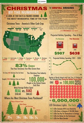
Christmas by the Numbers!


BillShrink.com presents this holiday infographic, Christmas by the Numbers, visualizing the decline in holiday spending in the U.S. and some other fascinating holiday figures.  Click the link to see the high-resolution version.
‘Tis the season for Christmas trees, lights and gifts, and in the past that has also meant the season of outrageous spending. While the holidays may not be cheap, hard times sometimes call for desperate measures and drastic budget changes. Here’s a look at the hard facts and numbers of this most wonderful time of the year.
Merry Christmas from Cool Infographics!

Tuesday
Dec082009

Infographic Coins!


What a great infographic product design idea!  From designer Mac Funamizu on his site, PetitInvention, Infographic Coins that use the physical analogy of a pie chart to help consumers figure out the currency, especially when visiting a foreign country.  You have to ignore some of the benefits of all round coins, but the idea is spot-on.  Feeling in your pocket, you could almost always pull out the right coin.


The round shaped coins must have a lot of benefits that other figures such as a triangle or a square don’t. Also, non-rounded coins may have many demerits. Aside from those, travelers and other people who are not accustomed to the currency would be able to easily remember how much each of these coins is (as long as she knows how to read pie charts).


Wednesday
Dec022009

Ebay Visualizes Black Friday 2009 - Interactive infographic map


From ebay, a map of the transaction activity on Black Friday 2009 (the shopping day after Thanksgiving).  1 million transaction are mapped in the U.S. over the course of the day!
Activity Level Indicator The color of the point on the map indicates the number of transactions that occurred in the corresponding area.
Data Execution This transaction map was created as a study of the extensive activity that occurs in the eBay Marketplace on the biggest offline shopping day of the year. It is a visualization of all U.S.-based buyer and seller transactions on eBay on Black Friday, November 27, 2009 (12:00:00 AM to 11:59:59 PM EST). Although eBay is an international marketplace, this map is focused on U.S. data, as Black Friday is the traditional beginning of the holiday shopping season for the U.S.
It's an interactive, animated timeline, so you can watch the transactions grow throughout the day and zoom in to specific areas of the country by clicking on the map.  It's a flash animation, but there's a WMV movie file available for download too.

They also did a map of the even bigger 1.4 million transactions on Cyber Monday 2009.

Found on VizWorld


Tuesday
Dec012009

Vote With Your Dollars! - Corporate Political Contributions infographic


Vote With Your Dollars, is a corporate political contributions map.  Using the public data from the Center for Responsive Politics (2004-2008), GoodGuide.com has plotted the balance of contributions from companies.  Mouse-over a specific company logo to see the detailed data (like Dell above).
View the political contributions of your favorite companies and see how you vote with your dollars.  The data is surprising!
You can choose specific companies or business sectors, and then change the sort order.  Here is the retail sector sorted by Most Democratic Leaning:


Thanks Anthony for sending in the link.  Sorry it took so long to get posted.

Wednesday
Oct072009

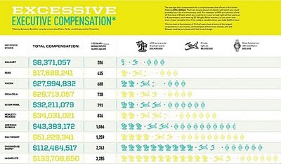
CEO Compensation Infographic Contest Winner!


In September, GOOD magazine held an infographic contest to illustrate the top CEO compensation packages.  The above infographic by Dee Adams wins the prize!
Dee Adams’s piece “The Top 8 of CEO Compensation” does an excellent job of illustrating the massive salaries of CEOs and relating them to regular employees in a clean and simple manner. It’s our winner, and Adams will take home our prize package, including a GOOD T-shirt, a free subscription, and $250. You’ll be able to see her infographic in print in our next issue as well.
All of the entries are available for viewing here, but I wanted to include a few of my other favorites:


By Robin Richards:


By Jessica Karle: