About
Randy Krum
President of InfoNewt.
Data Visualization and Infographic Design

Infographic Design

Infographics Design | Presentations
Consulting | Data Visualizations

DFW DataViz Meetup

Join the DFW Data Visualization and Infographics Meetup Group if you're in the Dallas/Fort Worth area!

Search the Cool Infographics site

Custom Search

Subscriptions:


Feedburner

The Cool Infographics® Gallery:

How to add the
Cool Infographics button to your:

Cool Infographics iOS icon

- iPhone
- iPad
- iPod Touch


Read on Flipboard for iPad and iPhone

Featured in the Tech & Science category

Flipboard icon

Twitter Feed
From the Bookstore

Caffeine Poster

The Caffeine Poster infographic

Entries in personal (139)

Monday
Nov042013

Find The Best Group Exercise Class for You

Find The Best Group Exercise Class for You infographic

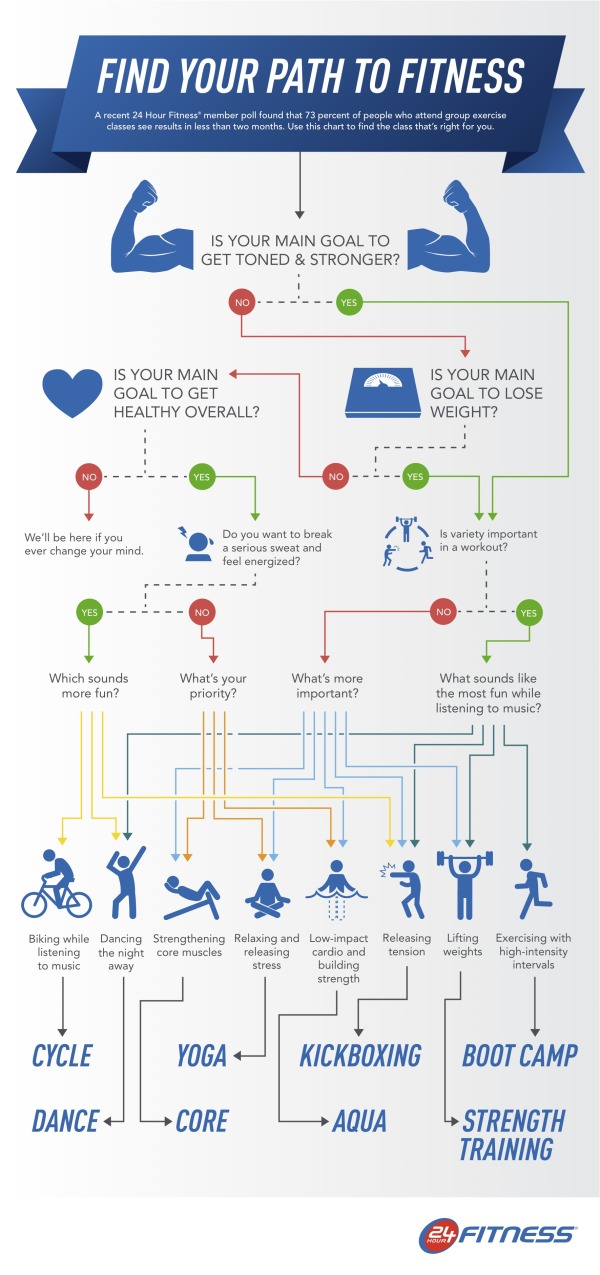
24 hour fitness has created an easy to read flowchart to figure out the best group fitness class for your lifestyle in the infographic Find You Path To Fitness, a decision tree based on your wants.

A recent poll revealed 73 percent 24 Hour Fitness members see results in less than two months of participating in group exercise classes. With the popularity and effectiveness of group exercise, 24 Hour Fitness developed a fun, interactive infographic where readers can find out which group exercise class is the best fit for them, based on preferences and fitness goals. The Find Your Path to Fitness infographic, released today, leads readers through a series of questions and directs them to the group workout they’ll find most beneficial.

This is a great design. 

  • Visually appealing
  • Minimal text, the icons and diagram tell most of the story
  • Clear, focused message.  No extraneous data included, which keeps the design simple
  • Topic highly relevant to 24 Hour Fitness without being an advertisement
  • Long online lifespan.  This infographic will be informative to readers for years to come

The footer should include copyright information, and the URL link to the original infographic landing page so readers can find the full-size version.

Thanks to Alafair for sending in the link!

Tuesday
Oct292013

How Many Jelly Beans Do You Have Left?

The Time You Have (in Jelly Beans) is a great visualization in video of how many days are available to each of us during our lives.  Created by Ze Frank from Buzzfeed.com.  What will you do with the jelly beans you have left?

Found on Elite Daily.  Thanks to Mary Kaye for the link!

Wednesday
Sep252013

Your One Month Guide To Beating Clutter

Your One Month Guide To Beating Clutter infographic

Clutter is everywhere. No matter what we seem to do, it just accumulates. Your One Month Guide To Beating Clutter infographic from Terrys Fabrics gives some helpful hints with a flowchart on how to decide what can be saved vs. tossed. There are also some specific tips based on areas of your home to help minimize clutter.

De-cluttering can sometimes be overwhelming. A room-by-room approach can make the process more manageable. By starting small and keeping up good habits, you can soon work your way towards clutterless bliss.

Thanks to Meilen for sending in the link!

Thursday
Sep122013

Slather on the Sunscreen: What You Should Know About Skin Cancer


Slather on the Sunscreen: What You Should Know About Skin Cancer infographic

After this infographic, you’ll never think the same of tanning. Slather on the Sunscreen: What You Should Know About Skin Cancer infographic from fourpointsdermatology.com starts with comparing skin cancer to the other types of cancers, educates you on what the symptoms are to look for, then points out the causes of skin cancer, and finally the possible treatments.

“Slather On That Sunscreen: What You Should Know About Skin Cancer” exposes the most commonly diagnosed type of cancer, explaining the three main types of skin cancer and revealing characteristics and statistics for each. Visually explained in the graphic are the symptoms, causes, prevention, and treatment options for skin cancer. With “Slather on That Sunscreen: What You Should Know About Skin Cancer”, Four Points Dermatology is educating viewers that skin cancer prevention can be nearly effortless, and knowing what signs to look for can be life-saving.

Skin cancer incidence has increased 300% since 1994, and shows no sign of slowing down. This infographic was created to educate and encourage people to seek treatment quickly if suspecting of a skin cancer growth. By creating awareness of what symptoms people should be looking for, Four Points Dermatology hopes that the steadily increasing number in cases of skin cancer can be minimized.

Great visuals. Everything from what the symptoms look like, to the causes and preventions are illustrated in a very comprehensible way.

The pie charts with slices that each have a different radius is pretty, but creates a false visualization that doesn’t match the data.  Readers see the area of objects when comparing them, and changing the radius, changes the area of each pie slice.  By reducing the radius of the smaller values, the area is actually reduced much lower than the actual values.

Thanks to Ramsay for sending in the link!

Monday
Aug192013

Evening Etiquette: A Gentleman's Guide

Evening Etiquette: A Gentleman's Guide infographic

Gentleman is not just a title, it is a way of life. The Evening Etiquette: A Gentleman’s Guide infographic created by Boisdale explains the finer points to being a Gentleman. The infographic shares tips on how to look the part, what to wear, and dinner advice.  A great follow-up to the last post about matching ties.

Being a gentleman is more than opening the door for the ladies. For men to truly live up to this title, they must look and act the part in all areas of life -  from grooming, style and culture to knowledge of food and booze and the proper treatment of women.  Making these gestures a natural part of one’s behaviour is how a true gent stands out from the boys.

In order to help lads mature into men of virtue, Boisdale has created an evening etiquette guide. From knowing one’s tweed and collars to the proper table setting and whiskey protocol, this infographic will turn those willing into a man ladies want and other men aspire to be.

Another great visual explanation, that shows the reader the information with illustrations and images instead of spelling out the information with too much text.

Thanks to John for sending in the link!

Tuesday
Aug132013

How to Match Shirt and Tie Patterns

How to Match Shirt and Tie Patterns infographic

If you have some trouble balancing your serious business side with your fun side, a look at the How to Match Shirt and Tie Patterns infographic could be helpful. The infographic from Beckett Simonon shows a few examples of complicated patterns that work together, and then some to definitely stay away from.

So you’ve been wearing solid ties and shirts for a while, you think you look great but you feel is time to earn some extra style points by adding some patterns? No worries, we got you covered! Shirt and tie patterns are great if you want to stand out from the crowd, they are also fun and will bring a new life to your look. Just make sure your pattern groupings are far from making people dizzy and fall hypnotized. We made this cheat guide so you can learn the basics and develop your own combinations and style from there. Enjoy!

Great visual explanation design that stays focused, and tells one story really well.

Thanks to Nicholas for sending in the link!

Friday
Aug022013

The 2012 Feltron Annual Report

The 2012 Feltron Annual Report

The 2012 Feltron Annual Report is a report by information designer Nicholas Felton whose numbers were gathered with a custom-built iPhone app called Reporter. At random intervals each day the app sent reminders to complete a survey. The results of these questions were saved alongside background measurements to form the basis of this document. You can see the examples of the report at Feltron.com and buy it at the shop.

An extensive write up can be found on Fast Co Design:

Today, you probably know Nicholas Felton best for his most widely seen work, Facebook’s Timeline. But since 2005, he’s been working on a cult-favorite project all his own, the annual Feltron Report. The 2012 version is out now for $28.

As always, the report is a meticulously documented year in review of everything he’s done, presented in a series of rich infographics that push the boundaries on personal data quantification. With a glance, you’ll learn some of Felton’s most intimate details. Each day, he consumes coffee around 10:40am and booze around 8:38pm. He spends about 4x as much time with his girlfriend as his mother. And on June 20, he shot a Glock 22.


Found at http://feltron.com

Tuesday
May142013

Bike To Work Week

Bike to Work Week infographic

This week is bike to work week. Why should you participate? The Bike to Work Week infographic from Fitness for Weight Loss explains the health benefits of participating as well as cost benefits!

Bike to Work Week is May 13th – 17th, 2013.

Thanks to Stephanie for sending in the link!

Friday
Apr052013

Your Dirty Habits Make Me Sick

Your Dirty Habits Make Me Sick infographic

We all have our habits, but some of these dirty habits may come to a shock to you. Your Dirty Habits Make Me Sick infographic from ionSwipes educates the reader on how their morning routines and work day can be full of nasty habits that will get them sick.

The isometric illustrations of the places we live and work are great, and draw in the readers.  By seeing these common places we all interact with, it makes the information and data more personal and relevant to the audience.  

However, none of the data is visualized.  Big fonts are not data visualizations, and relies on the audience to read all of the text contained in each callout.  Visualizations of the data would have communicated the information faster, attracted the reader’s attention and put it into context for the readers.

Thanks to Ashley for sending in the link!

Tuesday
Feb122013

Breakdown of A Person's Google Results...and How to Look Better

Breakdown of a Person's Google Results: How People Look in Google- and How to Look Better infographic

When you type your name in Google, what comes up? Hopefully nothing negative. The Breakdown of A Person’s Google Results: How People Look in Google - and How to Look Better infographic from brandyourself.com tells you which of your profiles are going to show up higher in google. If your personal image needs a boost, use BrandYourself, a free website that allows you to create a positive image of yourself and land it on the top page of the Google search.

At BrandYourself, our goal is give our users and readers everything they need to put their best foot forward in Google.  Since we track the Google results of over 130K users we were able to analyze millions of results and found some really insightful information.

Want to look better in Google? Think twice about building your personal website on WordPress.

  • Bad First Impression: 1.5 Billion names are Searched everyday in Google but people generally don’t look great on their first page
  • If you want to look better, you need to choose your profiles wisely: For example, LinkedIn is the best social network for rankings, while WordPress is the highest ranking personal site builder. Even more interesting, popular pages like about.me really have trouble ranking high.
  • BrandYourself is effective: To date, we have helped people raise their favorite profiles over 250K positions higher in Google. People can expect to raise a profile over 20 positions, or 2 whole pages, by using our software. We are very proud of this.

We know not everyone loves looking at data as much as we do, so we put it in fun infographic form so you can enjoy it too. Let us know what you think!

This is a great informational design that shares some really valuable information.  I can attest to much of the information, and have the advantage of owning all 10 results on Google if you search for “Randy Krum”.  Go ahead…try it!

A couple recommendations I would make to improve the design:

  • There doesn’t seem to be a higher resolution version available, so some of the font sizes are too small to read.  Especially the Sources list and the design credit.
  • There’s some good data and values in here that would make a better impression if they were visualized
  • There should be a URL to the infographic landing page in the footer, so readers can find the original

Thanks to Patrick for sending in the link!