About
Randy Krum
President of InfoNewt.
Data Visualization and Infographic Design

Infographic Design

Infographics Design | Presentations
Consulting | Data Visualizations

DFW DataViz Meetup

Join the DFW Data Visualization and Infographics Meetup Group if you're in the Dallas/Fort Worth area!

Search the Cool Infographics site

Custom Search

Subscriptions:


Feedburner

The Cool Infographics® Gallery:

How to add the
Cool Infographics button to your:

Cool Infographics iOS icon

- iPhone
- iPad
- iPod Touch


Read on Flipboard for iPad and iPhone

Featured in the Tech & Science category

Flipboard icon

Twitter Feed
From the Bookstore

Caffeine Poster

The Caffeine Poster infographic

Entries in personal (139)

Thursday
Jun252015

Business Etiquette Around the World

Business Etiquette Around the World infographic

When you are on a business trip, making a good impression is always key, but meeting internationally for business can make things a little tricky. The Business Etiquette Around the World infographic from CT Business Travel has compiled a list of expectations for those meeting in foreign countries around the world. As the infographic states, "Follow these tips and never put a hand, fork, or word out of place again."

Customs and etiquette vary wildly from country to country, and business professionals are often unaware of the differences.

This made us think, wouldn’t it be really useful to research and produce an illustrative guide that provides an easy to digest overview of the essential cultural differences for when professionals meet international clients, suppliers and colleagues overseas – so we did and here it is.

For instance the French prefer to shake hands lightly, as do the Japanese and South Koreans, and pre-business chit-chat may be customary in Brazil, but this is not the case in Russia, Switzerland and a number of other countries.

The following Infographic outlines the rules that can be unwittingly broken across the world and will be of interest to anyone who wants to seal the deal rather than tarnish their reputation.

Table data like this is always a challenge to visualize. Using icons in the table format is a good way to make the data easier to understand and compare between rows.

Thanks to Danny for posting the link on Linkedin!

Friday
Apr172015

Your Life in Weeks

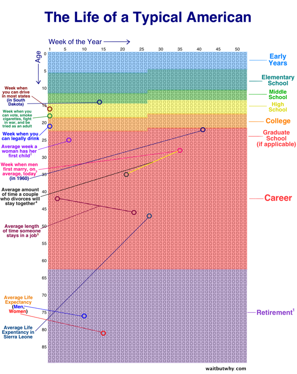
Your Life in Weeks infographic is the life of a typical American broken down into the 52 weeks within each year. This infographic was created by Tim Urban from Wait But Why. Each dot represents one week of your life. The infographic highlights some of the major milestones in life, while color coding the weeks into the big categories of schooling, career, and retirement.

Each row of weeks makes up one year. That’s how many weeks it takes to turn a newborn into a 90-year-old.

It kind of feels like our lives are made up of a countless number of weeks. But there they are — fully countable — staring you in the face. 


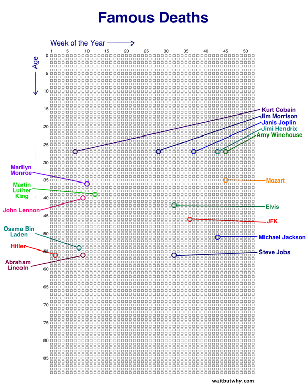
There are multiple events you can chart on this graph. Famous Deaths is an example of charting which week some famous people died.


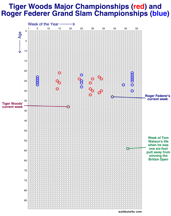
Tiger Woods Major Championships (red) and Roger Federer Grand Slam Championships (blue) is another example. This chart makes it easy to track the peak years for athletes.

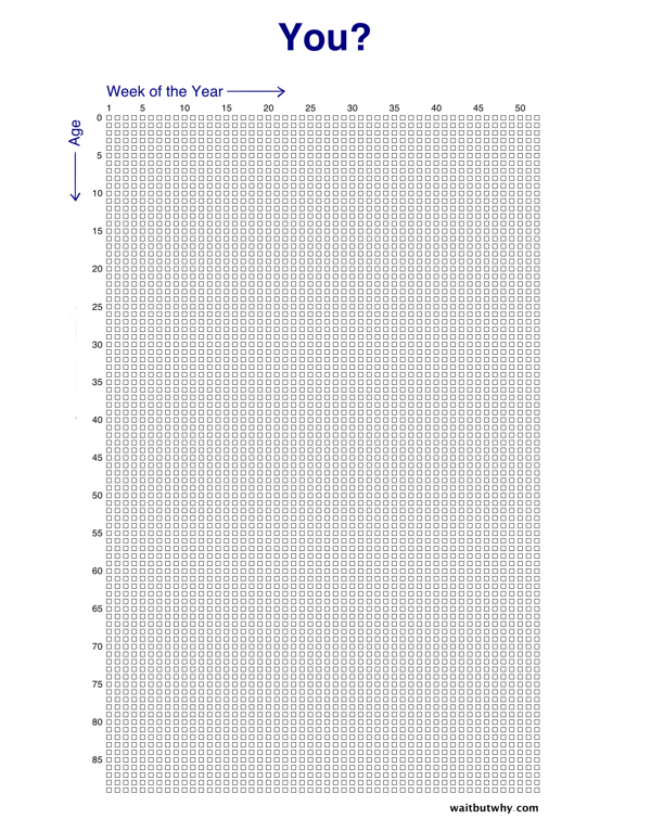
Tim made a blank version also available for you to fill in your own events or add some world events for perspective like the examples above. What would you add?

Found of Huffington Post.

Monday
Mar092015

Life Hacks for the Modern Traveller

Life Hacks for the Modern Traveller infographic

The Life Hacks for the Modern Traveller infographic from Direct Holiday Cottages provides you with some new travel tips for the connected traveller.

Here is an infographic that we have created providing a number of hacks to help you out on your holiday as well as some must have travel apps.

Busy design style, but that’s how people lay out their belongings before packing them all up in luggage. The font size is too small for the size of the infographic. 

Thursday
Feb192015

Busting Myths About Hand Sanitizers

Busting Myths About Hand Sanitizers infographic

The Debunking the Myths About Alcohol-Based Hand Sanitizer infographic from PURELL clears up some of the most common misconceptions about their products. 

All germs are bad germs, right? Not necessarily. Using hand sanitizer dries out hands? Some don’t, but PURELL® Advanced Hand Sanitizer won’t strip your hands of their natural moisturizers. There is much confusion today around antibiotics, antibacterial soaps and hand sanitizers, as well as their effectiveness and whether they contain harmful chemicals like Triclosan (which Purell does not). Learn the truth about alcohol-based hand sanitizers as 7 of their most common myths are debunked for good.

Infographics are a fantastic way for companies to help consumers better understand complicated products and issues. Health and safety are some of the top concerns from consumers, and the team at PURELL has done a great job here of addressing the top concerns and misunderstandings they hear about their products.

The use of the infographic as part of a larger marketing campaign is also a great use of the data and design assets that have been created. The larger campaign includes videos, a SlideShare presentation, the infographic and a downloadable PDF.

Monday
Jan262015

How to Have the Perfect Workday

How to Have the Perfect Workday infographic

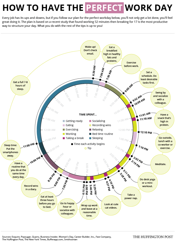
How do you manage your time? The How to Have the Perfect Workday infographic designed by Alissa Scheller for The Huffington Post tries to map out the perfect schedule to maximize your productivity. 

The good news is that there are plenty of little things you can do to improve both your productivity and your happiness if you feel stuck at your desk all day.

One simple trick is to structure your time better — which includes taking more breaks. In fact, the highest performers work for 52 minutes consecutively before taking a 17-minute break, according to a recent experiment conducted by the productivity app DeskTime.

Check out HuffPost’s perfect workday below:

The doughnut chart is easily understood by readers as visualizing the complete day, and this design tells this one story in the visualization very well. Nicely done.

Wednesday
Nov052014

How Well Do You Know Your Shit?

How Well Do You Know Your Shit? infographic

Poop is not a pleasant thing to talk about. And studying it in your toilet after you excrete it is probably not part of your normal routine. However, the How Well Do You Know Your Shit? infographic from Health Works enlightens us about what our poop can tell us about our health.

With its less than enticing scent, and unattractive physique, nobody wants to give their poop a second glance. The general rule when it comes to poop is – you do the deed quickly, and flush immediately.

While it’s no bed of roses, the next time you’re in the toilet doing the Number 2, take a look at your work of art before you flush. The brown blob in the toilet bowl can divulge little secrets about your health condition, since it’s the product of the waste from your body.

You might curse us for coming up with this cute little infographic, but you really should know your sh*t better. Enjoy:

This is a really good informational infographic about a topic no one likes to talk about. A perfect topic choice from a health information site.

Thanks to Wen for sending in the link!

Thursday
Aug072014

What are the Best Eyeglasses for Your Face Shape?

What are the Best Eyeglasses for Your Face Shape? infographic 

We can spend hours sitting in front of a mirror at the eyeglass store trying on every style of glasses they own… or we can read the What are the Best Eye Glasses for Your Face Shape? infographic from Zenni. Lets face it, our faces can’t pull off any look, so do yourself a favor and find the eyeglasses for your shape of face.

The general theme behind the infographic is to demonstrate that thought must be put into the frame design you’re planning on purchasing. By pairing your new frame design to the basic shape of your face, you’ll ensure that your eyeglasses are of a complimentary design - and help you look your best!

Eyeglasses are a fact of life for many of us. Beyond the benefit of clearer vision lies the ability to complement your facial features and overall look with eyeglass frames. In fact, there is some science behind selecting the appropriate frame that pairs nicely with the general shape of your face.

At Zenni Optical, we have constructed a simple way to determine which eyeglass frame will work best for you - all based on the basic shape of your face. Whether you have a “square face” that responds well to rounded or oval shaped frames in darker colors, or a “heart shaped” face that works well with oval or round shapes in lighter colors, you’ll be able to better choose the best eyeglasses for your face shape.

This is a great visual topic for an infographic!  If they had just tried to explain face shapes in text, it wouldn’t have worked at all.

A section on how to determine your own face shape would have been helpful.

Thanks to Daniel and Stacey for sending in the link!

Friday
Aug012014

Cold or the Flu? How to Spot the Difference

Cold or the Flu? How to Spot the Difference infographic

Getting sick is NOT fun and trying to figure out what you have is even worse. The Cold or Flu? How to Spot the Difference infographic from Vaccine Hub highlights some key points to help you tell the difference. Get well soon!

What is influenza?
Influenza, or the flu, is caused by a highly contagious virus that infects your nose, throat and lungs. Symptoms develop quickly and last around one week. The flu is seasonal and in Australia tends to occur between June and August.

Read more information at Vaccine Hub.

Determining if you have a cold or the flu is always difficult. This infographic does a good job of choosing one topic and telling its story well without adding too much information.  Visualizing the few statistics they included would make the side-by-side comparison more effective, and the treatment section could benefit from a few graphics to break up word usage.

The infographic is missing it’s URL address to the infographic landing page that should be included at the bottom of the graphic to locate the original.

Thanks to Ellie for sending in the link!

Thursday
Jul102014

The Ultimate Guide to the Moustache

The Ultimate Guide to the Moustache infographic

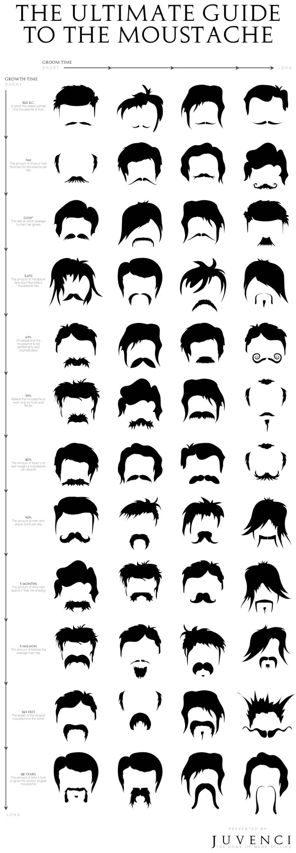
I moustache you a question. How do you pick your facial hair style?! The Ultimate Guide to the Moustache infographic presented by Juvenci balances length with groom time. Find out where you are on the spectrum!

We have just finished working on our ultimate guide to the moustache! It features 48 moustache styles sorted by a groom time v growth time matrix (with some fun moustache facts thrown in there too!).

This is a fun little graphic that brings style into the daily struggle of a man with his moustache.  The infographic design needs to include the infographic’s URL at the bottom of the graphic so that people can find the original.

Thanks to Conner for sending in the infographic!

Friday
May022014

The Deadliest Animal in the World

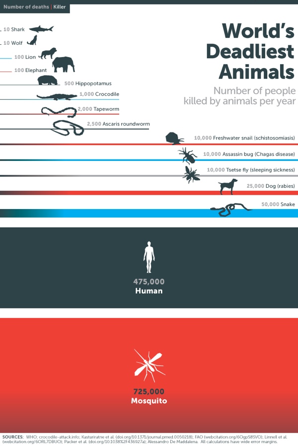
The Deadliest Animal in the World is an infographic posted by Bill Gates on his blog as part of Mosquito Week.

What would you say is the most dangerous animal on Earth? Sharks? Snakes? Humans?

Of course the answer depends on how you define dangerous. Personally I’ve had a thing about sharks since the first time I saw Jaws. But if you’re judging by how many people are killed by an animal every year, then the answer isn’t any of the above. It’s mosquitoes.

When it comes to killing humans, no other animal even comes close. Take a look:

Considering their impact, you might expect mosquitoes to get more attention than they do. Sharks kill fewer than a dozen people every year and in the U.S. they get a week dedicated to them on TV every year. Mosquitoes kill 50,000 times as many people, but if there’s a TV channel that features Mosquito Week, I haven’t heard about it.

This infographic does a number of things right from a design perspective, but the major point is that as humans we see the two-dimensional area of objects as representing the values.  This design uses both the width and height of the rectangles to visualize the scale of deaths caused by the various animals.

Sometimes it might be too subtle.  For example, the width is the same for the rectangles for tapeworms and crocodiles, but the height of the tapeworm box has twice the height to represent the value correctly.

The other thing it does well is to tell one story really well.  There’s isn’t any extraneous information like geographic locations or animal populations.  The infographic focuses on communicating one set of data.

Because the infographic will be shared online without the rest of the article, there are three piece of information that are missing from this design:

  1. The Gates Notes logo, or some type of identification of who published the infographic
  2. A copyright or Creative Commons license state to clearly identify the rights for people sharing the infographic
  3. The URL of the article where readers can find the original, full-size infographic and the associated text.

Thanks to Peter for recommending the link!