About
Randy Krum
President of InfoNewt.
Data Visualization and Infographic Design

Infographic Design

Infographics Design | Presentations
Consulting | Data Visualizations

DFW DataViz Meetup

Join the DFW Data Visualization and Infographics Meetup Group if you're in the Dallas/Fort Worth area!

Search the Cool Infographics site

Custom Search

Subscriptions:


Feedburner

The Cool Infographics® Gallery:

How to add the
Cool Infographics button to your:

Cool Infographics iOS icon

- iPhone
- iPad
- iPod Touch


Read on Flipboard for iPad and iPhone

Featured in the Tech & Science category

Flipboard icon

Twitter Feed
From the Bookstore

Caffeine Poster

The Caffeine Poster infographic

Entries in personal (139)

Thursday
Dec272012

Blood Pressure: Know Your Numbers


Blood Pressure: Know Your Numbers infographic

Being knowledgeable about your health is always helpful. Your blood pressure is no exception, 1/3 people who have strokes die because of high blood pressure. The Blood Pressure infographic created by westfieldhealth.com describes what blood pressure is, what it means, and then how to maintain a healthy blood pressure. The infographic was found on behance.net.

High blood pressure puts strain on your heart and increases your likelihood of developing health problems in the future. It is one of the most common causes of heart attacks and strokes, and is also a risk factor for heart disease, kidney disease and dementia. One in three people in the UK have high blood pressure even though just a few simple steps can help combat it. By checking your blood pressure, exercising regularly and reducing the amount of salt in your diet you can significantly lower your blood pressure and enjoy a healthier lifestyle.

The infographic provides some useful tips and advice about how you can keep your blood pressure in check.

This is a really good design with great information for people.  I wish it was a little bit easier to understand though.  A few of the data visualizations are not clearly explained.

In Blood pressure High Spots, I don’t understand what the size of each symbol on the UK map represents.  The implication is the amount of reports high blood pressure cases, but the values are not shown.  I don’t understand the right circle at all.  The percentage numbers seem to be spread on a map, but it’s not the UK, and I don’t recognize it.

In Looking After your Blood Pressure, I think this diagram is completely artistic, even though it seems to imply that it’s a data visualization.

In A Guide to Blood Pressure Levels, the area chart seems to be a visualization over time of some sort, but no x-axis values are shown, so the readers can’t tell what this chart means.

Thanks to Luke for sending in the link!

Monday
Dec172012

Eat Like A Caveman With The Paleo Diet

Eat Like A Caveman With The Paleo Diet infographic

The Paleo Diet infographic from DrVita.com shows readers what it would take to eat like a caveman!

For those of you who keep asking yourself, “is there a diet that is right for me?” There are hundreds of diets to pick and choose from. One popular diet is Paleo. Below is Paleo in a nutshell.

The paleo diet, sometimes referred to the caveman diet is based on the diet of ancient humans. Getting nutrients from vegetables, fruits, nuts, seeds, meats, and fish, this diet helps you achieve a healthy and nutritious diet. This infographic helps you understand why the paelo diet is healthy, what foods to eat and avoid, and how it works. Give it a try and see if this diet is right for you.

The design is a good, short explanation of the Paleo Diet, and what it would take eat only natural foods like our ancestors.  Intuitively it makes sense, since processed foods and grains are a relatively recent discovery in the history of mankind.

Mostly just a visual explanation, there are a couple statistics included that would have have been better if they had been represented as data visualizations.  The footer should include both a copyright statement and the URL directly to the original, full-size infographic so readers can find the high-resolution version.

Thanks to Mat for sending in the linK!

Thursday
Jul052012

A Woman's Place: Best and Worst Places To Be A Woman

National Post A Woman's Place infographic

An informative infographic called A Woman’s Place by Richard Johnson at the National Post.  Very interesting analysis of some different ways to measure the best and worst places in the world to be a woman.

Canada ranked 17th on a list of the best and worst places to be a woman in the world. In the report, researchers from Save the Children looked at the health, education and economic status of women in 165 countries to develop the ranking, with Norway claiming the top spot and Somalia the bottom. The National Post graphics department analyzes the data:

I like this use of circles to visualize the scores, numbers and percentages because it’s easy for the viewer to compare values on the page.  Circles are usually tough to differentiate when the values are close together, but there’s enough range in the values here to make the circles effective.

A high-resolution PDF of the infographic is also available.

Found on HolyKaw

Wednesday
Jun272012

How to Properly Use Sunscreen


STACK How To Use Sunscreen Properly infographic

How-to topics are popular infographic designs, and How To Properly Use Sunscreen is a great topic to cover.  From STACK.com.  It’s over 100°F (over 37°C) here in Texas this week, so this is a very appropriate topic to share.

Most people know they should use sunscreen to protect themselves from the sun’s harmful rays. Unfortunately, few are fully aware of how to properly use sunscreen. This is particularly true of athletes who train and compete in the sun throughout the summer.

If you’re spending long hours in the heat this summer, sunscreen could become your most important piece of training equipment. Check out the graphic below to learn how to select the right SPF, understand application and find out how different conditions impact the need to use and reapply sunscreen. Don’t find yourself sunburned on the sideline this summer because you failed to educate yourself on how to properly use sunscreen.

As strong as the topic is, I see a number of design improvements that could be made:

  • The stats need to be visualized!  The definition of SPF would have been a great data visualization comparing one hour in the sun without sunscreen to 15 hours in the sun with SPF 15.
  • I love the varying degrees of transparency in the shadows behind the shield illustrations for the different levels of SPF
  • Overall, there’s too much text.  More than a normal reader will take the time to read.
Friday
Jun152012

200+ Infographic Resumes, an escalating trend

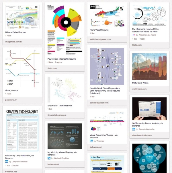
Pinterest Board of Infographic Visual ResumesPinterest Board of Infographic Resumes

Back in January of 2010, I posted 16 Infographic Resumes, A Visual Trend that highlighted the start of the trend of infographics and data visualization moving into resumes.  Why 16?  Because that’s how many good examples I could find at the time on the Internet to showcase the concept.  Two and a half years later, that post continues to be one of the most viewed blog posts on Cool Infographics with an average of 3,500 views every month.  A 2.5 year-old blog post!

Since then, the idea of infographic visual resumes has exploded.  I have continued to gather links to infographic resumes, and my collection is now over 200 examples of infographic resumes that have been published online.  Instead of trying to post them here on the blog like I did in 2010, I’m experimenting by creating a Pinterest Board dedicated to sharing Infographic Visual Resumes.  I will continue to add resumes and grow the board, so follow the board if you want to see new ones as they are addded.  If you know of any that I should include, add the link in the comments or send a link through the Contact form with “Infographic Resume” in the Subject line. 

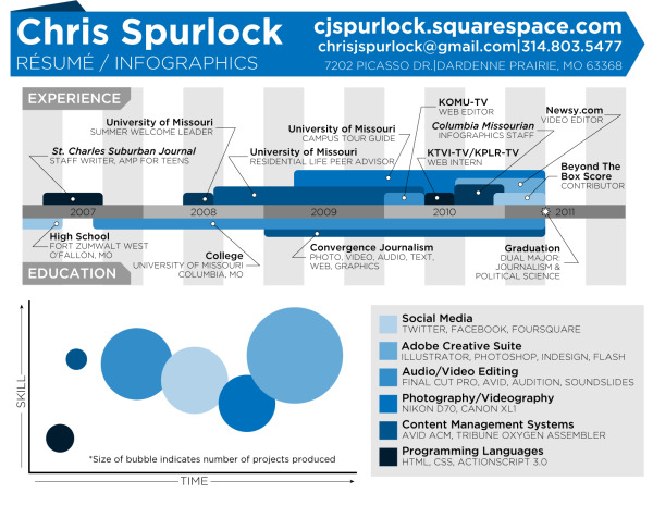
The Cinderella Story example is the Chris Spurlock resume shown below.  The story is that Chris was a graduating Journalism major at Missouri School of Journalism in early 2011, and created his infographic resume because he wanted to pursue data journalism as a career.  It was posted on the J-School blog, but quickly went viral on the Internet.  As a result, he was hired as an Infographic Design Editor for the Huffington Post!

Chris Spurlock infographic resume

I haven’t made any distintion between good and bad designs on the Pinterest board, because all of the designs can give you good ideas about types of data visualizations you can include in your own design.  The only distinction I have made is that they have to include some type of data visualization to be considered infographic.  There are many, many great graphic designer visual resumes that aren’t “infographic” so they aren’t included on the board.

Also, I have attempted to link each design back to the original owner’s site (like Chris’ resume above), but for many the public posting is on a portfolio site like Behance or Visual.ly.  If any of these should be linking to a different location, please send me a note through the Contact page, and I’ll get them linking to the correct places.

It’s definitely worth mentioning that there are a whole bunch of new online sites launching to capitalize on this growing trend.  The service they offer is to create an automatic infographic resume for you, usually based on your LinkedIN profile.  Vizualize.me, re.vu, Kinzaa, ResumUP and cvgram.me all create an infographic resume for you using their pre-designed templates.  I’ve tried to only include a couple examples from each service because 50 resumes based on the same template won’t provide you more inspiration to design your own.  My opinion is that these sites and templates are currently new enough to help your resume stand out, but very quickly the risk is that the templates will become recognized (like PowerPoint templates).

I’m planning a separate, future post about the best practices when designing your own infographic resume, but I wanted to shared the Pinterest Board with you as a resource for inspiration.

Please add a comment with your thoughts about the future of infographic resumes!

Thursday
May172012

INDi Unzipped - A Visual Business Plan?

INDi Unzipped infographic business plan

Did you know that 60% of Americans wear jeans to work? That the custom retail e-commerce market will grow by 5,000% by 2016?  The INDi Unzipped infographic from INDi Denim fills us in on the jeans we fill out!

We make custom jeans for men and women that can be fully customized in terms of style and fit. We created the infographic to show that custom is a HUGE trend in the e-commerce space and that INDi is a leader of this trend.

This is essentially a visual business plan for INDi Denim.  The infographic shows the data all about the jeans industry, the future growth of custom jeans and about INDi Denim in particular.  I would guess that the primary audience for this one is the investors and customers of INDi, but that’s a fantastic use of an infographic design!

The only thing missing from the bottom of the design, is the URL to the full-size infographic on the INDi blog.  Designers need to include the URL to the infographic so reader can find the original when the infographic gets shared, but isn’t linked back to the INDi page.

Thanks to Becca for sending in the link!

Monday
Mar262012

What About Me? - Intel's Infographic Generator


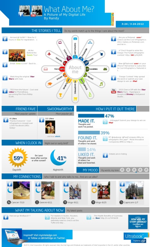
Intel has released What About Me?, an automatic infographic generator that connects to your own Twitter, Facebook and YouTube accounts to create a profile infographic about you.

Social media users know that discovery is half the fun. With What about Me? you can capture a snapshot of your social media life and create your own colorful image, full of clues and facts about one of the most fascinating subjects in the world — YOU!

In general, I’m not a fan of automatically generated infographics.  I find them repetitive, like PowerPoint templates, and that makes everyone’s information look the same.  This one at least incorporates a few photos of your own to give a little personal touch, but not much.

From a design perspective, the “About Me” section is the big central visual element.  I like the color spectrum and the simple icons used for the dominant categories.  It may be just my own data, but all of the percentages are small and fairly close to each other, so visually you don’t see much difference at all.  Am I really that well balanced???

In the “How I put it out there” section, the bars are all portions of the total 100%, so a pie chart or a stacked bar would have been a better chart style to use in the design.  Again, in the “When I clock in” section, these two values are portions of the total 100%, so some type of visualization that shows that would have been helpful to the reader.

I really like the simplicity of the “My Mood” section, and I think they actually made it too small in this design.  As a completely visual element it could reall be much larger and more prominent.  I would really like to have some type of editing capability, like choosing which images are included.

I think they setup the sharing function poorly.  You can save a JPG file of your own design (like mine above) to your own computer.  If you share on Facebook or Twitter it will post the infographic as a photo in your account, but the link it generates will just take someone else back to the front page to design their own.  That’s confusing because the link should be sharing your own design with others, so they would have the option to like or share your design.

If you create your own design, share post the link to your image in the comments!

Found on Mashable

Wednesday
Feb292012

The Startup Ecosystem: Predator vs. Prey

The Startup Ecosystem: Predator vs. Prey is a fun but informative infographic from udemy.  It looks at the different roles related to tech startup companies in an amusing way by personifying them as fish in the sea.

The startup waters are murky and full of hidden dangers. Below the surface, the ecosystem rests in a delicate balance between predators and prey.

To help you navigate these stormy seas, we’ve created the infographic below. Read on to find out where you stand in the startup food chain.

This one is light on data, but does convey valuable information to the reader.  The visual scale of Ubiquitous to Endangered is easy to understand, and the color coding is consistent throughout the design.

Found on Best Infographics

Tuesday
Feb282012

Payroll and Tax Deductions


The Payroll and Tax Deductions infographic from Paycor takes an unbelievably dry topic and makes it interesting by visually walking someone through their paycheck.  The design allows them to understand all of the different things that may come out prior to the final amount that makes it to their bank account. 

Most American workers aren’t aware of the factors that determine how much is deducted from their paychecks, yet it’s important to have that understanding so you can speak up about any errors. Read more about the details of payroll and tax deductions in this infographic.

So what exactly is that payroll software deducting from your paycheck? Typical deductions include federal income tax, OASDI, Medicare tax, disability and state income tax. Your tax bracket will range from 10% to 35% depending on your amount of taxable income. Medicare tax rates will be different depending on whether you work for a company or are self-employed.

At the state level, individual states handle taxes differently, with seven states charging all residents a flat tax rate and nine other states not collecting any income taxes at all. 

I think this is a fantastic use of an infographic to explain a really confusing and boring topic.  The visual design makes it much easier to understand and the character illustration help lighten up the topic to make it more approachable by readers.

I do think the visualizations using the stacks of cash are weak.  They show a size comparison between deduction amounts, but don’t visualize their specific value well.  There is also still more text than I would like in the design, but with this topic you do have to be clear and precise because the tax laws are so complicated.

At the bottom, the design is missing the URL for the original landing page, a copyright statement and any credit to the designer.

Thanks to Matt for sending in the link!


Friday
Feb102012

What's In Your Trash?

The What’s In Your Trash infographic explores what constitutes trash in America.  From Bolt Insurance, this design breaks down all of the stuff we throw away.

The cleaning services industry brings in more than $50 billion a year, from janitorial services to residential cleaning agencies, and the industry is projected to continue growing. Americans generated more than 250 tons of garbage in 2010. In BOLT’s What’s In Your Trash infographic, find out what is really in your trash and how important cleaning services and janitorial services are. Through recycling and waste incineration, as much as 90% of waste can bypass the landfill! Presented as an infographic (created for BOLT by Infographic World) to help you more easily visualize and retain this important information.

Although there is a lot of text here that could have been visualized (big fonts aren’t a data visualization), I really like the doughnut segments split apart to show different components of the trash.  It helps tell the story and lead the reader through the information top-to-bottom of the design.

Thanks to Jane for sending in the link!