About
Randy Krum
President of InfoNewt.
Data Visualization and Infographic Design

Infographic Design

Infographics Design | Presentations
Consulting | Data Visualizations

DFW DataViz Meetup

Join the DFW Data Visualization and Infographics Meetup Group if you're in the Dallas/Fort Worth area!

Search the Cool Infographics site

Custom Search

Subscriptions:


Feedburner

The Cool Infographics® Gallery:

How to add the
Cool Infographics button to your:

Cool Infographics iOS icon

- iPhone
- iPad
- iPod Touch


Read on Flipboard for iPad and iPhone

Featured in the Tech & Science category

Flipboard icon

Twitter Feed
From the Bookstore

Caffeine Poster

The Caffeine Poster infographic

Entries in personal (139)

Wednesday
Feb082012

Client Infographic: Hotels.com Romance Survey


Hotels.com has released two Romance Survey infographics that share their own research behind romance and Valentine’s Day.  Designed by InfoNewt with designer Jeremy Yingling, the two versions cover research data both the U.S. and Canada.

Pack your bags, Sweetie Pie, we’re going on a romantic getaway!  We surveyed guys and gals of different ages who shared their secret dreams about the perfect romantic weekend.  Here’s how our lovebirds responded.

It’s fun, timely information that has a long Online Lifespan (won’t change over time), so the infographics will be relevant for years.  There was a lot of survey data, and I really like how the final result mixes up different ways to look at the aggregate data by also using the available demographics to show findings by age and gender.

I was impressed with the chivalry shown by 58% of men (both in the U.S. and Canada) that feel they need to plan and pay for a romantic Valentine’s date.


Thanks to the Hotels.com team for being great to work with!

Friday
Jan272012

Weight of the Union 2.0

From Anytime Fitness has released the Weight of the Union 2.0 infographic to coincide with the U.S. State of the Union Address this week.

Last night, the President gave his State of the Union address to members of Congress and the general citizenry to report that our nation is moving in the right direction. But today we want to address what the President didn’t mention in his speech to the union. We want to discuss our nation’s biggest health concern: obesity. We are offering its own barometer for measuring progress — the second annual report called the “Weight of the Union.”

There’s a lot of data shown in this design, and a good blend of different data visualizations, illustrations and text descriptions. 

My biggest complaint is that many of the data points are just listed in text, and they could have been visualized.  For example, the dollar values showing that “Being Fat is Expensive”, should have been scaled so they could be easily compared to each other or some outside comparative spending values.

The other major issue I have is the shading of the silhouette as a stacked bar chart doesn’t work accurately.  Readers see the “AREA” of the colored sections as being representative of the values.  Because of the odd shape, you can’t just color by height.  The boots are showing the biggest value “Sleep”, but because that part of the silhouette is narrow, “Work” actually visualizes as a much bigger portion of the whole than the data really shows.

I like the inclusion of the QR Code at the bottom as a promotion tool for Anytime Fitness.

Thanks to Amanda for sending in the link!

Friday
Jan202012

A Visual Guide to Marathon Running

Taking it to the Streets: a Guide to Marathon Running is a cool infographic from CheapSally.com.

As you may already be aware, the number one resolution I made for myself for 2012 was to try my hand at running a half marathon! After some research, I decided to partake in the L.A. Marathon in March, and I have been doing quite a bit to prepare. First and foremost, I put together a handy little marathon training schedule that will help me prepare for the run of my lifetime, I also did tons of research regarding super foods that help sustain energy, and lastly I created this infographic so that all of you can learn a little bit more about what it takes to run a half or full marathon!

A great tactic for the Marketing, the information infographic is being used to draw attention to all of the coupons available on the site related to Dick’s Sporting Goods.

The design starts off slow, with a lot of text that could have been visualized, but gets much better halfway down.  I really like the sequence of information that starts with some general information, moves to fears that keeps people from taking up running, then gets into an actual training schedule and finishes with a list of marathons across the country. 

The Common Running Injuries section is well done with percentages shown in doughnuts connected to color-coded positions on the runners body.  For the non-statistical information, the illustrations are simple and easy to understand.

I love the visual Half-Marathon Training Calendar!  Even though these are just stacked bars, the reader can quickly understand a lot about the increasing training regiment required.

I though it finished weak.  The banners listing marathons throughout the year should have some visual element to it like silhouettes from the locations, or a map showing them color coded by month.  At the bottom, there should be a URL to find the original infographic, a copyright statement to be clear about allowed uses and I always prefer to see the designer listed.

Thanks to Cameron for sending in the link, and I also found it on Infographic Journal.

Friday
Jan202012

Geek vs. Nerd: Which Are You?


The Geeks vs. Nerds head-to-head smack-down comes to us from MastersInIT.org

In the ongoing battle between geek and nerd, one must take sides, but how can this be done without a solid argument for both personas? We here at Masters In IT (a mix of nerds and geeks) decided that it’s time to lay all the cards on the table to determine which is better and answer the question some fear to know: Are you a geek, or a nerd?

A little text-heavy and lighter fare than I normally post, but this one is just fun to read through.  There are a handful of stats included, and the doughnut charts and bar charts are easy to understand.

Like many of the infographics I’ve posted lately, it’s missing a URL at the bottom for readers to find the original post, a copyright statement and listing the designer!

Thanks to Gerri for sending in the link!  Also found on Infographic Journal, Daily Infographic.

Tuesday
Jan102012

The Anatomy of a Vegan

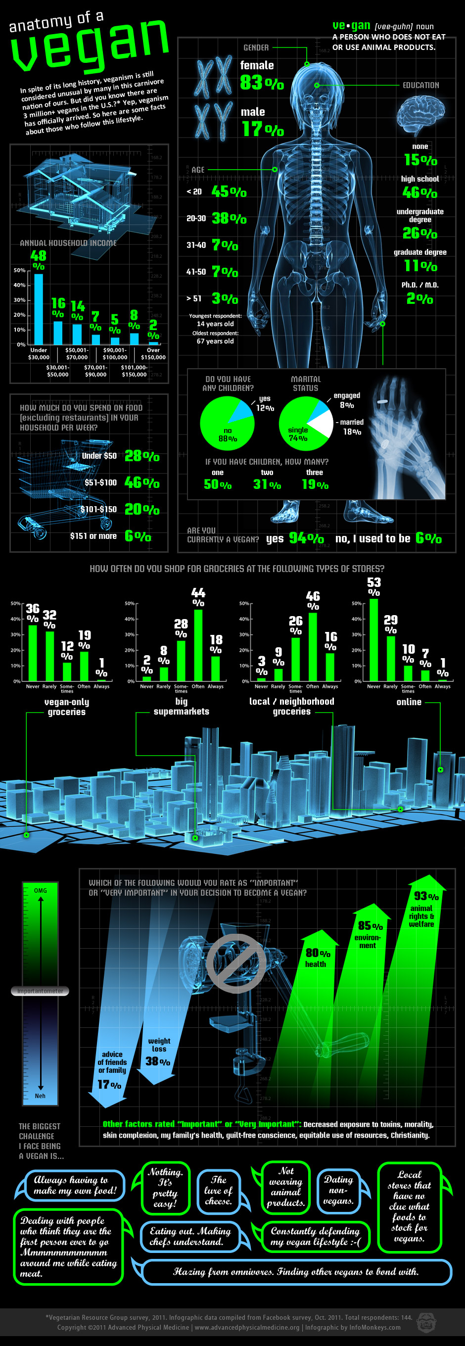
The Anatomy of a Vegan infographic from AdvancedPhysicalMedicine.org takes an “in depth” look at some of the demographic data they gathered in a survey of Vegans.

In spite of its long history, veganism is still considered unusual by many in this carnivore nation of ours.  But did you know there are 3 million+ vegans in the U.S.?  Yep, veganism has officially arrived.  So here are some facts about those who follow this lifestyle.

Designed by InfoMonkeys, I love the X-Ray design style.  They do a great job of showing context of the data being represented.  Hands with a wedding ring, the house, the shopping cart, the cityscape and the meat grinder is especially humorous.

Eye-popping colors and an X-ray theme give a whole new meaning to taking an “inside look” at veganism. Packed with information, this infographic strikes a great balance between education and entertainment. Based upon a Facebook survey with text provided by the client, this is one of our favorite pieces!

- InfoMonkeys

The black background stands out boldly in blog formats, and the infographic includes all the important information (clear title, data source, copyright, website URL and even lists the designer).  It should have listed the URL of the infographic on the Advanced Physical Medicine site instead of the homepage.  I like the idea of the “Importantometer”, but I just noticed the size of the arrows in the visualization doesn’t match the data.  The 17% arrow shouldn’t be larger than the 38% arrow, etc.

I have a few things I would suggest changing about the design:

  • I say it often here on the blog.  Big fonts do not make good data visualizations.  Too many of the statistics are listed as big numbers without any visualization, and it would have been simple to visualize these statistics.
  • The percentage sign under the value numbers on the bar charts are hard to read and disconcerting.  Shrink the numbers and lets the visualization tell the story.  The actual numbers themselves are secondary.
  • The Annual Household Income is shown as a bar chart, but those percentages are all part of the complete 100%.  They should be shown as parts of the whole like a pie chart or a stacked bar chart.  Same with the shopping statistics.
  • I have a really hard time reading the script font they used in the quoted responses at the bottom.

One final thought is that readers should always be skeptical of the data sources.  144 respondents from a Facebook survey is not enough to be a statistically valid study that would indicative of the entire population.  The reader also doesn’t know how the respondents were screened as part of the survey.  By visualizing the data in an infographic, it implies a certain level validity that isn’t truly there.

Thanks to David for sending in the link!

Friday
Dec302011

Ultimate Guide to Business Cards

Start the New Year off right with a new business card design!  The Ultimate Guide to Business Cards is a very well designed infographic from BusinessCards.com

Business owners can find themselves easily overwhelmed when it comes to working with a graphic designer on creating branded business cards. Often enough business owners underestimate the quantity and importance of design decisions (selecting typeface, font, card shape, size and material) that must be made in addition to organizing basic contact information.

Below are some common areas that sometimes get lost in translation between designer to business owner. If you’re starting a business card or identity project we recommend getting a head start and figuring out the following elements for your project.

I really like how the infographic literally shows the reader what each of the topics mean.  Using the actual fonts, showing the color blends, showing the actual business card dimensions is easy-to-compare rectangles, showing examples of the different materials, etc.

Simple, easy-to-read design that tells a story nicely from top-to-bottom.

Thanks to Chris for sending in the link!

Monday
Dec192011

Turks & Caicos: Your Personal Tropical Escape Awaits

A beautiful design, Turks & Caicos: Your Personal Tropical Escape Awaits shares information for potential tourists.  Designed by Digital Surgeons for Tranquility Vacations.

The “Your Turks and Caicos Escape” pulls together top attractions and things to do in the Turks and Caicos from our client Tranquility Vacations. The Providenciales based business manages private Turks and Caicos villas and sets guests up with perks like vacation concierge services and the good advice that comes from being longtime island locals. The infographic conveys a calm, sultry feel designed to entice, combined with facts and cool tips for fun in Turks and Caicos.

The colors and images convey a great sense of calm beaches and a carefree vacation experience.  I am left wondering where these islands are, and a globe showing the islands would have been helpful. 

Thanks to Peter for sending in the link!

Monday
Nov142011

Pancreatic Cancer Survival Rates Aren't Improving

The charity, Pancreatic Cancer UK has released this infographic showing some stats that aren’t common knowledge.

We’ve put an infographic together to highlight the main stats about pancreatic cancer that are unknown - you know, less than 3% of people who are diagnosed will live to see five years post-diagnosis? Infographics can be gorgeous and fun but occasionally have a really important message at their heart.

I like the tree maps showing the difference between death rates and funding for the different forms of cancer.

Thanks to Laura for sending in the link!

Friday
Nov112011

Broken Appliances: Repair or Replace?


PartSelect.com brings us a cool, interactive infographic that helps customers evaluate what to do with their Broken Appliances: Repair or Replace?  Obviously a design from an appliance parts retailer showing customers why they should buy repair parts instead of replacing their appliances, but it’s really good information and doesn’t feel like a hard sell.  It is actually very valuable information for consumers.

We created this diagnostic infographic to troubleshoot some of the common problems that affect household appliances. Clicking on the pulsing dots shows each common issue and the parts required to correct the problem. Many people replace an entire appliance, which is neither cost-effective nor environmentally responsible. We displayed the average cost of replacing the appliance as well as the cost of the parts required to fix the problem (and a scale of the difficulty of the repair).

I really like the design that places the replacement parts radially around the applicances.  The color coding for cost and difficulty also works well, but it would have been better without the legend (“Legends are Evil”).  Without the 1-2-3 as the text in the arc, it could have easily said Easy-Difficult-Very Difficult in the arcs.

Apparently the length of the arcs doesn’t have any meaning, although it looks like it should.  They are just designed long enough to fit the text and the images.

Figure 1 - Layering of the symptoms animation

In addition, PartSelect posted a lengthy, thorough post about the interactive infographic development process they went through.  This is fantastic!  While I may not agree with all of the decisions they made along the way, this type of transparency and under-the-hood information is what helps build credibility and trust with customers.

The Interactive Infographic Process

The process now looks like:

  1. Project Manager decides to make an infographic with some data.
  2. Project Manager brings on board a Programmer and Designer.
  3. Project Manager must decide on the balance of technology vs audience, based on discussions with the team.
  4. Designer fleshes out some rough concepts.
  5. The team meets to discuss; each has specific input:
    1. Project Manager: vision and potential target audiences.
    2. Designer: design concepts and how to make it clean.
    3. Programmer: what is possible. Ideas based on what the technology can do which PM and designer may not be aware of.
  6. Designer creates fleshed out design.
  7. Team meets again and iterates over designs until everybody happy.
  8. Programmer puts together technical spec on how it will be built, which will influence deliverables from designer.
  9. Designer sends across deliverables decided by programmer.
  10. Programmer builds the first functional version.
  11. Team meets and probably iterates and refines design in same process.

Thanks to Stephen for sending in the link!

Thursday
Nov032011

Death & Gravestone Symbolism

Death & Gravestone Symbolism from LifeInsuranceFinder.au takes an in-depth look at the most common signs and symbols used on gravestones around the world.

Death is life’s ending.  Because everyone who is born eventually dies, it is the center of many traditions and organizations.  Customs relating to death are a feature of every culture around the world.  Part of those customs are symbols, whcih signify or try to make sense of the phenomena.

I had no idea about some of the meanings behind these.

Thanks to William for sending in the link!  Also found on Chart Porn.

Page 1 ... 4 5 6 7 8 ... 14 Next 10 Entries »