About
Randy Krum
President of InfoNewt.
Data Visualization and Infographic Design

Infographic Design

Infographics Design | Presentations
Consulting | Data Visualizations

DFW DataViz Meetup

Join the DFW Data Visualization and Infographics Meetup Group if you're in the Dallas/Fort Worth area!

Search the Cool Infographics site

Custom Search

Subscriptions:


Feedburner

The Cool Infographics® Gallery:

How to add the
Cool Infographics button to your:

Cool Infographics iOS icon

- iPhone
- iPad
- iPod Touch


Read on Flipboard for iPad and iPhone

Featured in the Tech & Science category

Flipboard icon

Twitter Feed
From the Bookstore

Caffeine Poster

The Caffeine Poster infographic

Entries in personal (139)

Monday
May022011

The Real Cost of Dating

This is a pretty simple one, but I appreciate when companies are willing to experiment with infographics and even design their own.  The Real Cost of Dating is from Match.com and based on a survey they performed in March of 2011.  So here, the company is putting their own, proprietary data out on the web to inform readers and draw them into the match.com blog.

First, I like the talk bubble used as a pie chart.  It really helps reinforce the data as “Men say…”, “Women say…”.  Although I think the design is too subtle.  It took me a minute to even see that there were too colors in the bubbles.

Persoanlly, I think this design is very text-heavy, and much of the text is redundant.  For example, each statistic includes the text “…of women” when they are already in a section of the infographic of just statistics from women.

Overall, good first swing at using infographics in your marketing strategy, and I hope they do more.

Thanks to Colin for sending in the link!

Thursday
Apr282011

Self-Described Mac vs. PC People infographic

Profile of a Self-Described Mac Person vs. PC Person is a fun infographic looking at personality and preference differences.  Based on 388,315 survey respondents from Hunch.com, it illustrates topics like who throws parties, math aptitude, taste in art, cocktail drinks of choice and would they ride a Vespa or a Harley.

Our latest data project was to analyze how self-described Mac and PC people are different. The infographic below, designed by the talented folks at Column Five Media, breaks it down.

Back in ye olden days of Hunch — November 2009 — we explored the differences in personality, aesthetic tastes, and media preferences between Mac and PC users. Since then, the Hunch user base and question pool have grown many times over. The 2009 report started with more than 76,000 responses to its base “Mac or PC?” question. The same question now has nearly 400,000 responses. This is all in the context of the more than 80 million “Teach Hunch About You” questions which have been answered on Hunch to date.

From a research standpoint, even though the number of respondents is high, these are voluntary survey participants that haven’t gone through a screening process.  So while the results are fun, I don’t think they can be considered a statistically accurate representation of the population as a whole.

Very funny, and a great job by the design team at Column Five Media!  Found on FlowingData and Visual News

Wednesday
Apr202011

Social Media and College Admissions


Are colleges using social media as part of the student admissions process?  Schools.com explored this topic with the Reading Students like an Open Facebook infographic.  It’s hard enough to get teenagers to understand that online photos and status updates will be a permanent record of their behavior for the rest of their life, but even more immediately it could impact their entrance into college!

As Facebook has become more and more popular—if it were a country, it would be the third largest in the world—its use in the field of education has expanded, too. In fact, more than 80% of college admissions officers report using Facebook as part of their recruiting process. 

Are admissions officers really looking at the Facebook profiles of prospective students? And if so, are they making admissions decisions based on these profiles? Below is an infographic that highlights the answers to these questions and more—which might surprise you.

Thanks to Kristen for sending in the link!

Thursday
Apr142011

Eat, Drink and Be Thrifty: #infographic video

New infographic video from Mint.com,  Eat, Drink and Be Thrify uses their data to visualize the statistics behind monthly spending habits.
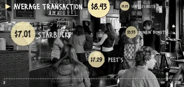
So how does your spending on food and dining compare to that of your peers? Using aggregate and anonymized data on Food & Dining spending from Mint.com, we created the video above to highlight some of the most interesting trends we found in Mint’s data, from average transaction at a variety of coffee shops, grocery stores and fast food restaurants, to the time of year when Mint users spend the most — or the least — in those categories.
Monday
Apr112011

Evolution of the Cell Phone #infographic

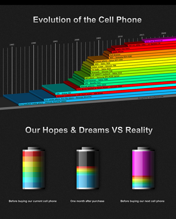
A cool infographic design, the Evolution of the Cell Phone by Zitron takes a light-hearted look at the timeline of phone features and the phones that first had each feature.  The second part of the infographic, Our Hopes and Dreams, takes a humorous stab at how the reality of our cell phones rarely lives up to our expectations (until the next Buzzword comes along!).

Thursday
Mar312011

Do You Need a Social Media Detox? [infographic]

From Column Five Media, Do You Need a Social Media Detox? is a lighthearted infographic look at what can happen when you get sucked into the social media hype.  Light on data, it’s a fun, infographic poke at those of us that believe being a Foursquare Mayor of the local grocery store actually means something.

If you find yourself tweeting from the shower and updating Facebook while doing 85 on the freeway, we created this graphic to save your life. Click below or go here to view the full-size version.

Thanks Jarred for sending in the link!

Wednesday
Mar022011

Blood Simple: Designing Infographic Health Reports

Blood Simple, by Steven Leckart, is a great article in the recent issue (Dec 2010) of WIRED magazine, and is also available to read online.  Three visual designers were challenged to design a better lab report to help make health information more approachable and understandable by patients.

…lab reports don’t have to be unintelligible. With some thought and design-minded thinking, tests can be as informative to patients as they are to physicians. With a little context and color, we can make sense of the numbers. And with a bit more understanding, patients can become participants in their own health.


These designs certainly aren’t perfect, but they very clearly illustrate the point that we should be able to help patients get a better grip around their own health information.  The last few decades have seen a tremendous shift in pushing the responsibility of a patient’s health back onto the patient without giving them a better way to understand the information. 

We consulted with Lisa Schwartz and Steven Woloshin, physicians at the Dartmouth Medical School Institute for Health Policy and Clinical Practice and experts in communicating data to patients, to make sure the right information gets onto the forms and the irrelevant stuff stays off. And we tapped three exceptional designers to reimagine how this information can be presented—limiting them to one printed page per report. Consider these a proof of concept, a refutation of the argument that ordinary people can’t handle their health (and inspiration, we hope, for the medical establishment).


I want my own Visual Health Report!

Monday
Feb282011

Visualizing Daily Activities With Media Wheel


I really like the Media Wheel for Visualizing Daily Activities from Hill Holiday.  The wheel visualizes how people consumer different types of media over the course of a day.  For example, DVD/Video is mostly consumed in the evening and Newspaper is mostly consumed in the morning.  each slice is a different type of media, and the consumption levels are shown by how bright the colors are at that time of day.

For a media planning project, we needed to find a simple way to illustrate how people in a particular segment engage with different media. After some experimentation, we came up with this “media wheel” chart that summarizes 216 data points from a media spreadsheet.  

Read their blog post, they included a good description of how they normalized the data and created the media wheel.  They also gave credit to the designer, Eric Fensternheim, which is always nice to see.

The wheel graph itself was built by hand in Adobe Illustrator. Each data point’s value relative to the highest in its row is tied to the corresponding level of color transparency.

Design: Eric Fensterheim, media design intern.

Thursday
Feb242011

WHAT?!? The Hearing Loss infographic


You Want to Lose Your Ears? is a cool infographic designed by Big Oak about common (and uncommon) sounds and their potential risk to your hearing.  I love the spiral visual as the sound examples get louder.  

Here we have a graphic that brilliantly displays the effects of hearing loss and how to cope with it. The graphic points out that the four main ways people lose their ears are through listening to loud music, spending too much time in an industrial work place with power drills and the like, being exposed to the sounds of a racetrack, and being exposed to the sounds of guns firing for long periods of time. So, how do you know if your ears are being damaged? Well, if someone is standing three feet away from you, but you cannot hear the words coming out of their mouth, then odds are that you are probably in a situation where the noise level is dangerous.

Hopefully, a grenade isn’t a common experience for any of us, but if it is, let’s hope hearing loss is the worst of your worries!

Infographic Design by Big Oak for The Ear Plug Superstore & Audilio.com (Protection Auditive)

Found on InfographicsShowcase.com

Tuesday
Jan252011

Horoscoped: Visualizing Our Common Future

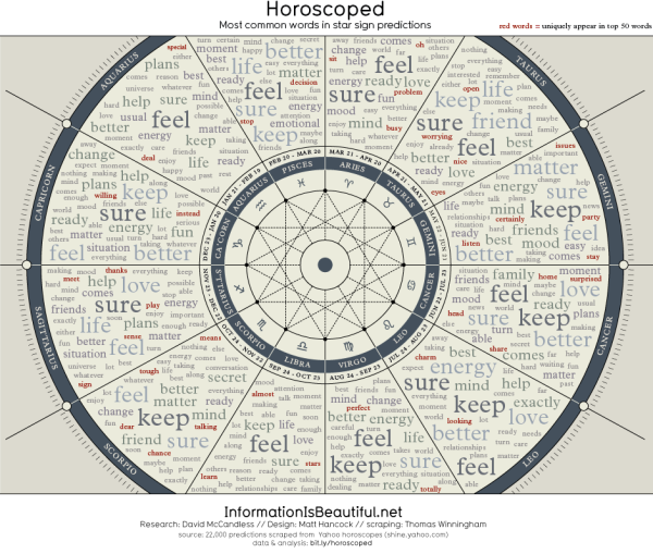
Horoscoped is another cool infographic project from Information Is Beautiful.  Scraping the text from over 22,000 horoscopes, a word cloud is created separately for each sign.  This visually shows you how common the words used truly are.

As part of their transparency, the team has also done a fantastic job of providing a description of their entire process and links to all of the data and the scripts here and here.

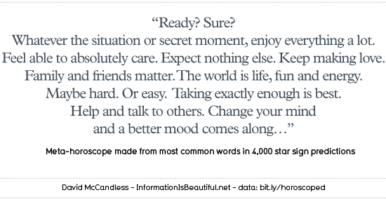
Taking the most common words from all of the horoscopes, they have created the Grand Unifying Horoscope:

Credits:

CONCEPT & RESEARCH: DAVID MCCANDLESS

DESIGN: MATT HANCOCK

ADDITIONAL RESEARCH: MIRIAM QUICK

HACKING: THOMAS WINNINGHAM

SOURCE: YAHOO SHINE HOROSCOPES


Found on Bad Astronomy and Chart Porn.