About
Randy Krum
President of InfoNewt.
Data Visualization and Infographic Design

Infographic Design

Infographics Design | Presentations
Consulting | Data Visualizations

DFW DataViz Meetup

Join the DFW Data Visualization and Infographics Meetup Group if you're in the Dallas/Fort Worth area!

Search the Cool Infographics site

Custom Search

Subscriptions:


Feedburner

The Cool Infographics® Gallery:

How to add the
Cool Infographics button to your:

Cool Infographics iOS icon

- iPhone
- iPad
- iPod Touch


Read on Flipboard for iPad and iPhone

Featured in the Tech & Science category

Flipboard icon

Twitter Feed
From the Bookstore

Caffeine Poster

The Caffeine Poster infographic

Entries in personal (139)

Wednesday
Dec292010

The Ride of Your Life


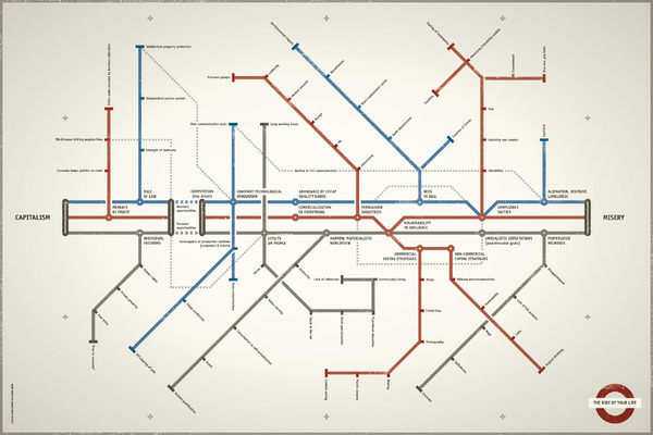
The Ride of Your Life is a very cool, interesting infographic using the subway map design style to show the potential dark side of capitalism.  Created by Lazar Dzamic, Digital Planning Director at Kitcatt Nohr Alexander Shaw in London and designed by Vladan Srdic, Partner and Creative Director at Studio360.

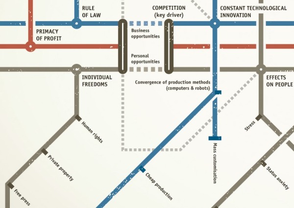
As a reader, you really need to look closely, and appreciate the level of detail and connections included in this design.  The overall message is that the dark side of Capitalism “can” lead to Misery, and the branches explore different aspects of business and personal life influences.


Lazar provided some behind-the-scenes information behind the making of The Ride of Your Life:

“The whole thing was inspired by two books that I would strongly recommend to any communications professional: Robert Cialdini’s ‘Influence: the psychology of persuasion’ and Oliver James’s ‘Afluenza’. Cialdini is a world renowned academic in social psychology applied to persuasion, while James is a psychologist dedicated to investigating the origins of what we also know as the ‘status syndrome’.

I was intrigued by the fact that people in liberal capitalist societies tend to feel less happy than in many others with significantly (sometimes shockingly) less wealth. Which made me think of the role of persuasion industries in that phenomenon.

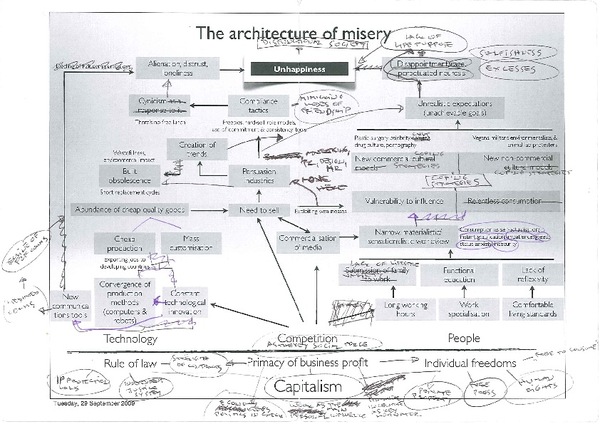
I did the original drawing in one short but frantic session on the inner back cover of Cialdini’s book, but the initial structure has evolved over the last few months, to the one that you see here. The original title was ‘The architecture of misery’ but then I realised that I need a visual partner who will bring it to life. Enter Vladan Srdic, my friend and an incredibly gifted designer from Slovenia, and the ‘spiritus movens’ behind the design Studio 360 in Ljubljana. He not just brought the structure to life by replacing my pitiful clouds with the stylish metro map but also changed its title into ‘Ride of your life’ - which I infinitely preferred.”


Lazar was also gracious enough to share one of his early drafts so Cool infographics readers could see how far the final infographic had evolved from the initial idea.


Fantastic job Lazar for going through the whole process and making your thoughts become a reality.  I want to see the next version exploring the good side of Capitalism!

Friday
May212010

Visualizing Alcohol Use

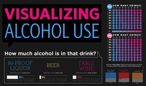
From phlebotomist.net (a website all about blood!), the highly-colorful Visualizing Alcohol Use infographic explores the effect of alcohol 

How much alcohol can your bloodstream handle? Take a look at the graphic to check out everything from blood alcohol averages to the highest blood alcohol content ever survived (you won’t want to try this at home).

There’s no designer credited, but if this wasn’t designed by EJ Fox (@pseudoplacebo) then it was heavily influenced by his work.

Thanks to Cate for the link!

Thursday
May132010

Facebook's Maze of Privacy Settings Infographic

The NY Times just published this infographic tree that shows how complex the privacy settings on Facebook have become.  I’ve got to imagine that Facebook wants the PR credit for giving their users a lot of control over these settings, but then in reality they know that they are so complicated that hardly anyone will take the time figure them out.

It’s astonishing how much of your personal information becomes public if you don’t take the time to figure all of this out.


The ever-increasing complexity of the Facebook Privacy Policy is another example of how complicated the privacy issue is.  It’s a fine line that Facebook has to walk to utilize their members traffic for advertising and respecting their privacy.  It seems to me that advertising is winning.

Found on Fast Company

Monday
May032010

Create Your Own Personal Infograph


Answer nine questions and ionz will create your own Personal Infograph, showing how you compare to everyone else who has also answered the questions.  You can then personalize your infograph by changing the colors, adding a personal message, change the layout, change the background color and add a picture.  Then you can save the image as your wallpaper.

So far, over 35,000 people have created their own infograph wallpaper.

Thanks to Simon Hinchco (@x_chemicalism_x) on Twitter for the link

Thursday
Apr292010

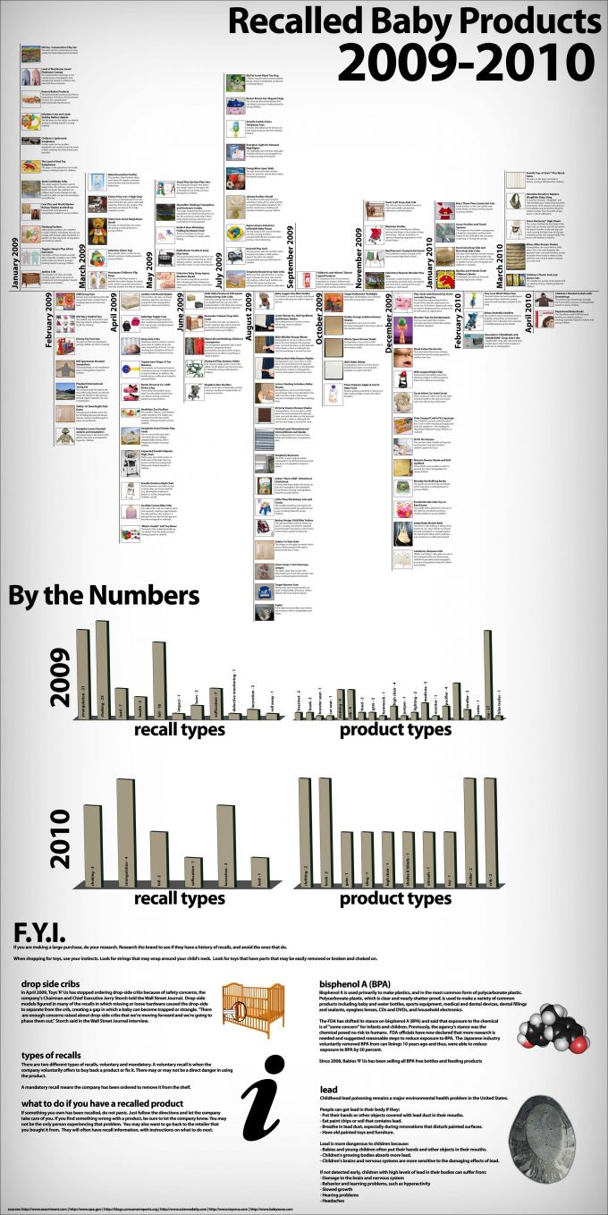
Recalled Baby Products infographic

The team at HugaMonkey.com has created this neat timeline of Baby Product Recalls in 2009 and 2010.  The timeline is the main feature, but they also broke down the recalls by injury and product type in the bar charts below.

Thanks Matt for the link!

Thursday
Apr152010

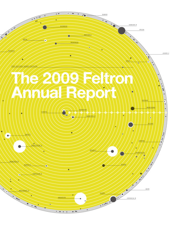
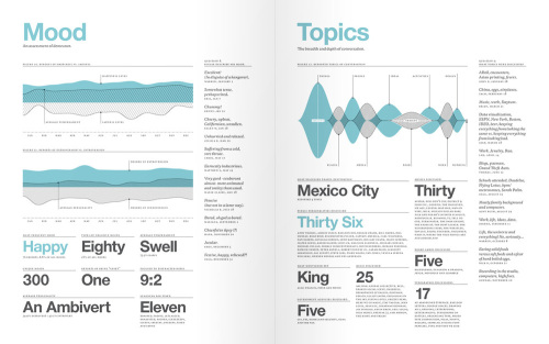
The Feltron Annual Report 2009 and an Online Class April 29th

I’m not sure how it slipped off the radar, but I haven’t posted a link to the Feltron Annual Report 2009 here on the blog yet.  Nicholas Feltron has done infographics for Time, CNN, Wired, New York Times, Fast Company and more, but probably his most popular infographics are his annual reports.  The print version of the Feltron Annual Report 2009 is available for pre-order for $30 from the Feltron Store.

Mike Aruz interviewed Nicholas Feltron when the 2009 Annual Report was released on mikearauz.com

The reason this came up today is that Nicholas is going to be the host of Live DesignCast: Nicholas Felton, A Master Class on Information Design.  This is an online class from PRINT Magazine on April 29, 2010 at 4pm EST.  The class costs $69 and is one hour long.

Our current information age has produced an inevitable crush of complicated data to sort through. Thankfully, there is a rising group of designers who present all this data in a way that we can understand and use. And for the last several years, no one has done it better than Nicholas Felton. 

In this Master Class, Felton explains how detailed data leads to better stories, offers a few guidelines for displaying complicated data sets, and challenges you to use all five senses through the process. 

In this Master Class DesignCast, you’ll learn: 

• How to visualize large data sets
• How to go from an initial question to gathering, comparison, and display 
• How to use sensors, whether hardware or software, to gather data
• How data helps satisfy curiosity, provides insight, and entertains
• How better data leads to better stories

Tuesday
Apr132010

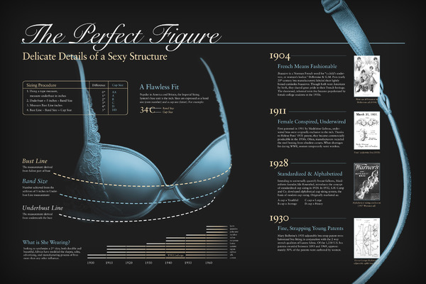
An Infographic Evolution of the Bra

This two-panel infographic on the Evolution of the Modern Bra was designed by Suzi Slavik for an assignment in her information graphics class at Ohio State University.

The first panel is devoted to social influences, industry leaders, and shifts in fashionable silhouettes. The second panel discusses historical milestones, significant fabrics used, and the bra fitting procedure.

The assignment was to choose any sequence, cycle, or evolution and represent it graphically. The information was to be presented in two separate panels that were related but could also function independently of one another.

Thanks to Matt for the link!

Thursday
Apr012010

Overpriced HDMI cables

Overpriced HDMI Cables was created by our friend Jess Bachman at WallStats.com.  This infographic shows the history and reasoning behind high-priced HDMI cables and why you should avoid them.


If you’ve already splashed out on the huge flat-screen tv, a state-of-art Blu-Ray player, and a satellite dish with a monthly subscription that brings with it hundreds of channels, then it probably seems like it’s a small price to pay for HDMI cables. But, this is exactly the mentality that gets people to pay for this habitually over-priced bit of technological excess. The truth, as our infographic points out, is that there is absolutely no difference between the cheapest and most expensive HDMI cables, at least over shorter runs. If you’re wiring an entire house, you may find these cables to be worth it.

To understand why you shouldn’t pay extra, you need to understand the difference between analog and digital. With analog cables, the signal degrades, with digital cables such as HDMI, it either works or it doesn’t. The signal doesn’t degrade any more than your JPEGs degrade when you put them on a thumb drive.


Wednesday
Mar312010

What's In MyBag?  [photos]


Chris Watson, from Visual Think Map, started a new network on Ning called “What’s In MyBag” for anyone to share photos of all the stuff they carry in their briefcase or bag.  It’s a fun, visual project that can share a lot of information within only one photo.

Join and share your own photo!

Tuesday
Mar302010

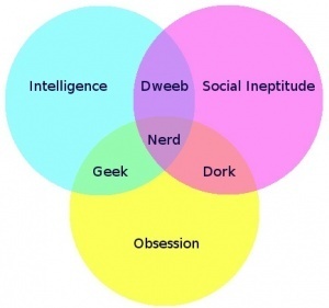
The Nerd Venn Diagram

Yep…I’m a geek.

From Matthew Mason on his blog, sed contra.


Thanks to Ken (LibertySquare} on TGM for the link!