About
Randy Krum
President of InfoNewt.
Data Visualization and Infographic Design

Infographic Design

Infographics Design | Presentations
Consulting | Data Visualizations

DFW DataViz Meetup

Join the DFW Data Visualization and Infographics Meetup Group if you're in the Dallas/Fort Worth area!

Search the Cool Infographics site

Custom Search

Subscriptions:


Feedburner

The Cool Infographics® Gallery:

How to add the
Cool Infographics button to your:

Cool Infographics iOS icon

- iPhone
- iPad
- iPod Touch


Read on Flipboard for iPad and iPhone

Featured in the Tech & Science category

Flipboard icon

Twitter Feed
From the Bookstore

Caffeine Poster

The Caffeine Poster infographic

Entries in personal (139)

Tuesday
Apr082014

Where Does Your Money Go When You Die?

Where Does Your Money Go When You Die? infographic

Do you know what happens to your assets once you die? Gorman & Jones has created a flow chart infographic to answer the question, Where Does Your Money Go When You Die? If you have a Will, no worries! If you don’t, maybe this flow chart will convince you to write one once you see who will inherit your things!

For many people, the concept of death and the consequences for those we leave behind is scary. While dwelling on this subject can be unpleasant, it’s important to know that your family is going to be taken care of when you die. Do you know where your money is going? To get a better idea of what happens to our assets when we pass on, here is a guide to help answer the question, “Where Does Your Money Go When You Die?”.

What a great, informative topic for a law firm that covers estate law.  I wish the different splits of the estate were visualized, but overall a good topic and design.

I like that the design company is given credit in the footer, but it’s missing the URL to the infographic landing page.  The link to the Gorman & Jones home page is fine, but there aren’t any links to the infographic there, so it doesn’t help readers find the original, full-size infographic.

Thanks to Andrew for sending in the link!

Monday
Apr072014

Women and Fashion In the Digital Age

Women and Fashion: In the Digital Age infographic

The Women and Fashion In the Digital Age infographic from Digital Surgeons breaks down how much a women spends on each item. This infographic also creates categories for each woman based on her style sense. 

A household CPO (Chief Purchasing Officer), women dictate trends across fashion and media. Let’s take a look at where she’s spending her time & money.

Good data and simple graphics that add context to the numbers.  Love the icons and silhouettes and the minimal color palette.  Simple character illustrations like these keep the focus on the data, and not the illustrations.  However, there are two major infographic design lessons that can be learned form this design.

First, shading portions of odd shapes is always tricky, so in this design the shaded shopping bags and bottles don’t actually match the data.  The reader’s eye sees the area of the colored shapes, and this is usually straightforward when working with basic shapes like rectangles and circles.  However, even with simple circles, the designer can’t just calculate the height of shaded regions like a bar chart.  That only works with rectangles, because the area is directly proportional to the height.  The math to calculate the correct area of a circle segment requires a little more math from geometry.  There’s no clear formula to calculate the area of a wine bottle or a shopping bag, so the designer had to take their best guess.

Second, big fonts are not data visualizations!  I hate to see values on an infographic that aren’t visualized.  They provide no context for the readers, and are perceived as less important than the numbers that are visualized.  The job of a good infographic is to make information easier to understand, not just to share information.  Even simple bars under each component of a woman’s outfit in the first section would have helps make the data meaningful to the audience.

You won’t find a link to this infographic on the Digital Surgeons home page, so the infographic image file itself should include the URL back to the landing page in text.  That way readers that see this infographic on other sites can make their way back to the original, full-size version.  Many sites that post infographics, don’t link back to the original like I do.  Don’t make it hard for your audience to find your infographic!

Thanks to Peter for sending in the link!

Friday
Apr042014

44 Simple Daily Activities To Enjoy Your Work

44 Simple Daily Activities To Enjoy Your WOrk infographic

Here are 44 Simple Daily Activities To Enjoy Your Work created by OfficeVibe to help keep the motivation high and add some fun back in your work day!

You might think it’s a truism, but most people tend to forget this crucial fact:

You should always make the effort to build good habits that will make you healthier, happier, and more productive over time.

Also, when it comes to new habits, it’s important to remember that these are things to do for long term changes.

This infographic will give you an overview of 44 habits to improve your productivity, your health and the overall quality of your workdays.

A fun infographic for Friday!  There is some fantastic information included in here.  The topic choice will also have a long Online Lifespan, and has the potential to be relevant to readers for years.

The design is visually very busy.  I understand the color-coding of the different activities, and those should be the visual highlight.  The illustrations in the background should be less “noisy” with simpler illustrations and fewer colors.  I might even consider making the background illustrations grayscale to make the 44 activities stand out even more.

The font choices in the text boxes seems too small, and clicking the image on the infographic landing page doesn’t open up a larger version.  I think this was done to allow more of the background illustration to be visible, even though that shouldn’t be the focus of the design.  The designer didn’t want all of their background illustration work to be covered up by the important information?  This also made the great activity icons too small to understand.

The point scores for each activity were intended to add the element of gamifying these activities, but that gets lost in the overall design.  There aren’t any score total categories, so there’s no benefit to the readers from adding up their scores.

The additional text on the infographic landing page is a little out of control.  Every one of the 44 activities has a few paragraphs of text on the page providing more details.  WAY more information that readers will stick around for, but thankfully they kept that separate from the infographic design.  

The infographic should include the URL to the landing page so readers can find this additional information about the activities as well as the original, full-size version of the infographic.  They include the URL to the OfficeVibe home page, but there are no links to the infographic there.

Thanks to @JacobShirar on Twitter for sending in the link!

Tuesday
Feb252014

An Infographic Guide to Wedding Roles

An Infographic Guide to Wedding Roles


The Ultimate Visual Guide to Wedding Roles from Great Speech Writing helps clarify the complicated and misunderstood traditions behind who does what in a wedding.

Thinking about proposing; recently proposed; or just worried about what planning a wedding actually involves?  Big or small, at home or in a venue, it’s going to tale a lot of organising. When it comes to the wedding speeches we take the strain.  But there’s also a guest list to compile, a venue to book and countless people to arrange.  And in most cases, it’s something we only do once!  So here is the Great Speech Writing contribution: a wedding infographic to print-off, pin on the fridge and help you focus on who does what and when.  It’s not going to be easy, but at least you won’t have to worry about the speeches.

In terms of relevance, this is a great topic selection for an infographic from the publisher, Great Speech Writing.  It’s related to their business, but it is also a general interest topic that will be informative to a broad audience.

The topic also has a long Online Lifespan, which is how long the infographic will remain relevant to readers and continue to generate page views and back links.  Since the topic isn’t tied to any current events in the news, the infographic will be relevant for years to come.

The design is overly text-heavy, but I understand the design challenge.  Each action item should probably have an associated icon or illustration like the Joint Responsibilities section.  For example, a silhouette of a stripper pole dancing for the “Organise and host a memorable stag party” action item.  The design of an “Ultimate Visual Guide” should be much more visual!

The footer has the URL to the main front page of the Great Speech Writing site, but that doesn’t help readers find the original full-size infographic.  There isn’t a link to the infographic on the front page.  So the infographic should include the URL directly to the infographic landing page, so readers can find it even when people share the infographic in social media without an active link.

Thanks to David for sending in the link!


Monday
Jan132014

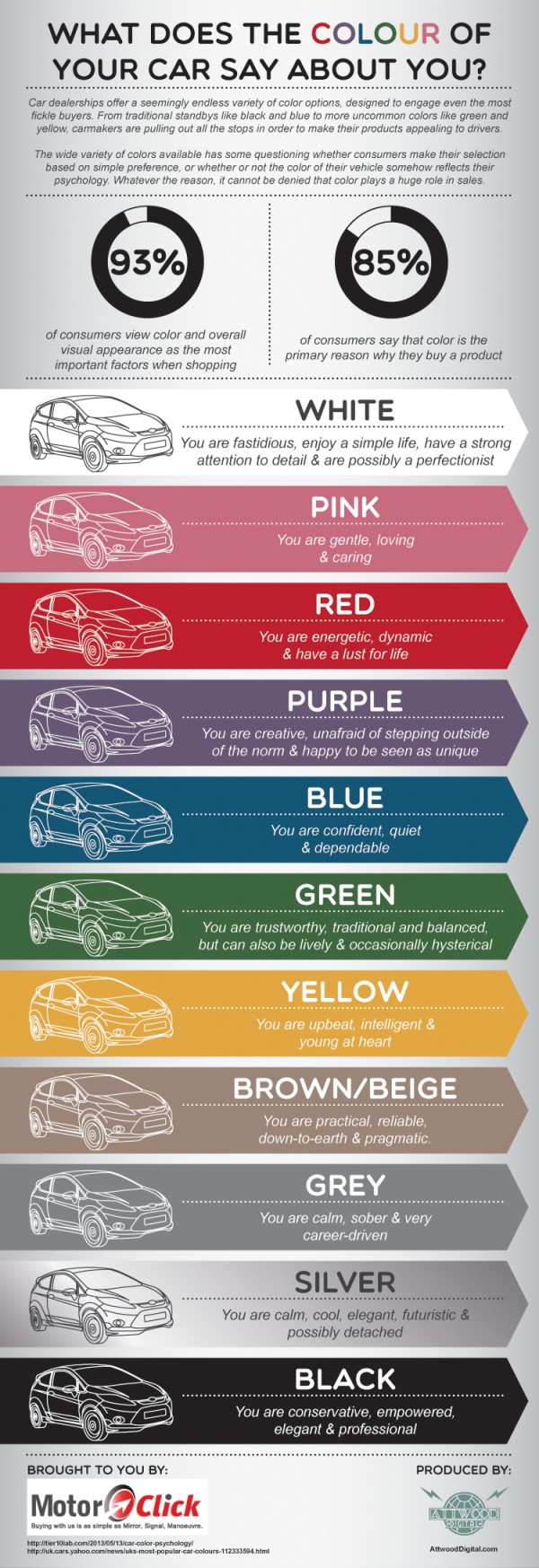
What Does the Colour of Your Car Say About You?

What Does the Colour of Your Car Say About You? infographic

If you think picking a car color was hard before, this infographic could make your decision easier or even harder. The What Does the Colour of Your Car Say About You? infographic published by Motor Click gives meaning to your choice in car color.

The wide variety of colors available has some questioning whether consumers make their selection based on simple preference, or whether or not the color of their vehicle somehow reflects their psychology. Whatever the reason, it cannot be denied that color plays a huge role in sales.

This is a good infographic design that takes information from the following text-only article and makes it visual: The Psychology Behind the Color of Your Car.  This design tells one story really well, and only takes a few seconds for the reader to understand.  Designed by Attwood Digital.

A couple issues with this design.  Obviously from a car company in the UK, the spelling of color/colour is oddly mixed throughout the design.  Also the data is a little bit questionable.  The article referenced isn’t the original source of information, and that article includes claims and quotes from additional sources.  Definitely take this information with a grain of salt.  There may be underlying credibility issues.

The footer should include the URL link back to the infographic landing page so the audience can find the original full-size version when they come across it shared on other sites.  For example, it’s had over 5,000 views on the Visual.ly site so far, but that submission does not link back to the original on the MotorClick site. So, all of that good traffic to view the infographic is not benefitting the original publisher at all.

Found on Visual.ly

Thursday
Dec122013

How To Boost Recovery After An Injury

How To Boost Recovery After An Injury infographic

How To Boost Recovery After An Injury from BodyHeal.com.au is a visual explanation infographic that uses illustrations and icons to explain the R.I.C.E. injury treatment process.

R.I.C.E. treatment is an acronym for: rest, ice, compression, elevation. It is commonly used to speed up healing and reduce pain and swelling caused by mild-to-moderate injuries, such as sprains, strains, and bruises.

The design uses a good combination of text explanations, character illustrations, icons and story layout to educate the audience about injury treatment.  Short text explanations effectively keep the information consumption quick and easy.

Some of the text is too small when reduced to fit on a blog (like this one), so the design should have included the URL back to the infographic landing page so readers can easily find the full-size original version.


Wednesday
Dec042013

50 Incredible Facts About Skin

50 Incredible Facts About Skin infographic

Did you know that your skin is considered an organ? Or that every 28 days the skin renews itself? These fact and more can be found on the 50 Incredible Facts About Skin infographic brought to you by Beautyflash. You can learn general facts about the skin as well as what you need to keep healthy skin.

Good visuals, minimal text, interesting topic and data, clear sources.  Good design all around.  The footer should have included the URL link directly to the infographic landing page so readers could find the original full-size version.

Thanks to David for sending in the link!

Wednesday
Nov272013

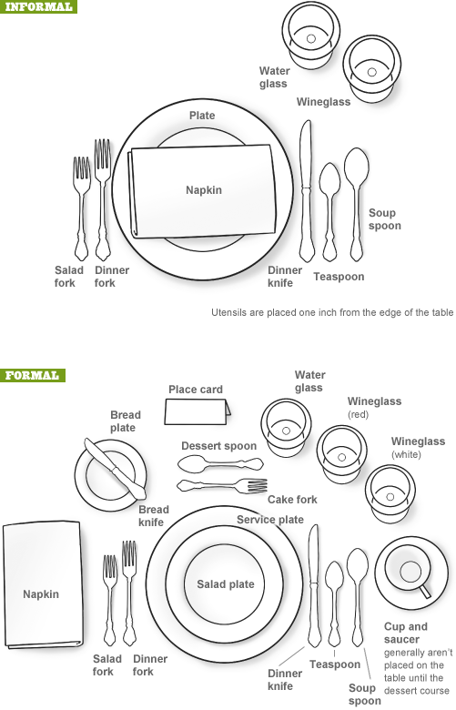
Thanksgiving Table Setting Diagrams

Thanksgiving Table Setting Diagrams

Just in case anyone needs a visual reminder when setting the Thanksgiving dinner table, the Table Setting Diagrams from Dinner-Party-Menu-Ideas.com make it super easy!  More of a diagram than an infographic, it’s still a super-useful visual!

Found on lifehacker, Brunch at Saks, and Apartment Therapy

Here’s a more detailed and further designed Thanksgiving Etiquette Table Setting Guide infographic from Adirondack Authority:

Thanksgiving Etiquette Table Setting Guide infographic

Found on Fine Dining Lovers

Both of these designs have an excellent Online Lifespan.  These designs are not new, they were originally published in years past.  The information presented is long-lasting, and will be relevant to readers every year for many years to come.

Monday
Nov252013

How NOT To Look Ugly on a Webcam

How NOT To Look Ugly on a Webcam infographic

How NOT To Look Ugly on a Webcam from Mixergy and Lemon.ly lays out the top 10 tips for successfully using your webcam.

No matter who you are and how good you look, it’s pretty easy to look terrible on a webcam. We teamed up with our friends at Mixergy to showcase just how NOT to look bad on a webcam with this handy infographic. By just following a few of our easy webcam tips, you’ll look as good as you feel in your next webcam interview. What do you think? Have any other tricks to add?

Nice instructional how-to infographic.  There’s no data visualized, just illustrations of the 10 tips.  Quick and easy to read.  This design also has a long Online Lifespan.  The topic is so universal, the infographic will be relevant for years!

The footer should include the text URL link to the infographic landing page on either Mixergy or Lemon.ly so when readers see smaller thumbnail versions posted on Facebook, Pinterest, Twitter, Google+ or blogs without a link, they can still find the original full-size version!

Thanks to @jasongaloob on Twitter for the link!


And Guy Kawasaki on Facebook:

Monday
Nov182013

17 LinkedIn Profile Must-Haves

17 LinkedIn Profile Must-Haves is a how-to infographic that walks the reader through optimizing their LinkedIn profile page.  Published by MarketMeSuite working with Maximize Social Business.com’s Neal Schaffer.

This year has been a big one for LinkedIn. With new features like the Creative Portfolio Display, you now have the ability to visually showcase your professional portfolio. But before diving any deeper with the latest add-ons, does your LinkedIn profile have all the elements that will help you rise to the top? This new infographic has all the tips you need to elevate your LinkedIn profile: 17 LinkedIn Profile Must-Haves!  Everyone can use great tips, so please share the LinkedIn love!

Great design using a mock LinkedIn profile as the background.  The callouts are clearly connected to the appropriate areas on the profile.  There’s a lot of text, but in this case I think most of it is necessary to clearly explain each point.  The reader can work off of this infographic without any additional research on other sites.

The statistics at the bottom should have been better visualized.  Mixing the 50.5% stat with the profile complete percentage visual from LinkedIn is confusing.  Also, it was difficult for me to find the original infographic landing page.  The footer should have the URL for readers to find the full-size original version of the infographic.  The source list text is too small to read too.

Thanks to Martin Mosler for post on Google+!