About
Randy Krum
President of InfoNewt.
Data Visualization and Infographic Design

Infographic Design

Infographics Design | Presentations
Consulting | Data Visualizations

DFW DataViz Meetup

Join the DFW Data Visualization and Infographics Meetup Group if you're in the Dallas/Fort Worth area!

Search the Cool Infographics site

Custom Search

Subscriptions:


Feedburner

The Cool Infographics® Gallery:

How to add the
Cool Infographics button to your:

Cool Infographics iOS icon

- iPhone
- iPad
- iPod Touch


Read on Flipboard for iPad and iPhone

Featured in the Tech & Science category

Flipboard icon

Twitter Feed
From the Bookstore

Caffeine Poster

The Caffeine Poster infographic

Entries in politics (59)

Thursday
Jun102010

A Visual History of the American Presidency - new infographic poster


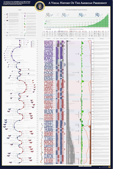
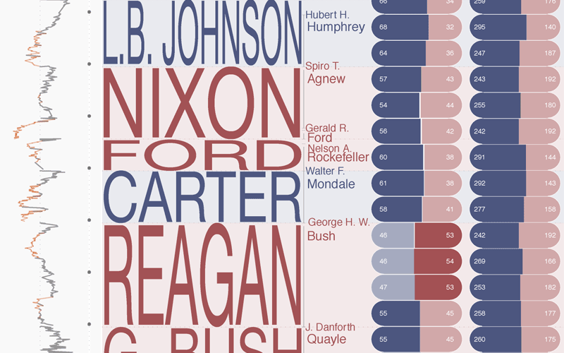
Timeplots has released their second infographic poster, A Visual History of the American Presidency.  Timeplots was launched by Nathaniel Pearlman and Frank Hamilton in December 2009 with the release of the Visual History of the Supreme Court infographic poster, which is now hanging in many schools, law practices and political offices.

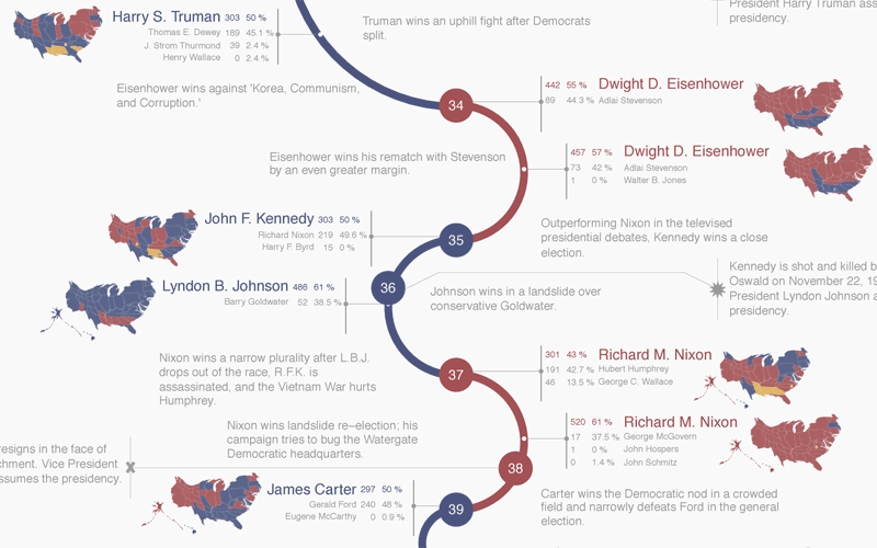
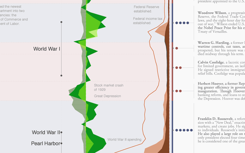
This large-scale print is like nothing else available on the history of the American presidency. It places each president in historical context, visualizing a remarkable range of political, social, and economic measures to succinctly tell the story of the presidency. Narratives are displayed within the larger context of American political history by aggregating and annotating hard data on population, presidential elections, Congress, the Supreme Court, the Cabinet, the U.S. economy, and the federal budget and debt. The Timeplot provides a new lens into American political history; it is not intended to be absorbed at a glance, but rather to be visited and revisited over time.


A beautiful poster, and a very impressive infographic design.  Very Tufte-like in its infographic design, which is no surprise since Nathaniel was a student of Edward Tufte at Yale.  

At its heart, this is a fantastic mix of timelines.  Additionally, the poster is an incredibly detailed infographic that includes things like the time period of each President, the balance of Congress during each term, approval ratings, population growth, the U.S. GDP, the Federal Budget, unemployment, election cartograms and statistics, a biography of each President’s political history and so much more.


The high-resolution infographic is available on the Timeplots site using Zoomify, but it really shines as the printed poster.  You can order the printed 32”x48” poster from the Timeplots.com site for $45, or a smaller 24”x36” version for $30. 


Great job to the entire team at Timeplots!  Later today, I’ll post a behind-the-scenes interview with Nathaniel.

Friday
Jan152010

World Progress Report poster - Available for one week ONLY


Nathan Yau at FlowingPrints has released a new poster, the World Progress Report.  It’s available for one week ONLY, and then he’s going to release the printer to start printing them up.  Orders will only be taken until January 21st.  Each 24”x30” poster is signed and numbered, and one can be yours for $26 + shipping & handling.

Nathan is doing another great thing.  All proceeds go to UNICEF’s relief effort in Haiti!

One more thing…for the first 50 people who pre-order: a free copy of Atley’s “How America Learns” poster!


UNdata provides a catalog of 27 United Nations statistical databases and 60 million records about the past, present, and future state of the world. Topics include demographics, life expectancy, labor levels, poverty, and a lot more. What does all that data mean though? World Progress Report, the latest from FlowingPrints, offers a look into the expansive UN collection.

In whole, the report tells a story of how we live and die, and the stuff in between.


Check out some of the great details in the poster:


Thursday
Jan142010

The British History Visual Timeline


The BBC has put up a great interactive, visual British History Timeline.  Each dot represents a signnificant event.  Clicking a color “era” zooms the timeline to just that time period.

Mousing over the individual dots shows the specific event details and timing.


You can also select a particular region of the UK, or search for a specific year or keyword.

Wednesday
Jan062010

Chart Wars: The Political Power of Data Visualization

Chart Wars is a great, short (5:15) presentation by Alex Lundry on the political power of data visualization and some of the issues surrounding using charts and infographics to promote a specific agenda.  Inspired title slide too.  Nice job Alex!

TargetPoint’s VP and Director of Research, Alex Lundry, was recently a featured speaker at DC Ignite, an evening of short presentations in which participants are limited to 5 minutes and precisely 20 slides that auto-advance every 15 seconds.


Thanks to Dave Gray for tweeting a link!

Thursday
Dec102009

The Carbon Economy - Infographic Video

New infographic video from Xplane.com.  The Carbon Economy takes a look at the political landscape around climate issues and new, green markets are emerging.

Created with The Economist, the video conveys the state of global climate change and what steps must be taken to reach a positive outcome. The piece was shown at The Economist’s recent Carbon Economy Summit in November 2009.
Timed with the publication of a special report in The Economist, The Carbon Economy summit examines how the political environment has changed since Kyoto and how committed regions and industries are to a sustainable carbon strategy.


Monday
Dec072009

A Visual History of the Supreme Court - New Infographic Poster!


Today, I want to share the launch of Timeplots.com.  A new infographic site focused on designing visual timelines by Nathaniel Pearlman and Frank Hamilton.  The Timeplots.com site launched today highlighting their first project; a poster called “A Visual History of the Supreme Court of the United States”.

This large-scale (48″x32″) print displays the full sweep of American federal judicial history from 1789 to 2009. It combines biographical information on every Supreme Court justice with a visualization of the influence of U.S. presidents and their political parties on the Court over time, and includes vote counts and summaries of landmark cases.

Months of work went into researching the history of the Supreme Court, and that effort really shows through in the level of detail in this poster.


It’s a good thing they offer this as a large format poster, because the detail draws you closer to discover the events and landmark decisions that are the colorful history of the SCOTUS (Supreme Court of the United States).


I love that even on their About page, they created small, infographic timelines as a visual of their individual experiences and career histories.  Here’s Nathaniel’s:


Timeplots has also started a new service, Timeplots on Demand:

Timeplots’ dedicated staff is ready to work directly with you to honor your own organization—your company, school, nonprofit, team, church, or family—with a custom Timeplot of your institution’s history. Let us help you collect data, create memorable images, and visualize the developments of your institution.

Congratulations to both Nathaniel and Frank!


Tuesday
Dec012009

Vote With Your Dollars! - Corporate Political Contributions infographic


Vote With Your Dollars, is a corporate political contributions map.  Using the public data from the Center for Responsive Politics (2004-2008), GoodGuide.com has plotted the balance of contributions from companies.  Mouse-over a specific company logo to see the detailed data (like Dell above).
View the political contributions of your favorite companies and see how you vote with your dollars.  The data is surprising!
You can choose specific companies or business sectors, and then change the sort order.  Here is the retail sector sorted by Most Democratic Leaning:


Thanks Anthony for sending in the link.  Sorry it took so long to get posted.

Monday
Nov092009

ANC Spending infographic


Diaan Minhardt created this simple infographic for his blog, Dreamfoundry, to show how money being spend on new cars for government officials could have been spent differently to build houses.
I’ve been keeping an eye on the rivers of money haemorrhaging out of the government coffers for idiotic reasons for some time now. What I saw inspired me to create this very simple infographic.
Thanks Diaan!

Thursday
Oct222009

Left vs. Right Ideology Concept Map


David McCandless and Stefanie Posavec from Information Is Beautiful have created this Left vs. Right concept map to help explain the differences in political opinions.
Of course, the political spectrum is not quite so polarised. Actually, it’s more of a diamond shape, apparently. But this is how it’s mostly presented via the media – left wing vs. right wing, liberal vs. conservative, Labour vs Tory. And perhaps in our minds too… 
This kind of visual approach to mapping concepts really excites me. I like the way it coaxes me to entertain two apparently contradictory value systems at the same time. Or, in other words, I like the way it f**ks with my head.


Using this blank template, David and Stefanie created two versions  One for the U.S. (top) and one for the World (below).
There are two versions with different colours: a US and a World version. This is because the US and Switzerland are the only countries in the world where red = right wing and blue = left wing. Grrr!


Found on VizWorld and Information Is Beautiful.

Monday
Sep142009

Obama's Worldwide Stamps of Approval infographic


From our friends at GOOD transparency, is a simple infographic showing President Obama's worldwide approval rating.  I like the use of stamps to help identify the countries around the world, and that the order is representative of highest approval to lowest approval ratings.  I think this graphic lacks the use of illustration to convey the data.  The actual approval ratings are only communicated with the numbers without any graphic representation.
During the campaign, President Obama argued that his election would help restore the image the rest of the world has of United States.  In the six months since his election, his approval ratings at home have slipped, though they remain high. Around the rest of the world, opinion is mixed. A recent study by WorldPublicOpinion.org asked people in 21 countries whether they had confidence that Obama would “do the right thing” when it came to world affairs. Our latest Transparency is a look at their responses.
One other criticism would be that the text implies that we should be looking at how worldwide opinion has changed since Obama's election, but the data is actually only a snapshot of opinions six months after the election.  No indication is this is higher or lower than the opinions at the time of his election.

A collaboration between GOOD and Michael Newhouse at Newhouse Design.

Thanks Michelle for the link!