New infographic poster by Larry Gormley from HistoryShots. The History of Film plots out the most important films of the last 100 years into a beautiful, flowing timeline that visually separates the films by 20 different genres.
This graphic chronicles the history of feature films from the origins in the 1910s until the present day. More than 2000 of the most important feature-length films are mapped into 20 genres spanning 100 years. Films selected to be included have: won important awards such as the best picture Academy Award; achieved critical acclaim according to recognized film critics; are considered to be key genre films by experts; and/or attained box office success.
You can buy the 43” x 23” inch poster for $34.00 and definitely check out the zooming viewer to see the poster up close at Historyshots.com.
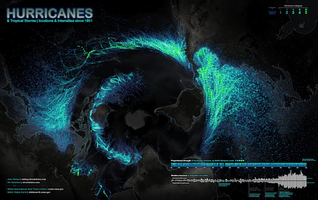
Science meets art in the Hurricanes Since 1851 infographic from John Nelson, IDV Solutions, on UXBlog. The infographic maps out storm paths and wind speeds of hurricanes since 1851. The photo is the projection view of the globe from the south pole perspective.
Ok, here’s a bottoms-up view of known tropical storms and hurricanes dating back to 1851. The fine folks at NOAA keep an archive of storm paths with wind speed, storm name, date, among other attributes, and are always updating and refining information for past events based on historical evidence and educated hunches. The data are awesome and they make it available in several formats. Here’s what it looks like slapped onto a polar projection (looking up at Antarctica) with point color tied to intensity…
A couple of things stood out to me about this data…
1) Structure. Hurricanes clearly abhor the equator and fling themselves away from the warm waters of their birth as quickly as they can. Paging Dr. Freud. The void circling the image is the equator. Hurricanes can never ever cross it.
2) Detection. Detection has skyrocketed since satellite technology but mostly since we started logging storms in the eastern hemisphere. Also the proportionality of storm severity looks to be getting more consistent year to year with the benefit of more data.
Data visualization design reveals patterns and makes data understandable, and this is a huge, effective data visualization.
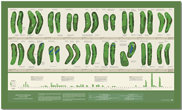
Augusta National Golf Club has undergone continuous modification since hosting its first Masters Tournament in 1934. This graphic depicts the more than 100 major changes made to the course over the past 79 years. At the top is a visual side-by-side comparison of each hole for 1934 and 2012. Below the hole comparisons is a timeline that maps tee, fairway and green area changes year-by-year. The combination of visual comparison and detailed timeline provides a sweeping overview of all the major changes made since 1934.
This is a great design that demonstrates how simple visuals can be used to show the viewer differences between the hole designs. By showing a terrain map of each hole then and now, side-by-side, the poster is easy for viewers to compare the changes and enjoy.
You can buy the 40” x 24” inch poster for $34.95 and definitely check out the zooming viewer to see the poster up close at Historyshots.com.
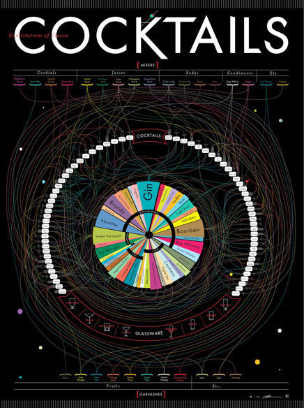
This definitive guide to classic cocktails breaks down 68 drinks into their constituent parts. Follow the lines to see where spirits, mixers, and garnishes intersect to form delightful concoctions. This massive movie poster-sized print contains over 40 types of alcohol (from distilled spirits to bitters), mixers from raspberry syrup to egg white, and garnishes from the classic olive to a salted rim. This obsessively detailed chart also includes the ratios for each drink, as well as the proper serving glass, making it as functional as it is beautiful. Over a year in the making, this is Pop Chart Lab’s most elaborate chart ever.
I love the circular design, with radial connections between the different alcohol types in the center and the mixed drinks around the perimeter. I find it easier to start in the center, and figure out which drinks you can make with that alcohol. They show the different shapes of glassware for cocktails across the bottom, and use those icons to show which glass should be used with each drink.
Pop Chart Lab also posted a fabulous, behind-the-scenes article on FastCoDesign about the process they went through during the design development. Check out The Only Chart You Need To Mix A Proper Cocktail to see the early concepts and the different stages the design went through.
As an exclusive gift to readers of Cool Infographics, Timeplots.com is offering a 30% discount on all posters when you use the Promo Code “sale2011” before the end of the year.
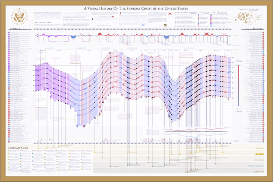
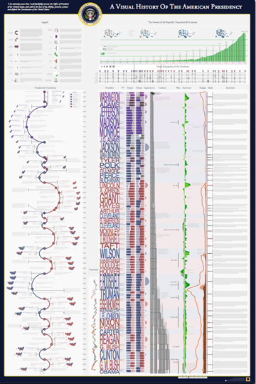
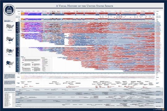
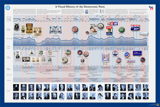
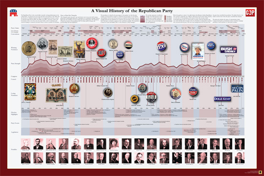
I love these posters, and I have both the Supreme Court and the American Presidency posters here at my office. For your office, for a nearby school, for your kids or even a Christmas gift, these posters are a fantastically detailed infographic reference. The U.S. Supreme Court, the American Presidency, the U.S. Senate and both U.S. Political Parties!
A big thanks to Nathaniel for all of his designs and offering this end-of-the-year discount to the readers of Cool Infographics!
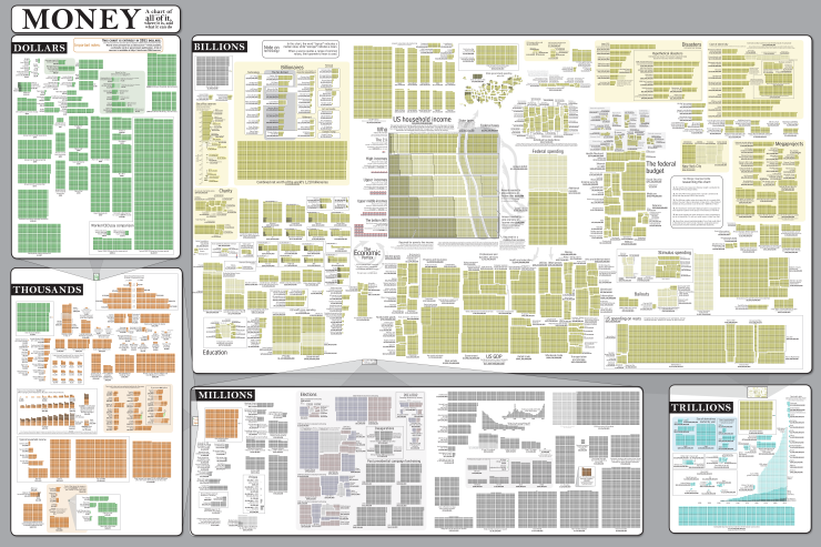
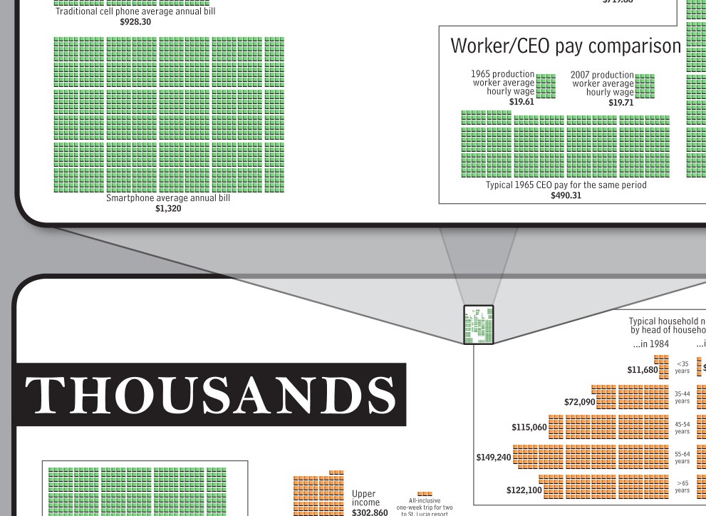
The Money Chart from Randall Munroe’s webcomic xkcd.com is a huge poster showing the scope and scale of money flowing all over the world. In a great move for transparency, the entire list of over 200 sources is also online.
This is the poster version of comic #980, which is a guide to money. It started as a project to understand taxes and government spending, and turned into a rather extensive research project. With upwards of 200 sources and 150,000 tiny boxes, it’s best appreciated in poster form. The 36”x24” high-quality poster print allows you to stand back and, all at once, take in the entire world economy.
Each square represents one unit of the specific section it’s in. One dollar, One million dollars, One trillion dollars, etc. To provide some scale, each section is then visualized to scale in the next higher section. Here’s the transition from dollars to thousands.
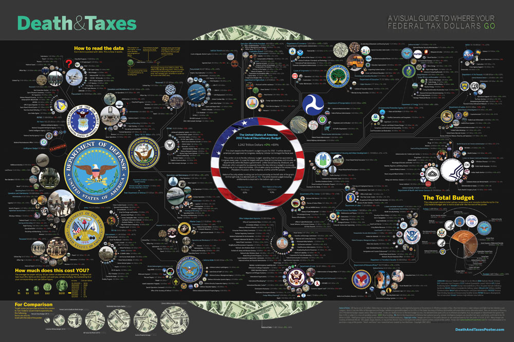
The new 2012 Death & Taxes poster has been released, and this year it’s better than ever. Designed by Jess Bachman (ByJess.net) this poster visualizes the 2012 proposed U.S. Federal Budget. The Death & Taxes poster is one of the best infographics I’ve ever seen, and it gets better every year.
“Death and Taxes” is a large representational graph and poster of the federal budget. It contains over 500 programs and departments and almost every program that receives over 200 million dollars annually. The data is straight from the president’s 2012 budget request and will be debated, amended, and approved by Congress to begin the fiscal year. All of the item circles are proportional in size to their funding levels for visual comparison and the percentage change from both 2012 and 2002 is included so you can spot trends.
PURCHASE: This year, Jess also had the opportunity to partner with Seth Godin and his Domino Project to make the full-size 24” x 36” poster available for purchase through Amazon. Currently, you can purchase a copy of the poster for $19.99. Also, check out Jess’s video introduction on the Amazon page.
POSTER GIVEAWAY: Cool Infographics is giving away one FREE copy of the poster. The free poster will go to one randomly chosen person that tweets a link to this blog post on Twitter and includes the hashtag: #deathandtaxes. I included the hashtag in the post title, so any retweets will be automatically eligible. NOTE: you must also be following me on Twitter (@rtkrum) so that I can send you a direct message if you have won!
I will choose the winner at 12 noon (Central Time) on Friday, November 11, 2011 (11/11/11). I will contact the winner, and order the poster from Amazon to be delivered to the winner.
INTERVIEW: Similar to last year, Jess was willing to answer some behind-the-scenes questions about this year’s poster:
Cool Infographics: What’s the most interesting thing you learned from the 2012 data?
Jess Bachman: Lots of reductions in the military side. It’s mostly from the OCO war funding, but its interesting to see what actually is getting cut the most. Mostly Army funding and RDT&E across the board. I would think the OCO was mostly Operations and Procurement.
Cool Infographics: Has you design process changed at all this year? What software did you use to help dig through the data and create the design?
Jess Bachman: Well this year I tried to work exclusively within the official spreadsheets, rather than pick out the numbers from the paper (PDF) budget. I think it’s more accurate and easier to get totals. Mainly just used excel and photoshop as always.
Cool Infographics: When did the 2012 data become available, and how long did it take you create this year’s poster?
Jess Bachman: It was supposed to be released in February but it was a month late. I started moving on it at a full clip then got involved with Amazon/Godin and the timelines shifted quite a bit, so while I usually get the post out in April, it was released in September this year.
Cool Infographics: How did working with Seth Godin and the Domino project come about?
Jess Bachman: Seth just emailed me out of the blue. We talked and it seemed like a no-brainer.
Cool Infographics: How does working with Amazon and the Domino project change how you print and distribute the poster?
Jess Bachman: Well previously my Mom did most of the shipper and I also had a 3rd party do fulfillment and shipping. It’s a rather time consuming and frustrating process. Sending out orders, doing customer support, paying vendors, etc. Now it’s all in Amazon’s hands. They got it printed and of course are warehousing and shipping it too. I’m quite glad as they do a much better job of shipping than I do. Of course they also take their cut of the profits. As for Domino, they have their own distribution channels and lists and also work closely with Amazon to make sure the product page is well presented too. This year it reached #18 on the best sellers list. I guess that makes me a best selling author. I don’t think I could have accomplished that without Domino/Amazon.
Cool Infographics: I see you made a video to include on the Amazon page, how was that experience?
Jess Bachman: Seth told me they needed a video ASAP so I just made one that afternoon. I suppose I would put more effort into it next year but videos help sell products and i think it does a good job of that.
Cool Infographics: Any new design features added to the poster this year?
Jess Bachman: I wanted to include some non-governmental items in the poster this year for reference. They are in the bottom left and include things like the size of the video game industry, bill gate’s net worth and other such things. When talking about billions of dollars all the time, sometimes you need to get out of government-mode to put those figures into further context.
Cool Infographics: The past posters have been shared very heavily in social media, which social sharing sites have you found most successful?
Jess Bachman: Well, Digg has traditionally been a big asset, but then Digg fell apart so I no longer pay attention to it. In general, I have abandoned the traditional accelerants like Digg, reddit, etc. and instead focus on my network of bloggers and influencers. Combine that with Facebook liking and you can really spread something.
Cool Infographics: Last year we talked about some favorite places that have the poster on display. Any new ones this year?
Jess Bachman: Well, with a larger audience and hopefully more sales, the poster will be everywhere. Unfortunately, I get lots of requests for discounts for schools with tight budgets, but I have no control over price anymore. I can say that an iOS app is in development so that will be interesting. My ultimate goal is to get on the Daily Show to talk about the poster in April. People constantly tell me I need to be on there, and I’m a huge fan, so I figure I have a good shot, just need to nag the right people.
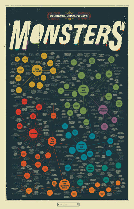
A taxonomic breakdown of all manner of frightful creatures from the silver screen, from the very large (like Godzilla) to the rather small (like Chucky) to the very weird (like the Crawling Eye). Hundreds in all, this is the definitive guide to a universe of scarifying baddies.
Over on the JESS3 blog, they’ve posted 10 of the different early versions and concepts of the Brandsphere so you can see some of the behind-the-scenes design process at work.
Social networks and channels present brands with a broad array of media opportunities to engage customers and those who influence them. Each channel offers a unique formula for engagement where brands become stories and people become storytellers. Using a transmedia approach, the brand story can connect with customers differently across each medium, creating a deeper, more enriching experience. Transmedia storytelling doesn’t follow the traditional rules of publishing; it caters to customers where they connect and folds them into the narrative. In any given network, brands can invest in digital assets that span five media landscapes:
1. Paid: Digital advertising, banners, adwords, overlays
2. Owned: Created assets, custom content
3. Earned: Brand-related conversations and user-generated content
4: Promoted: in-stream or social paid promotions vehicles (e.g. Twitter’s Promoted products and Facebook’s Sponsored Stories)
5. Shared: Open platforms or communities where customers co-create and collaborate with brands. (e.g. Dell’s IdeaStorm and Starbuck’s MyStarbucksIdea.)
Any combination of the five media strategies defines a new Brandsphere where or
ganizations can capture attention, steer online experiences, spark conversations and word of mouth can help customers address challenges or create new opportunities. Each media channel connects differently with people and thus requires a dedicated approach integrating tangible and intangible value. Doing so ensures a critical path for social media content: relevance, reach and resonance.
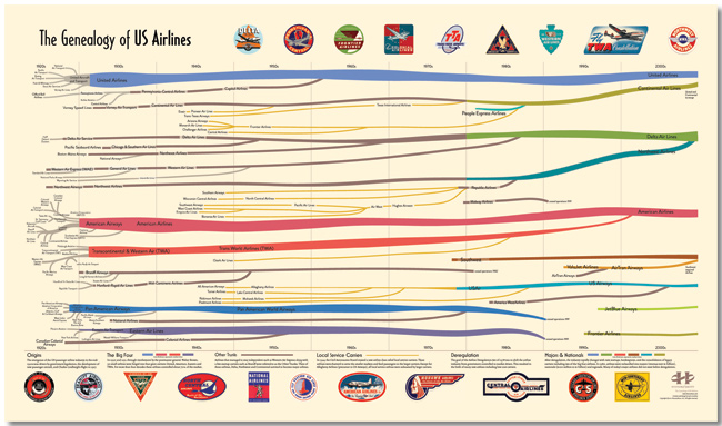
A new infographic poster designed by Larry Gormley at HistoryShots.com! The Genealogy of U.S. Airlines visualizes over 90 years or corporate history of airline mergers, acquisitions and closures. Over 100 different airlines have consolidated down the seven shown still in existence today.
The carriers are color coded and line widths represent market share for any particular year.
Over its short history, the US airline industry has experienced many dynamic phases of expansion and consolidation. From its origins in the 1920s, when air mail carriers started to transport passengers, to the creation (with the not so gentle prodding of the government) of the Big Four (American, United, TWA, and Eastern), from the rise of the local service carriers to deregulation and the most recent wave of mergers and acquisitions, the industry continues to fascinate both the casual traveler and the aviation buff.
The purpose of this graphic is to uncover and explain how the industry was created and how it arrived at its present form. At the core is a full genealogy of over 100 US airlines from the major airlines to the small local service carriers. Folded into the genealogy is the relative market share of passenger traffic for each airline. This allows the viewer to understand how the industry was controlled for many decades by the Big Four and how this dominance was quickly replaced by a number of other airlines.
You can buy a copy of the poster for $29.95 over at HistoryShots.com


 Randy
Randy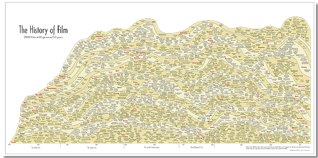


